Framing a small Edward Curtis—Another Carved Corner Design

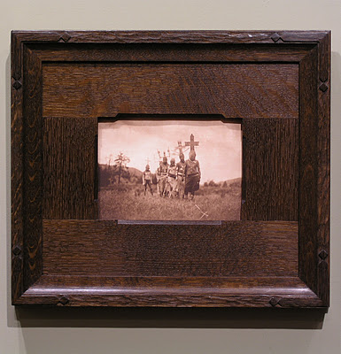
Recently framed this small original Edward Curtis photogravure of Apache Indians for a couple in Texas. The print had wide margins, but we wanted the effect of framing it close so used a lap-joined flat — kind of a wooden mat, although on top of the glass. We’ve taken this approach a number of times before.

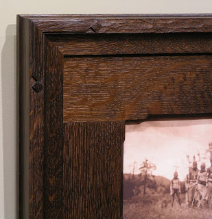
Also wanted to show the carved corner design. Both the corner design and the chamfer on the flat, which has 45 degree angled stops, echo the headdresses in the photo.

For more on framing photographs close, i.e., without a visible mat, read my article “Close Framed Photographs,” for Picture Framing Magazine.

“Wisdom of the Hands”—Doug Stowe Advocates for Handcraft in Education

For those of you who appreciate the aspect of handcraft in our work, I thought I’d draw your attention to the blog “Wisdom of the Hands” by Arkansan woodworker and teacher Doug Stowe. I learned about it while reading Matthew B. Crawford’s Shop Class as Soulcraft. Doug is something of a voice in the wilderness in arguing for more hands-on learning and a return to manual arts in schools—especially in the younger years.If handcraft is part of the bedrock of an economy (indeed, of civilization), as I argued in my essay “Real Wealth: The Value of Art and Craft in a Debased Economy,” it’s certainly part of the foundation of learning. I hope you’ll check it out and help spread the word about Stowe’s sound thinking and important work.

Framing Charles Partridge Adams—Simple Corner Carving

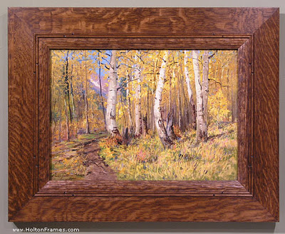
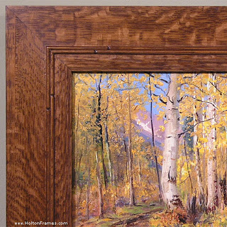
We recently got to frame this early twentieth century landscape by Charles Partridge Adams (1858-1942). At just 10″ x 14″, it’s humble in size as well as subject matter, and loosely painted—all aspects suggesting a fairly simple frame with a bit of carving.

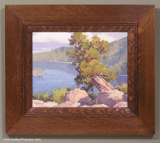
The tree trunks brought to mind the profile we’d come up with a few months ago for Paul Kratter’s view of Lake Tahoe, “Twisted Pine Above Emerald Bay,” below—a flat with a double reed near the sight edge and a carved flattened ovolo (convex form) at the sight edge—but I thought I’d refine it a little, adapting it to Adams’s more “dapple-y” style.  

So I decided to enhance the lines formed by the double reeds. So added a simple pattern of carved stops to the reeds near the corners. I’m pleased with the effect. I’d like to do more with simple corner carving this year.

Framing Contemporary Paintings—Andrij Korchynsky

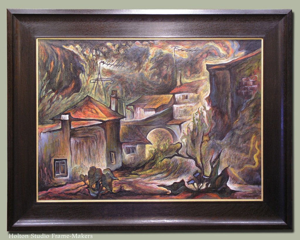
This recent job, a 23″ x 32″ contemporary oil painting on canvas by Ukrainian-American artist Andrij Korchynsky, offers a simple lesson in two key elements in frame design: line and form. Despite the loose style, the sweeping lines and angularity of the roofs suggested the form of the profile—a broad, 4″ flat sweeping up to a scoop and then beveling back. (The profile is No. 321.) With respect to line, a narrow raised panel at the sight edge, at the same width as the lines defining the structures, adopts the painter’s standard. A 1/4″ liner oil-gilded with 23 kt gold leaf gives it just the right highlight in keeping with the painting’s palette.

The wood is quartersawn white oak with Saturated Medieval Oak stain.

No. 321 on painting

Andrij Korchynsky, “Old Yard,” n.d. (1990’s?). Oil on canvas, 23″ x 32″.

Framing Kevin Courter in Compound Polyptych

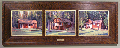
A customer recently commissioned Kevin Courter to paint three cottages on his rural northern California property, then had us frame the three 8 x 10’s. Here it is:

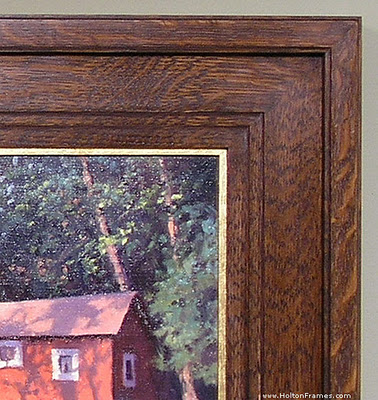
The idea was to create a frame alive to the soft edges as well as architectural subject matter. Given the vernacular cottages, we had to keep it simple but still worthy of the great admiration, felt by both painter and patron, of these charming structures in their locale, and all the wealth of memories and meaning they hold for the family that’s enjoyed them. The over all flat form of the profile was felt suitable to the relatively shallow depth of field and basically flat landscape populated by vertical trees, as well as the strong horizontal composition of the whole piece. It’s a very simple flat with a cap molding, all the profiling done with a 1/8″ radius.

The flat inner, or sight, edge of the frame made sense in terms of the frame construction, lending itself well to the dividers.

Polyptychs are interesting in part because of the trick of creating unity out of distinct parts. Japanese printmakers have done a lot with this idea. As you can see in this example from my portfolio, while the three panels create a whole scene, compositionally each panel also stands on its own.

We chose quartersawn white oak for its wild, rustic quality and stained it Medieval Oak which matches the burnt umber used in the shadows. While the frame thus has an overall shadow quality to spotlight the painting, the wonderful play of sunlight in Kevin’s pictures prompted our choice of a gilt oak slip to surround each panel. So the frame carries out the interplay of light and shadow that makes these images so appealing, but is on balance a shadow presence around the picture.

The metal plate at the bottom of the frame is engraved with the title of the piece, “My Three Sons,” and Kevin’s name.

Framing Ed Bearden—and Playing with Chamfers

I really enjoy chamfering and playing with chamfers as a design element.

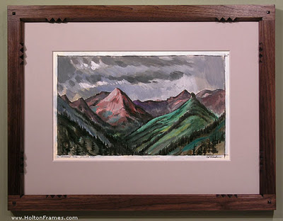
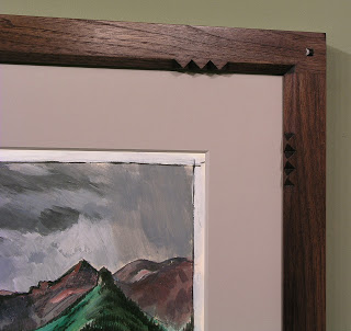
Here’s an acrylic on paper, recently framed, by mid-century Texan Edward Carpenter Bearden (1919-1980). We had fun coming up with this adaptation of our Aurora frame with flat mortise-and-tenon corners. We often use it with a chamfer all around the sight edge. In this case we played off the mountain peaks in the picture by adding the sets of points near the corners. On the same theme, Trevor shaped the corner plugs with a peak rather than our usual pillow form.

The frame profile is 1-1/2″ wide, and the wood is black walnut greyed down with a black wash.

Might have framed this piece close, but the customer preferred to mat it, in part to scale up a fairly small painting (about 11″ x 17″) to make it a stronger element on the wall—a perfectly good reason. The grey mat avoids the separating effect of white matting.

Another entry on chamfering is here.

Provide: The motto of business in the new economy

As the year winds up, I thought I’d write about another aspect of what we’re trying to do at Holton Studio—about our greater mission and purpose as a business. Because with the economy in a shambles, I believe it’s time businesses think in a fundamentally new way—which is actually an old way, as you’ll see—about what business is for.

Is the purpose of a business to make money? In answer to the commonplace belief that it is, John Ruskin wrote:

The fact is, that people never have had clearly explained to them the true functions of a merchant with respect to other people…

Five great intellectual professions, relating to daily necessities of life, have hitherto existed—three exist necessarily, in every civilized nation:

The Soldier’s profession is to defend it.
The Pastor’s, to teach it.
The Physician’s, to keep it in health.
The Lawyer’s, to enforce justice in it.
The Merchant’s, to provide for it.

…[T]he merchant’s function (or manufacturer’s, for in the broad sense in which it is here used the word must be understood to include both) is to provide for the nation. It is no more his function to get profit for himself out of that provision than it is a clergyman’s function to get his stipend. The stipend is a due and necessary adjunct, but not the object, of his life, if he be a true clergyman, any more than his fee (or honorarium) is the object of life to a true physician. Neither is his fee the object of life to a true merchant.

Who but a hopeless romantic—like John Ruskin, many will say—would expect serious business people to follow such an ideal? Well, for you scrooges out there, here’s one example from today’s New York Times—a banker, no less, in the small upstate NY town of Cattaraugus. The 130-year old Bank of Cattaraugus, the story says, “operates according to an antiquated theory of the business: that a bank should be a utility, like the power company, and serve as a broker between savers and borrowers in its community.”

While “banks have been dying for 20 years,” according to The Times, we’re witnessing a change as hard experience is reminding us of a bank’s true purpose which should be to provide for the savings and credit needs of a community. And smaller banks that have operated with that understanding are finally being appreciated. “In the last year…anger over big banks’ fees and mortgage lending practices has turned consumers against the mega-banks, and smaller institutions have been the beneficiaries.”

But what about growth—another widely assumed purpose of business? Bank president Patrick J. Cullen has faced that question many times.

“My examiners always ask me, ‘When are you going to grow?’ …But where is it written I have to grow? We take care of our customers.”

Pretty refreshing, no? But where’s the incentive? In partaking in, and facilitating, the life, joys and satisfactions of a genuine community—and,  as Ruskin said, of “every civilized nation.”

There is, after all, in that sage’s famous words, no wealth but life.

Merry Christmas!
Re-framing Thaddeus Welch

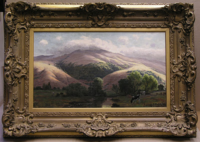
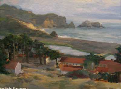
Thaddeus Welch (1844-1919) was one of the great historic California landscape painters. This classic bucolic hillside scene by Welch came in recently, the customer looking to free it from a typical period compo frame which he rightly judged to be pretentious and unsuitable to the rustic spirit of the painting.

Before

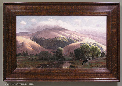
Here it is in its new quartersawn white oak frame in a dark stain matching the shadows and sympathetic with the forms of the hills, with simple fine beading to pick up the delicate line work in the painting (especially the trees)—and much more suitable to the spirit of nature that so moved Welch.

After