Framing James Cosgrove

A customer recently brought in this little (5-3/4″ x 8″) oil on board by Glasgow painter James Cosgrove(b. 1939). The stained walnut frame was designed entirely to the painting, with a carved cushion rim around a flat with fine carved flutes. I’m very pleased with the harmony of line and form, as well as color—a rare occasion when black works best with a painting.

Framing Dwight Clay Holmes

We just framed this 20″ x 16″ canvas by Texan Dwight Clay Holmes (1900-1986) titled “Red Bud”.

I was especially pleased with the form of the frame profile as an enhancement to both the graceful use of line in the painting (hence the reeding) and the loose brush work (hence the coarse, wild figured quartersawn white oak as well as the carved convex sight edge element). This frame is similar to one on the Charles Partridge Adams, below, which I wrote about here.

I realize these are pretty similar to the frame on the Louis Apol a couple of entries back. But it’s useful to compare three ostensibly similar frames with nevertheless significant differences when considered with respect to the pictures they’re on.
To make just one point about the frame on the Apol, it’s a slope; you can see the reason behind that choice. Focusing on these two paintings of trees, on the face of it, they’re very similar. Yet the forms of the trees in the Holmes are much finer and more linear and graceful. The most significant difference between these two frames, which are basically flat, is that while the Adams’s frame is perfectly flat outside the reeding and is squared off at the outside, the frame on the Holmes has a subtle cove up toward the outside of the profile terminating in a rounded outside edge. This curl up is basically as subtle as possible while still reading to the viewer. Also, although you can’t see it in the photo, the back is cut in giving this frame a much lighter feel than the blockier one on the Adams. This is a good example of how important it is for the frame design to be alive to the particular characteristics of a painting.

I love how subtle profile forms like this interact with the ray flake in the quartersawn oak. In this case, the rays curve laterally with the subtle cove of the profile (especially on the top), and so echo the curving lines of the trees. Note too the variation on the corner carving, which I focused on in the first entry. Not to put too fine a point on it, but the double reeds on the Adams frame echo the parallel tree trunks throughout the painting, whereas the red bud trunks stray off on their own and so are framed with a single bead, the second bead added to articulate the corners.

Finally, note that these are two bright sunny paintings very suitably served by dark wood frames. A narrow gold liner on the Holmes seems to reflect the sunlight in the painting, which seems very natural (like a window frame viewed from inside a house would reflect the sunny landscape outside). But the entire frame in gold would fail to complement the use of light with its complementary shadow tones.

Most importantly, I think both settings succeed at the great and primary purpose of the picture frame which is to sustain the spirit of the picture into the architectural real.

Framing Louis Apol

Here’s a notable historical work for you. Just framed this beautiful European landscape by Louis Apol (Dutch, 1850-1936), “A Forest in Winter” (oil on canvas, 32 x 25). (Click image for a larger view.)

The stained quartersawn white oak frame is a 4-1/2″ wide slope with a carved cushion sight edge. The double reeding outside the cushion, with carved stops near the corners are a nod to the delicate strokes that define the trees, and give the frame a degree of refinement in sympathy with the artist’s well-honed touch. The 1/4″ gilt slip catches the sunlight. We were aiming for a suitably rustic but sensitive feel, a quiet mood, simple. No “before” shot of this in a gold frame, but can you see how the dark wood suits the painting much better than a gold one would? How it’s like the shadows in the painting, and how the shadowy feel of the frame leads your eye to the picture and acts as a foil to the picture, and in particular to the sunlight? And, of course, the rustic feel connects you to the rustic subject matter much more successfully than would a gold frame.

Below is a corner sample of the frame design (without the carved stops on the reeding).

Framing a small Edward Curtis—Another Carved Corner Design

Recently framed this small original Edward Curtis photogravure of Apache Indians for a couple in Texas. The print had wide margins, but we wanted the effect of framing it close so used a lap-joined flat — kind of a wooden mat, although on top of the glass. We’ve taken this approach a number of times before.

Also wanted to show the carved corner design. Both the corner design and the chamfer on the flat, which has 45 degree angled stops, echo the headdresses in the photo.

For more on framing photographs close, i.e., without a visible mat, read my article “Close Framed Photographs,” for Picture Framing Magazine.

Framing Charles Partridge Adams—Simple Corner Carving

We recently got to frame this early twentieth century landscape by Charles Partridge Adams (1858-1942). At just 10″ x 14″, it’s humble in size as well as subject matter, and loosely painted—all aspects suggesting a fairly simple frame with a bit of carving.

The tree trunks brought to mind the profile we’d come up with a few months ago for Paul Kratter’s view of Lake Tahoe, “Twisted Pine Above Emerald Bay,” below—a flat with a double reed near the sight edge and a carved flattened ovolo (convex form) at the sight edge—but I thought I’d refine it a little, adapting it to Adams’s more “dapple-y” style.  

So I decided to enhance the lines formed by the double reeds. So added a simple pattern of carved stops to the reeds near the corners. I’m pleased with the effect. I’d like to do more with simple corner carving this year.

A Chamfered Mirror

John Ruskin wrote, “to those who love Architecture, the life and accent of the hand are everything.”

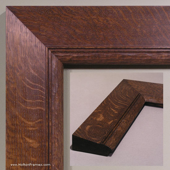
One age-old kind of handwork is chamfering, and its application to frames is one of the greatest joys in my work.

This is a quartersawn white oak mirror I just made for a customer to give as a wedding gift. It measures 34″ x 22″, and features a carved initial “S” at the top and the year at the bottom.

Here’s the story, with pictures, of its making.

The customer really liked an earlier design shown here, so we adapted it.

The main difference is the top, where I added the carved initial medallion and adapted the chamfer at the sight edge to accommodate it.

Below are some shots of it being made.

Starting with a simple, flat mitered frame, I marked out the chamfer and carving pattern in pencil (above).

Next, the frame is clamped to the bench hanging over the edge to leave clearance for the spokeshave, shown below.

The sole of the spokeshave is convex.
 

Chamfering the sight edge.

I do as much as I can of the outside chamfer with the spokeshave, then finish the tighter radius of the ends with a skew chisel. You can also use a gouge and carve across the grain.

Above—here’s one side all chamfered.

The inside of the top is a little different. Here are shots of it being carved, mostly with a straight chisel:

Above is frame with all the chamfering done. Below, with the initial and the year carved.

Then it’s off to the finishing room for stain and varnish, before a lifetime of service in somebody’s home!

Recent Bill Cone work, and framing

Bill Cone recently brought in these two beautiful pastels for The Summer Show.

“Gateway Morning,” pastel on paper. 8″ x 8″.
“Wildflowers,” pastel on paper. 9″ x 12″.  

We’ve also just completed framing a few of Bill’s works for a customer. Here they are:

All are profiles that are simple but designed to suit Bill’s direct and no nonsense views of the natural landscape. They’re done in carved walnut, muted with a light stain, which is just right with the artist’s palette and texture.

Bill’s blog is always fascinating. Top notch!

“Kevin Courter: From Dusk to Dawn” is posted

The last of Kevin Courter‘s paintings for his upcoming show, “From Dusk to Dawn,” is in, and it’s a great example of a theme he’s been having a lot of fun with for the last few months. This is called “Evening’s Solitude,” and it’s 8 x 16. The frame, No. 1.4 CV, is one we use often, as it’s so versatile, simple and effective.

Hope you’ll put the show on your calendar. It opens Saturday, February 26, with a reception for the artist from 4 to 6 in the evening.