Framing Gustave Baumann Prints

Over the years we’ve had the pleasure to frame quite a few prints by master American printmaker Gustave Baumann (1881-1971). Here are three just finished:

Gustave Baumann, “Early Spring, Brown County”
Gustave Baumann, “Rio Pecos”
Gustave Baumann, “Coast Range”

The frames are stained walnut compounds.

The flats are thin to act more as mats, although they’re on top of the glass, and cover the wide margins of the prints. The profiles are wide (4-1/2″ + 3/16″ gilt slips) but simple using 1/8″ radius coves to create a simple rhythm of lines. Here’s a corner detail:

The customer was very kind to let me use this image below of his hallway where he displays earlier Baumanns we’ve framed for him.

(Ted Ellison photo)

More Baumanns we’ve framed can be found in the “Prints and Works on Paper” section of the Portfolio.

Framing Charles Partridge Adams—Simple Corner Carving

We recently got to frame this early twentieth century landscape by Charles Partridge Adams (1858-1942). At just 10″ x 14″, it’s humble in size as well as subject matter, and loosely painted—all aspects suggesting a fairly simple frame with a bit of carving.

The tree trunks brought to mind the profile we’d come up with a few months ago for Paul Kratter’s view of Lake Tahoe, “Twisted Pine Above Emerald Bay,” below—a flat with a double reed near the sight edge and a carved flattened ovolo (convex form) at the sight edge—but I thought I’d refine it a little, adapting it to Adams’s more “dapple-y” style.  

So I decided to enhance the lines formed by the double reeds. So added a simple pattern of carved stops to the reeds near the corners. I’m pleased with the effect. I’d like to do more with simple corner carving this year.

Framing Kevin Courter in Compound Polyptych

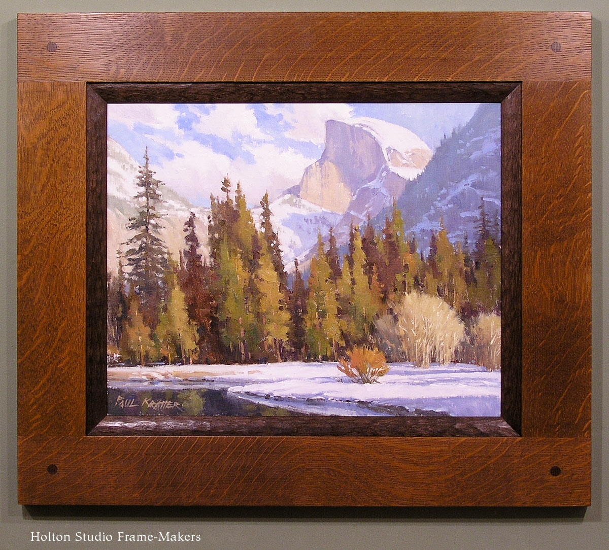
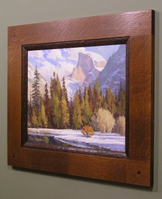
A customer recently commissioned Kevin Courter to paint three cottages on his rural northern California property, then had us frame the three 8 x 10’s. Here it is:

The idea was to create a frame alive to the soft edges as well as architectural subject matter. Given the vernacular cottages, we had to keep it simple but still worthy of the great admiration, felt by both painter and patron, of these charming structures in their locale, and all the wealth of memories and meaning they hold for the family that’s enjoyed them. The over all flat form of the profile was felt suitable to the relatively shallow depth of field and basically flat landscape populated by vertical trees, as well as the strong horizontal composition of the whole piece. It’s a very simple flat with a cap molding, all the profiling done with a 1/8″ radius.

The flat inner, or sight, edge of the frame made sense in terms of the frame construction, lending itself well to the dividers.

Polyptychs are interesting in part because of the trick of creating unity out of distinct parts. Japanese printmakers have done a lot with this idea. As you can see in this example from my portfolio, while the three panels create a whole scene, compositionally each panel also stands on its own.

We chose quartersawn white oak for its wild, rustic quality and stained it Medieval Oak which matches the burnt umber used in the shadows. While the frame thus has an overall shadow quality to spotlight the painting, the wonderful play of sunlight in Kevin’s pictures prompted our choice of a gilt oak slip to surround each panel. So the frame carries out the interplay of light and shadow that makes these images so appealing, but is on balance a shadow presence around the picture.

The metal plate at the bottom of the frame is engraved with the title of the piece, “My Three Sons,” and Kevin’s name.

“Kevin Courter: From Dusk to Dawn” is posted

The last of Kevin Courter‘s paintings for his upcoming show, “From Dusk to Dawn,” is in, and it’s a great example of a theme he’s been having a lot of fun with for the last few months. This is called “Evening’s Solitude,” and it’s 8 x 16. The frame, No. 1.4 CV, is one we use often, as it’s so versatile, simple and effective.

Hope you’ll put the show on your calendar. It opens Saturday, February 26, with a reception for the artist from 4 to 6 in the evening.

Carved Walnut

Of all the woods we use, we tend to emphasize quartersawn white oak. But walnut has always been a big favorite too, especially for carving. In preparing for the Paul Kratter show in June, the painting we decided to use for the publicity suggested walnut. Here’s a corner detail of the frame, which is a compound design, meaning it’s composed of more than one molding. This one has a cap molding as well as a liner. The liner has pale gold leaf laid directly on the walnut so the grain comes through.

The color of walnut harmonizes well with many pieces because it’s rich without being too intense. We typically stain it – this one has a light stain – to mute it even further.

We use walnut frequently for drawing frames (i.e., narrow profiles), but it’s often great on paintings and other items.


Mural Feeling

We recently framed this Paul Kratter painting for a couple in Washington State, and I wanted to share one aspect in particular that we’re emphasizing more and more. It’s what Walter Crane, the first president of the Arts and Crafts Exhibition Society, called “mural feeling”—the effect of an easel painting framed and hung to feel like a part of the wall. Paul Kratter painting

As Crane wrote, “The easel picture, properly considered and placed in its right relationship to its surroundings, by judicious treatment and hanging, and above all by a certain mural feeling, may be the acme of decoration. Its relation to a scheme of decoration may be like that of a jewel in a dress.” Two keys to achieving this effect are demonstrated by this piece: first, and more obviously, the very architectural feeling of the mortise-and-tenon frame; and second, the hanging system which allows the frame to hang right up against the wall with no gap, and especially importantly, without leaning forward and down the way pictures usually do when hung with a wire. The way we do this is to cut recesses on the back (the “reverse,” in framer’s parlance) of the frame and attach D-rings in the recesses. There’s no wire; the picture hooks are carefully located on the wall so the D-rings hang directly off the hooks. With the D-rings and the picture hooks both in the recesses there’s nothing to push the picture and frame away from the wall.

What’s so important about this is the effect of unity and the aim of restoring the primal unity of all the arts, but in particular the most divided arts historically speaking, which are painting and architecture.

One other thing about this frame that I particularly like is the flush through tenons, shown here: