I’m at the shop today in Emeryville, but the three of us at Holton Studio are also hanging in the American Museum of Natural History and taking part in the reopening of the North American Mammal Hall for which we produced dozens of hand carved oak frames as well as other fixtures. Read all about it in the New York Times, listen on NPR., and watch on MSNBC (where, at 1:26, you can see one of our frames directly behind the reporter). What a privilege to take part in such a monument of our nation’s public cultural heritage!
Archives
Framing Gustave Baumann Prints
Over the years we’ve had the pleasure to frame quite a few prints by master American printmaker Gustave Baumann (1881-1971). Here are three just finished:
 |
| Gustave Baumann, “Early Spring, Brown County” |
 |
| Gustave Baumann, “Rio Pecos” |
 |
| Gustave Baumann, “Coast Range” |
The frames are stained walnut compounds.
The flats are thin to act more as mats, although they’re on top of the glass, and cover the wide margins of the prints. The profiles are wide (4-1/2″ + 3/16″ gilt slips) but simple using 1/8″ radius coves to create a simple rhythm of lines. Here’s a corner detail:

The customer was very kind to let me use this image below of his hallway where he displays earlier Baumanns we’ve framed for him.
 |
| (Ted Ellison photo) |
More Baumanns we’ve framed can be found in the “Prints and Works on Paper” section of the Portfolio.
Framing a Benjamin Williams Leader Landscape
Just finished framing this spectacular 1875 Alpine landscape oil painting by British artist Benjamin Williams Leader (1831 – 1923), titled “The Wetterhorn from Rosenlaui.” At 72″ x 60″ it has a powerful presence (see last photo for scale). Commissioned by a Member of Parliament, John Derby Allcroft, the year it was painted it was displayed at the Royal Academy, where Leader’s work was shown in every summer exhibition from 1854 through 1922.

We made a 6″ wide stained quartersawn white oak compound frame with a chamfered mortise-and-tenon flat and gilt oak liner. The chamfer has carved points that articulate the corners with a detail that also picks up a form pervasive in the painting.
 |
| Corner detail |
Below is the painting in its old Victorian makeshift frame—a conventional 19th century exhibition frame heavy on compo (molded plaster-like material meant to pass itself off as carving).

Clearly influenced by John Ruskin’s pleas to painters to go to nature, to see her both truly and reverently—and sharing with Ruskin a passion for the Swiss Alps—Leader contributed in his way to the great project of re-framing art, led by Ruskin and the Pre-Raphaelites. I wonder if, while breaking with convention on the canvas itself, he followed the Pre-Raphaelites, Whistler and others to make his ideals real in the form of the picture frame itself. If so, I hope our efforts would have met with his approval.
This is the third Leader we’ve had the privilege of framing. Another is on my site, here.
View this Leader in the Portfolio…
 |
| The painting with Eric Johnson next to it to give a sense of scale (Eric’s over 6′ tall). |
Framing Dwight Clay Holmes
We just framed this 20″ x 16″ canvas by Texan Dwight Clay Holmes (1900-1986) titled “Red Bud”.
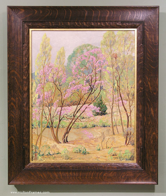
I was especially pleased with the form of the frame profile as an enhancement to both the graceful use of line in the painting (hence the reeding) and the loose brush work (hence the coarse, wild figured quartersawn white oak as well as the carved convex sight edge element). This frame is similar to one on the Charles Partridge Adams, below, which I wrote about here.
I realize these are pretty similar to the frame on the Louis Apol a couple of entries back. But it’s useful to compare three ostensibly similar frames with nevertheless significant differences when considered with respect to the pictures they’re on.
To make just one point about the frame on the Apol, it’s a slope; you can see the reason behind that choice. Focusing on these two paintings of trees, on the face of it, they’re very similar. Yet the forms of the trees in the Holmes are much finer and more linear and graceful. The most significant difference between these two frames, which are basically flat, is that while the Adams’s frame is perfectly flat outside the reeding and is squared off at the outside, the frame on the Holmes has a subtle cove up toward the outside of the profile terminating in a rounded outside edge. This curl up is basically as subtle as possible while still reading to the viewer. Also, although you can’t see it in the photo, the back is cut in giving this frame a much lighter feel than the blockier one on the Adams. This is a good example of how important it is for the frame design to be alive to the particular characteristics of a painting.
I love how subtle profile forms like this interact with the ray flake in the quartersawn oak. In this case, the rays curve laterally with the subtle cove of the profile (especially on the top), and so echo the curving lines of the trees. Note too the variation on the corner carving, which I focused on in the first entry. Not to put too fine a point on it, but the double reeds on the Adams frame echo the parallel tree trunks throughout the painting, whereas the red bud trunks stray off on their own and so are framed with a single bead, the second bead added to articulate the corners.
Finally, note that these are two bright sunny paintings very suitably served by dark wood frames. A narrow gold liner on the Holmes seems to reflect the sunlight in the painting, which seems very natural (like a window frame viewed from inside a house would reflect the sunny landscape outside). But the entire frame in gold would fail to complement the use of light with its complementary shadow tones.
Most importantly, I think both settings succeed at the great and primary purpose of the picture frame which is to sustain the spirit of the picture into the architectural real.
Framing a Grueby Tile
We just shipped out this beautiful 6″ Grueby tulip tile to a customer in Ohio. The soft and subtle form of the leaves suggested a very feminine frame and inspired this adaptation of our Holland profile.
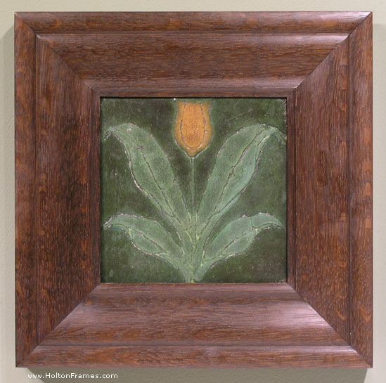
For more on framing Arts and Crafts tiles, see this older entry.
Framing a small Edward Curtis—Another Carved Corner Design
Recently framed this small original Edward Curtis photogravure of Apache Indians for a couple in Texas. The print had wide margins, but we wanted the effect of framing it close so used a lap-joined flat — kind of a wooden mat, although on top of the glass. We’ve taken this approach a number of times before.

Also wanted to show the carved corner design. Both the corner design and the chamfer on the flat, which has 45 degree angled stops, echo the headdresses in the photo.

For more on framing photographs close, i.e., without a visible mat, read my article “Close Framed Photographs,” for Picture Framing Magazine.
Framing Contemporary Paintings—Andrij Korchynsky
This recent job, a 23″ x 32″ contemporary oil painting on canvas by Ukrainian-American artist Andrij Korchynsky, offers a simple lesson in two key elements in frame design: line and form. Despite the loose style, the sweeping lines and angularity of the roofs suggested the form of the profile—a broad, 4″ flat sweeping up to a scoop and then beveling back. (The profile is No. 321.) With respect to line, a narrow raised panel at the sight edge, at the same width as the lines defining the structures, adopts the painter’s standard. A 1/4″ liner oil-gilded with 23 kt gold leaf gives it just the right highlight in keeping with the painting’s palette.
The wood is quartersawn white oak with Saturated Medieval Oak stain.
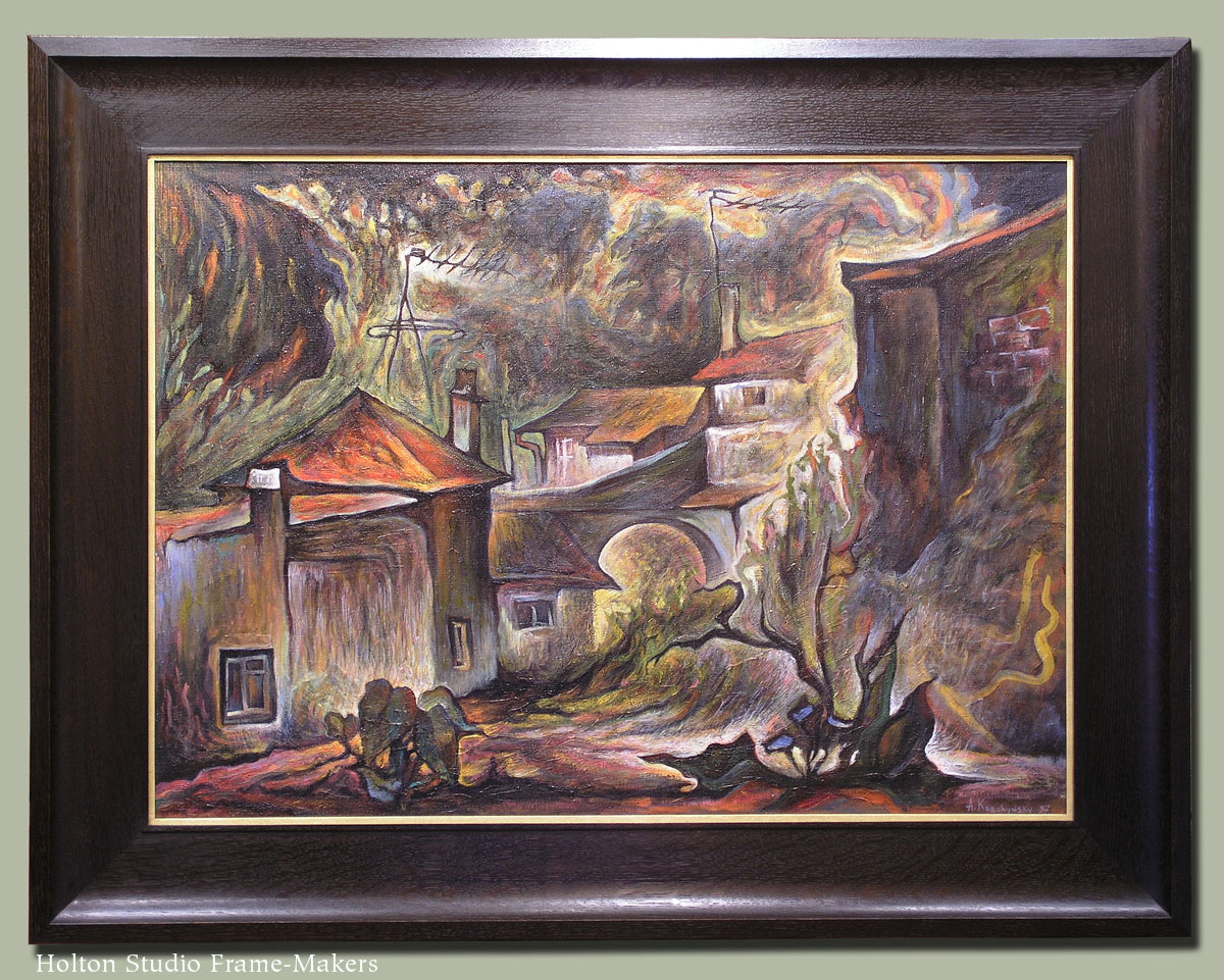
Andrij Korchynsky, “Old Yard,” n.d. (1990’s?). Oil on canvas, 23″ x 32″.
Framing Ed Bearden—and Playing with Chamfers
I really enjoy chamfering and playing with chamfers as a design element.

Here’s an acrylic on paper, recently framed, by mid-century Texan Edward Carpenter Bearden (1919-1980). We had fun coming up with this adaptation of our Aurora frame with flat mortise-and-tenon corners. We often use it with a chamfer all around the sight edge. In this case we played off the mountain peaks in the picture by adding the sets of points near the corners. On the same theme, Trevor shaped the corner plugs with a peak rather than our usual pillow form.

The frame profile is 1-1/2″ wide, and the wood is black walnut greyed down with a black wash.
Might have framed this piece close, but the customer preferred to mat it, in part to scale up a fairly small painting (about 11″ x 17″) to make it a stronger element on the wall—a perfectly good reason. The grey mat avoids the separating effect of white matting.
Another entry on chamfering is here.
Re-framing Thaddeus Welch
Thaddeus Welch (1844-1919) was one of the great historic California landscape painters. This classic bucolic hillside scene by Welch came in recently, the customer looking to free it from a typical period compo frame which he rightly judged to be pretentious and unsuitable to the rustic spirit of the painting.
 |
| Before |
Here it is in its new quartersawn white oak frame in a dark stain matching the shadows and sympathetic with the forms of the hills, with simple fine beading to pick up the delicate line work in the painting (especially the trees)—and much more suitable to the spirit of nature that so moved Welch.
 |
| After |