Framing Historic California Watercolors

We’ve recently had the pleasure of framing several watercolors by notable California artists working in the early twentieth century.

Maynard Dixon (1875-1946):

Chris Jorgensen (1838-1876):

William S. Rice (1873-1963):

Marjorie Stevens (1902-1992; available through North Point Gallery):

Lorenzo Latimer (1857-1941; these available through North Point Gallery):

Davis Schwartz (1879-1969):

Re-framing a New—and Much Larger—Rosa Bonheur

Last year we re-framed a couple of paintings of stags, both by premiere nineteenth century French wildlife painter Rosa Bonheur, which I blogged about here. We just did another one, and at 48″ x 36″ it’s considerably bigger than the first two. First, here it is in the compo exhibition frame that we were to replace:

And here it is now:

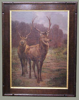
Given the log house setting it’s going in, our solution leans more to the rustic than it might have considering the highly formal (I generally use the term in reference to form, not sophistication and refinement) treatment of the subject matter. But having the frame come out of the same appreciation of the beauty of nature and handcraft that the painting does—especially in contrast to the original frame—more than makes up for whatever formal refinement we left out of the profile. (For a more formal profile on a similar painting, see the earlier entry on re-framing Bonheur stags, here.) I stand by it as a far more sympathetic setting than was the old frame, and far more successful at the primary job of a frame, which is to help us see the picture. Any rejection of pretentiousness and false luxury in art is a step in the right direction! Taking a picture from an exhibitionist presentation to one in harmony and sympathy with the picture is fulfilling one of my favorite William Morris phrases: “for beauty’s sake and not for show.”

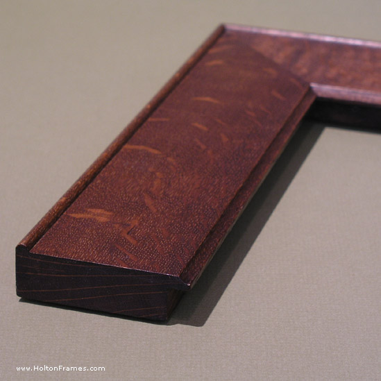
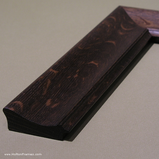
This is a compound frame with a mortise-and-tenon flat, a carved cap-molding and carved and gilt liner. After that wonderful reward of the framer—the moment when you finish fitting the picture and turn over the completed piece to see it—Trevor and I were struck by how the highlights were enhanced. Is it the gilt liner, the darker frame, or the combination? Beyond that, I can’t add anything that I didn’t say in the previous Bonheur re-framing example.

Here’s a corner detail:

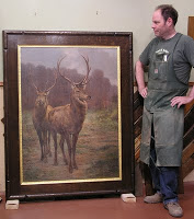
Trevor Davis gets credit for making it. Here’s the proud craftsman—giving you a sense of the scale of the piece, too.

Framing J Bond Francisco

Recently framed this John Bond Francisco , designing the setting to echo playfully with the massive green frame at the center of the painting. This little oil, 12″ x 8″, depicts the artist’s San Francisco studio around the turn of the century. The frame profile’s a No. 16—a plain flat mitered frame with a chamfered (45 degree bevel) sight edge. Chose a flat profile to go with the relatively shallow depth of field and flat object—the painting—that’s the focus of the piece. But the angles and design of the stove suggested the chamfer. A bit wider than I normally would’ve used on a piece this size, but in keeping with the proportions of the depicted frame on its painting. Going as green as the frame in the painting would have sacrificed the harmony of painting and frame, but rubbed green paint in to the grain of the oak to resonate with the frame in the picture.The liner is oak with gold leaf. All is simple as the room depicted—simple, but fun!

True Grit: See us on the big screen!

Early last year I got to brag here that we’d gotten a call from the set designers for the Coen Brothers remake of the classic western, True Grit. Well, as you’re probably aware, the film is out and doing gangbusters at the box office. If you look closely, you’ll see our frames (the oak ones—NOT the gold ones, of course) in the courthouse scenes near the beginning, in which Rooster Cogburn and Mattie Ross first meet up.

For the six frames they ordered they used two of our Century Series frames, the Maybeck and the Curtis in quartersawn white oak, both at a 3″ width (below). As the designers recognized, these are classic designs (although not reproductions, but our own takes on the genre). They knew that in the day photographs, such as the Matthew Brady Civil War vintage images they were using, would often be framed close (without mats) in frames of this type. If you see the film—and you definitely should; it’s terrific—it has a feeling of authenticity that feels absolutely dead-on. I feel pretty privileged to have been chosen to make a small contribution to a most impressive project.
(Pictured above, left to right, that’s Tim as William Wheeler, Trevor as Albert Pike, and Eric as Edmund Kirby-Smith.)