Framing Contemporary Photographs–Geoffrey Agrons, 2

A couple of years ago I posted an entry about framing Geoffrey Agrons’s wonderful photographs. Here are a couple more we just did.

This first one, “Big, Big Love” is in an exhibit opening this month at the Center for Fine Art Photography in Fort Collins, CO. It’s framed in a No. 123.8 Century Series flat, 3″ wide, in stained walnut.

The second example, a still life, is framed in our most basic mortise-and-tenon frame, the Aurora, with a liner that’s an ogee with a bead at the sight edge. The outer frame is a nod to the art of the cabinetmaker, while the refined liner picks up the forms and fine lines of the photo.

See more of Geoffrey’s work on his site, here.

For more on framing photographs close, i.e., without a visible mat, read my article “Close Framed Photographs,” for Picture Framing Magazine.

Framing a small Edward Curtis—Another Carved Corner Design

Recently framed this small original Edward Curtis photogravure of Apache Indians for a couple in Texas. The print had wide margins, but we wanted the effect of framing it close so used a lap-joined flat — kind of a wooden mat, although on top of the glass. We’ve taken this approach a number of times before.

Also wanted to show the carved corner design. Both the corner design and the chamfer on the flat, which has 45 degree angled stops, echo the headdresses in the photo.

For more on framing photographs close, i.e., without a visible mat, read my article “Close Framed Photographs,” for Picture Framing Magazine.

True Grit: See us on the big screen!

Early last year I got to brag here that we’d gotten a call from the set designers for the Coen Brothers remake of the classic western, True Grit. Well, as you’re probably aware, the film is out and doing gangbusters at the box office. If you look closely, you’ll see our frames (the oak ones—NOT the gold ones, of course) in the courthouse scenes near the beginning, in which Rooster Cogburn and Mattie Ross first meet up.

For the six frames they ordered they used two of our Century Series frames, the Maybeck and the Curtis in quartersawn white oak, both at a 3″ width (below). As the designers recognized, these are classic designs (although not reproductions, but our own takes on the genre). They knew that in the day photographs, such as the Matthew Brady Civil War vintage images they were using, would often be framed close (without mats) in frames of this type. If you see the film—and you definitely should; it’s terrific—it has a feeling of authenticity that feels absolutely dead-on. I feel pretty privileged to have been chosen to make a small contribution to a most impressive project.
(Pictured above, left to right, that’s Tim as William Wheeler, Trevor as Albert Pike, and Eric as Edmund Kirby-Smith.)

Framing Photographs—I: Contemporary Landscapes by Geoffrey Agrons

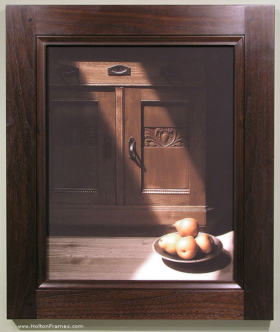
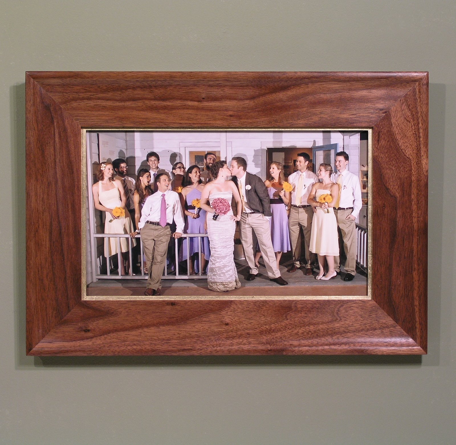
Geoffrey Agrons is a good customer and a superb photographer. We just framed this set of his photos printed on handmade Japanese paper, and they present a good opportunity to demonstrate two important lessons of framing design: framing contemporary photographs close, and individualized frame design. Geoffrey sent seven photos, most of which are of the Cape May area during last winter’s huge snow storm. (The large one here is of a woods in Ireland.)

For a slide show, with larger images, click here.

We decided to frame them all in walnut, a wood we frequently choose for photographs, first, because of the suitably native cool color—we used a black wash to better match the sepia ink color on most of them—and second, because of its tight grain and smooth texture, which is consistent with the smooth surface of photographs.

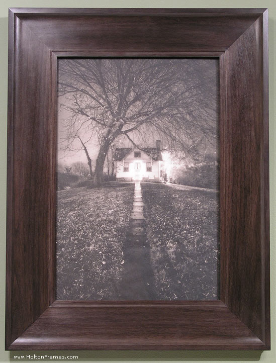
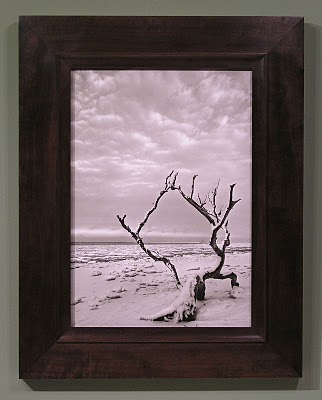
For the first image, above, I chose a slope for the overall profile since it was appropriate to the deep perspective as well as the slope of the ground and the angles formed by the roots. A cove terminating at the top with a fine bead made an ideal form to suit the trees and roots half-embedded in the earth.

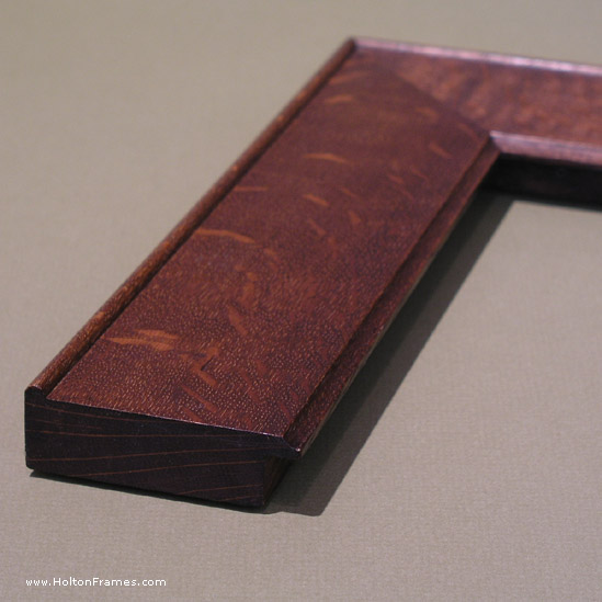
What fascinated me in this image was the staccato rhythm of the line of fencing in contrasting with the soft forms of snow. So that’s what I echoed in the frame, using fine 1/6″ “quirks,” or steps, and a soft cove at the sight edge. Here’s a detail of the frame profile.

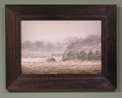
A flat profile was chosen for this picture because of the flat horizon. It’s true that there is a deep perspective in this image, but the horizontal quality seems to be stronger. (If more of the stream could be seen meandering away toward the horizon, that might have swayed me to go with a slope.) A fine line, its 1/8″ width in proportion to the sharp lines in the photos, was raised near the sight edge, and a gentle ovolo (convex form) at the sight edge to echo the banks of the stream and the snow.

This frame is a similar flat profile with a raised line, but with a cove at the sight edge. I love the way the grain of the walnut echoes the clouds.

This frame is a good example of the importance of line proportion because it’s essentially a frame that’s been an old standby for us, the Eastwood—a flat profile with a narrow step at the sight edge and a broader step at the back edge. But the line proportions formed by these steps had to be just right for this picture, since it’s so simple, and those line proportions that have become standard for the Eastwood were too wide for this image, so we adapted them to suit this specific photo.

For this color photo, a slope was chosen to echo the angle of the snow. I used a carved panel just outside the sight edge to echo the sense of coarse texture.

Finally, for this extremely subtle image I used a profile with a suitably very subtle curve down at the sight edge. The frame’s basically flat, but coves up toward the back edge with a quirk and a bead at the back edge, providing definition while also echoing the cylindrical form of the posts.

For more on framing photographs close, i.e., without a visible mat, read my article “Close Framed Photographs,” for Picture Framing Magazine.

Geoffrey will be showing these pieces and more this September at he New Jersey Audubon Nature Center in Goshen, NJ.

Again, click here to view these in a slide show (with larger views).

Wedding Gifts


With wedding season approaching I thought I’d put out a couple of examples of pieces we’ve recently done as wedding gifts. This picture’s framed close in a simple walnut “Hudson” frame with a gilt slip. Walnut, which is a tight-grained wood, has a smooth finish which suits the finish of the photo. The form gives a picture some space but has a graceful shape that suits the figurative subject matter. I think we struck the right balance between the formality of the image and occasion and the informality of the rustic porch (it’s actually a kind of stage set at the Museum of the New South in Charlotte, NC).

The second example is a mirror made for a customer who found an image in tile that she liked as an appropriate image for newlyweds, and wanted it integrated into a mirror to give as a wedding gift. (Mirrors make great wedding gifts, because when you get married you have to watch yourself.) I also carved the year of the wedding, 2009, into the bottom. The tiles are by Motawi Tileworks (the two on either side of the landscape tile are actually glaze samples). Made in quartersawn white oak (Weathered Oak stain) it measures about 38″ x 18-1/2″.