Paul Kratter Wins Plein Air Awards

Paul Kratter is sporting two more feathers in his cap. At last month’s Carmel Art Festival, his painting “Rush Hour” (oil on canvas, 8″ x 16″) was awarded Second Place—a feat topped this month with first prize honors for his “Glory Days” (oil on canvas, 10″ x 20″) at the Laguna Plein Air Painters Association Best of Plein Air Show! No doubt about it, Paul’s clearly established himself as one of California’s top landscape painters.

Congratulations, Paul!

Rush Hour
Glory Days

Re-framing William Hubacek

Just framed this 10″ x 14″ oil on canvas by notable Californian William Hubacek (1871-1958), rescuing it from a cheap gold setting. The job offers a good before-and-after, and a good example, I think, of how a frame helps or hinders your ability to see the picture:

The frame’s flat coving up to a carved cushion back edge. In quartersawn white oak with Weathered Oak stain. Very oak-y. Much more sympathetic to the spirit of a very lovely painting.

Framing Kevin Courter in Compound Polyptych

A customer recently commissioned Kevin Courter to paint three cottages on his rural northern California property, then had us frame the three 8 x 10’s. Here it is:

The idea was to create a frame alive to the soft edges as well as architectural subject matter. Given the vernacular cottages, we had to keep it simple but still worthy of the great admiration, felt by both painter and patron, of these charming structures in their locale, and all the wealth of memories and meaning they hold for the family that’s enjoyed them. The over all flat form of the profile was felt suitable to the relatively shallow depth of field and basically flat landscape populated by vertical trees, as well as the strong horizontal composition of the whole piece. It’s a very simple flat with a cap molding, all the profiling done with a 1/8″ radius.

The flat inner, or sight, edge of the frame made sense in terms of the frame construction, lending itself well to the dividers.

Polyptychs are interesting in part because of the trick of creating unity out of distinct parts. Japanese printmakers have done a lot with this idea. As you can see in this example from my portfolio, while the three panels create a whole scene, compositionally each panel also stands on its own.

We chose quartersawn white oak for its wild, rustic quality and stained it Medieval Oak which matches the burnt umber used in the shadows. While the frame thus has an overall shadow quality to spotlight the painting, the wonderful play of sunlight in Kevin’s pictures prompted our choice of a gilt oak slip to surround each panel. So the frame carries out the interplay of light and shadow that makes these images so appealing, but is on balance a shadow presence around the picture.

The metal plate at the bottom of the frame is engraved with the title of the piece, “My Three Sons,” and Kevin’s name.

Re-framing Thaddeus Welch

Thaddeus Welch (1844-1919) was one of the great historic California landscape painters. This classic bucolic hillside scene by Welch came in recently, the customer looking to free it from a typical period compo frame which he rightly judged to be pretentious and unsuitable to the rustic spirit of the painting.

Before

Here it is in its new quartersawn white oak frame in a dark stain matching the shadows and sympathetic with the forms of the hills, with simple fine beading to pick up the delicate line work in the painting (especially the trees)—and much more suitable to the spirit of nature that so moved Welch.

After

Re-framing a Sydney Yard Watercolor

A follow-up to the last entry, here’s a wonderful example of a watercolor by one of California’s premiere early watercolorists, Sydney Janis Yard (1855-1909). This is a frame we’ve used before, for other, similar California watercolors — by Percy Grey — but this job offers the re-framing aspect to the story.
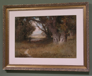
Before

The “before” shot demonstrates the typical conventional contemporary framing approach for this type of piece. The silk mat and curly-cue gold frame seem intended for nothing but projecting an air of sophistication around the painting. The glaring white mat contrasts so much with the deep shadowy tones of the painting that it actually interferes with the eye’s ability to adjust to the light the artist captures so effectively. In so doing, it spoils the painting. The incongruous framing not only fails to serve the painting itself, but creates a harsh divide between the painting and its surroundings. The gold frame may not look too bad in the photo above, but is a production compo molding nailed together. One corner was already broken. The frame didn’t hold up to scrutiny — or to life (see detail below)!
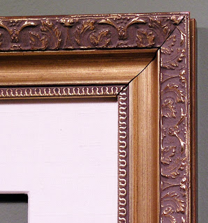
Corner of old frame

What the painting needed instead was a dark frame, quiet and soft in profile, with just a halo of gold to highlight it on the wall while continuing and sustaining the spirit of the picture into the architectural realm.
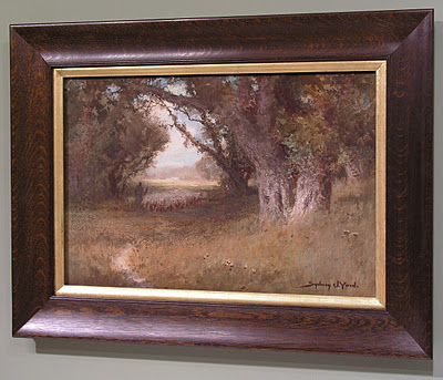
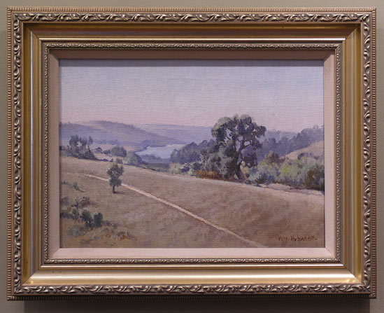
After

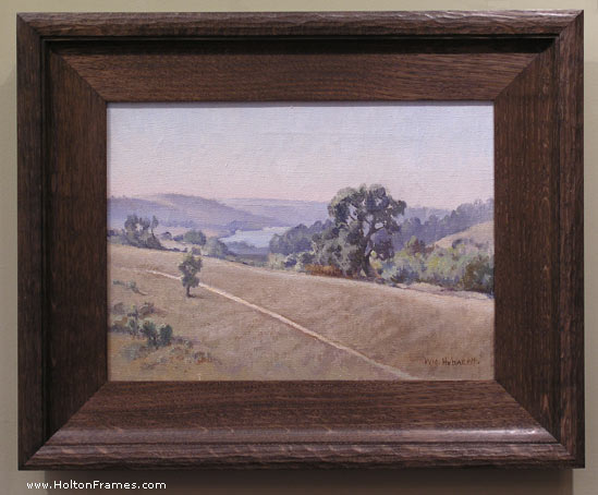
Titled “Under the Oaks,” the painting’s rustic spirit — completely ignored by the previous framing —  and of course the oak trees Yard painted called unquestionably for an oak frame. (The protective aspect of the oak frame is another level of meaning for a depiction of oak trees sheltering a shepherd.) This is a simple 2-3/4″ wide scoop in our Century Series (No. 308.2) around a 3/4″ ogee liner oil gilded with 23 kt leaf. We stained the scoop a burnt umber (our Medieval Oak stain) matching the shadows — the frame being a shadow effect around the painting, to draw your eye to the lighter painting. Two fine reeds at the sight edge of the dark molding echo some of the fine details in the painting. A closer view of the frame:

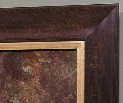
No. 308.2 (“Michigan”) — 2-3/4″ with 3/4″ gilt oak ogee liner

Taking the time to craft the frame well with splined closed corners (finished after joining) and attention to finishing off every detail actually has an aesthetic effect, a sense of caring made tangible, not conveyed by digital photos.

The piece is framed archivally by using a hidden, or “gasket,” mat under the liner. It’s purpose is to separate the picture from the glazing (in this case u.v.-filtering acrylic). The rabbet is lined with a metal tape to isolate the acids in the wood from the watercolor paper.

Thank you to Montgomery Gallery, where this beautiful painting is available.

Framing Historic California Watercolors

We’ve recently had the pleasure of framing several watercolors by notable California artists working in the early twentieth century.

Maynard Dixon (1875-1946):

Chris Jorgensen (1838-1876):

William S. Rice (1873-1963):

Marjorie Stevens (1902-1992; available through North Point Gallery):

Lorenzo Latimer (1857-1941; these available through North Point Gallery):

Davis Schwartz (1879-1969):

James McGrew

We’re excited to be welcoming James McGrew to the Gallery.

A passionate explorer and painter of Yosemite National Park, James has spent a lifetime (well, his life so far) capturing the Park’s magnificent natural beauty. We’re featuring his plein air work, all fairly small (i.e., nicely affordable). While we’re still framing his paintings, you can see what we have pre-framed on his page on our site, here. (His own website is here.)

We’re also framing a beautiful piece, below, for James to enter in the American Impressionist Society‘s Annual Show in October in Carmel.

Great to have you aboard, James!

Re-framing Hanson Puthuff

The landscape paintings of Hanson Puthoff (1875-1972) made a major contribution to California’s rich heritage of landscape painting. Unfortunately, his pieces did not always find their way into frames that do them justice. Here’s one example we had the honor of re-framing this week, taking it out of a machine-made, gold painted compo setting and putting it in a handcrafted, carved quartersawn oak frame. Here it is before and after:

 A well-made, simple home. A 3″ bevel profile (canvas is 11-1/2″ x 15″) with a 45 degree carved chamfer sight edge. Close-ups:

Here’s a profile view of the frame: