Framing a Benjamin Williams Leader Landscape

Just finished framing this spectacular 1875 Alpine landscape oil painting by British artist Benjamin Williams Leader (1831 – 1923), titled “The Wetterhorn from Rosenlaui.” At 72″ x 60″ it has a powerful presence (see last photo for scale). Commissioned by a Member of Parliament, John Derby Allcroft, the year it was painted it was displayed at the Royal Academy, where Leader’s work was shown in every summer exhibition from 1854 through 1922.

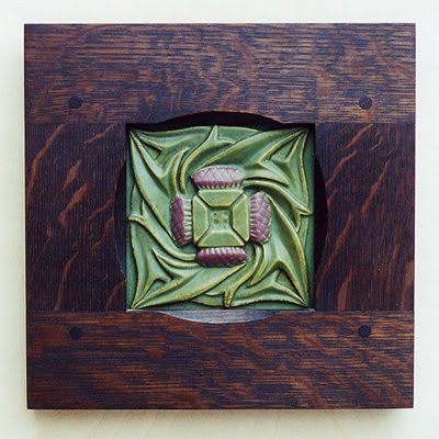
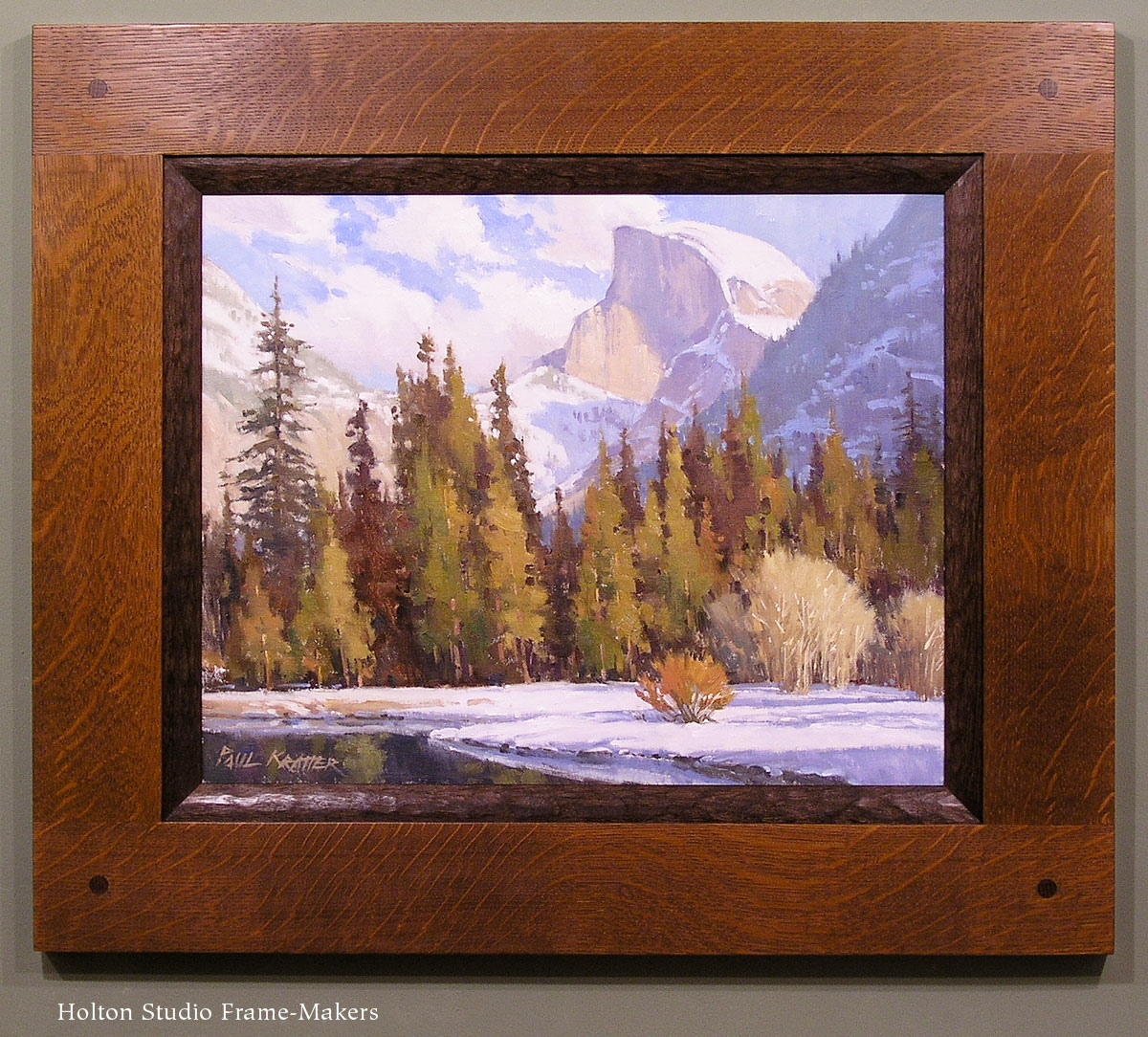
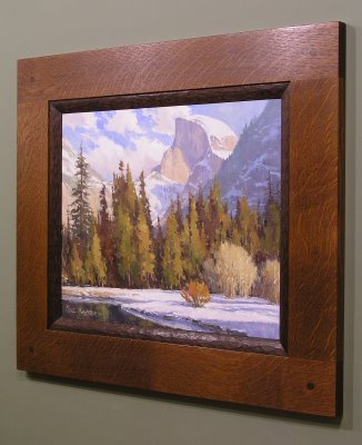
We made a 6″ wide stained quartersawn white oak compound frame with a chamfered mortise-and-tenon flat and gilt oak liner. The chamfer has carved points that articulate the corners with a detail that also picks up a form pervasive in the painting.

Corner detail

Below is the painting in its old Victorian makeshift frame—a conventional 19th century exhibition frame heavy on compo (molded plaster-like material meant to pass itself off as carving).

Clearly influenced by John Ruskin’s pleas to painters to go to nature, to see her both truly and reverently—and sharing with Ruskin a passion for the Swiss Alps—Leader contributed in his way to the great project of re-framing art, led by Ruskin and the Pre-Raphaelites. I wonder if, while breaking with convention on the canvas itself, he followed the Pre-Raphaelites, Whistler and others to make his ideals real in the form of the picture frame itself. If so, I hope our efforts would have met with his approval.

This is the third Leader we’ve had the privilege of framing. Another is on my site, here.

View this Leader in the Portfolio…

The painting with Eric Johnson next to it to give a sense of scale (Eric’s over 6′ tall).

Framing Ed Bearden—and Playing with Chamfers

I really enjoy chamfering and playing with chamfers as a design element.

Here’s an acrylic on paper, recently framed, by mid-century Texan Edward Carpenter Bearden (1919-1980). We had fun coming up with this adaptation of our Aurora frame with flat mortise-and-tenon corners. We often use it with a chamfer all around the sight edge. In this case we played off the mountain peaks in the picture by adding the sets of points near the corners. On the same theme, Trevor shaped the corner plugs with a peak rather than our usual pillow form.

The frame profile is 1-1/2″ wide, and the wood is black walnut greyed down with a black wash.

Might have framed this piece close, but the customer preferred to mat it, in part to scale up a fairly small painting (about 11″ x 17″) to make it a stronger element on the wall—a perfectly good reason. The grey mat avoids the separating effect of white matting.

Another entry on chamfering is here.

Framing a Pamela Glasscock Watercolor

We just framed a set of three floral watercolors by northern California artist Pamela Glasscock. To marry the delicate images with a Craftsman interior, we couldn’t do better than our old standby, the Yoshida frame. Made in machiche, a tropical hardwood (sustainably harvested) from Belize, which we chose for its natural color which harmonizes perfectly with the paintings. The frame’s joined with tiny through mortise-and-tenon joints with raised square plugs at the corners.

One reason I wanted to show this here is because it contrasts with the heavier frames we use on the oil paintings I tend to blog about. Also, we haven’t framed close here, so it’s a chance to show we don’t always frame close. Instead, the paper, which has nice deckled edges, is floated. Floating can come off as pretentious—a way of separating the picture from the frame and surroundings. In other words, it often has a stand-offish effect. In this case, though, it simply treats the paper as a three-dimensional object. A watercolor of this delicacy is never going to be integrated architecturally—achieving what’s sometimes called “mural feeling.” So in this case, the separation effect of floating makes sense.

Pamela Glasscock is represented by Calabi Gallery, in Petaluma, CA and I. Wolk Galleries. A wonderful watercolorist!

Re-framing a New—and Much Larger—Rosa Bonheur

Last year we re-framed a couple of paintings of stags, both by premiere nineteenth century French wildlife painter Rosa Bonheur, which I blogged about here. We just did another one, and at 48″ x 36″ it’s considerably bigger than the first two. First, here it is in the compo exhibition frame that we were to replace:

And here it is now:

Given the log house setting it’s going in, our solution leans more to the rustic than it might have considering the highly formal (I generally use the term in reference to form, not sophistication and refinement) treatment of the subject matter. But having the frame come out of the same appreciation of the beauty of nature and handcraft that the painting does—especially in contrast to the original frame—more than makes up for whatever formal refinement we left out of the profile. (For a more formal profile on a similar painting, see the earlier entry on re-framing Bonheur stags, here.) I stand by it as a far more sympathetic setting than was the old frame, and far more successful at the primary job of a frame, which is to help us see the picture. Any rejection of pretentiousness and false luxury in art is a step in the right direction! Taking a picture from an exhibitionist presentation to one in harmony and sympathy with the picture is fulfilling one of my favorite William Morris phrases: “for beauty’s sake and not for show.”

This is a compound frame with a mortise-and-tenon flat, a carved cap-molding and carved and gilt liner. After that wonderful reward of the framer—the moment when you finish fitting the picture and turn over the completed piece to see it—Trevor and I were struck by how the highlights were enhanced. Is it the gilt liner, the darker frame, or the combination? Beyond that, I can’t add anything that I didn’t say in the previous Bonheur re-framing example.

Here’s a corner detail:

Trevor Davis gets credit for making it. Here’s the proud craftsman—giving you a sense of the scale of the piece, too.

Framing Arts and Crafts Tiles

Suitable frames for tiles are hard to come by—especially as the old tiles in particular become more highly treasured: folks want to do them proud, but production frames on small works of real handcraft only accentuate their makeshift nature. Yes, tile frames are easy to overdo, and there’s absolutely nothing wrong with a totally plain frame. But tiles are highly architectural, which makes them similar to paintings in being able to hold up to substantial frames. Having relief helps them in this respect as well. I want to show a few examples of what can be done with an exceptional tile that you might want to feature in your home with a frame that both protects and suitably honors it. It’s also an opportunity to demonstrate what a single key design element can do for any piece of art.

This first piece, above, is a Grueby tile—a great and iconic Arts and Crafts piece familiar to many. At just 6″ x 6″ it wanted a restrained treatment. The fine line work suggested the two fine beads for the sight edge of the frame, while the cove (between the beads) provided a gentle means of focusing the eye on and taking the viewer in to the quiet mood of the piece.

The second example is another Grueby piece—an insignia tile in a diagonal format which offered an enjoyable challenge. We focused on the format of the of the piece to suggest an interesting design. This is two mitered frames with floating panels in the triangular spaces. I had fun using the ray flake to create kind of a sunburst effect.

The third example is a round trivet tile with a scene rendered in carved lines. Trevor expertly carved a line of the same size and shape (a small flute) just outside the circular window.

The series here is contemporary, made by Carreux de Nord out of Wisconsin. The wonderful line work in these needed only a complementary rectilinear treatment of the frame. A mortise-and-tenon flat was used for its architectural character and to enhance the horizontal format of the tiles. This frame in particular could be hung to achieve great mural feeling. A mitered cap molding was chosen to contain and delineate the whole composition. What beautiful work these tile makers do!

Finally, another mortise-and-tenon frame we made years ago for a Rookwood Thistle tile. Again, the frame couldn’t be simpler, except for the chamfer that amplifies the lines of the tile.

Of course, in all these examples, beautifully flaked quartersawn oak provides a great deal of interest as well as suitable material for Arts and Crafts items and the homes they’re likely to reside in.

All these frames are flat, in keeping with the decorative flat treatment of the tiles, relying on just one element in the frame to echo a key element in the tile. But that’s enough to achieve the frame’s goal of sustaining and expanding the spirit of an artwork into the architectural realm and the life of the setting in which it will take its place.

Mural Feeling

We recently framed this Paul Kratter painting for a couple in Washington State, and I wanted to share one aspect in particular that we’re emphasizing more and more. It’s what Walter Crane, the first president of the Arts and Crafts Exhibition Society, called “mural feeling”—the effect of an easel painting framed and hung to feel like a part of the wall. Paul Kratter painting

As Crane wrote, “The easel picture, properly considered and placed in its right relationship to its surroundings, by judicious treatment and hanging, and above all by a certain mural feeling, may be the acme of decoration. Its relation to a scheme of decoration may be like that of a jewel in a dress.” Two keys to achieving this effect are demonstrated by this piece: first, and more obviously, the very architectural feeling of the mortise-and-tenon frame; and second, the hanging system which allows the frame to hang right up against the wall with no gap, and especially importantly, without leaning forward and down the way pictures usually do when hung with a wire. The way we do this is to cut recesses on the back (the “reverse,” in framer’s parlance) of the frame and attach D-rings in the recesses. There’s no wire; the picture hooks are carefully located on the wall so the D-rings hang directly off the hooks. With the D-rings and the picture hooks both in the recesses there’s nothing to push the picture and frame away from the wall.

What’s so important about this is the effect of unity and the aim of restoring the primal unity of all the arts, but in particular the most divided arts historically speaking, which are painting and architecture.

One other thing about this frame that I particularly like is the flush through tenons, shown here: