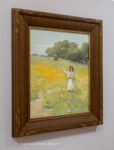
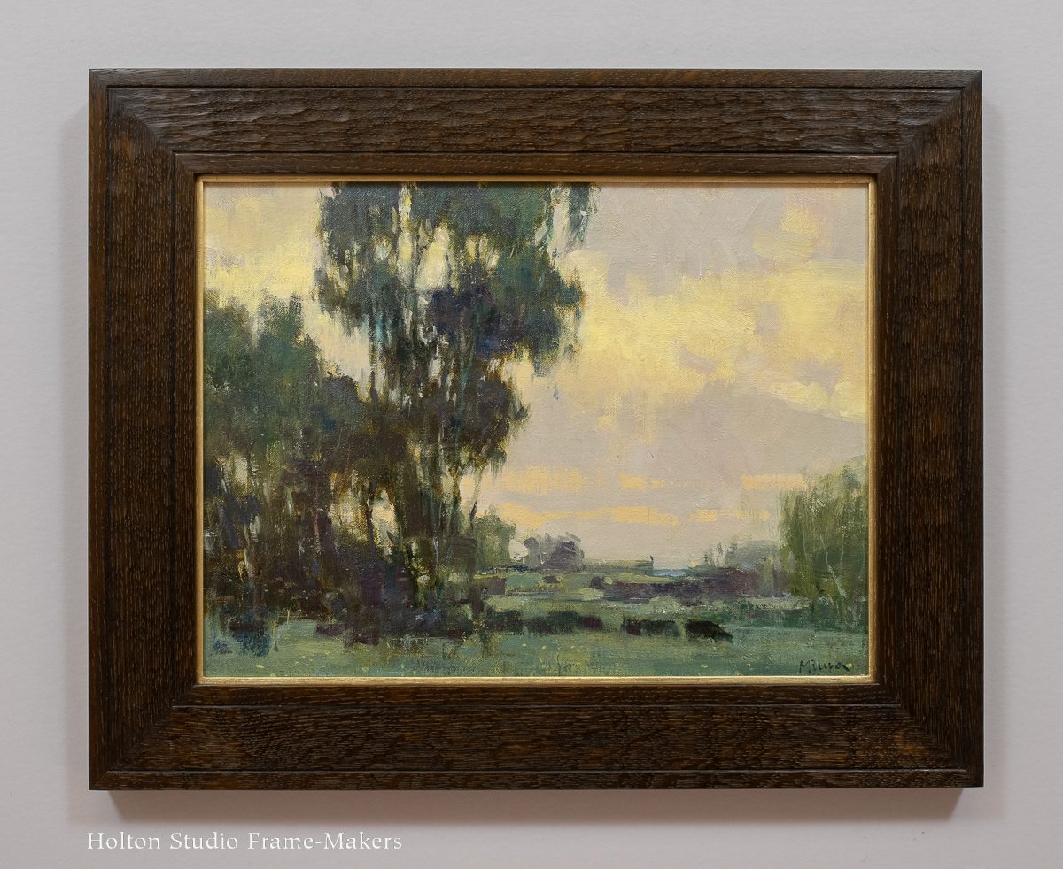
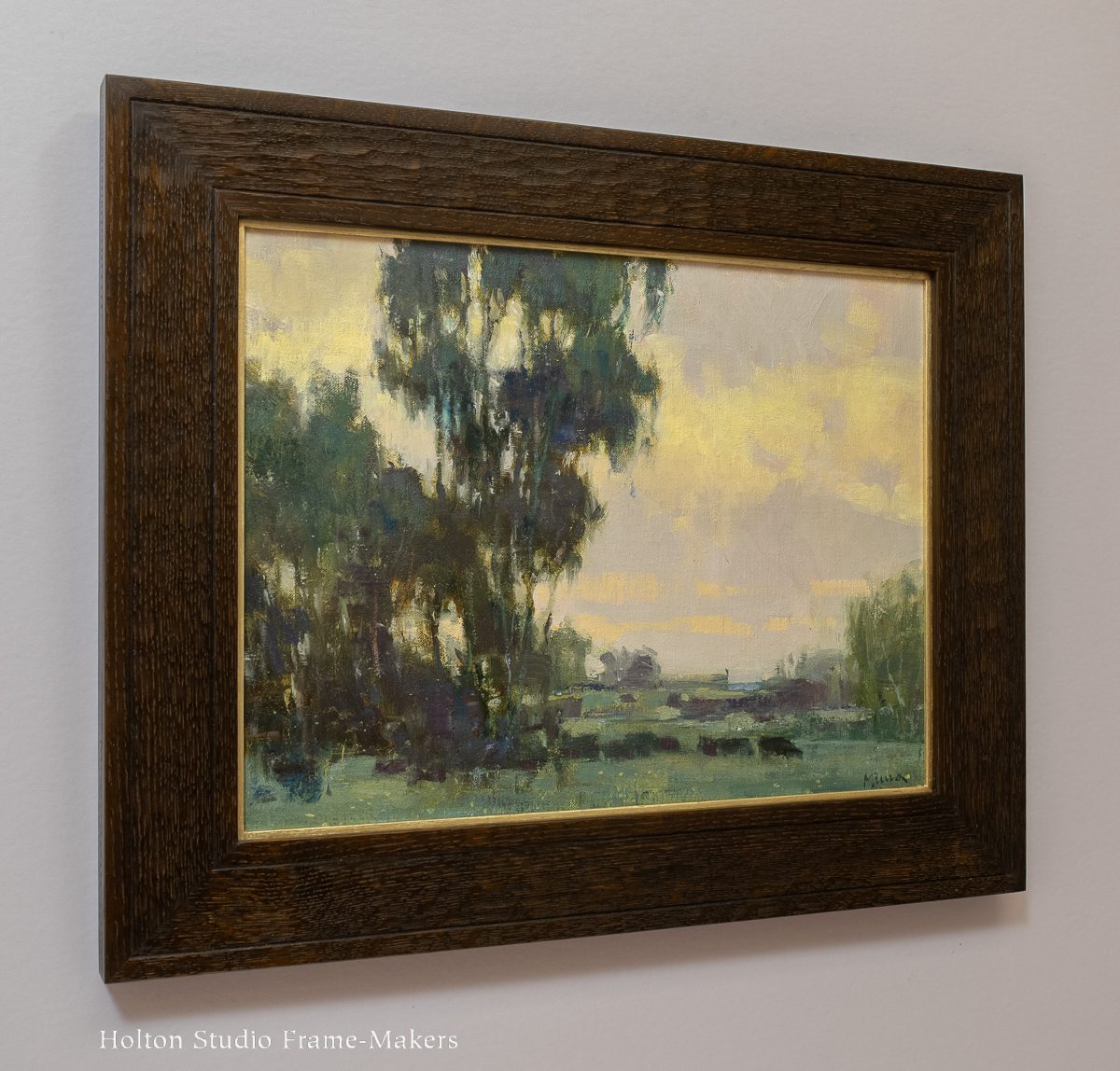
Arthur Frank Mathews (1860-1945) was California’s premiere muralist and a leading teacher in the state. He was also a great advocate for Arts and Crafts ideals—which led him directly to an appreciation for the significance of the architecture of the frame and its worthiness as an artform. We’ve enjoyed the privilege of framing several works by Mathews and his wife, Lucia Kleinhans Mathews (1870-1955). These jobs have been a wonderful opportunity to draw on the decorative vocabulary the couple are known for. This 18-1/4″ x 14-1/4″ pastel of a girl picking flowers on a poppy-covered hillside was a chance to employ the iconic carved, low relief, polychromed poppy patterns the Mathewses developed—a pure expression of their love for California.
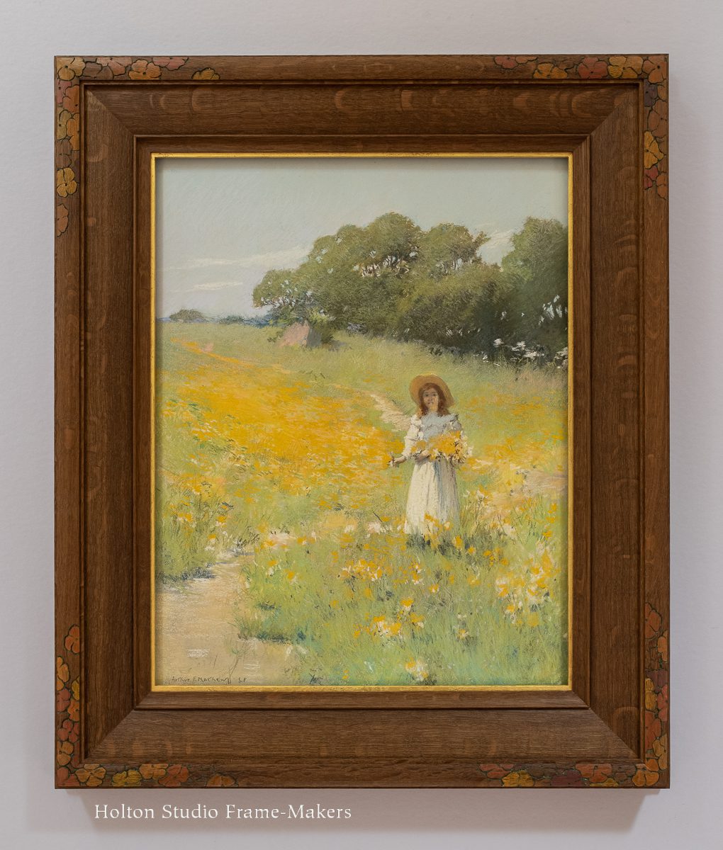
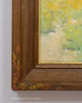
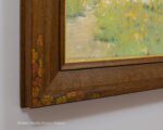
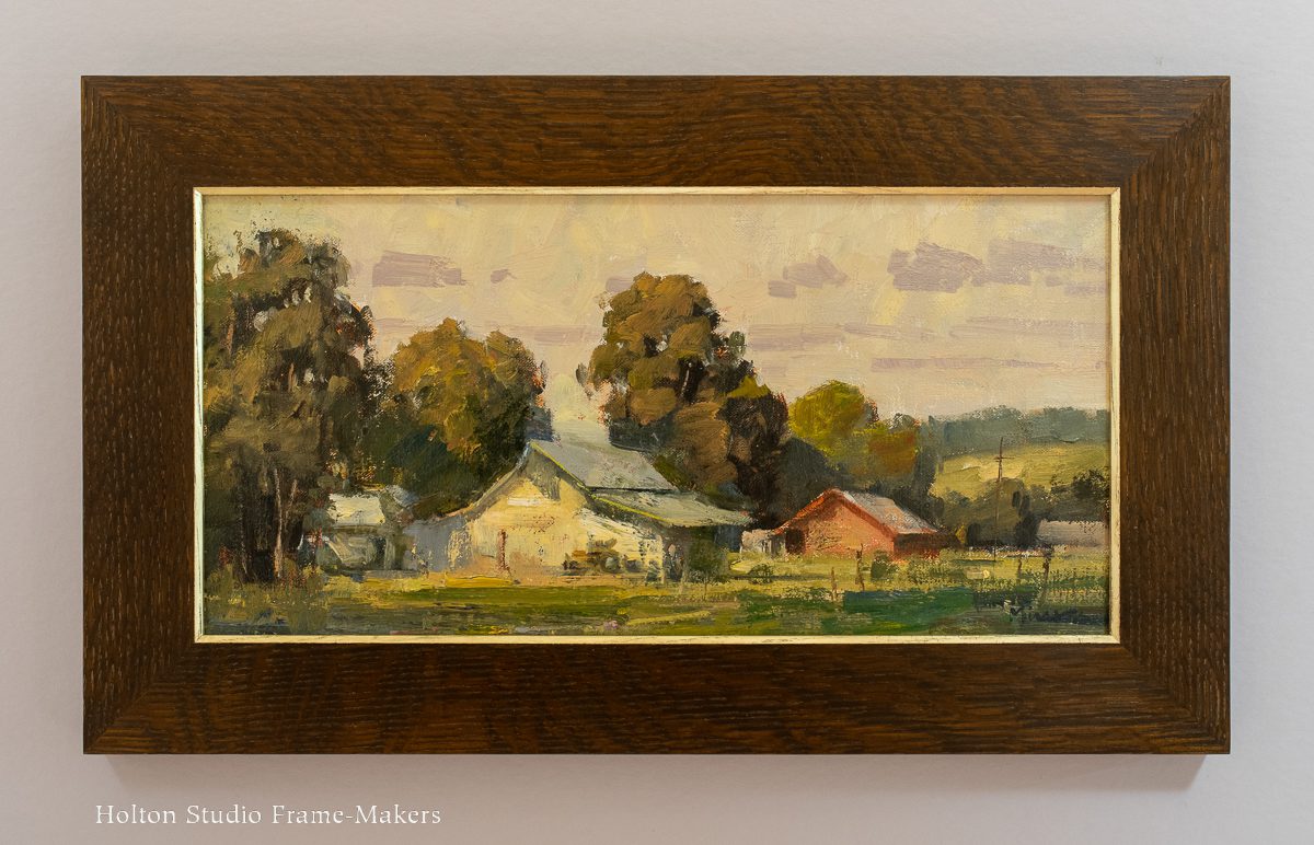
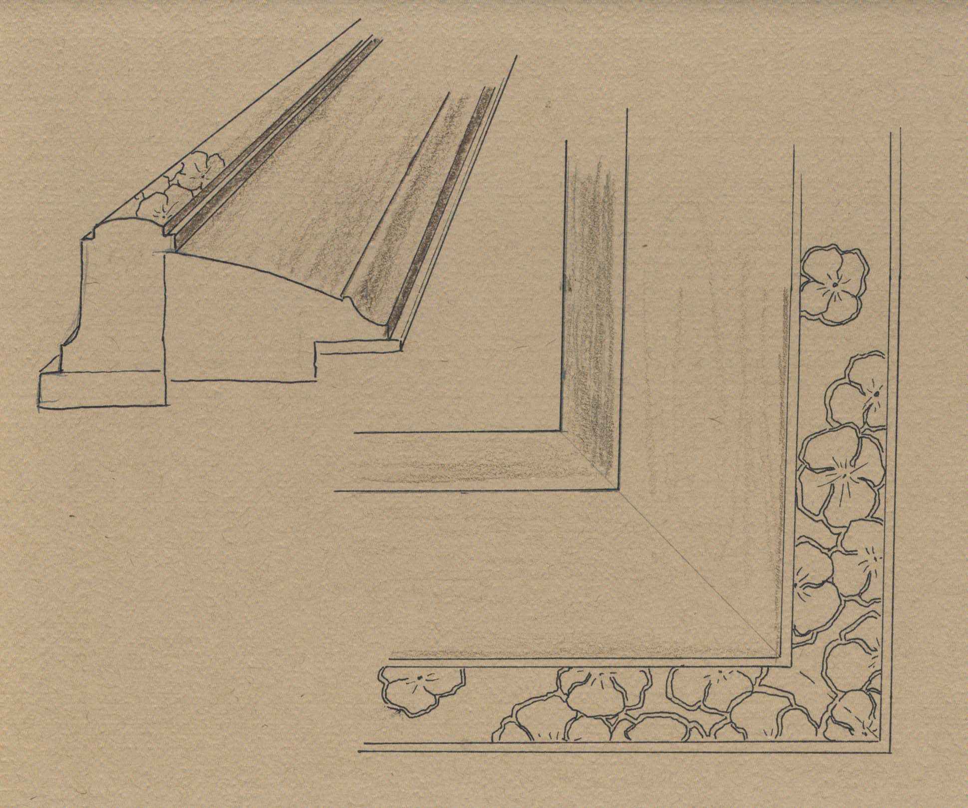 The frame is a compound mitered frame in fumed and oiled quartersawn white oak with a gilt slip. Given the gentle rounded form of the hillside and the oak trees, I chose the cushion form for the overall profile, adding a complementary form, a cove, to the sight edge. The cap is a low cushion as well, and I carved outlines of poppies at the corners and painted them.
This piece was framed for California Historical Design, and is available from them. View it here.
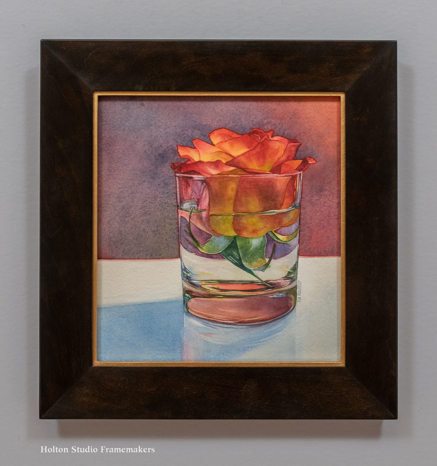
Another Arthur Mathews I framed can be seen here. A lovely framed watercolor by Lucia Mathews is here.