Framing James Cosgrove

A customer recently brought in this little (5-3/4″ x 8″) oil on board by Glasgow painter James Cosgrove(b. 1939). The stained walnut frame was designed entirely to the painting, with a carved cushion rim around a flat with fine carved flutes. I’m very pleased with the harmony of line and form, as well as color—a rare occasion when black works best with a painting.

Framing Dwight Clay Holmes

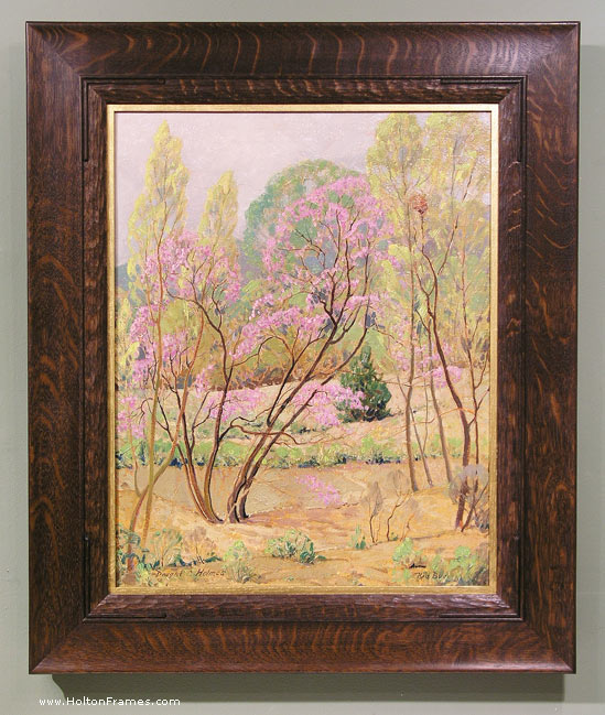
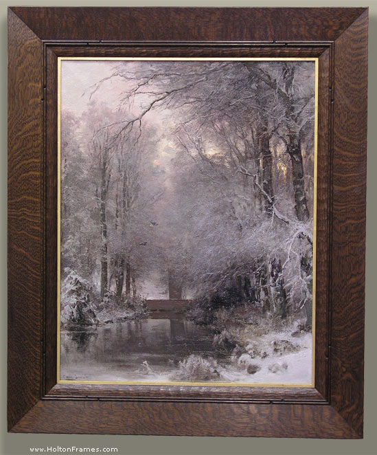
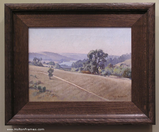
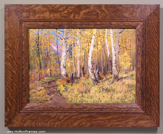
We just framed this 20″ x 16″ canvas by Texan Dwight Clay Holmes (1900-1986) titled “Red Bud”.

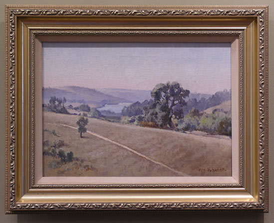
I was especially pleased with the form of the frame profile as an enhancement to both the graceful use of line in the painting (hence the reeding) and the loose brush work (hence the coarse, wild figured quartersawn white oak as well as the carved convex sight edge element). This frame is similar to one on the Charles Partridge Adams, below, which I wrote about here.

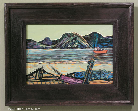
I realize these are pretty similar to the frame on the Louis Apol a couple of entries back. But it’s useful to compare three ostensibly similar frames with nevertheless significant differences when considered with respect to the pictures they’re on.
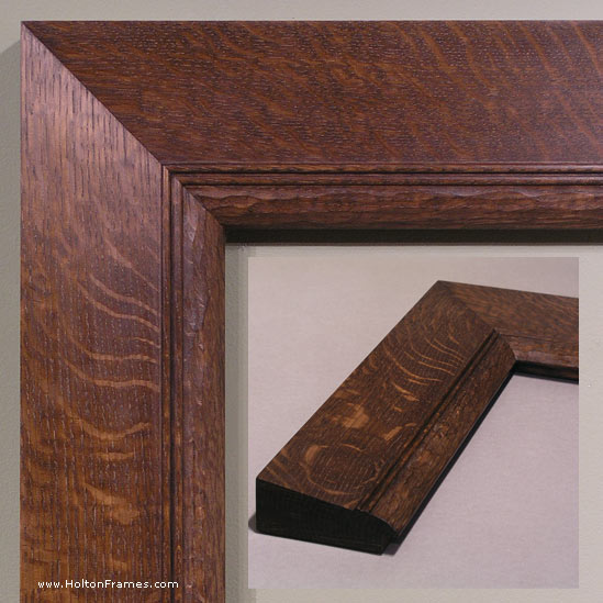
To make just one point about the frame on the Apol, it’s a slope; you can see the reason behind that choice. Focusing on these two paintings of trees, on the face of it, they’re very similar. Yet the forms of the trees in the Holmes are much finer and more linear and graceful. The most significant difference between these two frames, which are basically flat, is that while the Adams’s frame is perfectly flat outside the reeding and is squared off at the outside, the frame on the Holmes has a subtle cove up toward the outside of the profile terminating in a rounded outside edge. This curl up is basically as subtle as possible while still reading to the viewer. Also, although you can’t see it in the photo, the back is cut in giving this frame a much lighter feel than the blockier one on the Adams. This is a good example of how important it is for the frame design to be alive to the particular characteristics of a painting.

I love how subtle profile forms like this interact with the ray flake in the quartersawn oak. In this case, the rays curve laterally with the subtle cove of the profile (especially on the top), and so echo the curving lines of the trees. Note too the variation on the corner carving, which I focused on in the first entry. Not to put too fine a point on it, but the double reeds on the Adams frame echo the parallel tree trunks throughout the painting, whereas the red bud trunks stray off on their own and so are framed with a single bead, the second bead added to articulate the corners.

Finally, note that these are two bright sunny paintings very suitably served by dark wood frames. A narrow gold liner on the Holmes seems to reflect the sunlight in the painting, which seems very natural (like a window frame viewed from inside a house would reflect the sunny landscape outside). But the entire frame in gold would fail to complement the use of light with its complementary shadow tones.

Most importantly, I think both settings succeed at the great and primary purpose of the picture frame which is to sustain the spirit of the picture into the architectural real.

Framing Contemporary Photographs–Geoffrey Agrons, 2

A couple of years ago I posted an entry about framing Geoffrey Agrons’s wonderful photographs. Here are a couple more we just did.

This first one, “Big, Big Love” is in an exhibit opening this month at the Center for Fine Art Photography in Fort Collins, CO. It’s framed in a No. 123.8 Century Series flat, 3″ wide, in stained walnut.

The second example, a still life, is framed in our most basic mortise-and-tenon frame, the Aurora, with a liner that’s an ogee with a bead at the sight edge. The outer frame is a nod to the art of the cabinetmaker, while the refined liner picks up the forms and fine lines of the photo.

See more of Geoffrey’s work on his site, here.

For more on framing photographs close, i.e., without a visible mat, read my article “Close Framed Photographs,” for Picture Framing Magazine.

How Art Fairs Frame Art

“Art is the expression of man’s joy in his labor” — that’s how the great material task of humanity and civilization was framed by William Morris. (Yes, it was Morris — not, as a Google search will lead you to believe, Henry Kissinger). After reading Peter Schjeldahl’s New Yorker piece, “All Is Fairs” , it’s clear to me the thought is long overdue for rewriting. How about this: “Art is a few people’s expression of their joy in seeing how much money they can get the .000000001% to spend on kooky and ever-so-cleverly-ironic stuff they make, or find, or kind of throw together, or whatever.”

Art fairs, the cutting edge of the self-proclaimed cutting edge art world, are now so baldly and purely mercenary that uber-collector/”gallerist” (that would be a proponent of gallerism, the belief that the true place of art is not in the home but insulated from real life through relegation to art galleries where it can be properly cultivated) Larry Gagosian wouldn’t even bother to get out of his chair to greet populist emissary Morley Safer and the “60 Minutes” crew who showed up recently at his booth at a fair to find out if the scene’s really as crass and vapid as it appears. As Schjeldahl reports the incident, “‘It is a place to make money,’ Gagosian allowed languidly.” Yep, it’s really as crass and vapid as it appears.

Schjeldahl’s one of the elite, one of the critical — as in “crucial” not as in “ready and willing to criticize”  — critics the “Art World” depends on to cover it in otherwise intelligent journals and build up an otherwise dubious legitimacy (for the “Art World” if not for the journals). But his appreciation of art at least once in a while reveals authenticity, enough so that he sizes up current art fairs with the conclusion: “a spiritual gulf steadily widens between the people who buy art and those who only love it.” Of course, the truthfulness of that statement depends on how you frame your understanding of art.

But at least as Schjeldahl frames it, the long story of the separation of art from daily life and labor goes on, at least within the pure white walls of art fairs, deaf as ever to William Morris, blind as ever to 99.99999% of those of us who go on making things to express their joy in their labor.

Thanks for allowing me an occasional rant.

And thanks for asking.

Framing Louis Apol

Here’s a notable historical work for you. Just framed this beautiful European landscape by Louis Apol (Dutch, 1850-1936), “A Forest in Winter” (oil on canvas, 32 x 25). (Click image for a larger view.)

The stained quartersawn white oak frame is a 4-1/2″ wide slope with a carved cushion sight edge. The double reeding outside the cushion, with carved stops near the corners are a nod to the delicate strokes that define the trees, and give the frame a degree of refinement in sympathy with the artist’s well-honed touch. The 1/4″ gilt slip catches the sunlight. We were aiming for a suitably rustic but sensitive feel, a quiet mood, simple. No “before” shot of this in a gold frame, but can you see how the dark wood suits the painting much better than a gold one would? How it’s like the shadows in the painting, and how the shadowy feel of the frame leads your eye to the picture and acts as a foil to the picture, and in particular to the sunlight? And, of course, the rustic feel connects you to the rustic subject matter much more successfully than would a gold frame.

Below is a corner sample of the frame design (without the carved stops on the reeding).

Ranches & Rolling Hills – MALT Art Show and Sale 2012

Spring is here a bit early this year with daffodils and fruit trees in full bloom. I have been visiting some beautiful West Marin MALT ranches, painting and collecting images for this year’s 15th Annual “Ranches & Rolling Hills” art show. Three years ago I painted a portrait of a sheep named Torpedo on Al Poncia’s ranch in Tomales. He was one of the ‘bum’ lambs raised by Anita, Al Poncia’s mom, in her laundry room. A ‘bum lamb’ is one that is rejected by the mother ewe and therefore has either be hand fed or attached to another ewe. He became very tame and for a long time loved people more than his own kind. A couple of weeks ago I made a visit to the ranch and Torpedo was grazing out in the field. When I called his name, he came ambling over to the car and almost hopped in to see what I had in my cooler. I knew he liked apple, so I quickly pulled one out and cut off little pieces to give him. Torpedo loved it and soon had eaten the whole apple. He scratched my leg, just like a dog, begging for more. What a character! I gave him some good back scratches, which he gladly accepted, before he ambled off into the pasture with his flock.


I decided I had to paint another portrait of this friendly guy, and so he will once again make an appearance at the “Ranches & Rolling Hills” Art show to be held in Nicasio on May 19th and 20th, 2012. Make sure to mark your calendars and come out West to see a great show featuring over 40 well known California artists’ works of art. Fifty percent of the art sales will go to benefit Marin Agricultural Land Trust so that they can enable Marin ranchers to continue working their land. The event is free to the public. Please visit “Ranches & Rolling Hills Art Show” for more information about this event. Hope to see you there….


Re-framing William Hubacek

Just framed this 10″ x 14″ oil on canvas by notable Californian William Hubacek (1871-1958), rescuing it from a cheap gold setting. The job offers a good before-and-after, and a good example, I think, of how a frame helps or hinders your ability to see the picture:

The frame’s flat coving up to a carved cushion back edge. In quartersawn white oak with Weathered Oak stain. Very oak-y. Much more sympathetic to the spirit of a very lovely painting.