The theme of this post, replacing gilt frames with dark wood frames, has since been greatly expanded upon on a page created a couple years later, “Fixing ‘A Very Prevalent Error: The Cabinetmaker’s Answer to the Gold Frame Convention,” here.
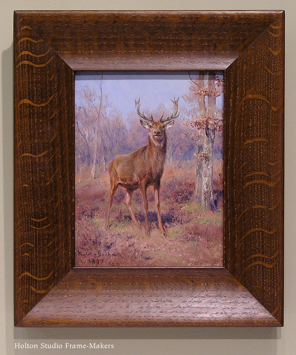
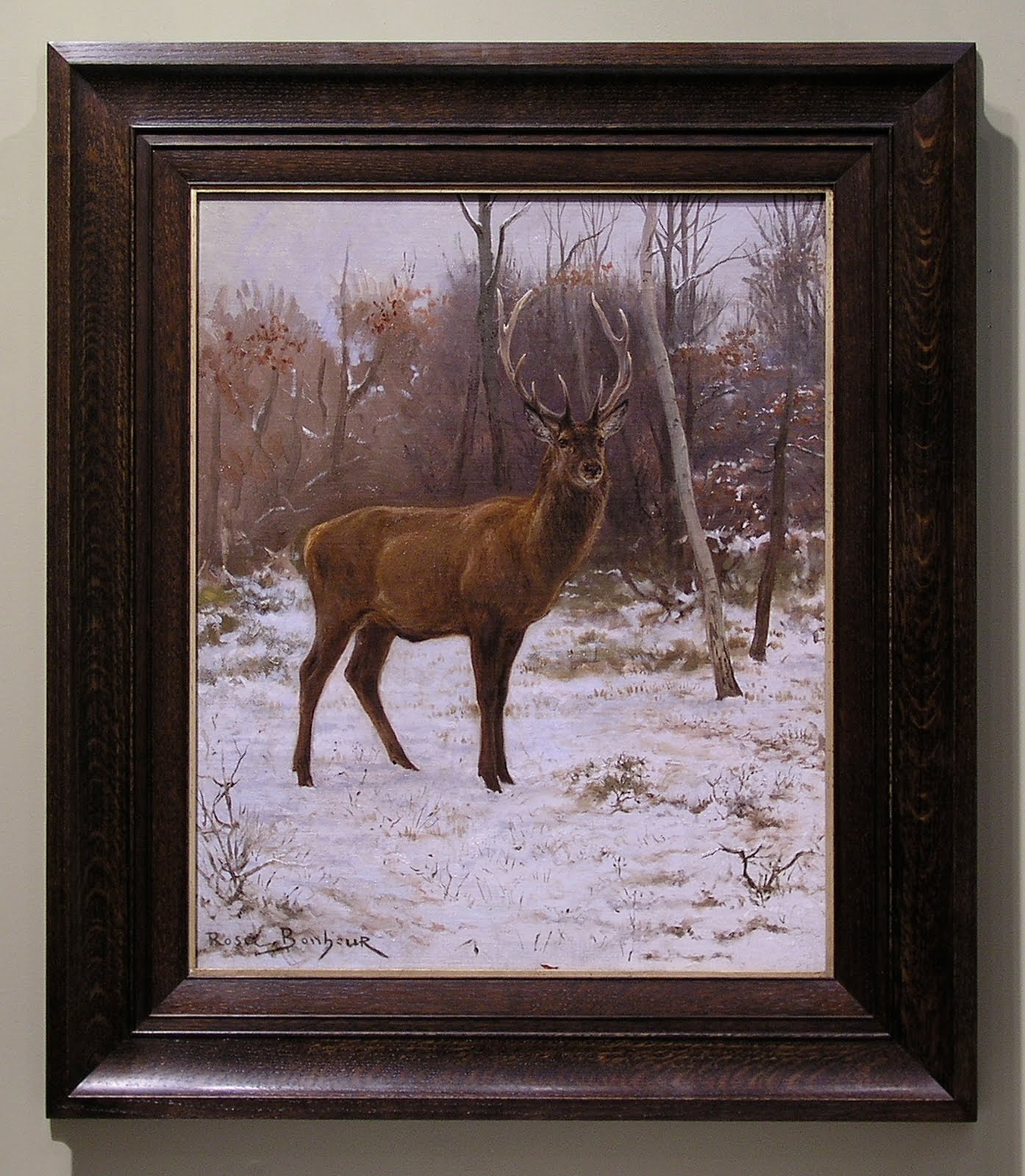
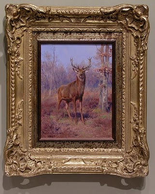 Have you ever looked at a painting and realized that you were fighting to see past the frame, that the frame was actually inhibiting you from seeing the painting? Maybe you’ve held your hands up to one eye and used them to block out the frame. That was very much my reaction—and I suspect the reaction of the customer who brought it to me—when I first laid eyes on this sweet little oil by the great French painter Rosa Bonheur. The elaborate, swirly gold frame was so imperious, showy and unsympathetic to everything about the picture—the subject, palette, line work, forms and, above all, the rustic spirit—that it actually felt laborious to really study and appreciate the painting itself. (The owner was also seeking a frame that would be more suitable to the painting’s destination in a log home.) At just a little over 8″ x 6″, it was being eaten alive by some past owner’s or dealer’s insecurities (it didn’t help that a makeshift gold colored liner had been used to make the painting fit a 10″ x 8″ frame). The poor creature appears inexplicably displaced to some Parisian bank manager’s parlor, and seems to stare at us as if to say, “What the heck am I doing here?”
 Relief finally came when I removed the work from its setting and could enjoy this stately fellow whom Mademoiselle Bonheur had distinguished so skillfully. Seeing past the significance of the painting and refusing to be awed by the signature in order to appreciate the work itself, I could craft no better solution than this plain and simple 2-5/8″ wide flattened scoop with a single bead at the sight edge. At last, we can see the painting without effort, and the stag is in his natural habitat, warily watching us as intruders of his home.
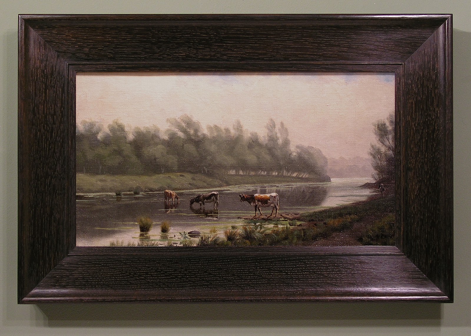
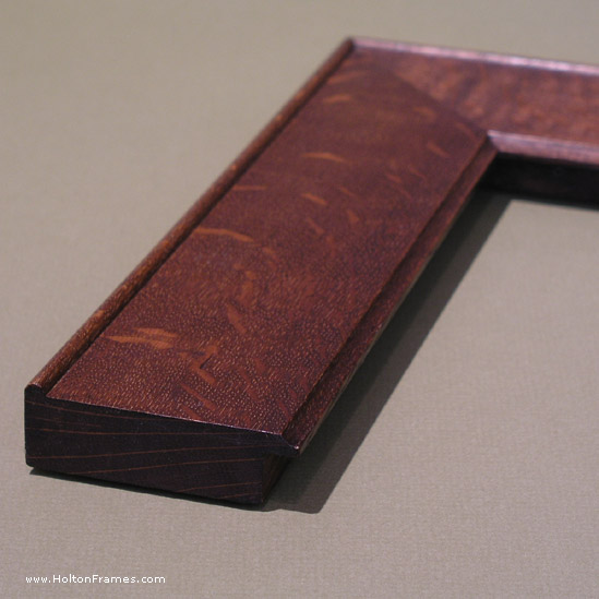
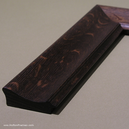
A larger Bonheur of similar subject matter came in about a year later, with a similarly overbearing frame. Damaged in transit, the composition—or “compo”—breaking off demonstrates the dubious
service of frames like this as protectors of paintings, not to mention the debased character of compo as fake carving. At 22″ x 18″, this canvas called for a larger and stronger frame, although with the same approach to line and form which we’d taken with framing the earlier painting.
The suitably rustic spirit of the quartersawn white oak frame molded to harmonize in line and form with this quiet but accomplished work, a dark stain to lead the eye to the lighter painting (the eye goes to light; frames are generally more successful when they’re darker than the picture), and a touch of pale gold leaf on oak at the sight edge to echo the painting’s contrasts and lend a note of honor to this noble beast all contribute to a setting that sustains and expands the spirit of this fine work and allows us at last to see and admire the painting.