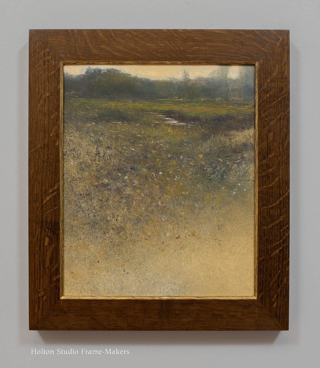
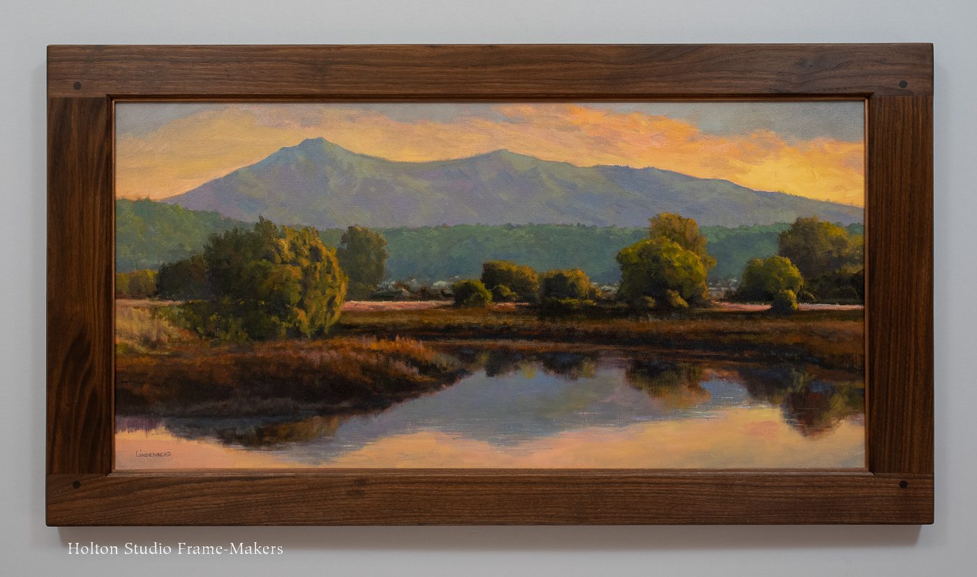
More Inspiration from Block Prints: Framing Charles Spitzack

This is a frame design I never would have come up with if this particular print hadn’t come through the door. The contemporary (2019) block print, “A Glimmer of Abundance,” is by Northwest artist Charles Spitzack (b. 1987). We set the 10″ x 8″ piece in a 2-1/4″ light tan solid core rag mat just a shade darker than the paper. The stained walnut frame is 1″ wide. Framed Charles Spitzack print

Framed Charles Spitzack printIn framing woodblocks, there’s a special pleasure that comes from the fact that the frame is made of the same material as the block that’s used to make the print. That commonality affords unique opportunities for achieving harmony between the picture and frame. As with other block prints—like this, and this, and this—I created a frame that you could, if you wanted, actually make prints from. I raised a flat strap all around, and at the corners mimicked the wave pattern in the print. Also in deference to the line and form in the print, I relieved the straight sides of the frame by curving them in a bit at the corners. That also harmonized nicely with the strap pattern.

Making frames from scratch, it is more natural for each frame to be unique to the picture. That’s one of the chief arguments for, and key virtues of, the studio frame-making model.

Framed Charles Spitzack printCheck out Charles Spitzack’s woodblocks on his website…

Framing Richard Lindenberg’s Quiet Discoveries

A week from tomorrow we’ll unveil a new show celebrating ten years of representing one of our outstanding painters. “Richard Lindenberg: Quiet Discoveries”, Richard lindenberg with paintingfeaturing all new and recent paintings, will open on Saturday, September 23 with a reception for the artist from 2 to 4 p.m.

While most anyone will be stopped in their tracks by a grand, spectacular vista, it’s those painters especially attuned to the natural world who see—and help us to see—the beauty revealed in the more commonplace view, the extraordinary everyday scene. Richard is one of those painters making, as he calls them, “quiet discoveries.”

There’s an affinity between these simpler scenes Richard attends to and the humbler tradition of cabinetmakers’ frames that our work is built on. That natural harmony makes framing and exhibiting Richard’s works always a reward and pleasure.

We chose “Late Fall,” above, for the postcard and poster, and set the 18″ x 36″ oil on canvas in a fumed quartersawn oak compound frame comprised of a mortise and tenon flat and carved mitered sight molding. It has a carved cushion-shaped liner finished with bronze wax to complete the quiet harmony between frame and painting. In keeping with the proportions of the painting, the frame is 1/2″ wider on the sides (3-3/4″ vs 3-1/4″ for the top and bottom members). Trevor Davis built it, and Sam Edie finished it.

I hope you’re free on the 23rd and will come meet Richard and enjoy his beautiful quiet discoveries.

On My Bench

There’s an unusual project on my workbench these days…

All parts of one frame. How will it come together? What’s it going on? Stay tuned!

UPDATE: My post on the completed frame is here.

Framing More Tonalism—and More Works by Charles Warren Eaton

We recently enjoyed framing a batch of circa 1910 canvases by Charles Warren Eaton (1857–1937). Eaton was one of the leading members of the nineteenth century tonalist movement, and a protege of the most prominent tonalist artist—indeed, one of the most important American artists of his time—George Inness. A couple of posts back I wrote about framing an Inness painting. (An earlier post on framing an Eaton is here.) Like the Inness, these by Eaton, below, were also framed for, and are available from, our friends at California Historical Design.CW Eaton

Tonalism sprung from deeply religious strivings for harmony, and observation of nature informed by a belief in “spiritual influx”—the holy spirit’s pervasive manifestation in nature. Key to its concerns were heightened sensitivity to the harmonies of light and shadow, which renders tonalism extraordinarily well-suited to dark wood frames. Such settings naturally respect a tonalist work’s low value contrast and the complementary effect of shadow tones on the picture’s lighter values. The gold convention on such paintings is especially unsuitable, so it’s always gratifying to rescue them from that treatment. The frame-maker’s obligation to harmonize the frame with the painting—in line, form and texture as well as color, tone and value—is never felt more strongly than in framing tonalist works.

Picture frame designThis first painting, which is untitled and undated, is 12″ x 16″. We set it in a quartersawn white oak frame with Saturated Medieval Oak stain. The profile, as you can see from the drawing here, is mostly flat but has a carved raised cushion at the sight edge. I’m very pleased with the complementary cove transition between the flat and the raised cushion. The slip has a bronze wax finish. (The painting is available here.)In this view below, you can see the coved back, which reaches out slightly beyond the outside edge of the frame’s face.Chas Warren Eaton paintingThis painting below, also undated, is titled “The Clearing In Winter.” At 24″ x 20″, it’s the largest of the set. Our 4″ wide compound mitered frame, No. 2.3 CV + Cap 400 CV, is a slope which I chose to extend the picture’s perspective. It has a carved cove sight edge and carved cushion cap molding. The wood is quartersawn white oak stained Medieval Oak. The liner is an ovolo (quarter round), carved and gilded. Charles Warren Eaton’s “The Clearing in Winter” is available here.Chas Warren Eaton paintingChas Warren Eaton paintingThe 12″ x 18″ haystacks painting below got the same treatment as the Inness painting in my recent post—a carved compound cushion form with a cove inner molding. The frame is quartersawn white oak with Dark Medieval Oak stain and has a bronze wax slip. The back is cut in.Chas Warren Eaton paintingChas Warren Eaton paintingThe 12″ x 15″ “Rolling Hills” seemed to ask for a frame to simply sustain the grassy bowl—a slope that coves up to a carved cushion. The stained walnut frame has a carved and bronzed liner and a coved back (see second photo). Available here.Chas Warren Eaton painting Charles Warren Eaton paintingThe small, 10″ x 8″ “Winter Woods” is in our No. 1.4 CV at 2-1/2″ wide in quartersawn white oak with Saturated Medieval Oak stain and a bronze wax slip. The carved cushion at the sight edge echoes the tree trunks. This painting is available here.Chas Warren Eaton painting Chas Warren Eaton painting“Tall Pines,” below, captures the subject matter Charles Warren Eaton was best known for. We set the 16″ x 12″ painting in a 3″ wide No. 410 CV in fumed quartersawn white oak with a bronze wax slip. The design is all about harmony of shape and texture. The strong perspective of the painting is enhanced not only by the frame canting inward, but by the graded widths of the three elements. (This one has sold.)Chas Warren Eaton painting Chas Warren Eaton paintingAbove all, tonalism’s reverence for nature is powerfully underscored by the beauty of a hardwood frame, one well-crafted—imbued, that is, with that reverence for life, that ethos of care for nature and the world we inhabit; an ethos we share with tonalist painters like George Inness and Charles Eaton.

Framing Don Demers

This is a painting that just arrived at the Buffalo Bill Museum in Cody, Wyoming, and will be part of their annual Art Show and Sale. Titled “The River and the Rodeo, Cody,” the 30″ x 25″ oil is by the outstanding Donald Demers, who asked us to frame it for the prestigious occasion. Trevor Davis came up with this design several years ago, and we’ve made a few like this or similar. (We have a ready-made 14″ x 18″ available here.) Don spotted it on this Thaddeus Welch painting on my website, and I couldn’t see a reason to modify it in any way. This one is a slope, chosen to extend Don’s masterful perspective. The wood is fumed quartersawn white oak, and it has a pale gold slip.Don Demers paintingA native of Massachusetts who spends a great deal of time in Maine, Don Demers is nationally renowned for both his landscapes and especially his seascapes, which are informed by a lifetime passion for boats and the ocean. In my experience, the best painters have an exceptional depth of connection to their subject matter—a deep reverence—and this short video leaves no question that Don is in that class.

While Wyoming is far from Don’s native turf—and the ocean—his reverence for the Earth and the delight we can find in being part of it travels well. About “The River and the Rodeo, Cody,” Don writes,

In late May/early June 2023, My partner, Jackie Jones and I took a trip out West to Colorado, Wyoming and Montana. Being from the East it’s always awe inspiring to see the Western landscape. Jackie, a fine painter in her own right, knows that area pretty well but we were accompanied and guided by our dear friend Tim Newton who happens to be the publisher of Western Art and Architecture magazine. He drove us around Cody, WY and beyond and served as our guide. He introduced me to the Shoshone River and all of its rich history, particularly where it comes upon Cody. When Tim took us to see this river gorge I was as excited as I can remember to create a painting of the experience. The place was compelling, not only for the striking beauty and power it possesses, but for the contrast between this deep river gorge and the conglomeration of buildings and structures that house the daily rodeos during the Summer season. It was such a view of unbridled nature and humans’ desire to be upon it that inspired me to paint the scene, first on location as a study and then a larger work created in the studio. The studio painting is now enhanced and embellished with this exquisite frame created by Holton Studio and is being showcased at the Buffalo Bill Center for the West in Cody.

Don Demers painting

View an excellent video interview with Don Demers here…

Visit Don Demers’s website…

Framing George Inness and the Spirit of Tonalism

Believed to date from the 1880’s, this 12″ x 18″ painting of the last light of day is from the brush of George Inness (1825–1894). We’ve made a few frames like this one, and the design seemed to me perfectly suited to Inness’s gentle and lush grassy hills. Constructed in quartersawn white oak, the 3″ wide frame is a compound, a simple carved cushion complemented by a narrow carved cove inner molding. The back of the frame is cut in and then sweeps out beyond the outside of the frame’s face. The frame is fumed and stained. A bronze slip seems to catch the vanishing sunlight. Trevor Davis made the frame, and Sam Edie finished it. The painting is available from California Historical Design. [UPDATE: This painting has sold.]

George Inness paintingWilliam Keith once called Inness “the biggest man in America,” and he wasn’t alone in his estimation of Inness’s significance to the nation’s landscape painting tradition and therefore its culture. Some have called Inness the father of American landscape painting, but that would seem to ignore the Hudson River School, which began a generation earlier to established a formidable landscape painting tradition in this country. Inness himself started out closely studying Thomas Cole and Asher B. Durand. But after a trip to Europe that exposed him to the French Barbizon painters, Inness brought to the American scene a more intimate and mystical approach that, at least for some, eclipsed in influence and significance the grand vistas of the earlier painters.

But if Inness is not the father of American landscape painting, he’s certainly the father of American Tonalism. (The younger James McNeill Whistler had quite a lot to do with it as well, but from a very different set of ideals.) Inness was deeply religious and philosophical, and sought to express on canvas the insights of the eighteenth century visionary Emanuel Swedenborg. Of special importance to Inness was Swedenborg’s philosophy of “correspondences,” summed up by the theologian’s saying “as above, so below” (borrowed from the old Hermetic texts), which posited that the material plane directly corresponds to the spiritual; and “spiritual influx,” painstakingly elaborated in texts such as “Interaction of the Soul and Body” but summarized as, “The spiritual clothes itself with the natural, as a man clothes himself with a garment.”* Thus, to contemplate the natural world was to contemplate the holy spirit and its all-permeating, unifying power in the natural creation. Among other effects on Inness, this vision led the painter to work in close tonal harmonies—thus the label Tonalism—exemplified by this picture. Sunlight corresponds to spiritual light, harmonizing in this still evening a well-nourished patch of landscape fed by the clear pool at its center (its reflections perhaps illustrating the principle of “correspondences”).

George Inness painting--oblique viewThe remarkably timeless quality of this painting makes it easy to forget that the entire twentieth century and then some stands between us and Inness’s life. That distance has left us somewhat numb to the turmoils of the late nineteenth century, and in turn to the profound significance of landscape painting to that rapidly industrializing and urbanizing age. Shifting their homes to cities, their work to factories, and their attention to consuming an unprecedented quantity of new products, Americans had begun that great project of transforming their civilization (although Mark Twain among others would mock its claim to that ideal). We’d undertaken to construct a human-made shell around our lives—replacing the eternal frame of nature with a man-made frame. And with traditional rural communities breaking up, daily labor made more divided and specialized than ever, and consumerism magnifying the desires and significance of the individual, life was fragmenting.

Little wonder that this painting seems so timeless. Such harmonizing visions were then, and remain now, an antidote to discordant times.

Inness painting in period gold frameI’m not sure how much Inness weighed in on the art of the frame. As many (though not all) artists of the time did, he probably regarded the fate of his works, once they left his studio, to be out of his hands. This would include the frames that dealers and buyers chose to set them in. The contrast—or conflict—between Inness’s ethos and that of his age is often glaringly clear, for example in this work at right recently sold at auction. The painting is distinctly the artist’s vision; it’s his or her appeal to the world. The frame is the world’s response to that appeal—or failure of response. The task of today’s frame maker who’s lucky enough to have a work of Inness’s come his or her way is to respect its essence and to provide it with a setting that sustains that unifying, harmonizing, and reverent vision.

It’s notable in relation to the subject of this painting that when Inness died in 1894 in Scotland he was watching the sunset. According to his son, who was accompanying him, Inness “threw up his hands into the air and exclaimed, ‘My God! oh, how beautiful!’,” then collapsed and in minutes was dead.

Find both an excellent biography of George Inness and a gallery of his paintings on Wikipedia…


* Van Gogh reportedly said that “A picture without a frame is like a soul without a body,” or, in other words, the picture is to the frame as the soul is to the body. It’s a metaphor that would seem consistent with Swedenborg’s description of spiritual influx: “The spiritual clothes itself with the natural, as a man clothes himself with a garment… [T]he spiritual is within the natural as the fibre is within the muscle, and as the blood is within the arteries; or as the thought is within the speech, and the affection in sounds; and it makes itself felt by means of the natural.… [T]here is only one life, and this is not capable of being created, but is eminently capable of flowing into forms organically adapted to its reception. Such forms are each and all of the things in the created universe.” —From Emanuel Swedenborg, “Interaction of the Soul and Body”.

Video Release: Paul Kratter—Landscape Painting and Design

Gallery favorite Paul Kratter, whom we’ve represented now for twenty years, has another instructional video coming out. It’s called “Landscape Painting and Design.” If you’ve always wanted to come to one of Paul’s demos here at the gallery but couldn’t make it, or you have attended and just want to have that illuminating experience again, here’s your chance. The video, from Eric Rhoads’s Streamline Publishing’s Painttube.tv, will be released this week. Learn more here…  And watch the trailer below:

Watch Paul paint in high speed!—

(And, yes, that’s one of our frames in the background!)

“On the Threshold” Opens Today!

Today’s the day! It’s the opening of “On the Threshold: 3 Women, 3 Mediums, 3 Views,” our show of paintings by standout artists Ellen Howard, Tia Kratter, and Kim Lordier, and we’ll be hosting a reception for the artists from 2 to 4. If you can’t be here in person, though, check it out online—on the show page our main site, our ecommerce site, and on Kim Lordier’s beautiful look book for the show.

But we’d love to see you here in person (nice and cool 70’s temps by the Bay)! Hope you can come!

—Tim HoltonEllen Howard, Tia Kratter, and Kim Lordier

Framing Tia Kratter for “On the Threshold”

Ellen Howard, Tia Kratter, and Kim Lordier

Left to right: Ellen Howard, Tia Kratter, & Kim Lordier

The subtitle of our new show “On the Threshold,” is “3 Women, 3 Mediums, 3 Views.” My last two blog posts featured two of those three women—Ellen Howard, and Kim Lordier. As we approach this Saturday’s opening and artists’ reception—from 2 to 4; I hope you’ll come!—I wanted to turn the spotlight on a piece by the third painter in the group, Tia Kratter.

I especially loved framing “Serengeti Reflections.” The 17″ x 12-1/2″ watercolor shows off the artist’s extraordinary painting skill in regards to handling, suitably enough, both water and color. The vibrant beauty of a traditional African textile (evoking for Tia several memorable trips to Africa) is multiplied and magnified by its distortion through clear liquid and glass—a fairly astonishing technical feat. The rich patterns provided ample inspiration for the frame.

Tia Kratter watercolor, "Serengeti Reflections"The angularity of the picture’s design suggested the molding profile—a slope with a beveled back and chamfered sight edge. The wood for the 2″ frame is mahogany, simply oiled and waxed, except for the sight edge chamfer which Sam painted with dark charcoal grey milk paint. Framed Tia Kratter watercolor, "Serengeti Reflections"I’d been playing around a bit with chip carving, and the zig zag patterns in the painting offered the perfect chance to use a simple carved triangle pattern. I especially like how it complements the angular profile.

“Serengeti Reflections” exemplifies the show’s threshold theme, and Tia’s artist’s statement:

Threshold: that sensitive fine line between abstract and reality; what we think we should see and what is reality. There’s an opportunity to look more carefully at that tipping point; whether it’s a reflection, a play of light, or perhaps the translucency of objects. I aim to look for visuals that blur the line between real and abstraction.

Through a career that began with her studies at the Art Center College of Design in Pasadena and more than three decades working in animation with Disney and Pixar, Tia has honed her skills and artistic sensibilities to an extraordinary degree. In addition to its amazing technique, “Serengeti Reflections” demonstrates another wonderful and distinct aspect of Tia’s work: her unique and compelling compositional sense.

Just finished framing and hanging “On the Threshold: 3 Women, 3 Mediums, 3 Views,” and we are delighted with it. Come to the opening this Saturday, July 22 from 2 to 4 to meet Tia Kratter, Ellen Howard, and Kim Lordier and bask in their beautiful work.

Process shots—


Tia Kratter at work—Tia Kratter