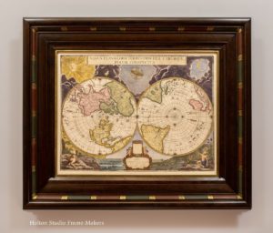
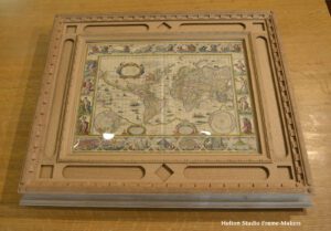
My September 12 post, “On My Bench,” was kind of a teaser for today’s post, showing details of a frame in the works for a map by Willem Blaeu (1571-1638). I finished the frame a couple of weeks ago, and am especially pleased with it.
 Willem Blaeu was one of the greatest cartographers of the Dutch Golden Age—mapmaker to the Dutch East India Company and immortalized by the paintings of Vermeer. The plate for this world map, which is about 17″ x 22″, dates from 1606. According to the customer who sent it to us, this hand-colored impression is most likely from the 1640’s.
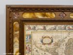
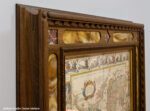
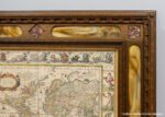
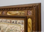
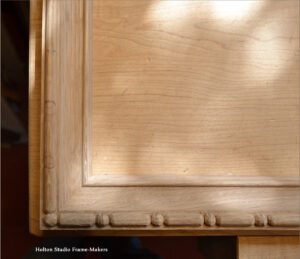
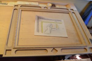
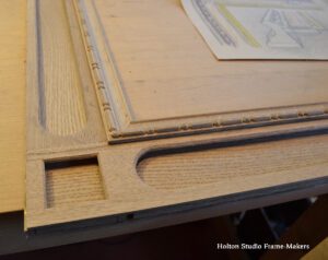
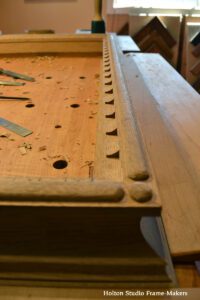
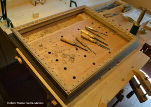
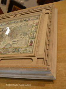
The face of the quartersawn white oak cassetta frame is 4-1/2″ wide, but the back sweeps out a bit further. The richly decorated map provided plenty of material for a frame that would celebrate its significance and beauty, and my customer and I had a blast designing the frame. I cut in to the flat panel, or frieze, long openings with round ends that echo the shapes of the frames for the vignettes in the top and bottom portions of the map’s decorative border (descriptions of those are below) and set swirly amber and white stained glass into those openings. Square openings inset with jasper tiles accent the corners and centers of the top and bottom panels of the frieze. The sight mold, with a gilded ovolo on the inside, is carved with a bead pattern to echo the two patterns defining the decorative border of the map. The outer cap molding has a carved broken cove pattern that is strongly architectural and also echoes the graticule markings, conventional on maps, that designate latitude and longitude. The outermost, surmounting bead is carved at each corner with a ball. 
Sam fumed the frame, exposing it to strong ammonia in a sealed tent. The ammonia reacts with the tannins in the oak which darkens the wood and essentially accelerates the natural effects of aging. Sam then finished it with linseed oil and wax. I love the mellow effect of this finish, but it’s especially appealing on historical work like this—not because it feels old (I avoid false “aging” or distressing treatments) but because it feels timeless, helping connect us to the world of Willem Blaeu. (You’ll find process shots at the end of the post.)

In the authoritative book The Mapping of the World, Rodney Shirley writes,
This classic single-sheet world map on Mercator’s projection, brought out by Willem J. Blaeu in 1606, remained in active circulation for over fifty years. It is celebrated as one of the supreme examples of the map maker’s art and[,] because it was later reprinted [in] atlas form[,] is to be found in many private collections…
The most striking characteristics of Blaeu’s map are the superb border decorations. Along the top are allegorical representations of the sun and moon and the five known planets—Mercury, Venus, Mars, Jupiter and Saturn. Down the sides are, on the left, four panels illustrating the elements (Fire, Air, Water and Earth), and on the right, the four seasons. Along the bottom are seven vignettes showing the seven wonders of the world: the Hanging Gardens of Babylon, the Colossus over the harbor at Rhodes, the Pyramids (very quaintly depicted), the Mausoleum of Halicarnassus at Caria, the Temple of Diana (in Dutch baroque style), the Statue of Jupiter, and the conical lighthouse of Alexandria.
The relationship between Blaeu and Vermeer demonstrates the fact that in the Golden Age the arts of cartography and painting were not separate. (More on that close association is in the post on framing a map by Willem Blaeu’s son, Joan.) Willem Blaeu was a such a favorite of Vermeer’s that one historian has written of “Vermeer’s Blaeu Period”. His map of Holland and West Friesland figures prominently in the painter’s “Officer and Laughing Girl,” at left, below. (Framing it like this, with iron rods, was not a consideration. Doing so might have been more historically appropriate, but on the other hand, the map in the painting wasn’t 400 years old.) Vermeer’s “The Geographer,” (at right, below) also shows a bit of a Willem Blaeu map (in a nice dark wood frame). The Wikipedia entry on this painting is well worth reading for insights about the theme of revelation that helps explain the affinity between painters like Vermeer and cartographers like Blaeu.
-
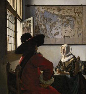
- Johannes Vermeer, “Officer and Laughing Girl”
-
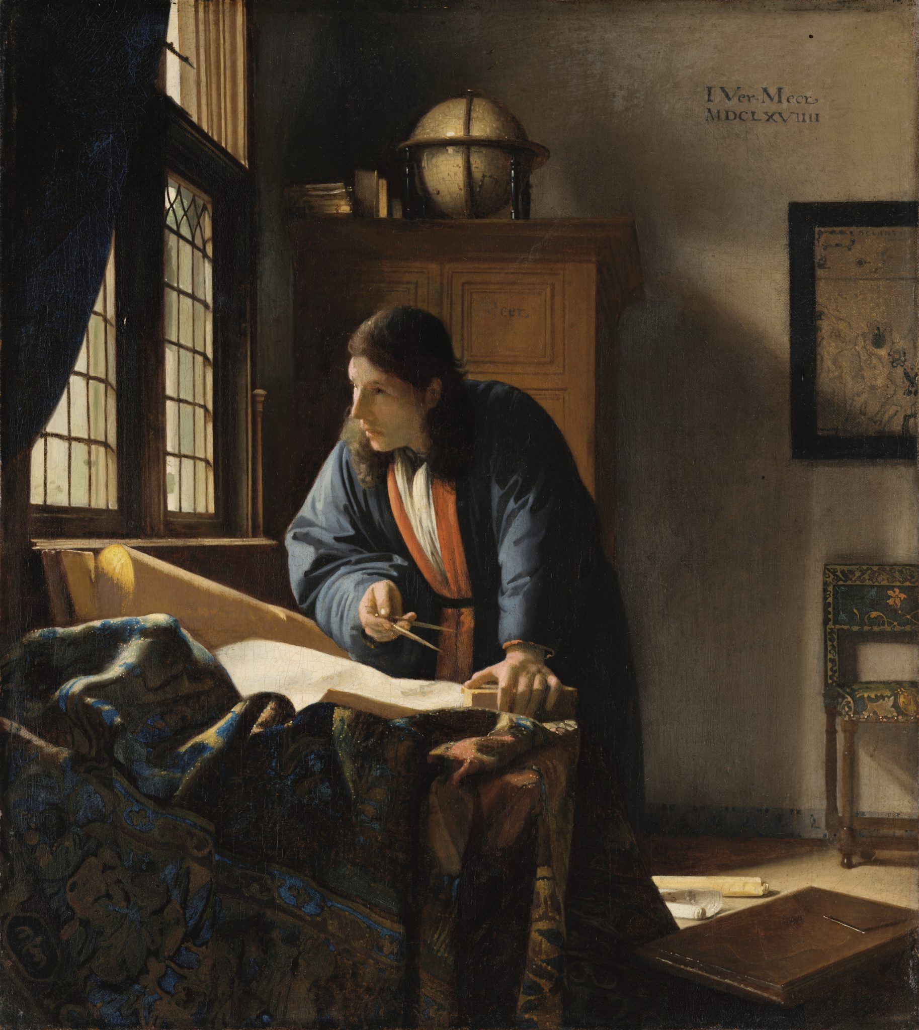
- Johannes Vermeer, “The Geographer”
The Dutch Golden Age’s Great Re-Framing
A year ago we framed a map made in the 1670’s by Willem Blaeu’s son, Joan Blaeu. (Shown below. Read my post about it here.) While choosing cherry for the junior Blaeu’s map, for the older map by his father, we used oak. Why? There’s a remarkable phenomenon in frame history which I became intrigued by in studying Pieter J.J. Van Thiele’s, Framing In the Golden Age: Picture and Frame in 17th Century Holland: an astonishingly sharp line of demarcation that takes place in 1630. Before that date, almost all the frames in the study are oak, while after that year, almost none of them are. (I’d wager that oak frames continued to be popular in rural areas and villages.)
 This was, of course, a transformational age. An exploding merchant class was exploring other lands, their peoples and resources, and forging new, mostly commercial (and not always virtuous) relationships. The unprecedented exploration and engagement brought about radical changes in the Western worldview—”the greatest ever change in the mental outlook of humanity,” according to historian A.C. Grayling. And that deep change happened fast. At the century’s outset, Grayling argues, the worldview of educated and thinking Europeans was still essentially medieval; “by the end of that century it had become modern.” Naturally enough, those shifts in outlook were expressed nowhere more explicitly than in world maps and atlases.
But more generally, nothing is more telling about a people’s worldview and values than what they choose to represent, how they represent those things, and, just as importantly, the settings they provide for those representations. And such matters are especially clear when we look back on times of greatest change. Historians frequently use the term “re-framing” to describe fundamental shifts of perceptions and values; it’s an apt metaphor, since great historical shifts are always, without exception, embodied in significant changes in the character and the art of the picture frame. This includes the kind of material frame makers have used.
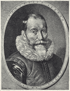
Willem Janszoon Blaeu (1571-1638)
So what does it tell us about the changes being experienced in the Dutch Golden Age that in 1630, the class of people displaying the most pictures abruptly lost their taste for oak—the wood that they had almost invariably favored for their frames—and turned instead to exotic woods like ebony (or fruitwoods, like pear, stained to imitate ebony) and to gilded frames? I’ve never been able to figure out why the change turned on that particular year. Was it just an arbitrary whim of fashion? More likely, the change reflects the speed and character of the rise of modernity. A chief characteristic of modernity, of course, was technological innovation. In 1594, the Dutchman Cornelis Corneliszoon van Uitgeest had come up with the first mechanical sawmill—powered by a windmill, of course. Oak is highly workable. Ebony? Extremely dense, hard and difficult. The ability to saw it mechanically was a breakthrough in its usefulness.
But if ebony was now a practical option, what made the choice so appealing? The medieval world had been literally framed in oak. Not only the picture frames (and the panels on which pictures were painted) but all the buildings and furnishings of that age had been made with the wood most common, most close at hand, most familiar and congenial to the woodworker. The new merchant class, though, perhaps a bit insecure about so much wealth gained so rapidly, wanted to distance itself from the old ways. And how better to define and display newfound status and wealth than to take advantage of new technology and reject lowly local materials in favor of the exotic resources of the global trade by which this rising class was transforming the world and getting rich?
But in 1606 when Willem Blaeu engraved his world map, the world was still made of oak. His son Joan’s world, though, would be different. Unprecedented changes were underway, revealing the Earth and the cosmos as never before. It was an age of inquiry, curiosity, and, not least of all, wonder directly expressed in rich and playful decoration that engages the eye—and the hand of any frame maker fortunate enough to have a chance to provide suitable place for the early maps, and emerging worldview, of the modern age.
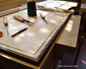
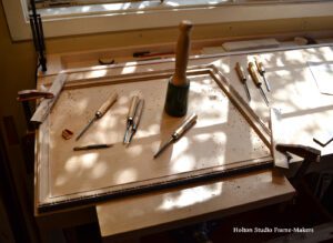
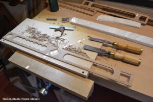
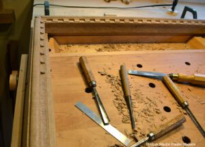
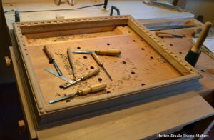
Making the Frame—
Below are pictures of the process.
 At right is the frame after fuming. At this point, I realized I wanted to make a couple of adjustments. As you can see in the drawing shown in one of the pictures above, the plan was to gild the entire inner beaded molding. That, I could now see, would be too much. I also checked how the stones looked in the frame. What you see here is the white onyx we had originally chosen for the long panels, but it was clear that was going to be too bright and contrast too much. So I went on the hunt for a swirly amber stained glass that my customer and I agreed would harmonize with the fumed oak, and fortunately our neighbors at Stained Glass Garden had the perfect thing. The glass’s swirling pattern surrounding the map suggests the Earth’s surrounding ether—the cosmos. I especially like the choice of amber glass and the association of amber with preserving old things.

 UPDATE: Holton Studio was honored to have this job chosen as the Design of the Month in the March issue of our industry’s trade publication, Picture Framing Magazine. We were also honored with pride of place on the issue’s cover.