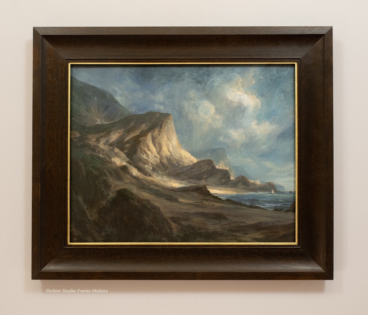
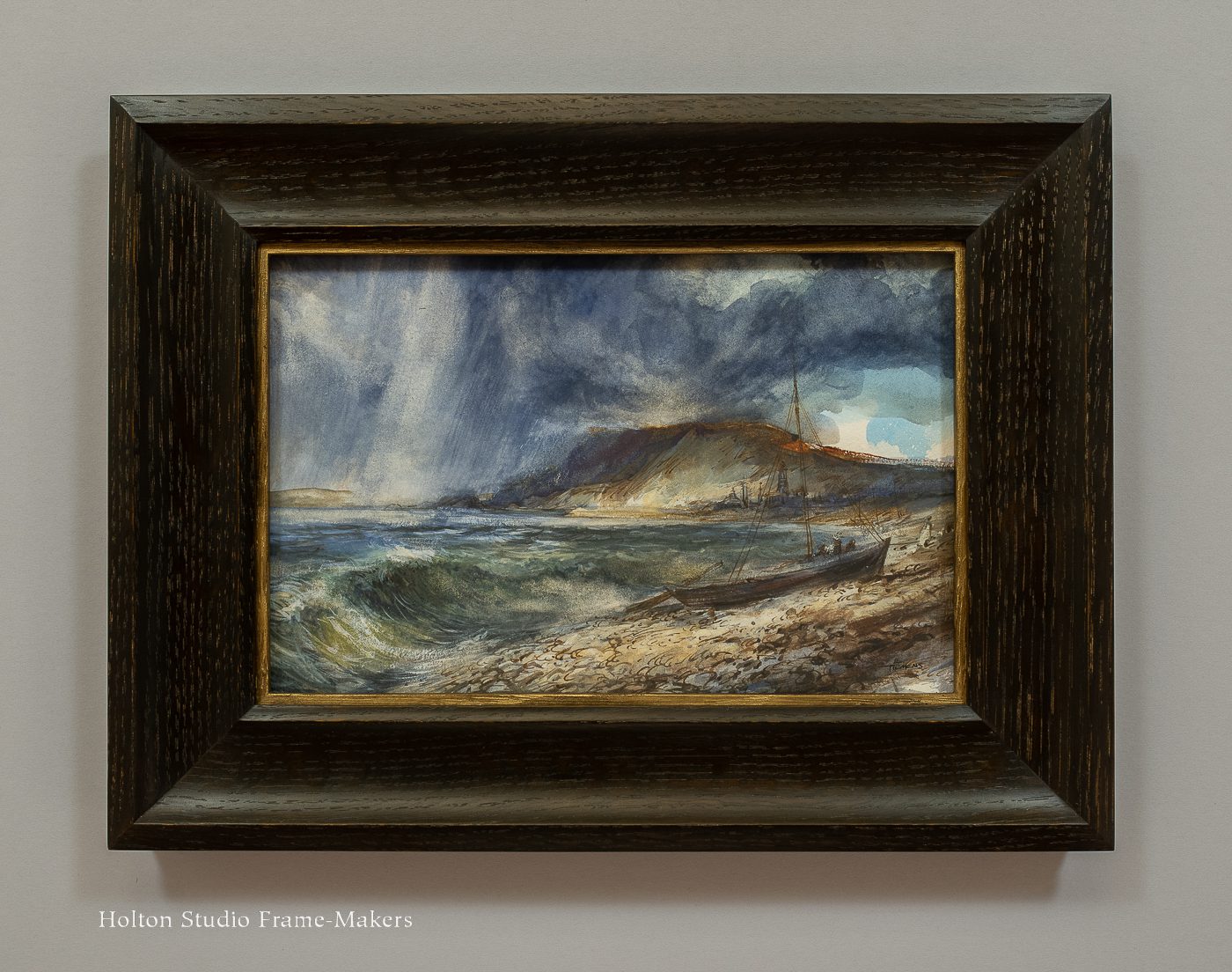
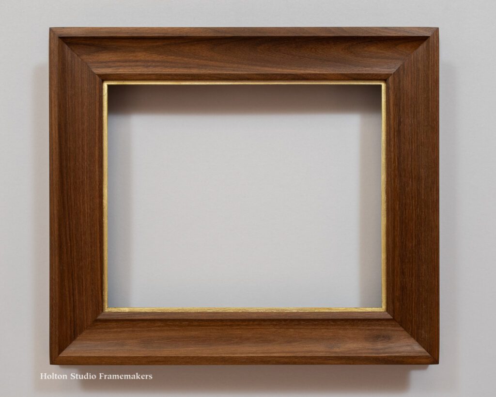
This week we added dozens of frames to our online store. And not only that—the entire inventory of ready-made frames including the new ones, are on sale! We’ve also added a number of frames at a deeper discounts, which you’ll find on our sale page, here. And get another 5% off when you buy three or more frames!
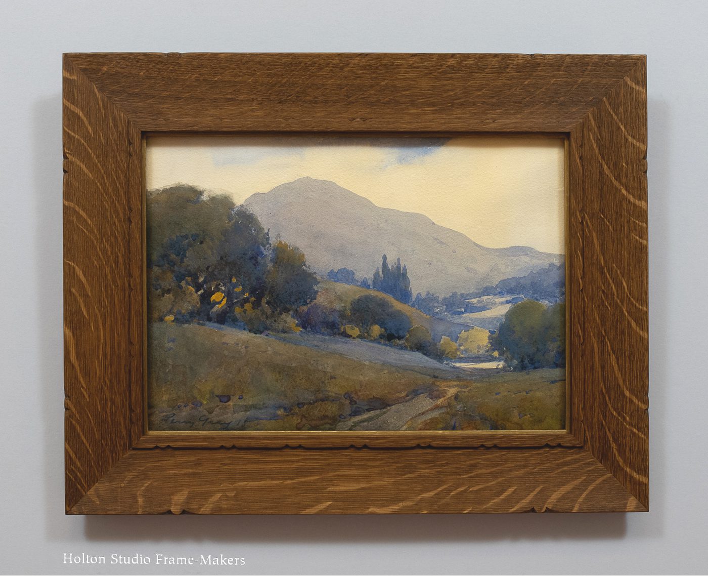
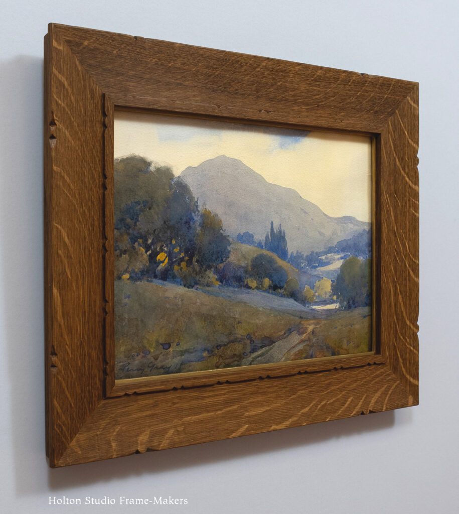
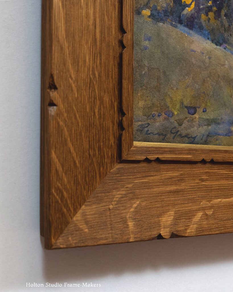
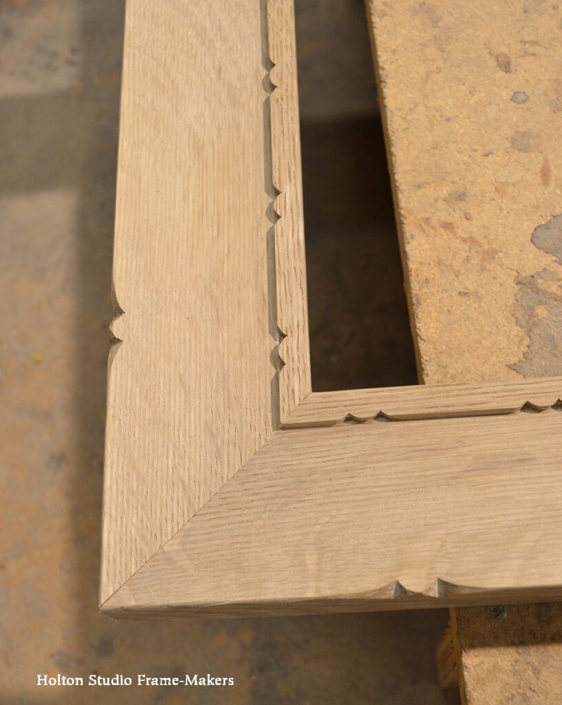
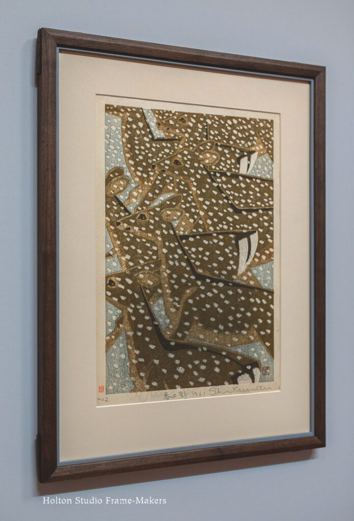
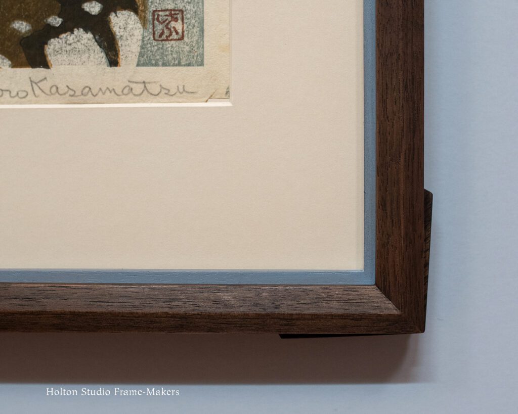
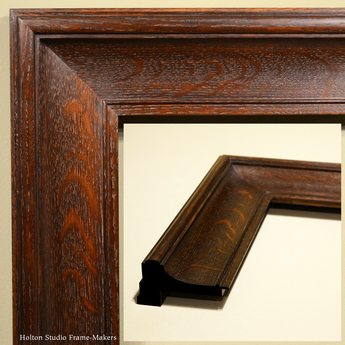
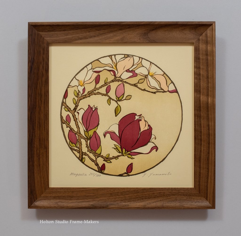
Use the filter to search by size, or for frames for paintings, frames for matted works, diploma and photo frames, etc. We also just added a category for Premium Frames, which includes more elaborate designs like this 18″ x 24″, 4-1/4″ wide carved compound mitered frame in stained walnut with gilt slip.


Purchase this frame here. View the main sale page …


