Video Release: Paul Kratter—Landscape Painting and Design

Gallery favorite Paul Kratter, whom we’ve represented now for twenty years, has another instructional video coming out. It’s called “Landscape Painting and Design.” If you’ve always wanted to come to one of Paul’s demos here at the gallery but couldn’t make it, or you have attended and just want to have that illuminating experience again, here’s your chance. The video, from Eric Rhoads’s Streamline Publishing’s Painttube.tv, will be released this week. Learn more here…  And watch the trailer below:

Watch Paul paint in high speed!—

(And, yes, that’s one of our frames in the background!)

“On the Threshold” Opens Today!

Today’s the day! It’s the opening of “On the Threshold: 3 Women, 3 Mediums, 3 Views,” our show of paintings by standout artists Ellen Howard, Tia Kratter, and Kim Lordier, and we’ll be hosting a reception for the artists from 2 to 4. If you can’t be here in person, though, check it out online—on the show page our main site, our ecommerce site, and on Kim Lordier’s beautiful look book for the show.

But we’d love to see you here in person (nice and cool 70’s temps by the Bay)! Hope you can come!

—Tim HoltonEllen Howard, Tia Kratter, and Kim Lordier

Framing Tia Kratter for “On the Threshold”

Ellen Howard, Tia Kratter, and Kim Lordier

Left to right: Ellen Howard, Tia Kratter, & Kim Lordier

The subtitle of our new show “On the Threshold,” is “3 Women, 3 Mediums, 3 Views.” My last two blog posts featured two of those three women—Ellen Howard, and Kim Lordier. As we approach this Saturday’s opening and artists’ reception—from 2 to 4; I hope you’ll come!—I wanted to turn the spotlight on a piece by the third painter in the group, Tia Kratter.

I especially loved framing “Serengeti Reflections.” The 17″ x 12-1/2″ watercolor shows off the artist’s extraordinary painting skill in regards to handling, suitably enough, both water and color. The vibrant beauty of a traditional African textile (evoking for Tia several memorable trips to Africa) is multiplied and magnified by its distortion through clear liquid and glass—a fairly astonishing technical feat. The rich patterns provided ample inspiration for the frame.

Tia Kratter watercolor, "Serengeti Reflections"The angularity of the picture’s design suggested the molding profile—a slope with a beveled back and chamfered sight edge. The wood for the 2″ frame is mahogany, simply oiled and waxed, except for the sight edge chamfer which Sam painted with dark charcoal grey milk paint. Framed Tia Kratter watercolor, "Serengeti Reflections"I’d been playing around a bit with chip carving, and the zig zag patterns in the painting offered the perfect chance to use a simple carved triangle pattern. I especially like how it complements the angular profile.

“Serengeti Reflections” exemplifies the show’s threshold theme, and Tia’s artist’s statement:

Threshold: that sensitive fine line between abstract and reality; what we think we should see and what is reality. There’s an opportunity to look more carefully at that tipping point; whether it’s a reflection, a play of light, or perhaps the translucency of objects. I aim to look for visuals that blur the line between real and abstraction.

Through a career that began with her studies at the Art Center College of Design in Pasadena and more than three decades working in animation with Disney and Pixar, Tia has honed her skills and artistic sensibilities to an extraordinary degree. In addition to its amazing technique, “Serengeti Reflections” demonstrates another wonderful and distinct aspect of Tia’s work: her unique and compelling compositional sense.

Just finished framing and hanging “On the Threshold: 3 Women, 3 Mediums, 3 Views,” and we are delighted with it. Come to the opening this Saturday, July 22 from 2 to 4 to meet Tia Kratter, Ellen Howard, and Kim Lordier and bask in their beautiful work.

Process shots—


Tia Kratter at work—Tia Kratter

Framing Kim Lordier for “On the Threshold”

“This series of paintings is based on the exploration of dusk to dawn,” Kim Lordier says of her work in our new show opening this coming Saturday. The show is titled “On the Threshold,” and Kim has captured its theme with her representations of “illuminated crossings through a threshold of light and absence of detail.”

Kim Lordier“Intersection,” which is 8″ x 10″, offers just a little taste of the gorgeous grouping of Kim Lordier’s landscapes we’ll have on display. We set it in a 2″ wide mitered mahogany flat which Trevor Davis carved with three fine freehand flutes. A rose gold slip catches the setting sun’s rays.

In the past two decades Kim has steadily risen in her artistry and the esteem of her peers, winning awards—most recently receiving the American Tonalist Society’s Curtis Hanson Best in Show Award at the Salmagundi Club—and being showcased in magazines and online.

“Mother nature is my church,” Kim has said. And indeed, her reverence for the land and the natural creation permeates every picture she makes.

Come meet Kim Lordier at the opening reception for the artists next Saturday from 2 to 4. “On the Threshold: Ellen Howard, Tia Kratter, and Kim Lordier” will run till August 26.

Kim has put up a beautiful digital lookbook for the show here…

See Kim interviewed by Carl Olson on the Artful Painter Podcast…

Kim Lordier portrait

Framing Ellen Howard for “On the Threshold”

A week from Saturday is the opening of our new show, “On the Threshold: Ellen Howard, Tia Kratter, and Kim Lordier,” and we’re framing up a storm. This beautiful autumn scene is Ellen’s “Interconnected,” an oil on panel, 16″ x 20″, which we’ve set in a 3″ wide slope with a carved sight edge (No. 2.4 CV) in quartersawn white oak with Medieval Oak stain.

In this show featuring three women, three mediums, three views, each artist explores the threshold theme. For Ellen Howard, it’s about seasons:

The threshold of each new season is a space in time for us to look at what has been and what is to come. The paintings in this show represent my creative journey, from the quiet dormancy of winter to the exuberance of spring, vitality of summer and the warm comforts of fall. Painting through the seasons allows me to boldly embrace change and listen deeply with intention to my creative calling.

Ellen Howard painting in aspensEllen explains her attraction to aspens:

The aspens are considered a single organism connected through a shared root system. They are also important for biodiversity. They provide a habitat for a variety of animals, nesting sites, and food sources. These trees are considered sacred to indigenous communities too. Lastly, they are gorgeous trees—seeing the bright yellow-orange leaves makes people happy and I love seeing the leaves in the wind. The leaves twinkle like being in a fairyland.

These reflections Ellen expresses in “Interconnected”:

I wanted to portray the intricate web of relationships and interdependencies that define our existence through the beauty of the aspen trees. I enjoyed working with a higher-key palette and mixing the variety of vibrant yellows and oranges occurring in the vast aspen groves. This palette reminds me of the comforts of home and the subtle changes in our environment as we say goodbye to summer and welcome the slower pace of the fall season. My hope for this piece is that it serves as a reminder of the interconnectedness of humanity and our shared responsibility to protect and cherish our planet. It invites contemplation and reflection, prompting a deeper appreciation for the delicate balance and beauty that surrounds us.

Again, “On the Threshold” opens Saturday, July 22 with an opening reception from 2-4, and runs to August 26. The exhibit’s webpage, which will eventually show all the works, is here.

View Ellen’s page…

Ellen Howard in the aspens

Ellen Howard frame by aspens, and photographed by her good friend Kim Lordier

Framing Hedwig Casprzig’s Big Cats

Hedwig Casprzig (1886 – 1958) was an outstanding German wildlife painter. We recently had the honor of framing two of the artist’s paintings of big cats. The first one here, a lion’s head Casprzig painted in oil on canvas, is 25-1/2″ x 21″. The 5″ wide frame is in quartersawn white oak with Medieval Oak stain. The compound Aurora frame combines a broad mortise and tenon flat with a 1-1/4″ wide carved beveled sight edge molding and a 3/16″ gilt slip. I like the way the picture frame repeats the how the mane of the male lion frames its face.Casprzig painting of lion head

This tiger head, a pastel on paper, is a bit smaller (about 13″ x 11″) but even more intense in expression. I chose a 3″ wide slope, No. 22.6 CV, to sustain the feeling of the cat coming at you.

Casprzig painting of tiger headH. Casprzig painting of tiger head

Debey Zito and Terry Schmitt

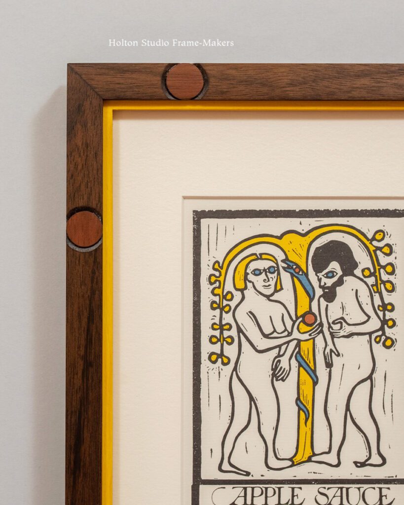
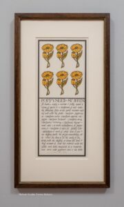
There’s a key principle of the Arts and Crafts Movement that few artisans fully grasp; and of those who have, even fewer have pursued and found the opportunities to apply their understanding. That principle is the unity of the arts, and it’s only at the architectural scale, in the collaboration of many trades, that one is able to fully express that ideal. But it requires more than design to accomplish. The interior designer or architect, at least in my experience, must also be an accomplished artisan. Because truly fulfilling the ideal of the unity of the arts requires both a comprehensive view of the project and a facility with detail—a facility at that particular level that only an artisan is truly engaged with.

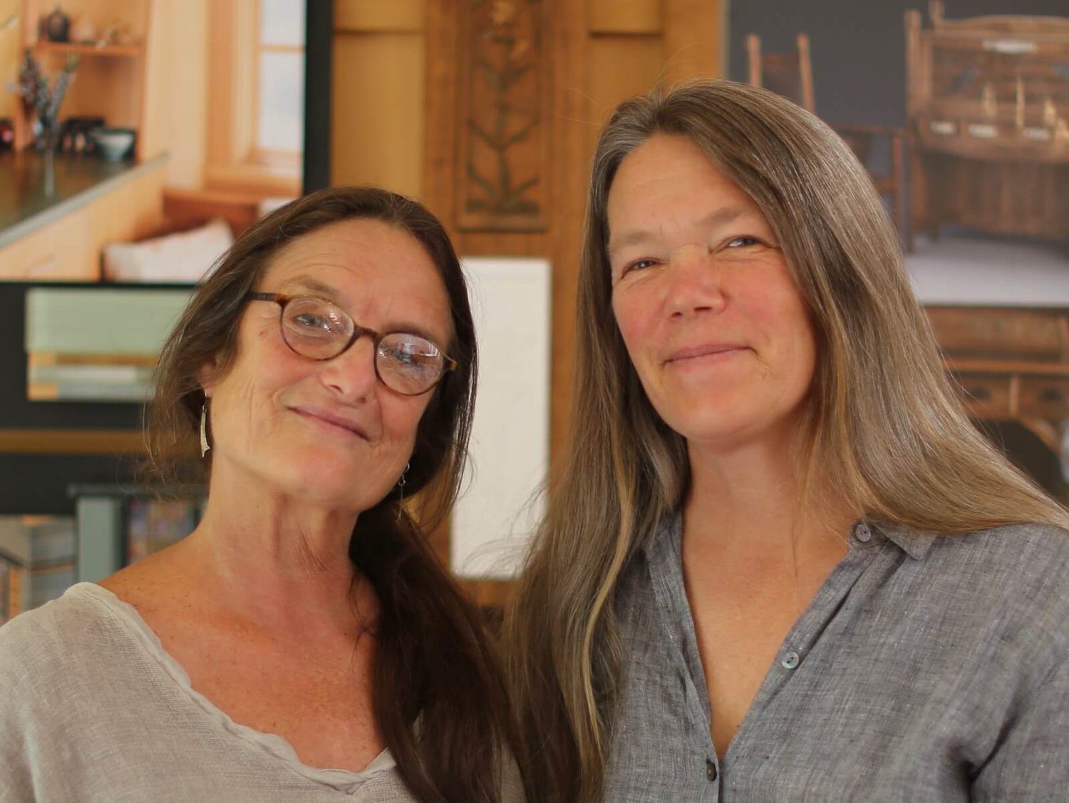
Zito Schmitt Design, the work of Debey Zito and Terry Schmitt, fits that bill. Debey started her studio in San Francisco in 1980 building furniture, but also immersing herself in architecture and interiors. Terry Schmitt came on as an apprentice, bringing carpentry skills and fine art training as a student at San Francisco State. Discovering carving tools at Debey’s studio, she now especially excels in woodcarving, which is often painted. With those indispensable backgrounds, the team now focuses on interior design, which, as they say on their website, “is a collaborative process, working closely with clients, builders, consultants, fabricators, and artists.”

If you’re considering building or remodeling and would like to have the project guided by the timeless spirit of the Arts and Crafts Movement—a collaborative, comprehensive design sensibility grounded in masterful handcraft—I whole-heartedly recommend Debey Zito and Terry Schmitt, and Zito Schmitt Design.

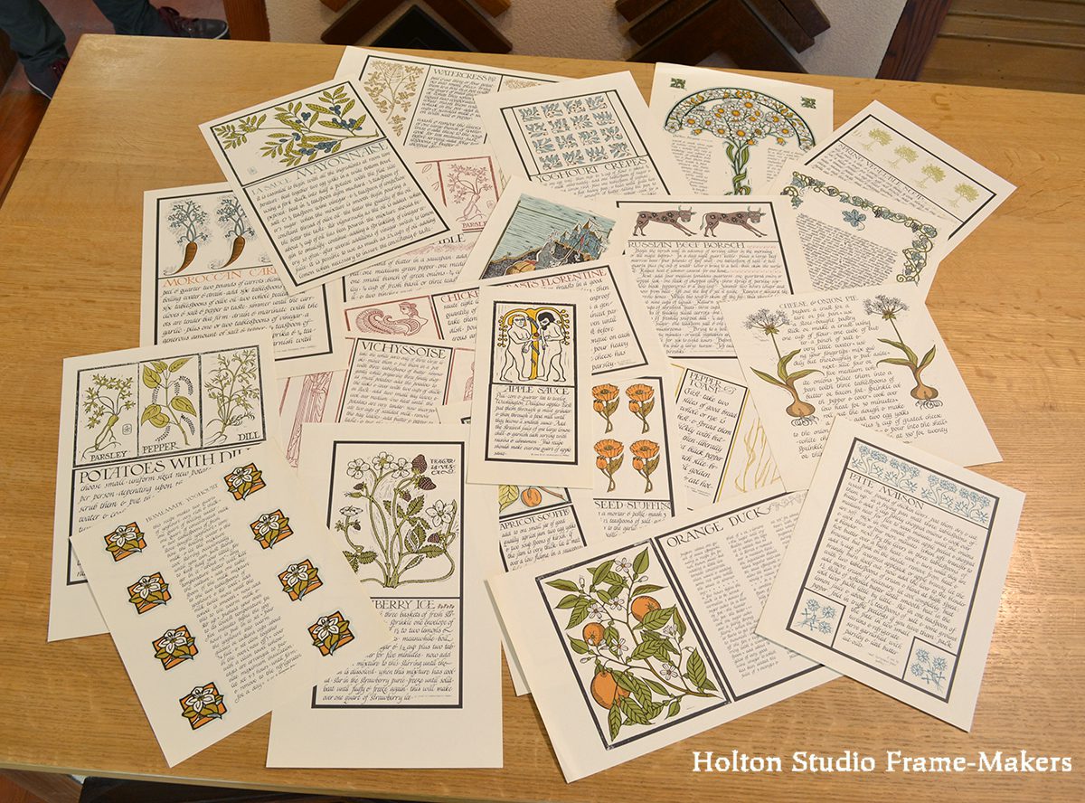
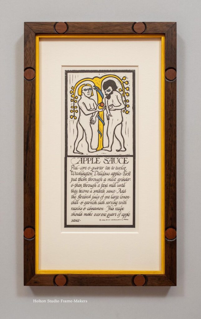
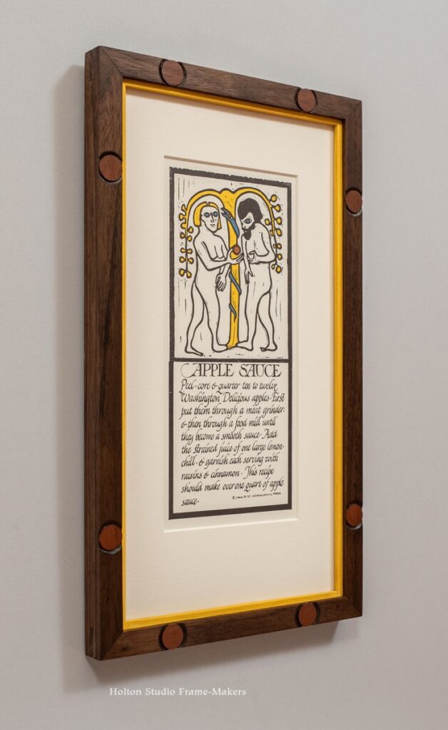
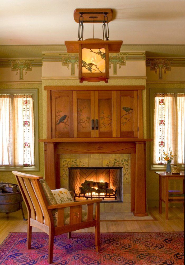
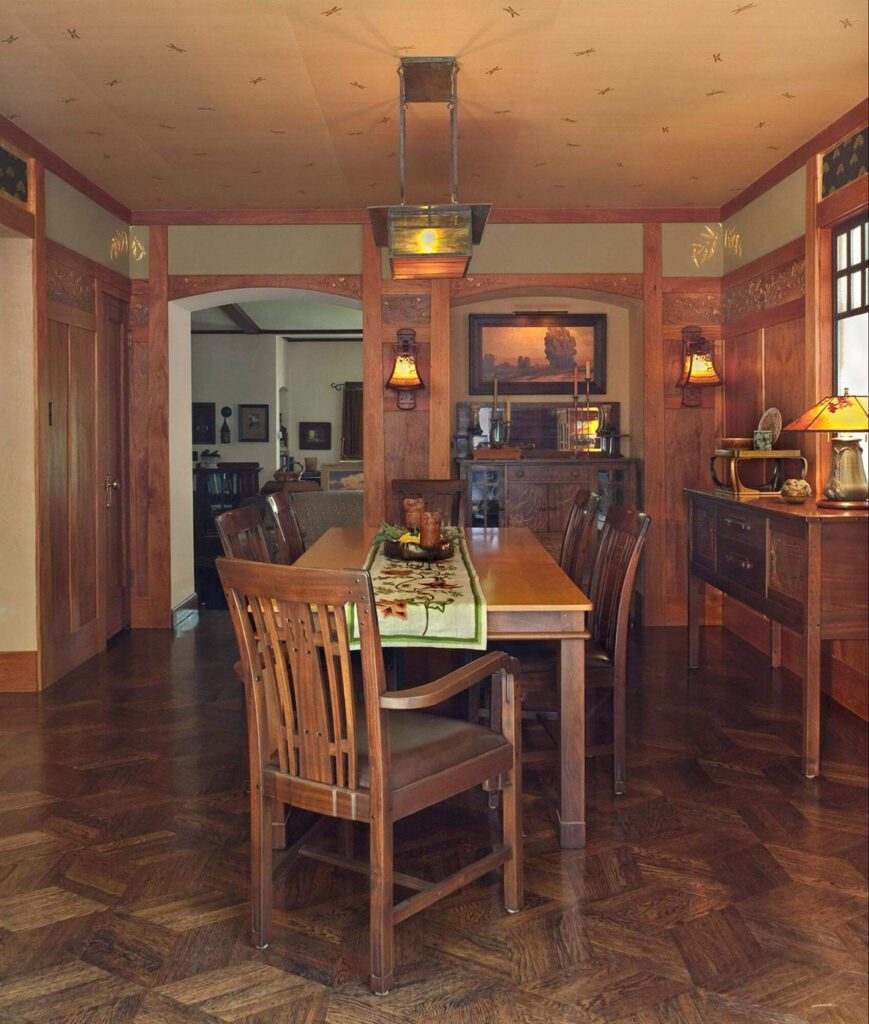
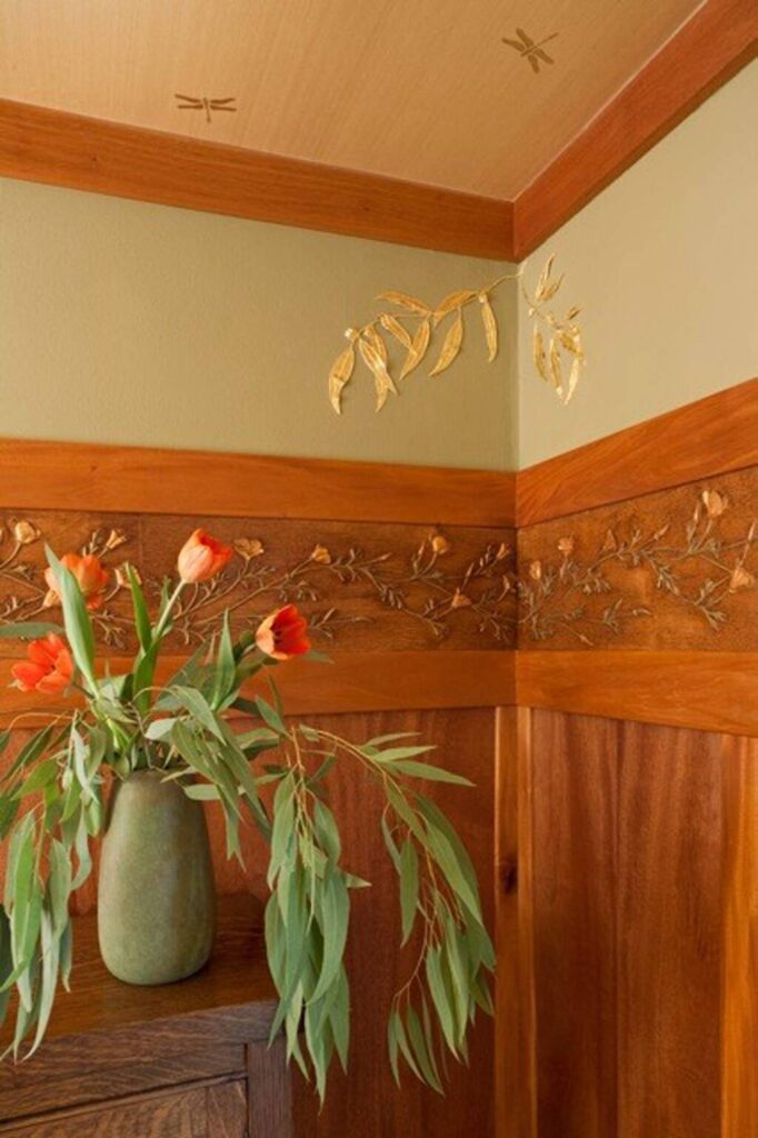
A sampling of interiors by Zito Schmitt Design—

Find more at ZitoSchmittDesign.com.

Zito Schmitt Voysey fireplaceZito Schmitt dining roomZito Schmitt dining room detail

More at ZitoSchmittDesign.com.

Selected Press:

The Press Democrat, “Sebastopol woman creates magic in wood” by Meg Mcconahey, January 9th, 2015

Curbed, “Nationally-renowned, intricate woodworking has roots in Bay Area” by Daphne White, December 27th, 2019

Sonoma West Marketplace, “West County woodworkers draw on nature for heritage works of art” by David Abbott, April 13th, 2016

Apple Sauce, Suitably Framed

Yesterday I posted (here) about the David Lance Goines woodcut prints we’re offering, all from “Thirty Recipes Suitable for Framing,” which Goines did with his friend Alice Waters around 1970—Goines & Waters, array of 22 prints from "Thirty Recipes Suitable for Framing"just as she was about to open her now world-renowned restaurant, Chez Panisse. I can show you how one of those, “Apple Sauce,” (right in the center of the array posted yesterday and shown at right) may be framed because a customer brought us another impression of it last year. For him, we matted the 9″ x 4″ print and set it in a flat 5/8″ walnut frame with carved and painted circles repeating the central motif of the print. A cheerful (hey, at least we got apple sauce in the bargain) yellow slip matches the tree of knowledge and Eve’s hair.

After yesterday’s post, we sold a few, but still have “Apple Sauce” and 17 (at this writing) other prints from “Thirty Recipes Suitable for Framing,” available for $90 each.

More posts on the late David Lance Goines can be found here, here, and here. We also have two beautifully framed Goines posters here.

David Goines-Alice Waters Recipes Suitable for Framing

Several months ago we came into a set of the beautiful woodcuts that the late graphic artist and printer David Lance Goines produced around 1970 illustrating recipes by his one-time girlfriend and famed chef Alice Waters of Chez Panisse. The complete folio is titled “Thirty Recipes Suitable for Framing,” and our set included all but one. (The missing one, sadly, was “Chocolate Mousse”!). We’ve sold several, but still have 22, offered for $90 each.

They’re not only suitable for framing but also, being smaller than 16″ x 20″, are suitable for Everyday Framing—our simple, discounted approach. Or do something more special, like we did with “Poppyseed Stuffing,” below, framed in a No. 16 CV in walnut with painted sight edge. (A customer brought us the one below a while back; we have another of these in our set.) Or pull out the stops completely as we did with “Cherries Jubilee.”

If you can’t swing by the shop to have a look, feel free to call or email us and we can send you a list of the prints, as well as images of them and framing suggestions.