Framing Chiura Obata

With our current exhibit of watercolors by Robert Tetlow and our launch this week of the expansive catalog page, “Mitered Frames—Special Corners,” I’ve been posting all week examples of that medium framed in the sorts of frames featured on the new page. Here’s one last such example, a marvelous figurative work, dated 1939 and measuring 15″ x 20″, by one of Berkeley’s notable citizens. Like Robert Tetlow, this painter, Chiura Obata (1885-1975) taught at UC Berkeley—although his career was interrupted by the shameful internment of Japanese-Americans during the Second World War.

Hasui frame corner detail on Chiura Obata painting

The frame, which we call the Hasui, is in a 3/4″ profile in walnut with a black wash, and has a black slip. The rounded corners have proud splines (detail at right). The profile has a round-over on both the inside and outside edges. So the soft shape of the whole form of the frame harmonizes with the round forms of the figure.

I like the proportions of the frame, slip and matting. The mat is narrower than I normally use, but felt right given all the negative space the painter left around the subject.

I’m pleased to see that next weekend the Crocker Museum in Sacramento is opening an exhibition, “Chiura Obata: An American Modern,” to run from June 23 to September 29, 2019.

Another Obata we framed several years ago, this one in a Yoshida frame, is shown below. And finally, I had to include another wonderful figurative piece from the 1930’s, found on the Crocker Museum’s blog, of students on the UC campus.


Chiura Obata, Untitled (UC Berkeley Students), ca. 1930s. Ink on paper, 15 1/2 x 20 3/4 in. Private Collection.

Framing HW Hansen in a Mitered Frame with Special Corners

When it comes to framing watercolors in frames with special corners—which we’re featuring this week with our Robert Tetlow watercolor exhibit up and our new catalog page, “Mitered Frames—Special Corners”—I can’t resist re-posting a job that is my all time favorite example of that sort of piece.

Corner detail

Corner detail

This one’s by German-born Herman Wendelborg Hansen (1853-1924), who came to California and settled in San Francisco in the 1880’s. There he befriended notables like William Keith and Maynard Dixon. He was also the father of Armin Hansen, the more famous California Impressionist.

Read more on the original post…

Check out the new catalog page, “Mitered Frames—Special Corners”…

HW Hansen, "At the Round-up,"

Historical watercolor by HW Hansen, “At the Round-up,” framed close in walnut cove frame with carved corners and pale gold slip.


Framing Watercolors: A Way In to the Wilderness of James Everett Stuart

With our little exhibit of watercolors by Robert Tetlow as well as having just launched the new catalog page, Mitered Frames—Special Corners, this week I’m posting examples of watercolors in frames with special corners. One of the frames shown on the new page is on this 10″ x 14″ historical watercolor of Mount Ranier, by James Everett Stuart (1852 – 1941). The simple cove frame is in a 2-5/8″ profile, and has a 1/8″ gilt slip. The painting’s lovely rose-y cast suggested a wood with the warm native tones of cherry. The tracks through the snow are key to the composition and to what makes the painting attractive, because they are the path of another human being in this wild landscape and naturally we want to follow them. Such paintings were, of course, often made to offer the wider world world a view and access—a way in—to the spectacular scenery of the Far West. The tracks make the painting more than that of a mountain; they make it about our relationship to the mountain; it’s the timeless “protection and prospect” principle. Given their significance, then, those simple but suggestive lines provided me a suitable pattern for carving on the frame—something else that takes us into the scene.

Corner detail

The corners interrupt the lines with a simple scallop pattern further accentuating the fine line work of the painting.

Not all watercolors so delicately rendered benefit from being framed close, and some people might opt to mat it. But my feeling was that, subtle though the execution of the picture is, the simple composition and massive subject matter give it the presence of an oil painting and allow the opportunity for the directness and unity that framing close provides—as long as the frame is simple and made in sympathy with the watercolor’s fineness of detail.

Below is a tiny 7″ x 5″ Grace Carpenter Hudson oil painting in a similar, but simpler, frame (without the set of lines near the sight edge). This one is also very delicately rendered. In this case, the fine lines work with the child’s pinstriped dress.


Carving on the Stuart frame, just completed, before staining

New Catalog Section Just Added: Mitered Frames—Special Corners

We’ve just added a new section to A Frame-Maker’s Catalog for frame designs that take advantage of the decorative possibilities inherent in the joints of mitered frames: “Mitered Frames—Special Corners.”

The page offers “examples of mitered frame designs featuring decorative corners, emphasizing a key source of the frame’s artistic beauty: the constructive significance of its joints. The infinite range of decorative opportunities the corners of the frame present is one of the great benefits of closed-corner frames. For good reason, picture frame makers have traditionally found their chief expressive power in embellishing the frame’s corners to emphasize the frame’s protective duty and function, as well as its unifying compositional role—the elemental artistic concern for unity being ultimately in the physical integrity of the frame and the evident care in how it’s put together.” View “Mitered Frames—Special Corners.”


Some process shots of Mitered Frames with special corners—

“Historic Views of San Francisco Bay” Opens Today at North Point Gallery

Yesterday I popped into North Point Gallery to get a sneak preview of their show opening today, and I can tell you that it is an absolutely wonderful display that will lift the spirits of anyone who loves the Bay we live on.

Alfred Farnsworth (1858-1908), “Mt Tamalpais from Richardson Bay,” 1906. Watercolor, 10-1/2” x 21”.

With some works on loan and not for sale (including the beautiful Alfred Farnsworth watercolor we framed for North Point a few years ago, right), the show amounts to a small and select museum exhibition. Curated by gallery owner and leading California art historian, Alfred Harrison, “Historic Views of San Francisco Bay and The Golden Gate” includes great historical paintings by notables like Raymond Dabb Yelland (1848-1900), Marianne Mathieu (1827 – 1897), Gideon Jacques Denny (1830 – 1886), and Theodore Wores (1859-1939). But one painting alone is worth a trip to the gallery: this large (24″ x 48″) canvas, below, painted in 1890 by William A. Coulter. It may well be the best nineteenth century painting of the Bay that you’ll ever see. This piece has already been sold, so the current exhibition will probably be your only chance to see it in person.

The show opens today, with a reception from 3 to 5, and runs through June 29. North Point Gallery is at 2247 Fifth Street.

And while you’re in the neighborhood, swing by to see us!

William A. Coulter (1849-1936), “San Francisco Bay,” 1890. Oil on canvas, 24″ x 48″.

Framing Alexander Harmer

With our current small exhibit of watercolors by Robert Tetlow, we’re emphasizing that medium this month. Thanks to our kind neighbors at North Point Gallery, we’ve borrowed and are also showing this exquisitely painted and historically notable watercolor which we framed for them last summer. It’s a depiction painted around 1890 of Mission San Gabriel California by early Santa Barbara artist Alexander Harmer (1856-1925). I’m especially pleased with the harmony of the profile with the painting’s perspective and refinement.

Alexander Harmer (1856 – 1925), “Mission San Gabriel,” n.d. Watercolor and gouache, 10″ x 17″.

The 10″ x  17″ painting is in a compound mitered frame, No. 208 + Cap 328, 3″ wide, with a gilt slip to provide emphasis and echo the sunlight. The wood is quartersawn white oak with Medieval Oak stain.

It’s an honor to frame a work by an artist the California painting authority Edan Hughes wrote “is considered Southern California’s first great painter of the 19th century.” Born in New Jersey, Harmer first came west to fight in the cavalry against the Apache and from that experience contributed illustrations to Harper’s Weekly. After studying at the Pennsylvania School of Fine Arts in Philadelphia with Thomas Eakins and Thomas Anshutz, he came back out West and settled in Santa Barbara in 1890, about the time this painted was done. California’s missions were a favorite subject of Harmer’s, so this is an exemplary work.

The important Southern California writer and editor Charles Lummis (1859-1928) said of his friend Harmer,

Whether by shrewd deliberation or by natural gravitation, Alexander Harmer has made a field (of art) peculiarly his own. No other painter has given so much attention to the Californio of the old times—and for that matter, no other painter knows the subject one-half as well.

More about Alexander Harmer here and here…

More about this frame…

Framing a Francis Luis Mora Watercolor

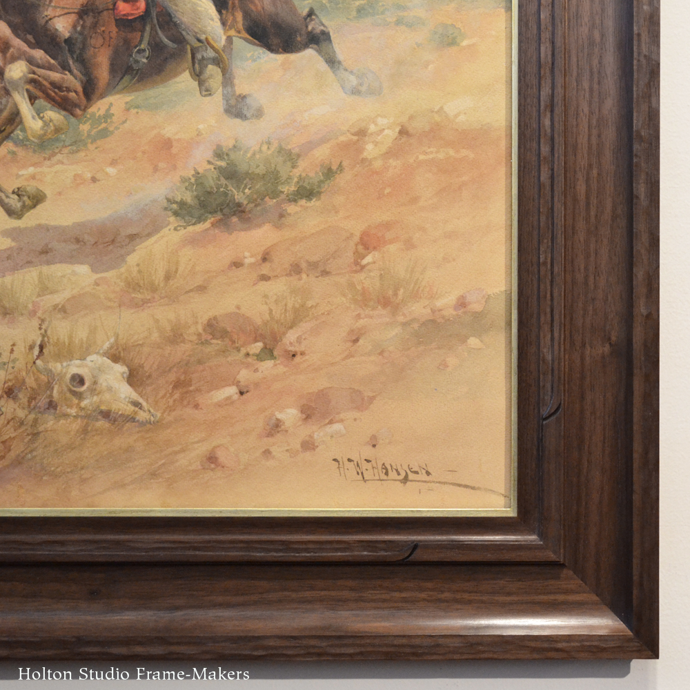
In preparation for my talk tomorrow, “A Frame-Maker’s Approach to Framing Watercolors,” I’m posting this delightfully festive, early twentieth century impressionist watercolor, “Santa Fe Race Scene.” The artist is the noted Hispanic-American painter, illustrator, muralist, and teacher Francis Luis Mora (1874-1940). We framed this one a number of years ago, but it’s such an appealing piece and I’ve always been pleased with the framing.

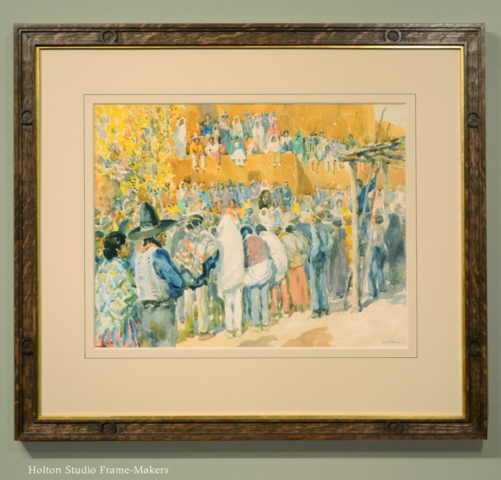
F. Luis Mora, Santa Fe race scene

The Frame

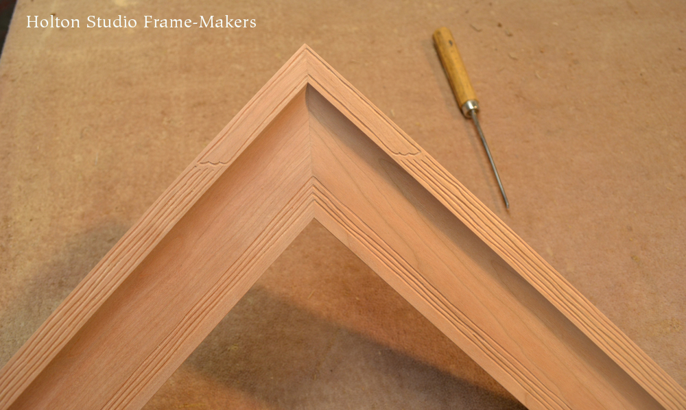
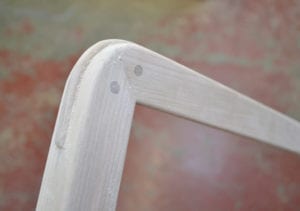
The frame, which is 1-1/4″ wide, is made in quartersawn white oak with a Weathered Oak stain, and has a gilt slip repeating the yellows of the sun-drenched day. For such a loose, impressionistic painting which is less concerned with line or depicting three-dimensional form than it is in the dance of color and pattern, I used a less formal or refined profile. (Mora’s self-portrait at the bottom of this post, for example, would call for a more formal frame profile, such as a cove or ogee, to suit the subtle rendering of the figure.) The texture of the carved surfaces of the molding echo the painting technique. The carved circles near the corners give emphasis to the frame’s joints and provide a suitably simple decorative motif to celebrate the picture and echo all the circles used to render the heads and faces in the crowd, many framed by serapes. For a picture capturing the life of a culture that hasn’t lost the instinct to decorate its arts, decoration in the frame feels necessary. In fact, the absence of decoration might have actually felt incongruous.

Matting and Framing Close

A Japanese watercolor framed close, subject of yesterday’s post.

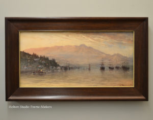
One thing I’ll discuss in tomorrow’s presentation is the choice between matting watercolors and framing them “close”—i.e., without a visible mat. Yesterday’s post, in contrast to today’s, showed a watercolor framed close in a relatively wide frame (right). In framing pictures in general, the rule of thumb is to either use no mat and a wide frame or a mat with a narrow frame. A wide frame outside a wide mat is too dominant and pulls the eye away from the picture, whereas a narrow frame remains visually subordinate. In any case, the pleasing and compelling window effect of a wide frame used close is largely lost once there’s a mat. When matted, the picture’s role in the decor of a room becomes less architectural and more decorative, if you will. But in any case, the goal, as always, is to connect, not separate, the picture from its larger setting.

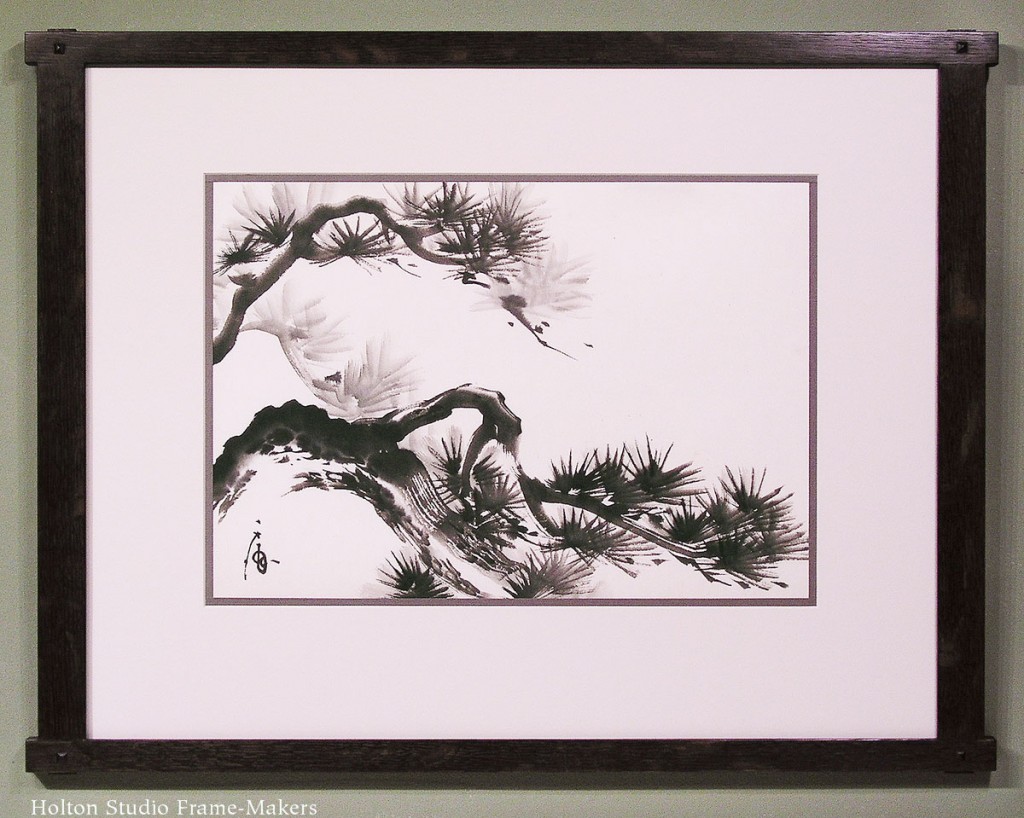
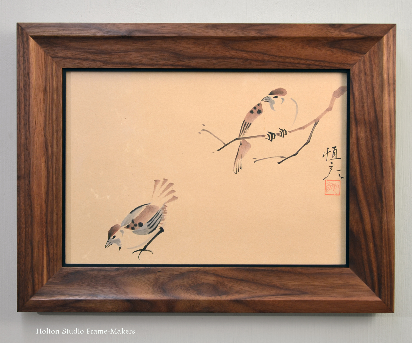
Watercolors present an excellent opportunity to discuss this fundamental problem in framing because, whereas other media—including traditional Japanese block prints, the topic of a parallel talk I gave in March—can, as a rule, be said to call for one or the other approach, in the case of watercolors it depends entirely on the particular picture. The Japanese painting of two birds, yesterday’s example, was very simple and had a great deal of space around the subjects, whereas the Mora, above, is very busy, and the painting fills the picture area. The image’s density and busy-ness benefits from the complementary blank space the mat provides. Also, the medium of watercolor is significantly more delicate than oil paint, and is easily overwhelmed by a wide frame. In addition, we’re almost always seeing the paper through the paint, and paper is a more delicate support than canvas or wood; and is, in any case, basically the same material as mat board and therefore naturally harmonizes with a mat. On a busy picture like the Mora, a problem with a plain mat can be that, while it provides needed quiet surrounding space, the eye seems to want a harder line to “contain” the action. But this can be provided, as we did on the Mora, by an ink line just outside the mat window. (An ink line is also consistent and harmonious with the medium of the picture.) A painted bevel or the deeper bevel of an 8- or 12-ply mat can also provide this line. Otherwise, the mat should be plain so that it provides a “space of silence” which many pictures need to allow the eye to dwell on them.

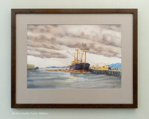
Robert Tetlow (1922-1988), Loading Fir Logs, 1974. Watercolor, 14 1/2″ x 21 1/2.”

If the decision is made to mat the picture, the choice of mat color becomes a crucial question. The mat strongly effects the viewer’s perception of color and value in the picture, as well as the eye’s natural attraction to the picture. The eye goes to light, color intensity, and contrast. There is a distinct sensation of relaxation in the eyes when the right mat is found, because the mat is neutral in relation to the colors and values in the picture. Most people grasp the idea of a mat being neutral, but don’t understand that that means careful selection based on and within the terms of the color scheme of the picture. The most common example of this mistake is believing that the most neutral color for a mat is white, when in fact white is at the extreme end of the value spectrum. Therefore, in most cases (but not always), a white mat pulls the eye from the picture as well as throws off the value balance the artist created. It also, by complement, over-emphasizes the picture’s dark tones. In respect to value and color, the mat should occupy the middle, the balancing point, you might say, of the picture’s color and value scheme.

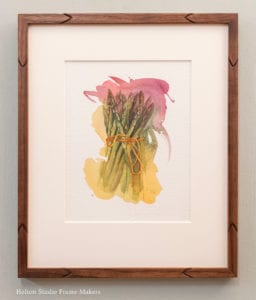
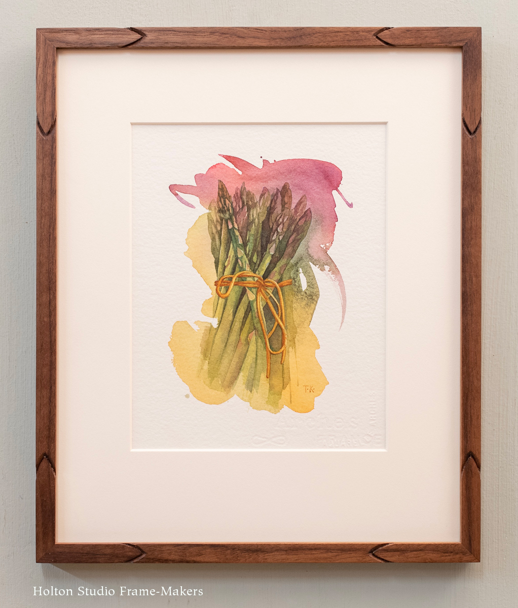
Asparagus, 7″ x 5″ (image size), watercolor on paper. $495.

The common exception is that of watercolors on white paper that leave much of the paper exposed. In those cases, like the Tia Kratter painting at right, the white mat is the best choice, and simply extends and enlarges the piece.

But more discussion of all that in the presentation.

Saturday’s talk is at 3:00, followed by an opening reception from 4:00 to 6:00 for our exhibit Robert Tetlow (1922-1988): A Berkeley Watercolorist Rediscovered and Remembered. I hope you’ll come!


Learn more about F. Luis Mora

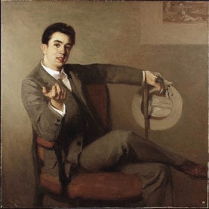
F. Luis Mora self-portrait

According to Wikipedia, “Mora is known for his attempts to translate the techniques of the Spanish Old Masters to a modern American idiom.” Read more…

Visit fluismora.org…


A Frame Is a Kind of Nest

This Saturday here at the gallery prior to the opening of our show of watercolors by Robert Tetlow, I’ll be giving a talk called “A Frame-Maker’s Approach to Framing Watercolors.” I’d forgotten about this lovely mid-century Japanese watercolor we framed a couple of years ago, but stumbled on it while preparing my presentation. The piece is 9″ x 13″, and the profile of the walnut frame is 2″ wide, with a 1/8″ black slip. The shape of the profile had to be simple for such a simple and spare composition. I took my cue for the form from the branch the one bird is perched on. Another way to do that would have been through use of line, carving it into the frame or an element of the profile. But using the branch’s form in the other dimension led to the feeling of the frame as a sort of nest, with a gentle cove and slope into the picture combined with a sturdy outer edge.

A nest is a suitable model and metaphor both for the protective and caring role a frame plays with respect to any picture, but of course especially for the subject of this particular picture.

In any case, the frame had to be simple to suit the mood of the two subjects, unrushed, comfortable and content in each other’s company—at home in their nest (as any picture should be in its frame). Otherwise, the beauty of the frame is in the wood, amplifying the love of nature the picture expresses, its natural walnut color (the wood is simply oiled) matching the walnut hues in the picture. Original paintings always put us in closest contact with the skill and artistic powers of the painter, and so the careful workmanship in the frame too is part of the harmony we were after, as well as evidence, to anyone who stops to look at it (which framing any picture encourages people to do), that someone cares deeply about the picture and, for all its simplicity, the profound happiness it offers.

I learned recently about the Japanese concept of ikigai, which many believe accounts for the extraordinarily long lifespans of some populations in Japan, notably those on the islands of Okinawa. “Ikigai” translates to “reason to live.” There are several factors believed to contribute to the longevity of Okinawans, but this philosophy and practice of focusing attention on the things that matter deeply as the very reasons for living, creating a powerful desire to live, seems to play a role impossible to ignore.

In this simple image are at least three things so profoundly and inherently meaningful that they could be said, if we pause to truly see and consider them, to constitute reasons for living: examples of nature’s wonderful creation; the subtly comfortable relationship between the two creatures, clearly mates; and the work itself as that of a skilled and expert artistic hand.

At the root of the entire purpose of the frame-maker is the spirit of ikigai—paying sustained attention to and caring for the important things in life, our very reasons for living.

I hope you’ll come to this Saturday’s presentation, “A Frame-Maker’s Approach to Framing Watercolors,” at 3:00 and the opening for the show, “Robert Tetlow (1922-1988): A Berkeley Watercolorist Rediscovered and Remembered,” from 4 to 6.


An Exhibit of Watercolors by Robert Tetlow

We’re looking forward to the opening next Saturday of our exhibit, “Robert Tetlow (1922-1988): A Berkeley Watercolorist Rediscovered and Remembered.” Tetlow taught Landscape Architecture at the UC Berkeley Schools of Environmental Design, and is also known for designing the Strybing Botanical Garden in Golden Gate Park. A teacher of rendering at Berkeley, he accomplished much as a watercolorist, exhibiting in numerous shows during his lifetime. We’re quite proud to show these excellent examples of Tetlow’s work.

Below are three we framed. Most of the works will be shown in mats only, with prices ranging from $600 to $800.  View the exhibit’s page…

The Saturday, June 1 opening is from 4 to 6. Prior to the event, Tim will give a talk, “A Frame-Maker’s Approach to Framing Watercolors.” We hope you’ll come!

Loading Fir Logs, 1974, 14 1/2″ x 21 1/2.” $1,250. 

Vinalhaven, Maine, 1988. 14″ x 21.” $1,250.

Launch For Hire (“Inverness, California”), 11″ x 19.” $1,150.