An Exhibit of Watercolors by Robert Tetlow

We’re looking forward to the opening next Saturday of our exhibit, “Robert Tetlow (1922-1988): A Berkeley Watercolorist Rediscovered and Remembered.” Tetlow taught Landscape Architecture at the UC Berkeley Schools of Environmental Design, and is also known for designing the Strybing Botanical Garden in Golden Gate Park. A teacher of rendering at Berkeley, he accomplished much as a watercolorist, exhibiting in numerous shows during his lifetime. We’re quite proud to show these excellent examples of Tetlow’s work.

Below are three we framed. Most of the works will be shown in mats only, with prices ranging from $600 to $800.  View the exhibit’s page…

The Saturday, June 1 opening is from 4 to 6. Prior to the event, Tim will give a talk, “A Frame-Maker’s Approach to Framing Watercolors.” We hope you’ll come!

Loading Fir Logs, 1974, 14 1/2″ x 21 1/2.” $1,250. 

Vinalhaven, Maine, 1988. 14″ x 21.” $1,250.

Launch For Hire (“Inverness, California”), 11″ x 19.” $1,150.

On the Corner: New Thoughts on Closed-Corner Frames

In preparation to launch a new section of the catalog, “Mitered Frames—Special Corners,” I had a fresh look at the page “Closed-Corner Frames”, which explains one of the most fundamental aspects of our work, and found it needed sprucing up. So I added a couple of images and the copy below:

Look no further than the entry for the word “art” in Webster’s Dictionary to understand this elemental relationship between construction and beauty: the base of the word art is “ar-, to join, fit together,” and is “akin to Greek harmos, joint,” the root of the word harmony.

The point formed by the corner is, in a sense, the point of the frame, the art of frame-making and, in fact, of making pictures: to express—literally, to “press out” the artist’s vision into the world to join it to the life and larger creation of which it’s a part. The four corners of the frame radiate the picture in the fashion of a star, or any number of natural forms, including flower petals or leaf clusters enlivened above all by their primal aspiration toward the source of life in sun, oxygen, and water. For this reason, we can suppose, the most suitable decorative motifs for corners have been flowers and leaves, or patterns derived from them.

The significance of the corners is therefore, if rarely understood or explained, keenly felt: when the frame-maker looks for “something to do with the frame”—a way to decorate it to give a suitably significant and enhancing place to the picture—instinct can’t help but go to the corners.

Call that instinct the human creative instinct—the artistic instinct, which is, by definition, the instinct to join the world. Those artistic powers, powers to make, and put things together, are unique, but are nonetheless fundamentally driven by the same instinct as leaves and flowers and trees, reaching out for life.

I’ll also be updating the gallery at the bottom of the “Closed-Corner Frames” page, which will be a very small sampling of the new catalog page.

See the updated page, “Closed-Corner Frames.”

The picture below shows Eric Johnson cleaning up the splines on the cap moulding of a large compound frame made for a Thomas Hill painting. Learn more about that piece…

How I Came to Ruskin

In this year that celebrates John Ruskin’s 200th birthday, the scholarly website, www.victorianweb.org has been asking students of the great 19th century art and social critic for stories of their “Ruskin encounters.” I was flattered to be asked by the site’s founder and webmaster, George Landow, for a submission. You can read my piece, “How I Came to Ruskin,” here.

Paul Kratter on the Cover of Southwest Art Magazine

Hurray for Paul Kratter, for being the featured painter on the cover of Southwest Art Magazine’s June 2019 issue! Many of our customers know and have admired Paul’s work since the Gallery began representing him sixteen(!) years ago. The well written piece delves into the artist’s plein air approach as well as the evolution of his career, as he’s become one of the most admired landscape painters on the scene today. Read the Southwest Art article here… Go to Paul’s page on our site…

One of the paintings featured in the article is this 16″ x 20” oil titled “Creekside, Curry Canyon,” 2018. (Sold.)

Framing Kevin Red Star

This is a serigraph by Montana painter Kevin Red Star (b. 1943). The 3/4″ frame is carved with a simple repeat pattern. Cherry was the perfect wood for carving as well as for color.

I love doing repeats like this, and in this case it’s doubly resonant with the picture, being consistent not only with the patterns on the attire of the figures but with the rhythmic arrangement of mounted Indians.

It’s a privilege to frame a work from this talented artist—especially since the customer was so in love with it and purchased it directly from the artist at his studio.

Everyday Framing

We’re excited to announce a new, specially priced offering called “Everyday Framing.”

The Everyday Framing display in our showroom

Many of the things folks most commonly want to frame are highly significant to them but really only call for the simplest, most economical framing. Such pieces might be small works on paper, or personal items such as family photos, certificates, childrens’ work, odd mementos—call them “everyday” items. One of the great virtues of making frames the way we do is that, because we’re relying first of all on solid natural materials and good workmanship, the frame can be as simple as you like and still be beautiful—perfect for those pieces that you love enough to want to hang up where you’ll see them every day. And simple as such jobs are, and because they don’t take us much time to design or set up for, we’ve figured out how to significantly reduce the prices on them—even when they have a little bit of hand carving, like the frame on this Tia Kratter watercolor, below. Okay—it’s obviously not only “everyday” items that our discounted “Everyday Framing” can be used on!

Learn more on the new page, “Everyday Framing.”

No. 1 Simple Carved Corner—1/2″ on watercolor by Tia Kratter


Re-framing Ray Strong

It felt good to free this one from the cheap ‘sixties linen liner and frame. It’s a terrific small (5-3/4″ x 11-3/4″) oil painting by the important and influential California landscape painter Ray Strong (1905-2006).

Ray Strong painting before re-framing

The land forms provided plenty of inspiration for the shape of the 2-1/2″ wide walnut frame. The profile slopes up to a slight cove terminating with the raised outer flat, which has carved corners echoing the angularity of the landscape. The wood is oiled and waxed. The chamfered liner, leafed in 18 kt gold, is also carved.

Strong was a student, friend and collaborator of Maynard Dixon‘s, with whom he shared an interest in the Golden Gate Bridge: Dixon’s role in that monumental project includes coming up with the orange color for the structure, while Strong’s 1934 “Golden Gate Bridge,” depicting the bridge under construction, was chosen by President Roosevelt to hang in the White House. Strong and Dixon worked on several mural projects through the WPA. Strong maintained an understanding of the architectural role of paintings—an understanding that naturally lends itself to harmonious framing.

Scroll down to read about a Ray Strong mural we also framed recently.

Framing a Ray Strong mural

The canvas glued to the wall, original damaged trim removed

As it happened, shortly before the piece above came in I was approached by the owners of a 1940’s home here in Berkeley that boasted a Ray Strong mural over the fireplace—evidence of how recently folks still understood the architectural role of paintings, and also that they still valued them highly enough to give them permanent place. Strong was a friend of the man who built the house. The painting is on canvas, but was thoroughly glued to the plaster wall above the fireplace. The wall itself provided most of the framing, and the owners wisely painted it a darker color. The frame itself, designed to go with the minimalist cabinetry flanking the fireplace, is a plain mortise-and-tenon No. 1000—2-1/4″ in stained Honduran Mahogany.

Learn more about Ray Strong…

Go here for a video on the artist…

Suitable Settings for Hard-Won Honors: Framing Diplomas and Certificates

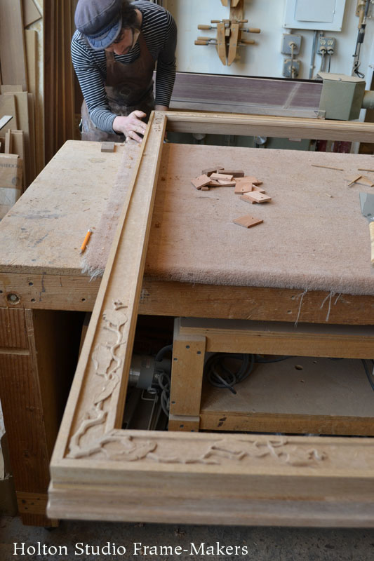
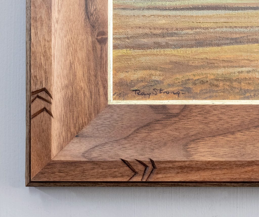
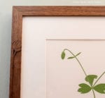
As graduation time approaches, I want to show an example of how we like to frame diplomas. This frame is in stained solid quartersawn white oak—a humble and famously sturdy and enduring hardwood. The No. 238 profile, which slopes in to the certificate, has a refinement of form that resonates with the calligraphy, but in a restrained and graceful fashion. The gilt slip further dignifies the achievement that the award represents. The proportions are important to the spirit and purpose: At just 1-3/4″ wide, on the 13″ x 15″ document, it’s substantial but self-effacing, providing due service without being showy.

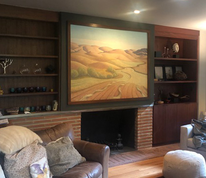
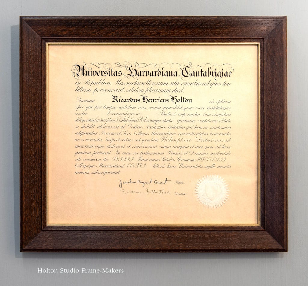
This is my father’s PhD diploma from 1952. Modest as he was, Dad kept it in a folder in a closet (thus its yellowed condition) until I recently decided to dig it out to use as an example of how we like to frame such documents. He’d blush to see me posting this, but I hope he’d approve of the spirit of this treatment. In fact, if there’s one term that sums up my aim as a picture framer, it’s one my father used to describe things he approved of: No nonsense.

Dad liked to tell the story of being introduced at one talk he gave early in his teaching career: “Our speaker was born in London, and educated in Oxford and Cambridge—but he’s never been to England!” Dad had no pretentions about his academic achievements. His small town midwestern upbringing in London, Ohio had taught him that education is to prepare you to serve others, to serve the common good. When, upon graduating from high school, his plans to serve his country by fighting in the Second World War were foiled—after just a month in the army he was released due to a health condition—he doubled his resolve to apply himself academically, the better to serve humanity in other ways. Having grown up in the Depression, the most obvious way to do some real good in the world was in the field of economics. So he enrolled to pursue an Economics degree at Miami University, about a hundred miles west of London in Oxford, Ohio; then having done pretty well there, was admitted to a certain prestigious school in Cambridge, Massachusetts, where he obtained the doctorate award pictured here.

A frame can be used to brag about something as hard-won as a diploma. But that approach in fact falls short of capturing the significance of the achievement a diploma represents. It is evidence of achievement, but achievement above all in the acquisition of knowledge, skills, and wisdom received from those who’ve come before, and to be used to serve others and the greater good. It’s a reminder not so much of praise earned but of trust earned. And it is evidence of substance, not superficiality. It is, in short, a real honor that comes with real duties, and should be framed suitably—with substance, integrity and humility.

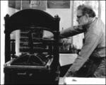
I still have the typewriter my father used in graduate school—probably his most important tool in earning this degree. And I still remember as a small boy Dad sitting me on his lap at his desk to show me how the intriguing machine worked. He hit the keys to magically activate the typebars and tap out the sentence traditionally used as a typing drill: “Now is the time for all good men to come to the aid of their country.”


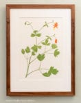
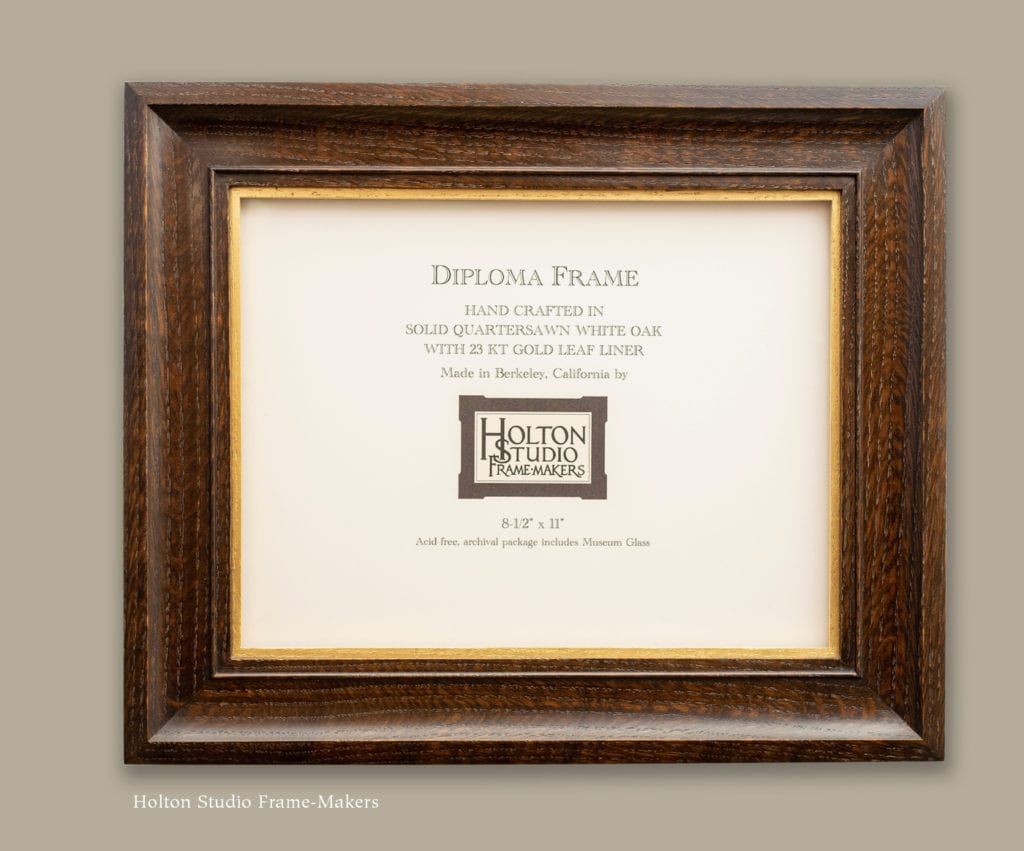
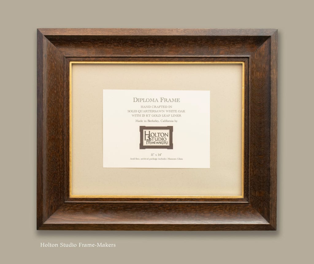
Do you, or does someone you know need a diploma framed? In addition to providing custom framing for certificates, we’ve also just added a Diploma Frames category to the In Stock section of the site. We’ll be posting more items there, but are starting off with the two versions below. (We have on hand two in each size.) All are in our No. 328 profile not unlike the frame on my dad’s diploma, but in a cove, rather than a slope, form. Makes a very special gift for someone whose hard work you really appreciate!

Framing Henry Evans

When I worked at Storey Framing—way back in the ’70’s and ’80’s—an older gentlemen would often come in with his wife, bringing us his botanical linoleum block prints he made and sold here in town.

Henry Evans (1918-1990)

His name was Henry Evans, and I think it’s fair to say that his images, of some 1400 subjects, became part of the enduring iconography of Berkeley, tapping into that deep strain of affection for nature and simplicity so characteristic of the city. I have one family member, in fact, who has at least a couple dozen Evans prints hanging in her living room! But no great achievement remains strictly local, and the range of influence of Evans’s work is evident in the impressive fact that in his career, he had more than 250 one-man shows, distributed across nearly every state in the union as well as several international venues.

This lovely print, “Thistle,” on the artist’s typical 13″ x 20″ paper, was one of three (the whole set’s shown at the bottom of the post) that we framed for some folks who escaped the Paradise fire last fall but, sadly, lost their home and all their possessions, including several Evans prints. Of course they can never replace all the meaning the prints they’d lived with for so long held for them, but I hope these three new pieces, as examples of Evans’s honest and direct depiction of life’s ever-resurgent beauty, might mean more in other ways.

The 1″ frame is carved walnut, simply oiled, not stained. I used a composition I’ve developed recently (this William Rice print is one example) in which the bottom profile is a simple carved flat with a raised outer strap, that profile continuing up the sides until near the top, where a simple relief design “grows” in from the raised outer strap and toward the image. The carved pattern is drawn from, and celebrates, the forms in the block print. But I also really love how they are carved identically to the blocks used to create such prints, the frame thus becoming a tribute to the art form as well as the work of art—and a nod to the natural unity of the arts. Above the decorative pattern there is no carving, and the whole molding is a simple uncarved flat. The extra thickness of the top makes it feel a bit like it’s sheltering the picture—just what a frame should do.

Henry Evans’s wife, Marsha, who was so instrumental in the artist’s career, has a website offering prints for sale at HenryEvans.com. While visiting the site, don’t miss the charming 1969 video of Evans, which captures his wise and profound understanding of the role and significance of pictures. Among the thoughts worth remembering is this one: “The artist has to be concerned with beauty… If he’s opposed to ugliness, then he shouldn’t propagate it and reproduce it.”

See our Henry Evans prints here.

The whole set of three Evans prints we framed for this customer—

Gallery of details—