We’ve spent many years developing and establishing our expertise in framing early California paintings. Now we’re pleased to announce our first exhibit of such work. “Historical California Paintings and How to Frame Them” will open next Saturday, July 20 with an open house from 2 to 5, where I’ll be available to share my particular approach, as a frame-maker, in framing such works—and usually re-framing them; case in point below. The exhibit will run through August 31. The occasion will also mark the launch of a new webpage called “Historical Paintings,” part of The Holton Studio Gallery, and offering such works for sale, including those in our exhibit. (The page for the exhibit is in fact the new webpage.) Both the exhibit and webpage are with the kind cooperation of our great friends at North Point Gallery. Alfred Harrison, North Point’s owner for over 30 years, has been not only a loyal customer but loyal friend and enormously supportive of our approach. We’re tremendously grateful to him—as well as to his long-time gallery director, Jessie Dunn-Gilbert, who, for the past 3 years has also—how much can one person do!?—served as Holton Studio’s gallery director and business manager.
Framing Thomas Hill
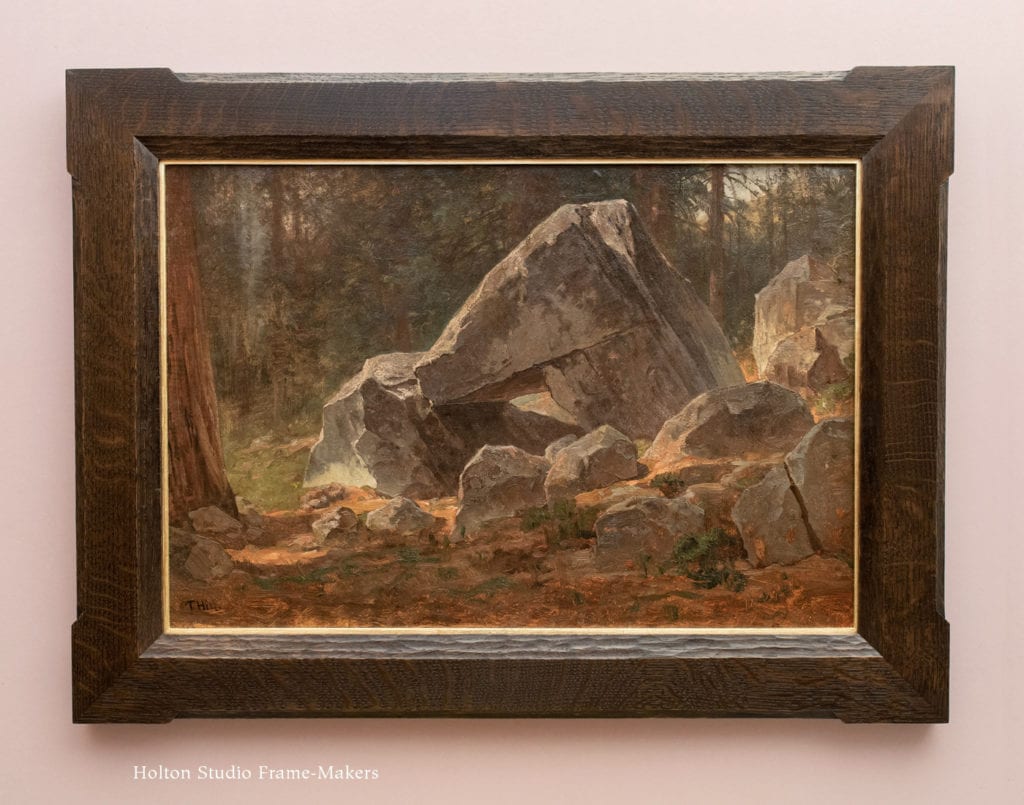
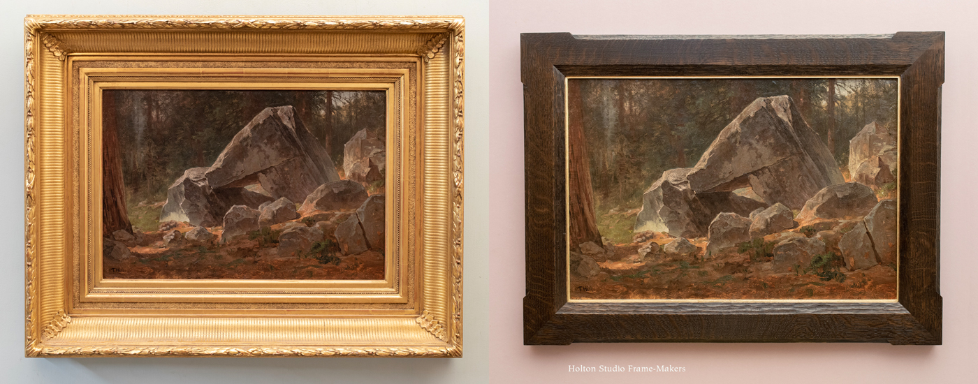
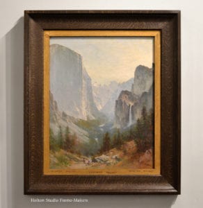
Thomas Hill (1829-1908) “Study for Boulders, Yosemite” 15″ x 22,” signed, oil on paper. (Contact Holton Studio for price.)
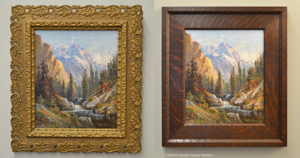
One painting we’ll be featuring in the exhibit is “Study for Boulders, Yosemite,” by Thomas Hill (1829-1908). If you can put yourself in the shoes of an Englishman who, in 1865, having spent his thirty-six years in topographically lovely, but relatively tame, Britain and Massachusetts, saw Yosemite Valley for the first time, you can imagine the sense of awe that Hill felt on his first visit there. In time, the Valley would become the artist’s signature subject. But on first arrival, as he took in the novelty of a land seemingly built by and for giants, its effect on the painter would have been other-worldly. For those who’ve visited the Valley, what impresses isn’t only the spectacularly towering granite walls of El Capitan, Half Dome and the like, but also the way that those granite walls have shed and littered the Valley floor with enormous boulders. The humbling scale of these rocks makes adults who walk among them feel like toddlers in a wonderful playground of hiding places. More than likely, during his visit Hill encountered a Sierra rain storm or two, and was thankful to discover that such boulders frequently offer emergency shelter. This is one he could have curled up and taken a nap under till the storm passed.
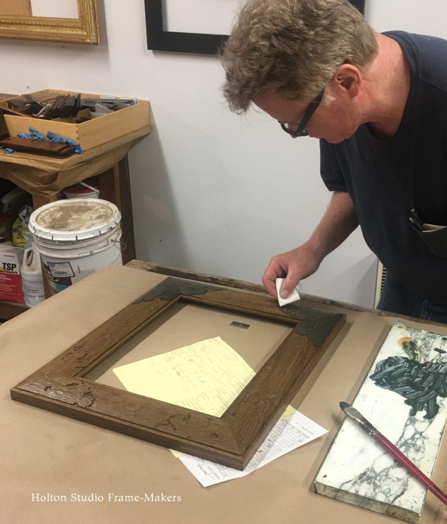
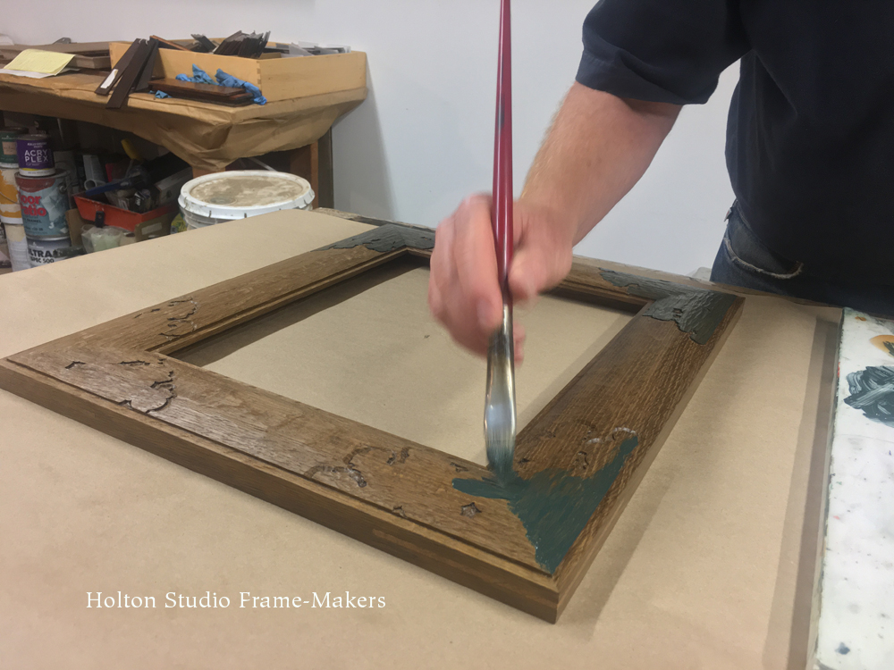
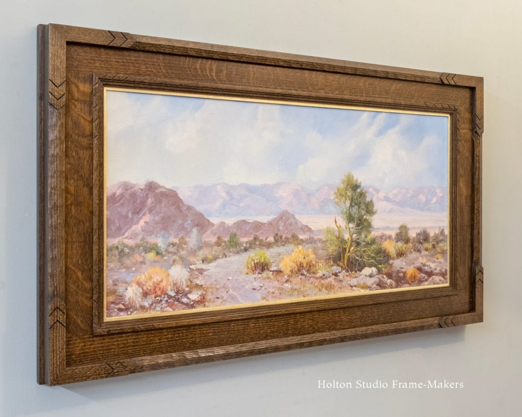
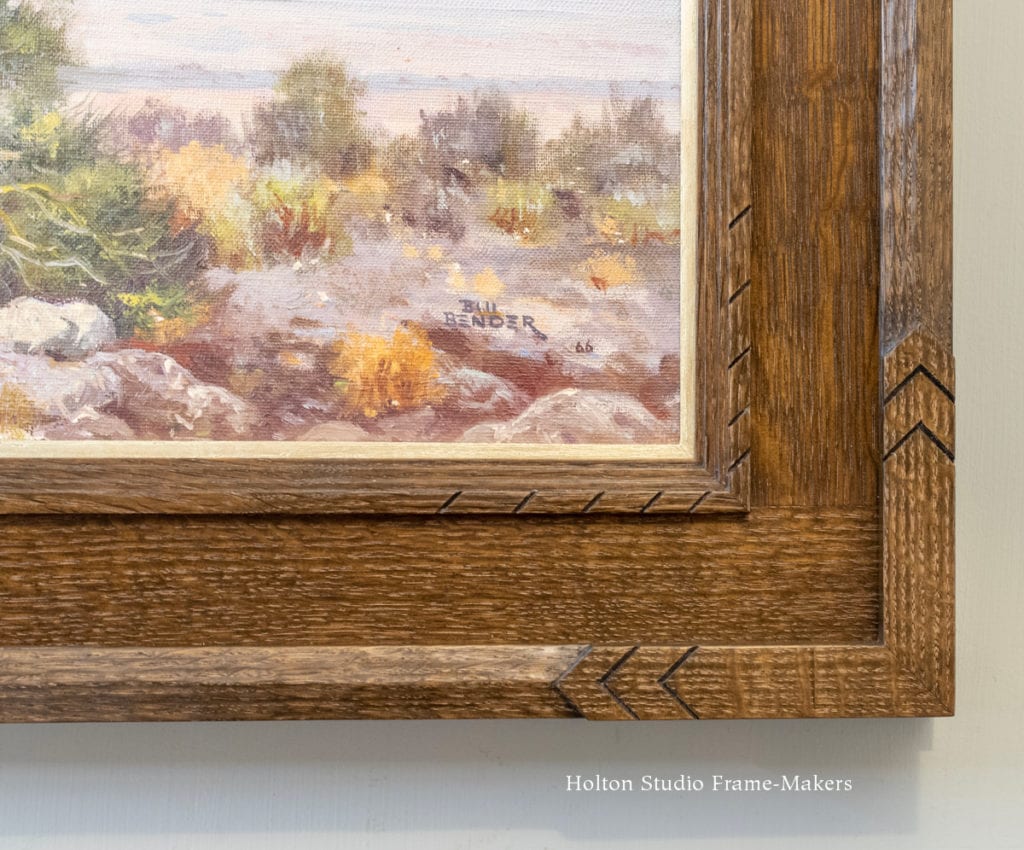
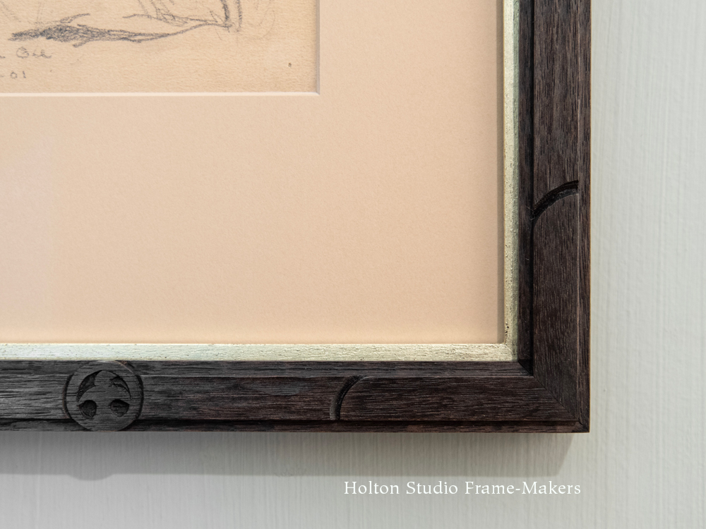
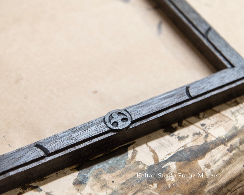
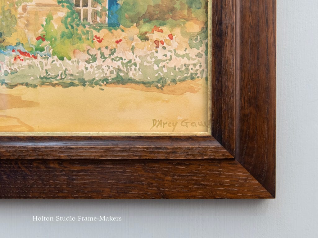
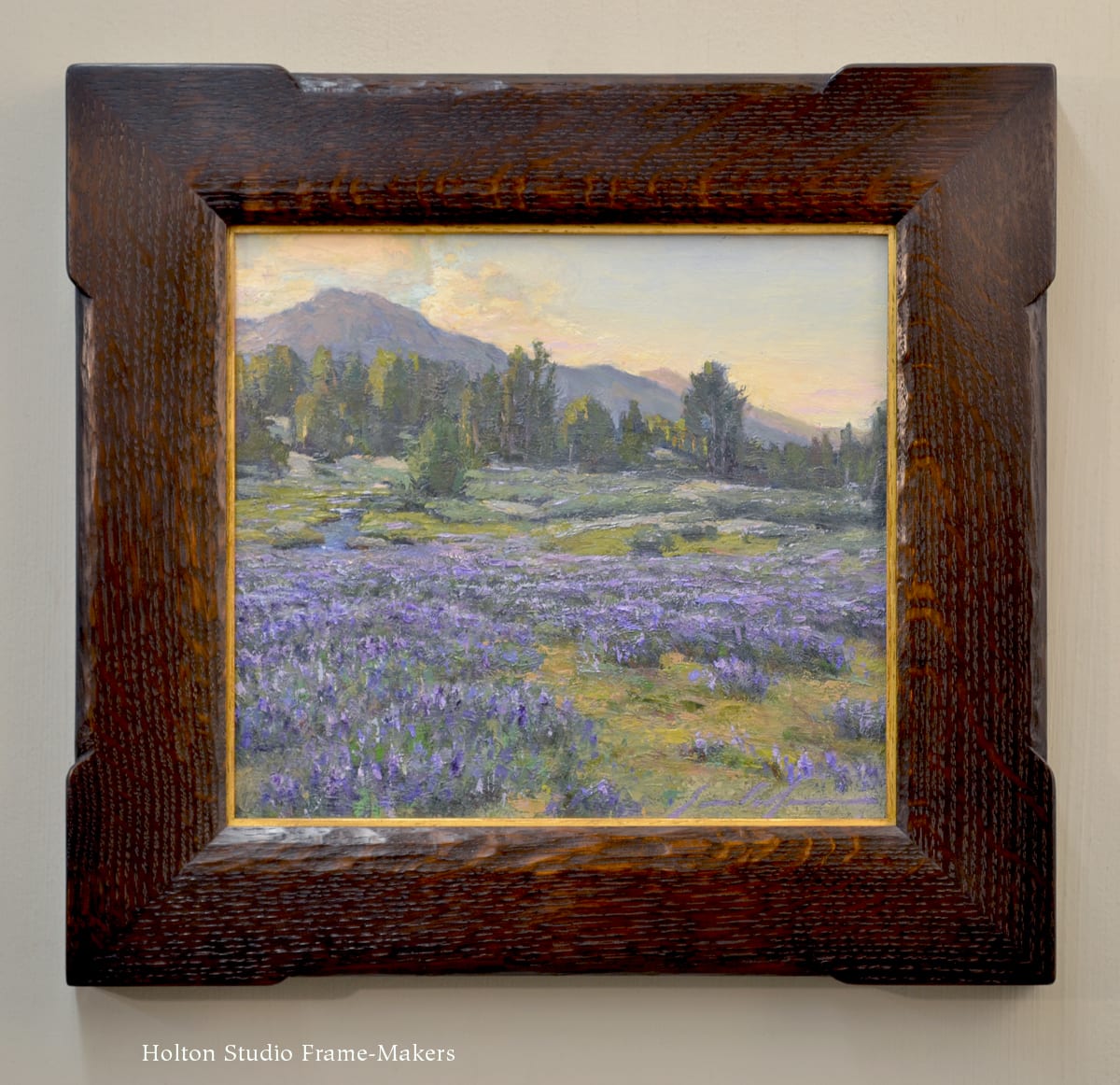
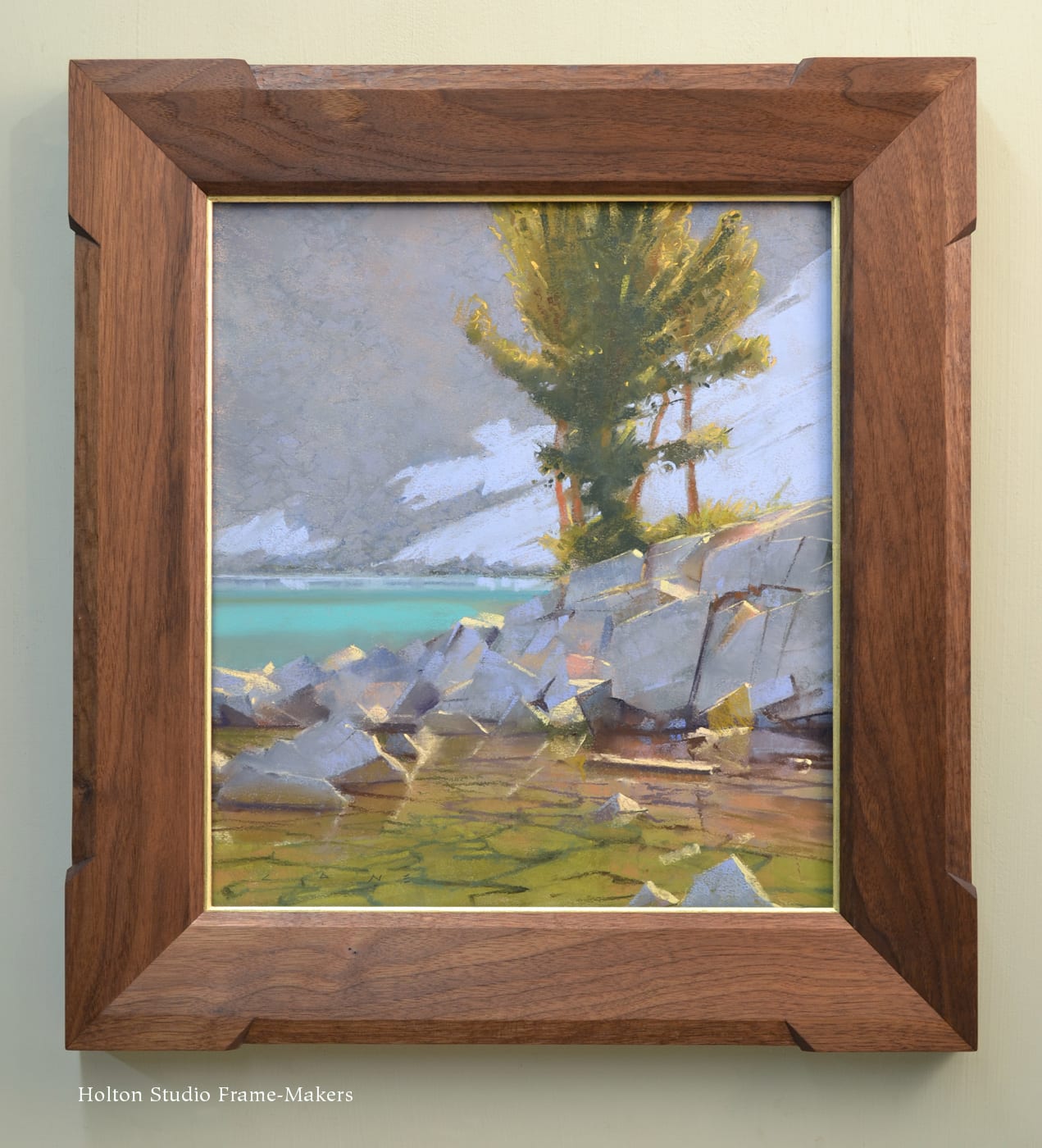
Perhaps in gratitude for his subject, but in admiration in any case, Hill might have painted this study. We just recently re-framed the 15″ x 20″ canvas in a 3″ quartersawn white oak frame with a gilt slip. The idea was to carry out Hill’s tribute to the rugged angularity and texture of this crag. This we did with the outset corners and carved beveled elements at the sight edge and back edge. (We used similar frames on Ernesto Nemesio’s “Sailor Lake Wildflowers” and Bill Cone’s “Chickenfoot Inlet”.)
Thomas Hill (1820-1908), (Yosemite Valley), n.d.
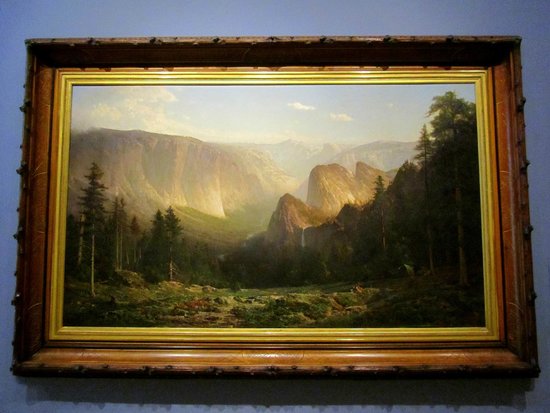
But this study, which is undated but believed to be from the 1880’s, gets us ahead of the story. Because Hill, like contemporaries such as Albert Bierstadt (who may have introduced Hill to oil painting en plein air on paper, of which the boulder study is an example), tended earlier on to more frequently direct his artistic efforts toward the grand vistas afforded by sites like Yosemite. In fact, a large panoramic Yosemite scene by Hill was one of just twelve paintings, out of four hundred entrants, chosen by an international jury at Philadelphia’s Centennial Exposition of 1876. (Another served as the backdrop at President Obama’s inaugural luncheon; we’ve framed two smaller examples of this type, shown at left, and at the bottom of the post.) Such pictures were instrumental in the burgeoning preservation and conservation movements. (In 1887, the preservationist John Muir, who more than anyone was responsible for the preservation of Yosemite, enlisted Hill to accompany him on an expedition to Alaska, where Hill painted a glacier Muir had discovered.)
But these dramatic vistas suggested the vantage point of a new arrival, a visiting outsider—awestruck but still at a remove. Hill, though, enjoyed not only the amazed gaze from afar at a vast, dramatic scene, but also hungered for close communion with nature, and to revel in the pleasures of being a real part of the landscape. It was that desire that led to work typified by the boulder study. This intimacy with the world—especially geology—through painting was no doubt guided by John Ruskin, whose Modern Painters and other writings greatly influenced English and American painters of the age. In his memoir, Praeterita, Ruskin wrote a passage powerfully describing his own deeply-felt and formative longing for such communion and the wisdom gained by it:
The living inhabitation of the world — the grazing and nesting in it, — the spiritual power of the air, the rocks, the waters, to be in the midst of it, and rejoice and wonder at it, and help it if I could, — happier if it needed no help of mine, — this was the essential love of Nature in me, this the root of all that I have usefully become, and the light of all that I have rightly learned.
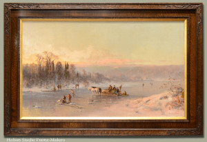
Thomas Hill, “Figures on a Horse-Drawn Sledge…”
Thomas Hill’s Yosemite boulder study conveys just that sort of pleasure of inhabiting such a place, of “nesting in it.” By showing the soft duff around the rock glowing orange in the sun, Hill deliberately imparts a sense of warmth to the hard, grey granite. The intimate space feels almost like home—as Yosemite would eventually become to Hill, when later in life he took up residence in and opened a studio at the Wawona Hotel.* Even in his grander, panoramic compositions Hill could capture the sense of living as one with the Earth. Reflecting the admiration he shared with his friend John Muir for Indians and the state of harmony they enjoyed with the land, Hill’s landscapes frequently depicted Indians carrying on their everyday activities (as in his major work, “Great Canyon of the Sierra, Yosemite” at bottom of page). In another example of humanity living as a real part of a landscape—not Yosemite in this case, but the White Mountains of New Hampshire—a large (36″ x 60″) painting (above), “Figures on a Horse-Drawn Sledge with Fishers on a River“, which we framed, represents the people of a small New England town enjoying the simple pleasures afforded by the frozen river running through their community.
The Question of Re-Framing: To Honor Historical Convention or the Painting?
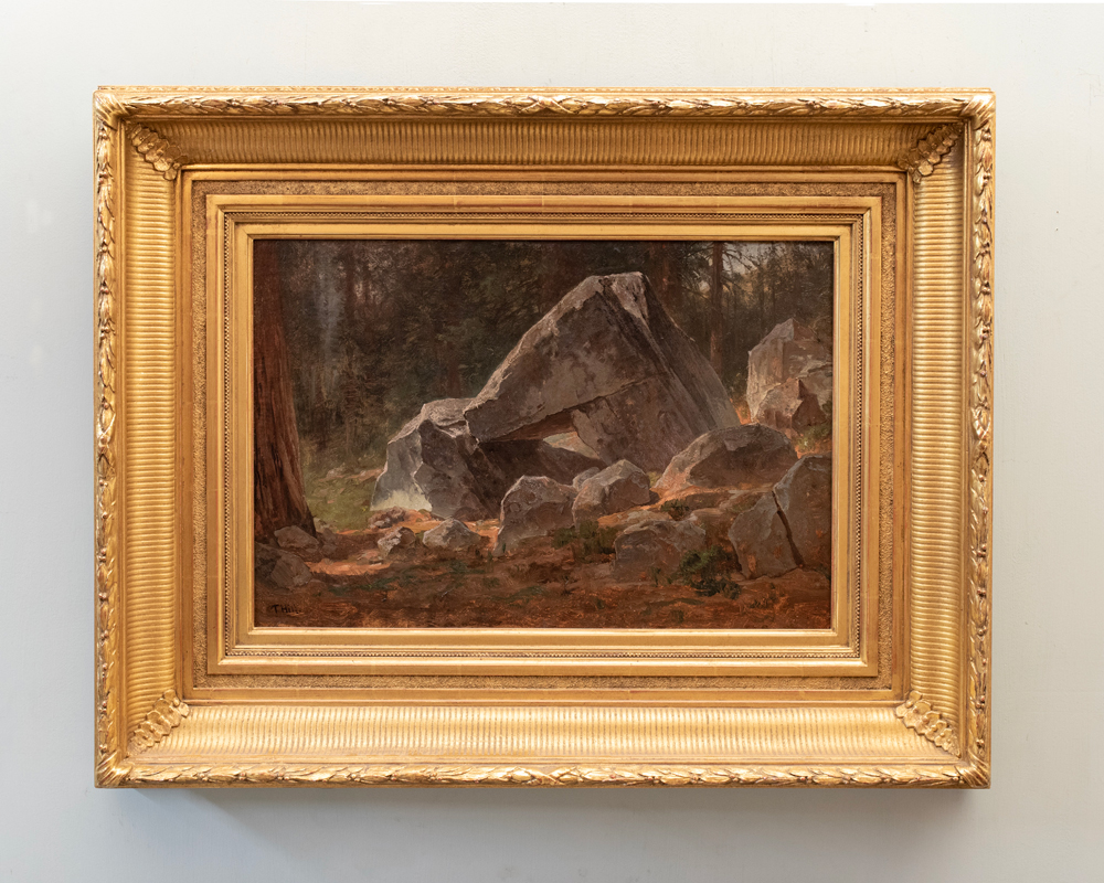
Thomas Hill, “Study for Boulders, Yosemite,” before re-framing
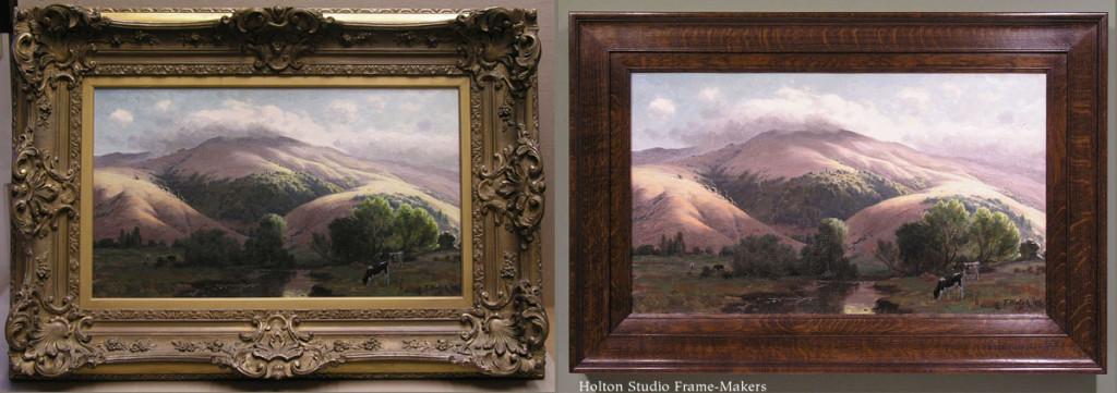
Museum curators, art historians, and other authoritative voices on such matters often argue that a frame that is contemporaneous with a painting allows us to see the painting as it was seen at the time it was painted. The “historically correct” frame is therefore supposed to be more true to the picture. It is also, this view implies, conducive to experiencing a sort of historical transcendence and opportunity to truly connect with the painting. While certainly plausible in the abstract, this is far from necessarily true and, in my experience, is usually—with notable exceptions—not true of 19th century paintings. (The exceptions, mostly frames made or designed by painters for their own work, were often created in deliberate rebellion against the makeshift quality and arbitrary design of conventional frames. I’ll say more on those exceptions in a bit.) It’s certainly not true of the frame that was on the Hill when it came to us, shown here (a reproduction of a period frame).
If we are to believe that this frame allows us to see the painting as it was seen in the time it was painted, then we can only conclude that people at that time weren’t actually seeing paintings very well at all. If picture frames were nothing more than attention-getting devices, then this one would be a rousing success. But a frame, to put it plainly, should have something to do with the picture itself. It should be in harmony and sympathy with the actual characteristics and qualities of the picture, and help us truly see the painting. That’s what it is to be genuinely true to the painting—and what it is to transcend time to a historically distant moment the painter has captured. Such an expertly executed work as this was achieved first of all by inspired and painstaking seeing. And to see these boulders as he did is what Hill wanted us to do, creating in materials made to last generations a more or less permanent record of something significant and of enduring meaning and value. He wanted to transport us to where he stood, in Yosemite Valley on that enchanting day. But the frame holds us hostage in some stuffy Victorian parlor.
A painting by HD Gremke, which will also be in the show, in its especially horrendous period dealer’s frame and in ours.
This gold frame that was on the Hill (like a similarly debased period example shown at right, alongside our re-framing) impedes, clutters, and confuses our view of the painting by imposing design elements foreign to the picture. It also forces the eye to fight the glare of the gold to see a subdued, shadowy scene and its quiet value scheme, to which this frame has no relation. Above all, its insular pretentiousness and fake urbane refinement are absurdly discordant with a decidedly unpretentious painting—a “study,” after all—of a beautiful but nonetheless humble subject, and a creation of a soul wanting above all else to reconnect us with nature.
Which leads us to suspect that the frame in the days of early California was not made to serve the painting by helping people actually see the painting, but was used in pursuit of some other, extraneous purpose.
For Beauty’s Sake, and Not for Show
The vast majority of frames from this period were either entirely factory-made or put together in smaller shops using prefab molding and ornaments. More than likely, the frame was chosen by an art dealer; such frames are often called “dealer’s frames.” Familiar with the kinds of homes his clients owned, the dealer was also (perhaps even more so) guided in his choice by his objective of winning over a buyer. Thus the point of the frame was very often to package the painting to enhance, not the artistic qualities of the work, but the prospective buyer’s sense of its monetary value.
An important Yosemite scene by William Keith, and example of how a period dealer’s frame can be improved on. The western figure at the lower left, approaching an Indian camp, is John Muir.
Certainly period frames can have nostalgic appeal. But if they can be relied on as anything genuinely suggestive of how people of another time and a different culture saw paintings, what these frames tell us about the culture of late-nineteenth century California (and, in fact, the western world generally) is rather troubling. Sad to say, paintings of this era were at least as likely to be framed in order to draw attention to them as tokens of wealth and prestige as they were to be actually seen and thus presented and authentically valued as appeals to us to stop and notice things of significance, and as skillful expressions of reverence and wonder for such things—for the power and beauty of life. William Morris addressed this prevalent nineteenth century mindset with the guiding phrase, “for beauty’s sake and not for show.”** To anyone paying attention to the spirit with which a picture is painted, especially landscapes and other rustic subject matter, conventional late-nineteenth century dealer’s frames are often astonishingly, comically incongruous. (More “before-and-after” pictures of paintings that came to us in gold frames and how we re-framed them can be found on our page, “Fixing a ‘Very Prevalent Error.”)
Thaddeus Welch (1844-1919), “Mt. Tamalpais from San Anselmo,” ca. 1910. Oil on canvas, 14″ x 24″.
We should remember that in the late nineteenth century, frame-making, a once-honored art form in itself, was at its absolute nadir. This was a direct consequence and reflection of the demise of a common cultural understanding of the very nature of the arts as being cooperative and unified, acknowledging, inspiring, and drawing on each other—and no more significantly so than in regards to painting. The art had been commonly understood to owe its very existence to its integral role in the greater and most cooperative art of all, architecture. Naturally and inevitably, the frame in this proper context had a clear and crucial harmonizing and connecting purpose, rendering it an important art form—architecture, you might say, at its most refined.
Virgil Wiliams, “California Farm Scene,” 1884.
So just as naturally and inevitably, the dissolution of this previously insoluble partnership between painting and architecture brought on the degradation and debasement of the art of the frame itself, as well as the frame’s role. Not only did the workmanship of the frame deteriorate radically (nothing exemplifies the common Victorian terms of opprobrium like “shoddy” and “makeshift” than the era’s typical picture frames; more here), but where it once served to connect pictures and architecture, in the new, more divided and fragmented state of affairs, the frame’s purpose changed to one of separating them. (I’m comparing here the nineteenth century’s notoriously wide, overblown gilt frames with the early, pre-renaissance frames which were treated straightforwardly as fairly humble windows through which the subject of the painting was, as would anything outside a real window be, let in to the room to connect with the room and the viewer. A good example of this is medieval portraits in which the subject in the painting rests his or her hands on the sill.)
Thaddeus Welch (1844-1919), California hills
Paintings, as fine art—an art of a special, higher, and exclusive breed—was held apart from the other arts comprising an architectural space, and from life (increasingly viewed as potentially corrupting and certainly more vulgar compared to the pure realm of the artist’s conception and expression). In this role, naturally enough, frames became noticeably more pretentious—and were frequently, and deservedly, ridiculed as such, and widely scorned by thoughtful cultural observers as emblematic of the decay of the arts as a whole, and their decline from a once revered place and purpose in the world.
Worst of all is the plain evidence that people who would frame a painting of a rock this way didn’t much care about the rock—the motif, or motive, of the painting. Which is to say they didn’t care about the artist’s motive in painting it: not merely to represent it on canvas (“art-for-art’s-sake”) but to move us to care about it. Painters paint to affect the world, for the world to be alive to, and pay attention—attend—to something. A sympathetic society responds by attending to the painting with the object the painting first encounters in its mission, and the thing made to protect it and secure its rightful place in the world—the frame. That is to say, the right frame, a suitable frame, attends to the picture and its motive in regards to the society it’s made for. In this case, Hill’s project was, as was John Muir’s, to help move a world set on trampling nature and the wilderness to change its course, stop ignoring the sacred, inviolable value of places like Yosemite and instead attend to them. To the extent that the dealer’s frame plainly does not attend to such a painting and is the product instead of a failure to do so, it can truly be said to have failed the painting and—what is much worse—the plea that is the very essence of such a painting.
-
-
Thomas Hill’s “Study for Boulders, Yosemite,” before and after re-framing
The Frame-Maker’s Approach
Especially with rustic subject matter like Hill’s boulder, the frame need not, and generally should not, be complicated. Above all, it should sustain the spirit of reverence for nature by being made in natural material and made to reveal and honor the material’s natural beauty and character. Nothing we make is as beautiful as what nature makes—an understanding that most of Hill’s paintings express—so the frame’s contribution and effect should follow first of all from the inherent beauty of the wood it’s made of.
Secondly, and following from this, through the pleasure the craftsman takes in nature’s materials, is the workmanship of the frame. Not only does good workmanship begin and end with care—care toward a significant object of its purpose (in this case the painting)—but one aspect of the care expressed by an expert painting is the care with which it’s executed, that is, its workmanship (an unfashionable idea, I’ll admit). Thus, just as the frame’s materials and their use follow from the love of nature shared by the painter and frame-maker, the handling of the materials follows from a love of the awesome powers of the hands and the arts of humanity. Love of these two, nature and the arts, is indispensable to—in fact the very basis of—harmony between the painting and its frame.
But of course these two are not all it takes to make a harmonious frame. So thirdly, the form, color, texture, and use of line in the frame should, as I said above, be a direct and living response to the painting, and attend to the painting, sustaining it as an expression (the word literally means “pressing out”) effecting the architecture of which it is inevitably a part, and the lives lived in that architecture.
All three of these factors are far more available through the model of the studio frame-maker—a true joiner, or woodworker, working directly for the customer who brings him a picture—than through the conventional industrial factory-distributor-retailer model by which most modern frames are made and sold.
Frames and the Enduring Struggle for the Unity of the Arts—and of Creation
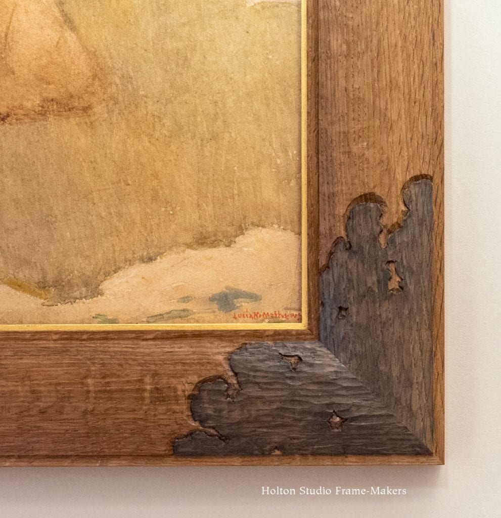
Just as painters like Hill and preservationists like Muir were fighting to save precious lands, there were, in the face of a broken harmony in the arts, notable worthy frame-makers, painters and architects who understood the great problem and its significance, and were passionately fighting—against powerful and finally overwhelming cultural forces very much analogous to those the preservationists were fighting against—for the old unified order of things. 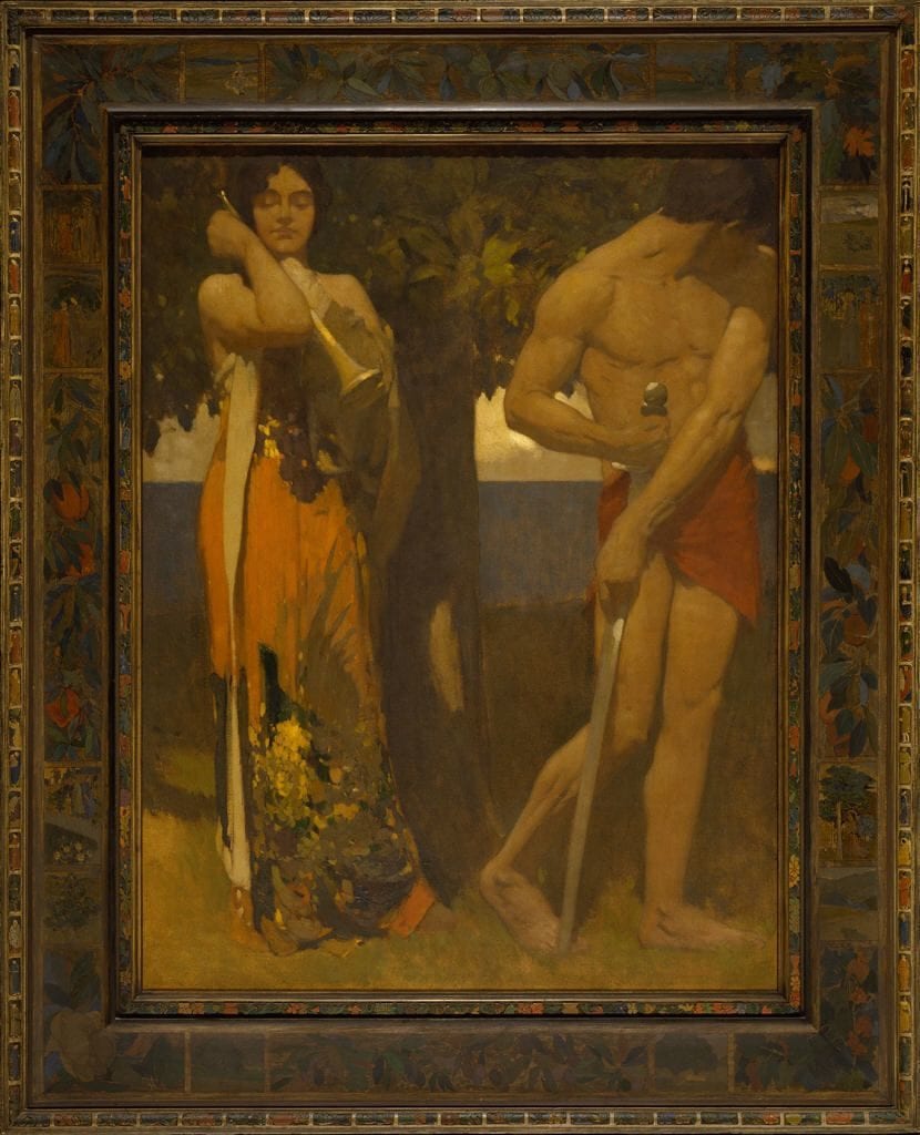 Hill’s fellow Californians Arthur and Lucia Mathews were outstanding examples, producing an extraordinary quantity of wonderful frames for their own paintings. They were also familiar with the plight of the unheeded artist, as demonstrated by Arthur’s “I Piped but Ye Would Not Dance,” (Hirshhorn Museum) shown at left in its carved and painted dark frame (probably by Lucia) of exemplary harmony. The Mathewses understood that the problem of the artist being unheeded by the larger culture (symbolized in this painting by the man, armed for war, very deliberately refusing to attend to the woman symbolizing the arts) was most immediately, directly, and tangibly visible in the absurdly incongruous and distracting conventional frames that a careless culture would subject their work to.
The Mathewses’s fellow San Franciscan, the Reverend Joseph Worcester, was also steeped in the old ideals of unity. So when he built his church, he drew first of all on the inherent beauty of nature’s materials as well as the example of vernacular structures that were the unselfconscious product of the various trades in cooperation. Understanding the fullest natural scope of this older, unifying and cooperative understanding of the nature of architecture, he invited William Keith to paint murals for one wall of the church (below). (Among the other artisans in this effort were Bruce Porter, who did the stained glass windows, and a recently arrived architect named Bernard Maybeck who was brought up in furniture-making and built the stout maple and rush chairs.)
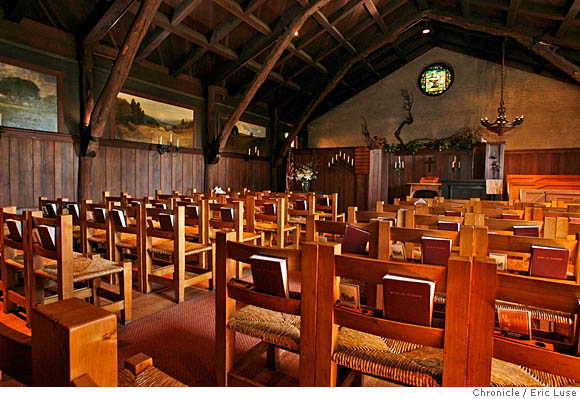
The Swedenborgian Church, San Francisco, with William Keith’s murals visible on the left wall.
In stark contrast to the conventional wide, ornate gilt frames that deliberately separated paintings from their architectural settings, in the Swedenborgian Church, appropriately plain redwood boards, treated essentially as window casings, effortlessly and harmoniously melded Keith’s paintings into the intimate setting of the sanctuary. By no stretch designed for show, the frames are instead truly windows opening up to congregants the views provided by Keith, and with their help, the Swedenborgian mission of restoring our connection with nature. The congruence of this quest for unity with that sought for the arts was not lost on thoughtful souls like Worcester. The two were in the end the same quest—for the unity of all creation, humanity’s and nature’s.
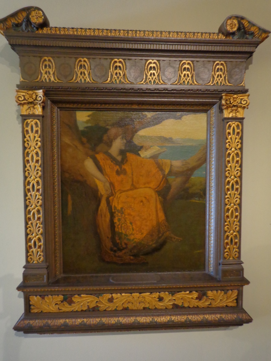
Again, Arthur and Lucia Mathews captured the spirit of this ideal in the important painting shown below. It’s an allegorical depiction of the arts, represented by a beautifully robed woman engrossed in a book being read to her, fully at home in nature—comfortably nested in an oak tree—and the painting’s lovingly carved and crafted, solid oak frame—or, perhaps, shrine. The painting is called, simply, California, and seems to embodied all the Mathewses’ aspirations for their state as the place of a renaissance of true civilization firmly grounded in reverence for nature. (Not visible in this photo is the frame’s poppy-strewn sill at the bottom sight edge.)

Arthur Mathews, “California,” in carved oak frame
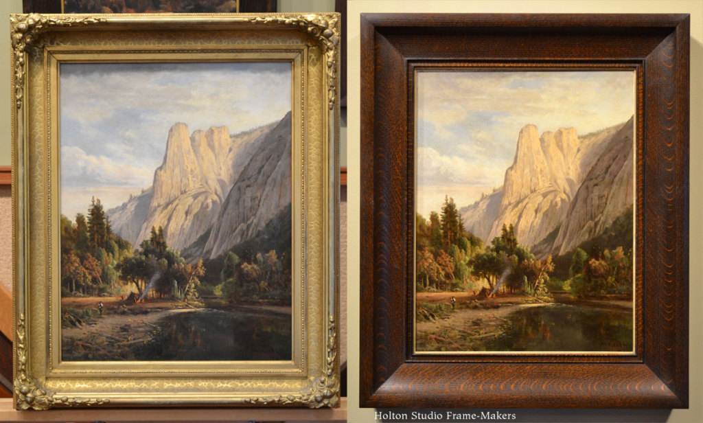
Though more ornate, the carved frame in solid walnut, made by the San Francisco shop Snow and Roos, on the grand Thomas Hill shown below is another exception (largely due to the fact of this particular painting’s size and significance) to more typical Victorian settings; and its superior visual harmony with the painting is apparent.
A carved walnut frame by Snow and Roos in San Francisco, on Hill’s massive 72″ x 120″ “Great Canyon of the Sierra, Yosemite,” 1871 at the Crocker Art Museum, Sacramento. An exception to the degraded frames more typical of the time, this is a well-crafted, solid walnut setting worthy of a significant painting.
Still, these were the exceptions to the era’s conventional frames. So it’s little wonder that in the next century the frame would be tossed aside altogether, its historical, legitimate and crucial service to paintings practically forgotten.
As the painting represents the painter’s close communion with something in nature, the frame-maker and the frame should aid the painter’s purpose and bring the viewer into intimate communion with the painting—and serve the deeply felt spirit exemplified by Thomas Hill’s reverie and accomplished study amidst the wonders of Yosemite Valley. We do neither paintings nor ourselves any favors by keeping the ideals such pictures capture separate from our worlds—historically remote though they may be—obscured inside what Ruskin called “vaults of gold”, prisons for pictures that defy and even betray their whole reason for being and capacity to reach, touch, and affect us, even across more than a century’s time, to remind us of the enduring and eternally significant things the human race must attend to.
We hope you’ll come see “Historical California Paintings and How to Frame Them,” and perhaps join us for the open house this Saturday from 2 to 5. The show runs July 20 to August 31.
Three more California scenes by Thomas Hill—
-
-
Thomas Hill, Russian River
-
-
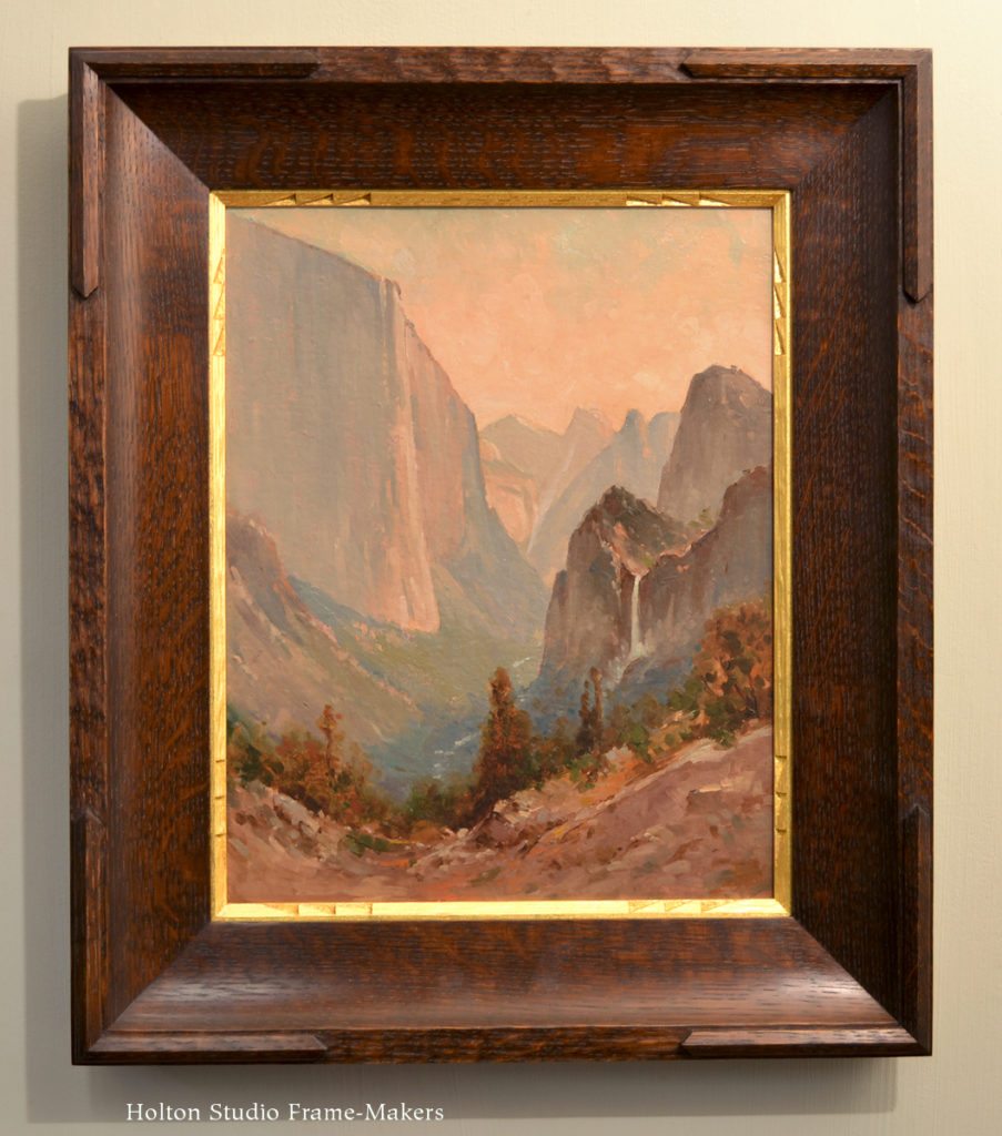
Thomas Hill, view of El Capitan and Bridalveil Falls, 26″ x 21″.
-
-
Thomas Hill (Sierra scene; possibly Lake Tenaya).
Two more Hills of more intimate subject matter
FOOTNOTES:
* It was there that in 1903 President Theodore Roosevelt paid Hill a visit and left with a painting of Bridalveil Falls. Reflecting the important influence artists such as Hill had in cultivating the modern conservation movement, just three years later, Roosevelt would take the momentous action of merging state and federal lands, previously set aside as preserve, and form them into Yosemite National Park.
** “[Y]ou may hang your walls with tapestry instead of whitewash or paper; or you may cover them with mosaic, or have them frescoed by a great painter: all this is not luxury, if it be done for beauty’s sake, and not for show: it does not break our golden rule: HAVE NOTHING IN YOUR HOUSES WHICH YOU DO NOT KNOW TO BE USEFUL OR BELIEVE TO BE BEAUTIFUL. “—William Morris, from his lecture, “The Beauty of Life”


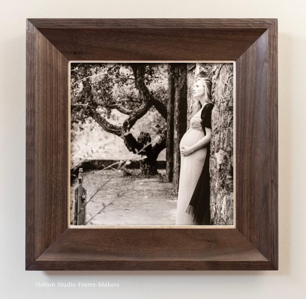
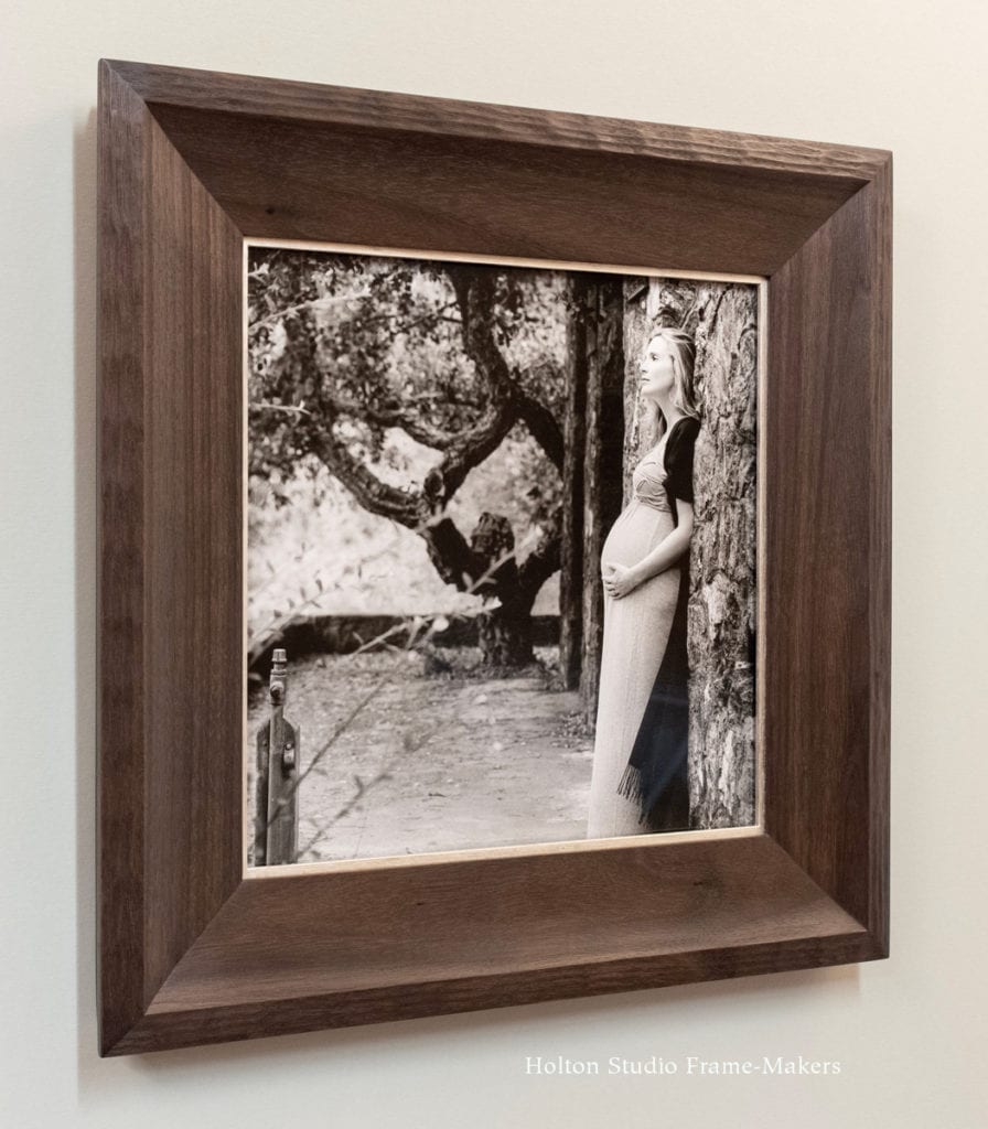
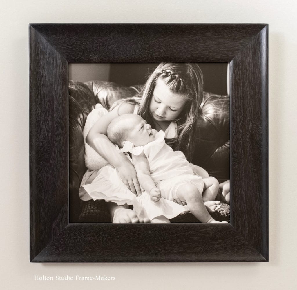
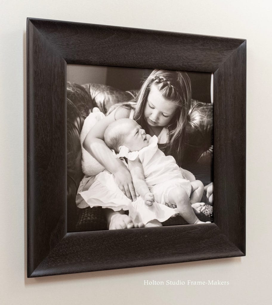
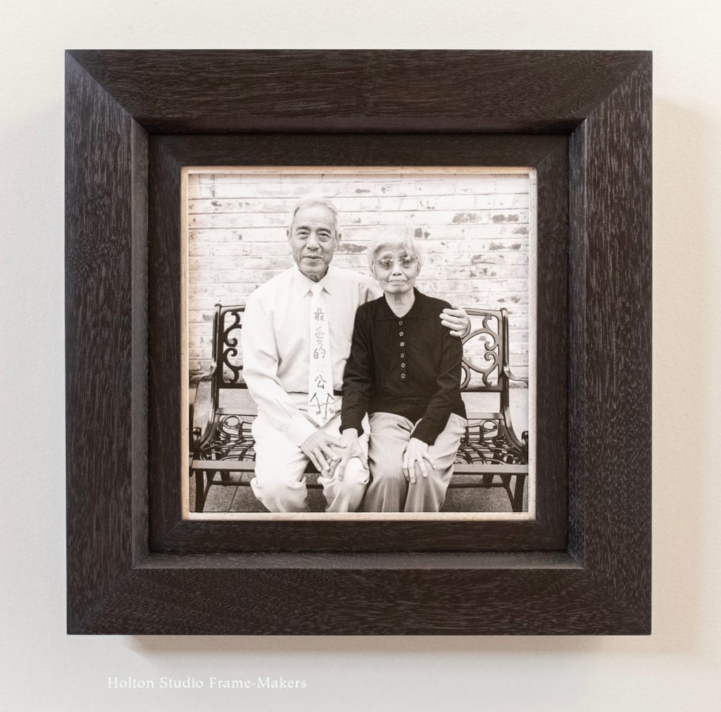
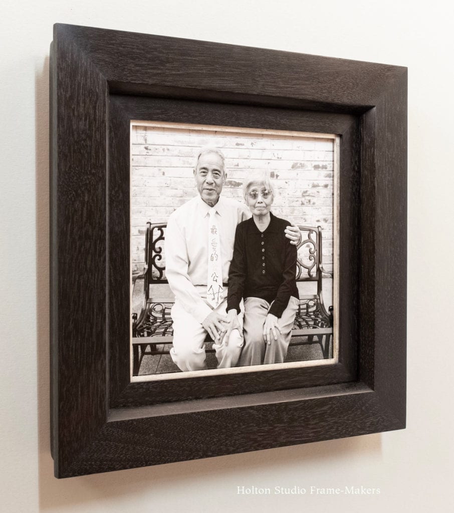
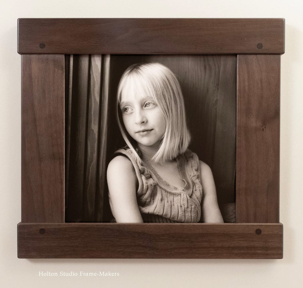
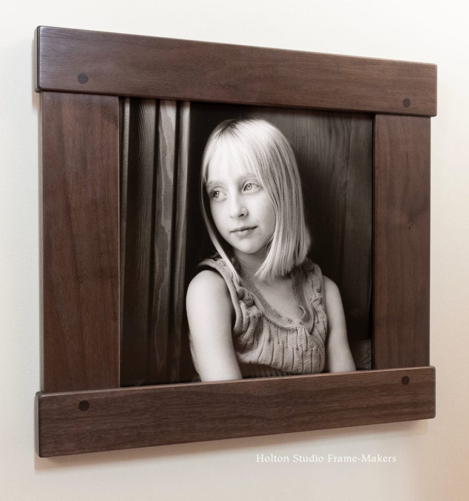
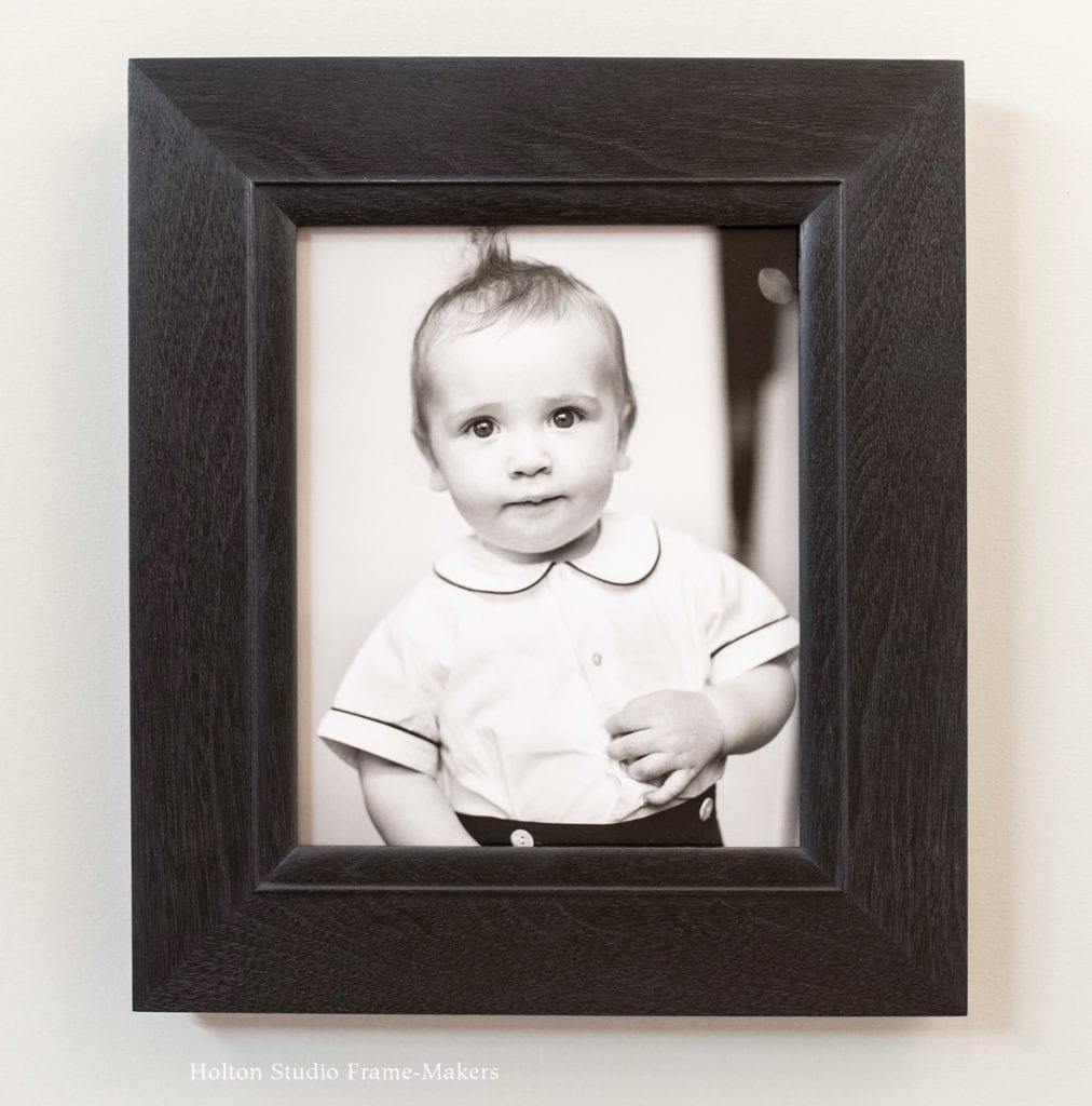
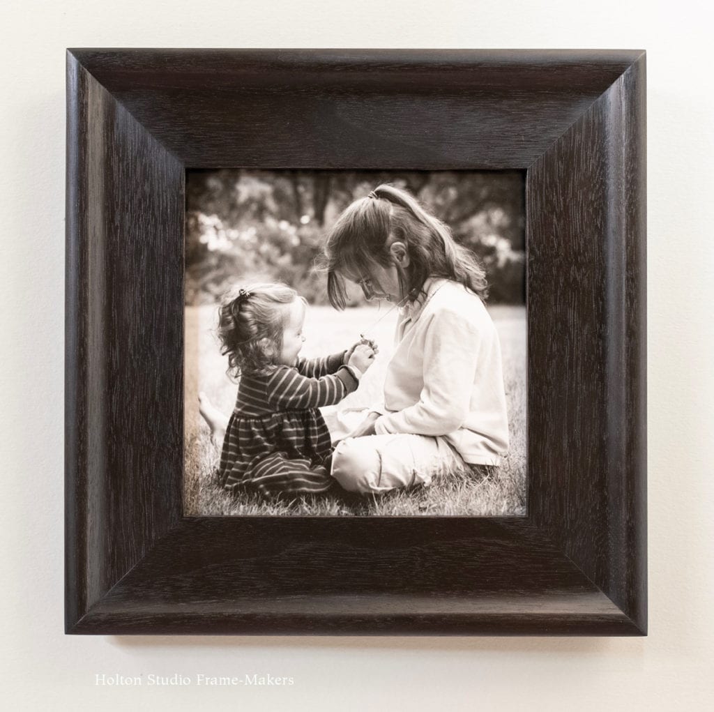
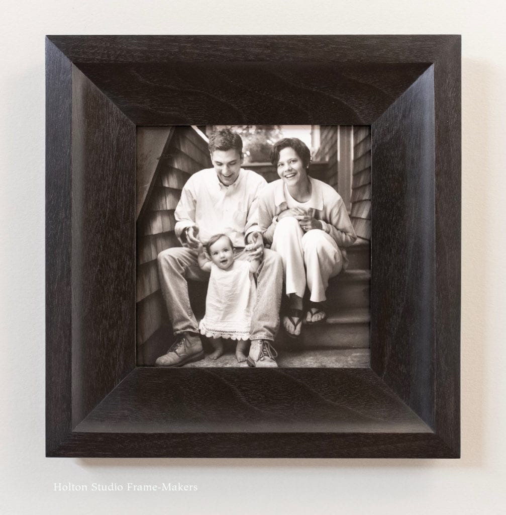
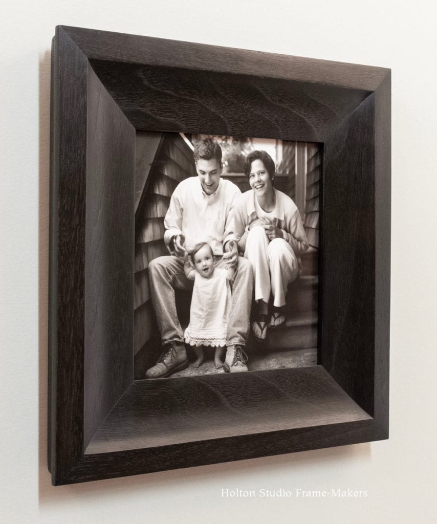
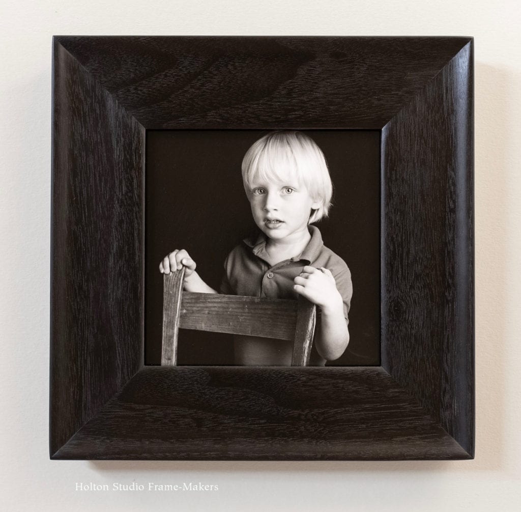
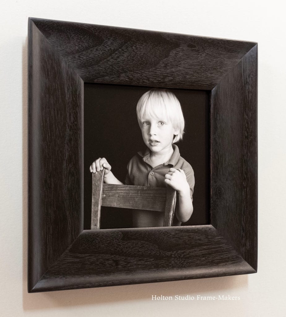
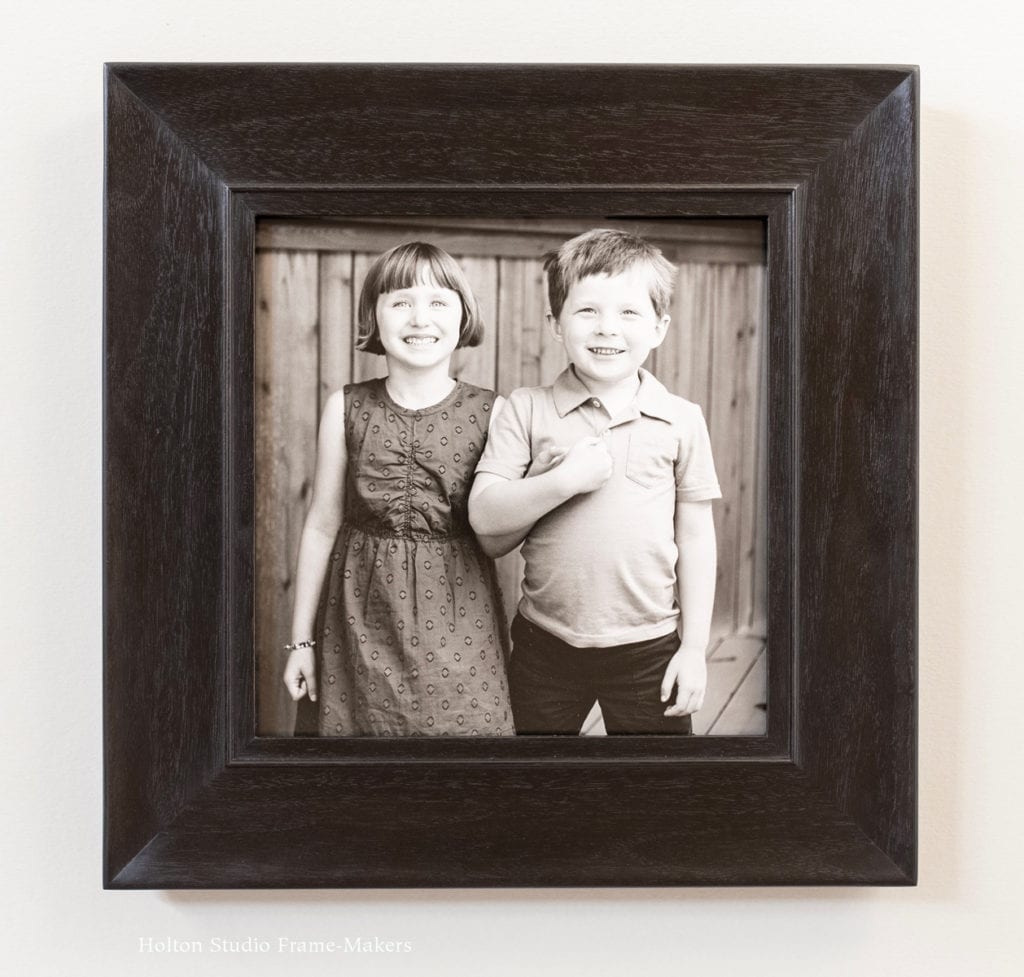
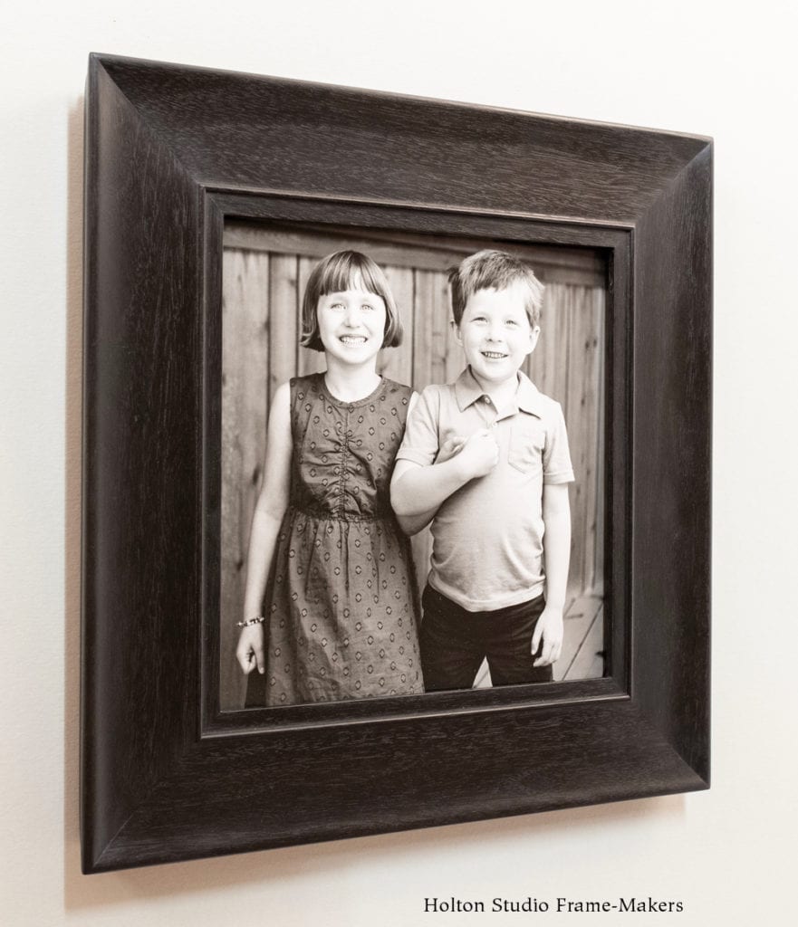
 But compared to other media, in the case of most photographs (I’d exclude large, especially color photos), such illusion is generally less tenable. This is mainly due to the fact that the genesis of photography had nothing at all to do with architecture. Whereas painting and even much of printmaking originated and largely evolved in the service of buildings, photographs were originally made to be portable and/or to be reproduced in print media—that is, to be framed not by walls but by the printed pages of newspapers, journals and books. In any case, they were too fine, subtle and detailed—these were among their most admired qualities—to command attention against the weight and mass of architecture, or have presence or the kind of decorative effect on the room as a whole that’s generally been intended in the case of paintings, prints and other media. A photo displayed on a wall is usually hard to enjoy unless one deliberately approaches it for close viewing. In their early days, when photographic portraits were framed, it was usually so that they could be propped on shelves, but also to protect them while being held in the hands of admirers or stashed into trunks and suitcases. The little, usually metal frames made for these early tintypes and daguerreotypes and cartes de visite were more like carrying cases made for portability—the very opposite of what architecture provides which is more or less permanent place as a part (even if only an illusionary part) of the wall.
 So here’s the problem: We want photographs on the walls of our homes, and to be part of our homes; but photography is a medium that does not naturally feel at home on our walls. Certainly to a large degree the solution to the problem of making photographs suited to walls follows from consciously considering what it takes to make them feel more harmonious with architecture. Two things that help are, 1) the choice of photograph, and 2) where it’s hung. Brought up to a certain appropriate size (but not necessarily large), and when graphically bold enough, photographic prints can gain the sort of presence on the wall that other media do, especially with judicious placement, usually in smaller, intimate settings, such as hallways, offices and bedrooms. Even so, achieving the kind of architectural presence, the feeling of a window, that’s typically easier to accomplish with other media, depends on suitable framing.


