The Holiday Frame of Memory—and a Mother’s Fruitcake

Yesterday, the San Francisco Chronicle Food and Wine section included a poem, “Mom’s Fruitcake,” by my wife, Stephanie McCoy, recounting the story of Steph’s late mother’s traditional Christmas fruitcake and its lasting meaning for her family. (That’s one thing we can all agree on about fruitcake—it lasts!) The poem is a beautiful read (I am not, of course, at all biased) and reminder, to those wearied by the excesses of the holidays, of some of the essential beauty of the season, the enduring power of what we make, and the enduring spirit of mothers, even those now passed, who make the season one of joy. Read it here…

Merry Christmas and Happy Holidays to all!

Jane's Christmas table

Jane McCoy’s Christmas table, featuring her fruitcake.

Framing Sharon Calahan for “Beloved California”

When it comes to painting the light, one exemplary artist on the scene today is Sharon Calahan. We’ve been representing the Petaluma painter and Pixar mainstay since 2011. Sharon’s painting, “Bear Creek Summer” (16″ x 20″) is featured in our current show, Beloved California IV.

Sharon Calahan painting

Sharon Calahan, “Bear Creek Summer”. 2019, oil on panel, 16 x 20 inches.

Sharon CalahanIf you saw Pixar‘s 2015 animated film The Good Dinosaur (see the trailer here), you’ll recognize Sharon’s distinctive hand. This 2015 Wired Magazine artist profile, written after the release of the film, provides a good sense of how painting informs Sharon’s work for the animation studio. In 2014, her outstanding achievements earned her membership in the elite American Society of Cinematographers—”the first member,” according to her Wikipedia entry, “to be elected to that professional group who had worked only in animation, without also having done live action film.”

The Frame

For this pastoral, simple rural scene, Eric Johnson made a frame in a fairly plain 3-1/4″ wide slope in quartersawn white oak stained Medieval Oak to harmonize with the shadows and warm tones of the rocks under the water. The idea of the slope, of course, is to sustain and amplify the picture’s strong perspective, which draws you in to the intoxicating mood of a summer day in the countryside. We did carve the profile a bit, and also carved the pale gold liner, which is in a convex, or cushion, shape. With the carved, rounded portions of the profile, the point was to repeat the textures depicted in the painting, including the rocks. Carving also echos the texture of the paint on the canvas.

Below are two more works by Sharon, both examples of her mastery of light: her 9″ x 12″ painting, “Sierra Glow” (sold), which we used on the postcard for the very first “Beloved California” in 2016; and “Spring Majesty,” on hand in the gallery (though not included in the show).

Visit Sharon’s page...

More on Beloved California IV…

Framing Robert Flanary for “Beloved California”

We had a tremendous turnout for the November 16 opening reception for our current all-gallery show, “Beloved California IV: Twenty Artists with a Passion for Place.” Gallery opening(Photo at right; more pictures of the opening can be found at the bottom of the show’s page here.) One of the artists we proudly feature is the one that Holton Studio Gallery has been exhibiting the longest, Robert Flanary. “A Grove In the Lowlands,” shown here, is one of two larger featured works by this artist, both 20″ x 24″. Trevor Davis made this 3-1/2″ carved scoop for it. It’s in quartersawn white oak with Saturated Medieval Oak stain with gilt liner.Robert Flanary paintingOne artist at the opening described Robert’s work as “masterful.” Especially impressive is his skill in pushing his images toward the abstract while maintaining highly realistic handling of aspects like perspective and light. We can easily enter the paintings as believable places, but the paintings’ loose rendering also gives them a transcendent quality that is intoxicating and invites one to just stare at the work for quite a while.

About the Frame

Robert’s paintings always have luscious surfaces. His current work has free and loose brushwork that I wanted to celebrate and amplify with carving of the main cove element as well as a narrower sight edge cove. These I complemented with smooth inner and outer panels.

Robert Flanary painting

Robert Flanary, “The Edge of the Mire.” 2018. Oil, 12″ x 9″. (Sold.)

A useful proportioning principle helpful in frame design is what Pedro Lemos called “graded measure.” Whether it’s a vase or frame molding, a design is more dynamic if the dimensions of different sections contrast rather than match. With three sections, it’s especially pleasing to create ratios using 1, 2 and 3 in different arrangements. In this case they’re 2:3:1. (The frame at right—on a Flanary that I’m happy to report we sold at the opening—uses this same pattern in a different shape. As mentioned, for “A Grove In the Lowlands” I actually added another narrow carved cove at the sight edge.) So the 1″ wide outer raised panel is 2/3 of the width of the 1-1/2″ wide middle scoop section, and the 1/2″ wide inner raised panel is 1/3 of the width of the scoop, and half the width of the outer panel. The frames on the Flanarys below (both are available) use the proportions in different arrangements—3:2:1, and 3:1:2. When the outer element is wider than the inner one, it creates the illusion of perspective and enhances the perspective of the painting as well as helps to draw the viewer in to the painting.

Robert Flanary, “A Row of Farm Buildings,” 2017. Oil, 5″ x 7″.

Robert Flanary painting

Robert Flanary, “Before a Summer Storm.” 2017. Oil, 8″ x 10″.

We hope you’ll come see “Beloved California” to see Robert Flanary‘s beautiful paintings in person and fully appreciate them.

Paul Kratter, Terry Miura & Bill Cone

Bill Cone, Terry Miura and Paul Kratter catch up at the opening in front of Robert Flanary’s display

Framing Kim Lordier for “Beloved California”

The title of this pastel by Kim Lordier, “Bathed in Riches,” sums up the pleasurable feeling of being out on the ranch lands of Northern California, especially as the late shadows begin to cool off a hot summer day. How often do we think to measure our wealth by the abundance of moments and scenes like these? “Bathed in Riches” also describes pretty well the feeling I get this evening standing in the midst of the Gallery, which is now completely hung with Kim’s work and that of nineteen other artists for tomorrow’s opening of our annual all-gallery show, “Beloved California.” I was pleased that Fine Art Connoisseur Magazine chose to feature this beauty in their email newsletter article on the show! But the sumptuous palette, masterful handling of light, and the intoxicating mood of “Bathed in Riches” has to be enjoyed in person.

Kim Lordier painting

Kim Lordier, “Bathed in Riches.” Pastel, 12″ x 24″ (18″ x 30″ outside frame dimensions).

“Beloved California IV: Twenty Artists with a Passion for Place” opens tomorrow, Saturday, November 16, and runs through December 28. Please come meet Kim Lordier and many of the other artists at the reception tomorrow from 4 to 6.

Frame corner detail on Kim Lordier paintingAbout the Frame

The frame on “Bathed in Riches” is a suitably plain and simple 3″ compound slope, in a nice tight-grained quartersawn white oak with Medieval Oak stain. A carved cap molding and sight edge fillet repeat the painting’s textures. A narrow gilt slip subtly completes the radiant theme.


More work by Kim Lordier included in the show—

Framing Carol Peek for “Beloved California”

Another outstanding painting featured in our upcoming annual all-gallery exhibition will be Carol Peek‘s 24″ x 36″ oil called “Metamorphosis.” Carol says that “this beautiful place has a creek that runs through it [which] marks the Marin/Sonoma boundaries. The entire area between these two extraordinary counties is a very inspiring place for me.” The story behind “Metamorphosis” makes clear that this work exemplifies the spirit of our show, “Beloved California IV: Twenty Painters with a Passion for Place.”

Framed Carol Peek painting

Carol Peek, “Metamorphosis,” 2019. Oil on canvas, 24″ x 36″ (35″ x 47″ outside frame dimensions).

About “Metamorphosis”, the painter has composed the following notes:

In our lives, we may find a place, scene or area that we connect with in a very intimate way for a myriad of reasons; sometimes tangible and often times not. These places feel reverent, spiritual, familiar or extraordinary in some way that sets them apart from scenes or places we pass without notice. My friend lives in such a place and I had the great fortune of living in this valley myself, on a small horse ranch, in my life before marriage and kids, exploring the paths on horseback that lead through this timeless place, letting inspiration plant seeds that would later become paintings. My current home is not far and as time allows, I come to paint and experience anew, as a human being and artist, the commencement of seasons, their blossoming and transformation, in a continual flow of life, transition and wisdom.

Carved frame corner detailShortly before Carol brought us the painting, Jessie and I had been talking about asking one of our artists to paint something for this beautiful frame Trevor Davis made earlier this year. It’s a stately, carved 6″ wide quartersawn white oak compound mitered profile with a gilt liner. Just a couple days later, as I recall, Carol emailed an image of “Metamorphosis” and asked if we’d like to include it in the show. Seeing the dimensions, Jessie and I could hardly believe our luck.

When the painting arrived, we immediately placed it in the frame. Simply put, the two completed each other. The frame’s color is perfectly harmonious as a warm, surrounding window frame in shadow; the wood and carving suit the rustic subject matter; while the frame’s mass and decorative detail express and sustain the artist’s spirit of reverence for this Northern California ranch set in oak-covered hills.

“Metamorphosis” is a work of passion and praise for that place, but also a plea for its preservation. I find it greatly rewarding that the painting found its way so naturally to a frame made for precisely the responsibility of keeping such devotional works firmly fixed before the eyes of folks fortunate enough to live in its midst.

“Beloved California IV: Twenty Artists with a Passion for Place” opens this Saturday, November 16, with a reception from 4 to 6 for the artists, including Carol Peek. We hope you’ll join us—and come see “Metamorphosis” in person, as well as more than fifty other outstanding paintings.


Framing Kevin Brown for “Beloved California”

We fell in love with this painting when Kevin Brown brought it in a few months ago, had a great time framing it, and are very excited to finally be unveiling it. The 19″ x 21″ oil on board is titled “Snowy Egret, South Lake,” an scene Kevin spotted in Golden Gate Park. Between its luminosity (doubled by reflection), the enveloping greenery, and the tiny but captivating focal point of the waterbird, the picture rivets my attention. I love lakes, and this image evokes memories of summer afternoons exploring a shoreline, just enjoying being part of it.

Kevin Brown painting

Kevin Brown, “Snowy Egret, South Lake” oil, 19 x 21 inches.

In designing the frame, I wanted to sustain and expand the stillness the picture captures with a fairly plain, flat profile while at the same time acknowledging Kevin’s impressively sensitive rendering with subtle molding elements. The frame is a 3-1/2″ stained walnut flat with a low ovolo (convex) sight edge and a slight curl at the back edge. As a complement to the broad, smooth expanse, there’s a narrow carved ovolo near the sight edge. The proportions of the elements enhance the perspective that’s so masterfully handled and crucial to the charm of the scene and its power to pull us in. A narrow carved liner gilded with 18 kt pale leaf catches the sunlight emanating from the painting. But above all, the frame’s refinement is due to Trevor Davis’s impeccable craftsmanship.

Corner detail, framed Kevin Brown painting

Corner detail. The 3-1/2″ profile is stained walnut with a narrow carved ovolo and carved pale gold liner.

Kevin Brown‘s “Snowy Egret, South Lake” is one of more than fifty paintings by twenty outstanding artists of the Northern California landscape who will be featured in “Beloved California IV.” The show opens Saturday, November 16 with a reception for the artists (Kevin expects to be there!) from 4 to 6. It runs through the end of the year. More on the show here…

Read about framing Paul Kratter’s painting “Farm of the Freeway” here…

Read about framing Bill Cone’s pastel “Cliff A.M.” here…

Framing Bill Cone for “Beloved California”

Another post on the wonderful new work we’ll be exhibiting in our annual all-gallery show, “Beloved California,” which opens November 16. This pastel comes from the masterful hand of Bill Cone. “Cliff A.M.” (12″ x 9″) shows a beach on Drake’s Bay near Chimney Rock at Point Reyes. Several elephant seals look forward to sunbathing—just as soon as the fog burns off. The bit of pink sky is a perfect complement to, and relief from, the characteristic gray light.

Framed Bill Cone pastel, "Cliff A.M."Trevor Davis, who made the frame, a 2-1/2″ wide walnut slope, meticulously carved flutes across the shallow sight edge cove. The frame design not only enhances the perspective, but plays off the form of the beach, and Bill’s treatment of it using radiating lines. The goal was not only harmony of color, form, and line, but harmony of hand between two arts made for each other. A pale gold slip adorns the sight edge.

Bill Cone is one of twenty artists included in Beloved California IV, which opens on November 16 with a reception for the artists from 4 to 6, and runs through December 28.

Framing Beloved California

“Find your place on the planet. Dig in, and take responsibility from there.”—Gary Snyder

Beloved California poster

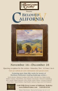
The poster for the show

Our first show after moving to Berkeley from Emeryville three years ago this past summer was an all-gallery exhibition of our outstanding roster of Northern California landscape painters. Looking for a name for the spirit that impels artists out to paint our local landscape, we decided to call the show Beloved California. The show was such a success and such fun that we followed it up the next year with Beloved California II, then last year with—you guessed it—Beloved California III. So now we’re up to Beloved California IV, and this is the best one yet, featuring more than fifty paintings by twenty outstanding artists.

The show opens in two weeks, with a reception on Saturday, November 16 from 4 to 6. Come join us in toasting these artists whom we’ve grown so fond of and whose dedication to their art and to this special “place on the planet” we so deeply appreciate. The show runs through December, closing December 28 with an open house (details to come). Visit the show’s webpage…

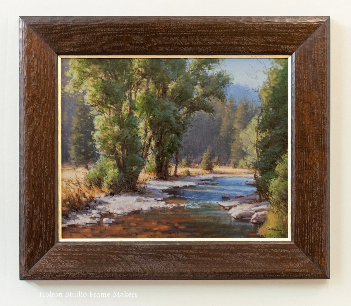
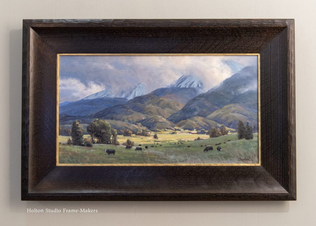
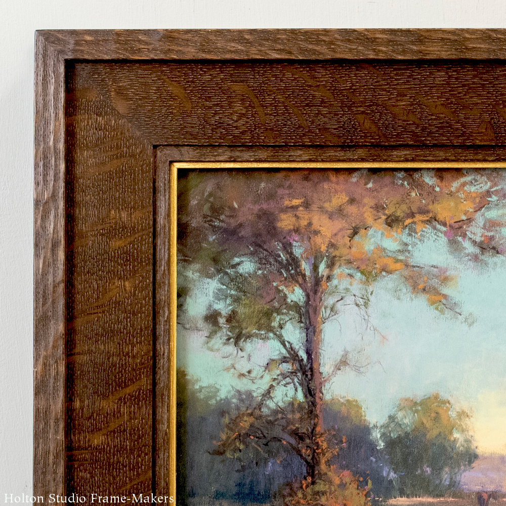
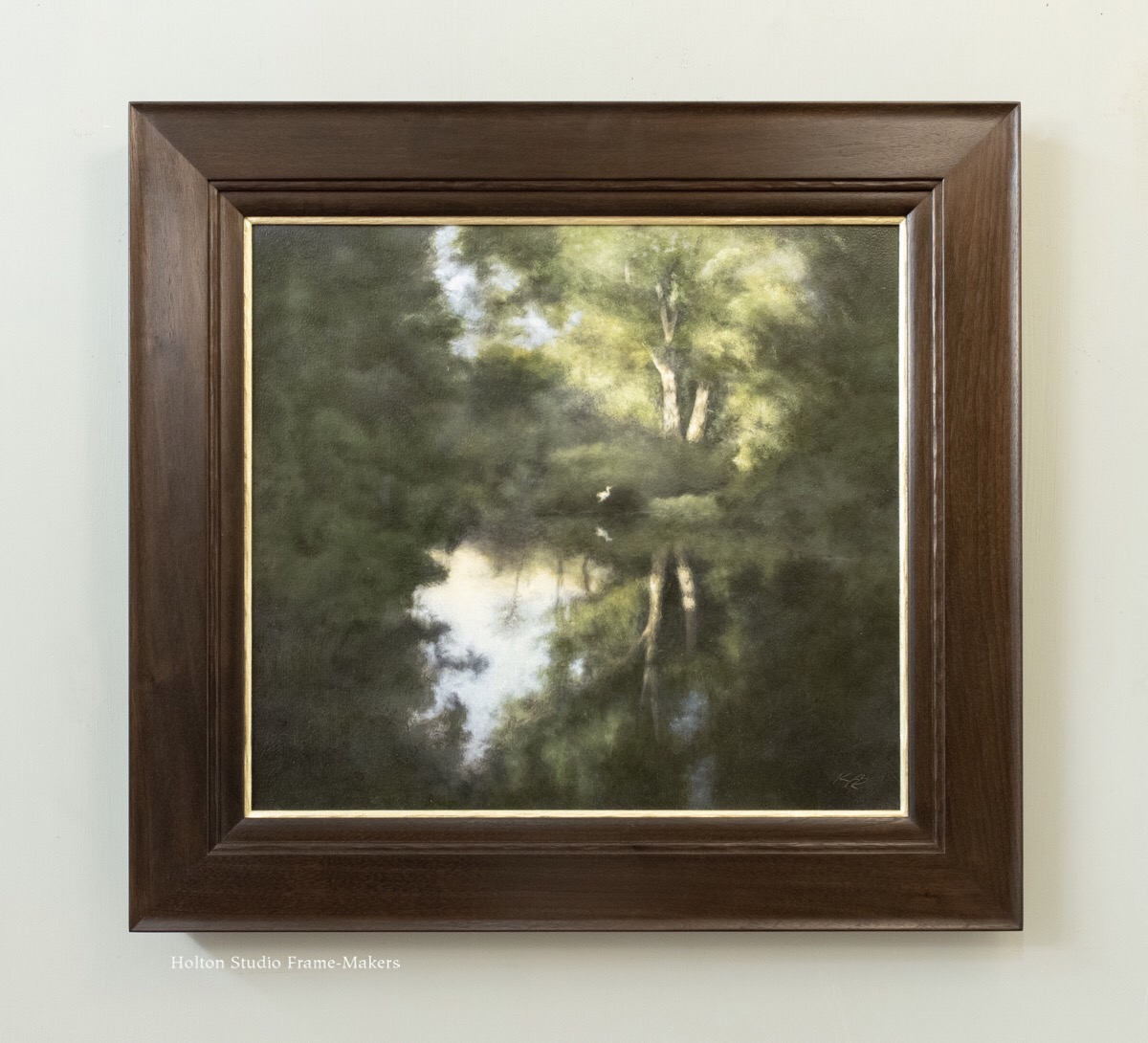
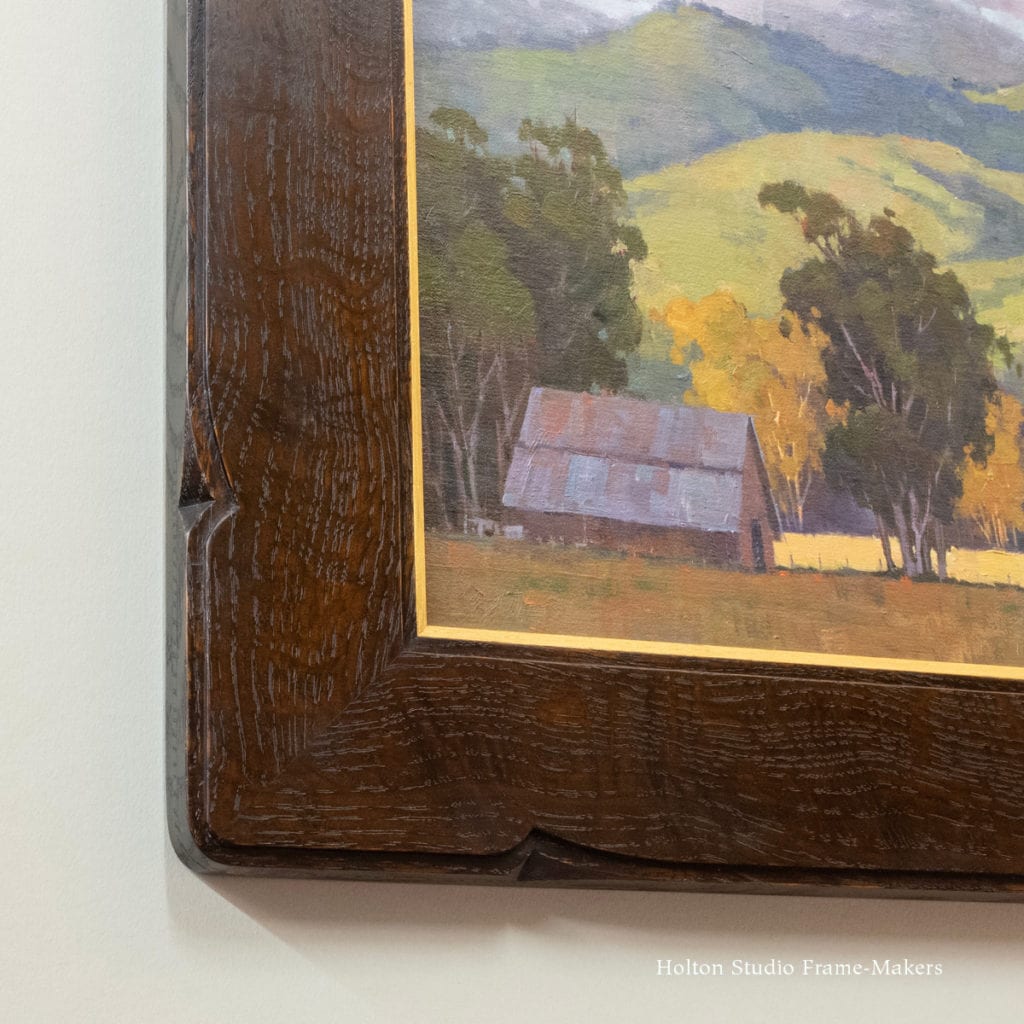
As always, we have framed all the paintings in the show. I aim to do a series of posts featuring selections from the show and how we framed them. So I’m starting with the painting we chose to use on the poster and postcard. It’s by our great friend and gallery stalwart Paul Kratter. This is a 16″ x 16″ canvas titled “Farm of the Freeway.” It seems to exemplify the fine bit of advice from one of our region’s stellar poets, Gary Snyder, quoted above.

Paul Kratter painting
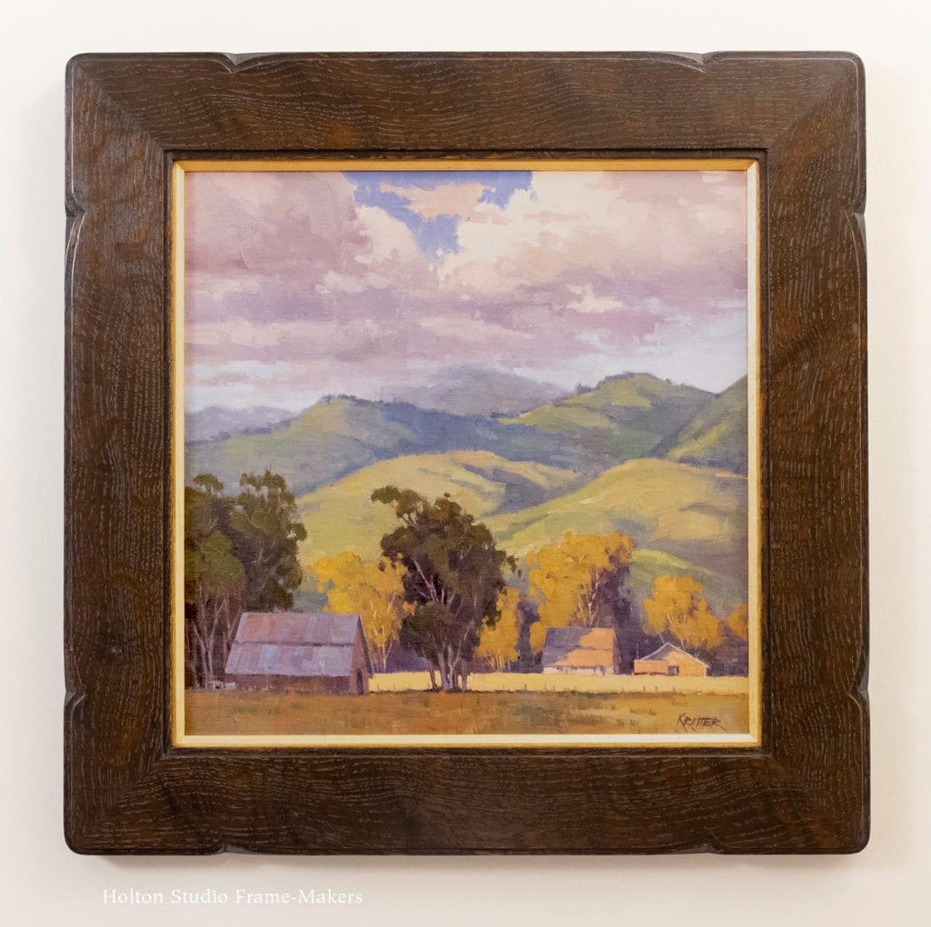
On the back of the panel, Paul wrote down a little story that explains the work’s title: “Painted on a Friday afternoon on a small road in Livermore. It must have been a short-cut, because there was a constant rush of cars buzzing by me.” But while those hurried drivers spend their lives trying to be somewhere else, careless of the timeless beauty of where they are, this farm appears to be a place where folks are dug in. And so Paul honors it in oil paint made to endure hundreds of years.

This is one of my absolute favorite paintings we’ve had from Paul. I love the foreground shadow and the characteristic hills in their winter green, which reminds me, along with the clouds, of the wonderfully wet winter we had last year, and fills me with hope of seeing more rain soon. It also features the trees that Paul’s become famous for. (Check out his new video on how to paint trees.) And I’m always a sucker for barns like this that have quietly and over many years become one with the landscape—again, dug in.

detail, Paul Kratter paintingAbout the Frame

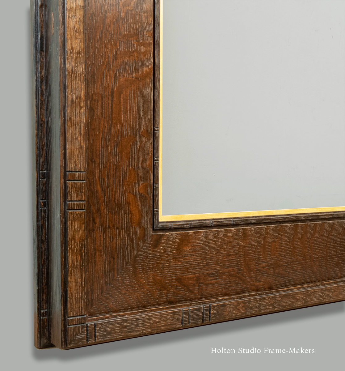
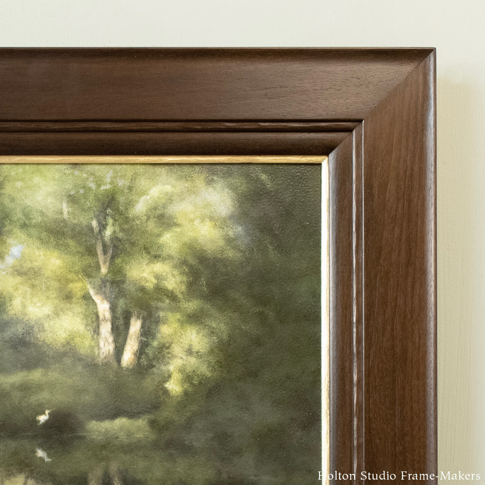
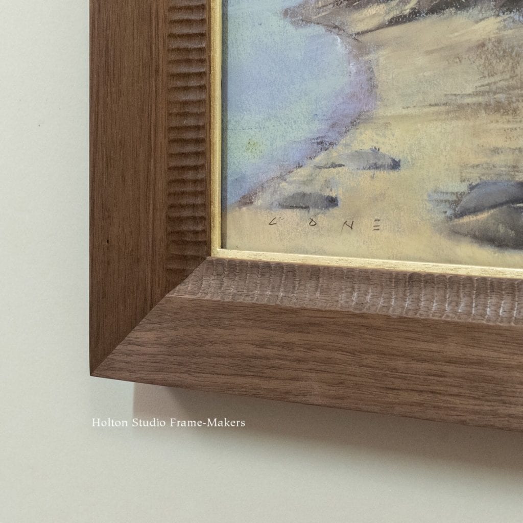
For Paul’s painting, I decided on a fairly plain frame design, but using a quartersawn white oak board with especially wonderful and wild figure—a board that I’d set aside till just the right project came along. As you can see, the undulations in the grain quietly echo the painting’s undulating hills, clouds and even suggest the tree trunks.

This is a good example of a first principle I’ve been expounding in the series of presentations I’ve been doing over the course of this year covering a frame-maker’s approach to framing various types of pictures (beginning with antique Japanese prints, and most recently black and white portrait photographs). That principle is that the frame’s effectiveness and power depend first of all on the natural material it’s made of, because nothing we make can be as beautiful as what nature has made.

This first principle goes to the first of the three beautiful things necessary to a beautiful frame. The second beautiful thing is care—that is, careful and thoughtful workmanship. As are all our mitered frames, this one is splined and finished after it’s joined. It’s a simple frame, but it’s made right. And things made right convey the care that was put into them.

Paul Kratter painting

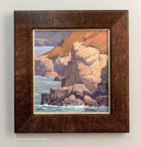
No. 15—2-1/2″ on oil painting*

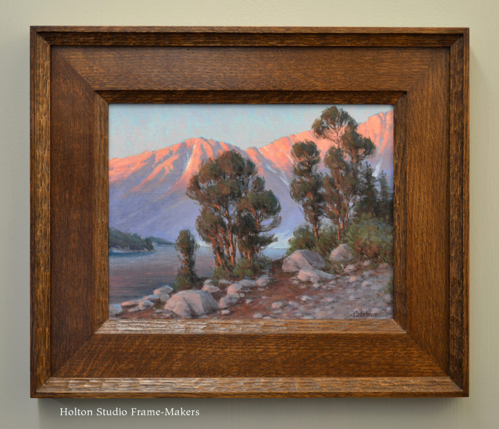
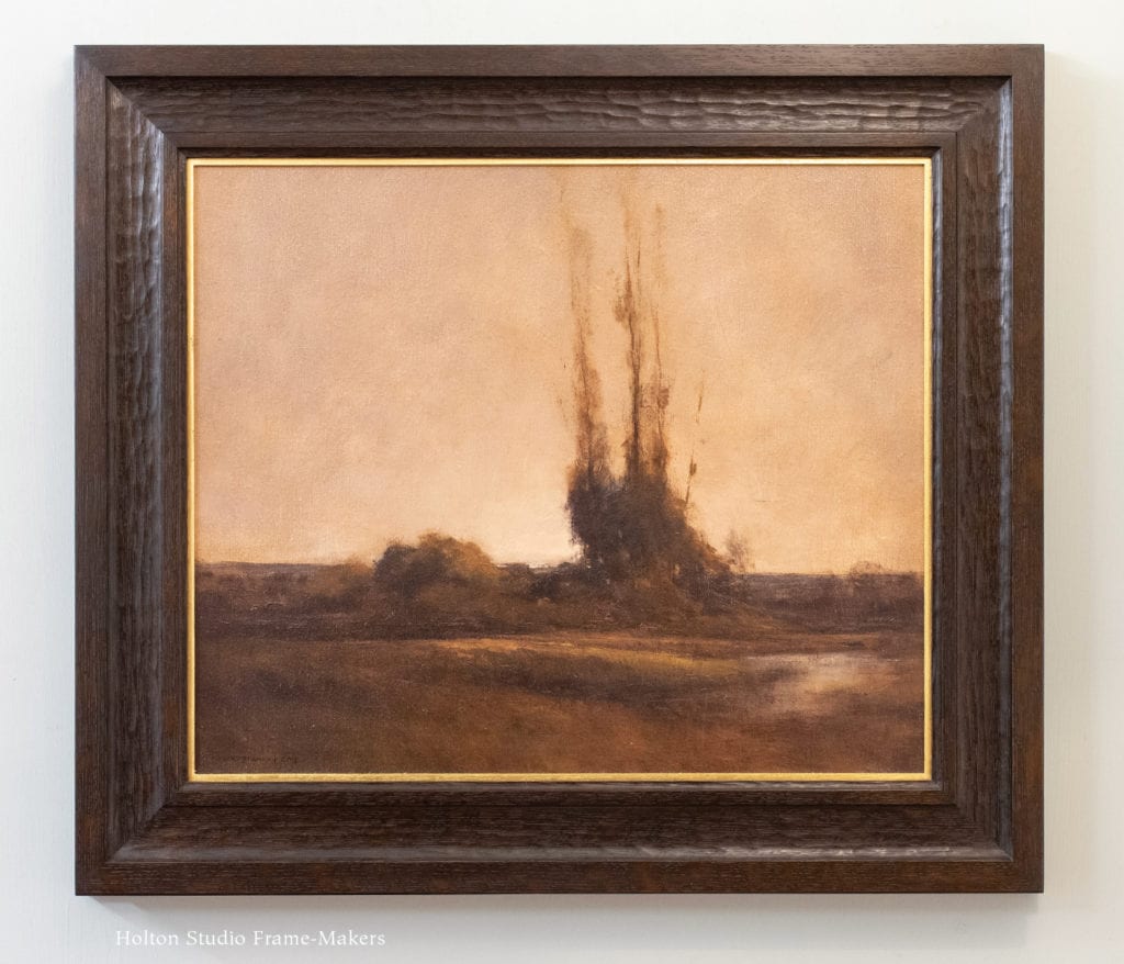
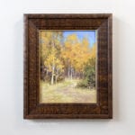
The third beautiful thing is the frame’s relationship to the picture—the harmony and interdependence between picture and frame; the joining of two arts. The simplest version of this profile, which is a flat with a small step (or fillet) on the inside and outside edges, is one we’ve used on Paul’s paintings before (an example is shown at right), and I’ve always liked how it works with his confidently defined, graphic style. This past year I’ve enjoyed combining the simple filleting of this profile with chamfered details and patterns to articulate the corners. (Good examples are on the post “Framing Three RTK Studio Tiles.”) For the frame for “Farm of the Freeway,” a frame alive to this picture, I tapped those explorations to shape the corners to repeat the rounded clouds and hills.

A Responsibility

As you’re no doubt aware, California’s landscape now faces terrifying threats from wildfire. Paul himself had to evacuate his home in Moraga just a couple of weeks ago when a fire broke out in the woodlands adjacent to his neighborhood. Scheduled at the end of the calendar year, “Beloved California” has come during, or in the wake of, the intense fall fire season. Each year, as the threat to these places our painters celebrate in their work grows, our appreciation and love for the land—the spirit of our title—grows and deepens as well. As I wrote in the show description for the first “Beloved California”, a painting says, Consider this. This matters. Three years later, I’d put it a little differently: a painting says, Pay attention to this. This matters. Because to pay attention to something doesn’t mean simply to idly consider it. It means to attend to it; it implies action.

It means, turn off from the rush of the road—stop the car, kill the engine, and get out and put your feet down on the land where they belong: your place on the planet. Dig in to the earth beneath your feet, our beloved California. And take responsibility from there—attend to it.

Again, the show is from November 16 through December 28, with a reception on Saturday, November 16 from 4 to 6. More on the show here.

Framing Photography—and the Pictorial Revolution

In preparation for tonight’s event with portrait photographer Nan Phelps, I’m thinking more deeply than usual about portrait photography and how it’s framed. As I touched on in my last post, the essential problem of framing black and white portrait photography can be attributed to the very nature of the medium and its origins: unlike other pictorial media, photographs weren’t made to hang on our walls. Born in an age of massive commercial and social mobilization and expansion, photography was created in service to that age and in response to the demands of increasingly impermanent, transient, and simply unfamiliar social conditions—many of which were unprecedented in scale and scope. Naturally, the place of photographs in a world suddenly much more mobile and transient was likewise impermanent and portable.

Book cover, "Consuming Identities"Most of what I’m learning about this I’ve gleaned from a wonderful recent book, Consuming Identities: Visual Culture in Nineteenth Century San Francisco, by Amy DeFalco Lippert, a historian at the University of Chicago. San Francisco in the gold rush years—the so-called “instant city”—provides an especially strong example of the use and power of the new technologies of pictorial reproduction.

Photography, of course, originated in the midst of the industrial revolution. But while most of us understand and appreciate the impact and revolutionary effects of industrialization and its many social effects, rarely do we appreciate the relation of that massive historical phenomenon to photography or to the drastically altered role of pictures generally. Chiefly this impact was through the the technology of reproduction, but closely associated with that—in fact largely dependent on it—and no less important, was the invention of photography. And a third massive contributing factor of industrialization must be appreciated as well: the breakthroughs in communication and transportation that not only aided broad distribution of photographs but perhaps more importantly, the things people used those pictures for—the needs they satisfied.

The industrial revolution, in short, was also a pictorial revolution.

As it happens, and somewhat surprisingly, a key city in this revolution and the development of photography was the metropolis right across the Bay from us, which astonishingly quickly came to life in those explosive years of the mid-nineteenth century.

DeFalco Lippert writes,

From its inception, photography provided Americans with affordable access to unprecedentedly detailed renderings of the familiar and the unfamiliar: pictures of themselves, of loved ones and strangers, as well as their own landscapes and views of the world beyond the places they knew and traversed. By the mid-nineteenth century, photographs became mechanically  reproducible via new image technology. Commodified images could be conveyed much more efficiently than ever before over longer distances, thanks to simultaneous improvements in the national postal system, and developments in transportation and communication infrastructures. In other words, images became much more accessible to ordinary people at the same time that they seemed more lifelike and realistic. At just this moment, the gold rush prompted a long-term and long-distance separation of friends and loved ones that ensured San Francisco a critical but heretofore overlooked role in the history of the visual medium.

…The gold rush metropolis embodied most of the century’’s pivotal transformations, often in extreme forms: the separation, isolation, and individualism of the industrial era gave rise to a society in which the distinction between lived and virtual reality became as tantalizing as it was increasingly difficult to locate or discern.

Apropos tonight’s event, the author points out that “Human portraits were by far the most popular form of photography, and they enjoyed a particularly avid reception in the United States.” And in gold rush San Francisco the “extreme forms” of the century’s social changes “infused [these portraits] with heightened levels of significance because they served as irreplaceable sources of virtual intimacy for a dislocated and anonymous urban populace.”

Nan Phelps photographIn regards to framing photographs for our walls, recognizing the origins of photography in a society characterized by “dislocation” is key. The uniquely impermanent and transitory qualities of photography, seemingly rooted in its very genesis, go a long way toward explaining the problem, mentioned in my last post, of giving photographs the same presence in a room that other pictures enjoy; as well as the conventional approach to framing photographs—in wide white mats and narrow-as-possible frames—that seems to ignore or even reject any connection to architecture, to our walls. But if the medium is of a piece with and reflective of an age of “separation, isolation, and individualism,” we can, paradoxically, also appreciate the tremendous power of photography as a remedy and solution to precisely those problems—its power to  connect people to distant events and places that were miraculously becoming much more near, as well as to home, to loved ones. If the age was pulling people apart, photography offered a means to keep them close, make their place permanent in homes and hearts.

To that end, one early problem with photography was that photos, as objects, were impermanent and given to deterioration. The technology of papers and inks, however, would eventually give them the longevity of other pictorial media. In any case, people were in no way deterred from trying to make them as much a part of their walls and homes as other pictures were—giving them the architectural place that is the goal of the frame-maker. And in fact, around the turn of the twentieth century a new fashion in framing, one much better suited to wall display, would develop. Still, somehow that too, expressive as it was of the kind of permanent architectural place the frame-maker has historically offered, was eventually overcome by an age of that increasingly valued impermanence and disruption, leaving us today with the task of searching through a fairly short historical tradition for an understanding of how to effectively frame photographs for the home.

That, in a nutshell, is the problem explored in our little exhibit, featuring Nan Phelps’s beautiful work, of “Black and White Portrait Photographs and How to Frame Them.”

The event’s at 7:00 tonight. I hope you’ll join us!