Framing Peet’s Coffee and Mr Peet’s Place In the Living Legacy of the Arts and Crafts Movement In Berkeley

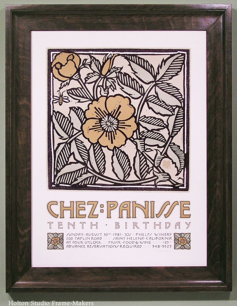
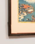
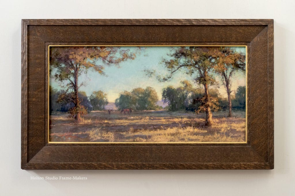
My last post celebrated 50 years of Chez Panisse by featuring two recently framed David Lance Goines posters made for the restaurant. Here, also recently framed, is another poster by Mr Goines, this one made in 2010 for another world-renowned North Berkeley food establishment, Peet’s Coffee, founded in 1966, just a few years before Chez Panisse. This poster, in stained quartersawn white oak, is in a classic Craftsman form with through mortise and tenon joints.

Framed David Goines Peet's Coffee poster
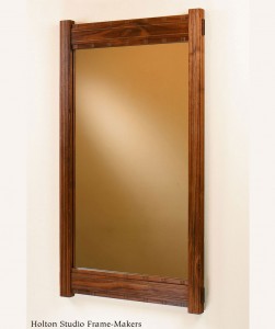
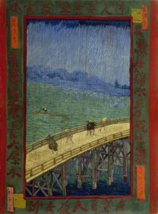
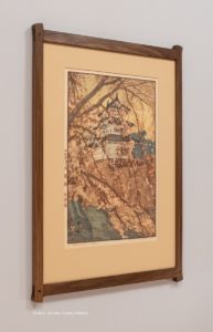
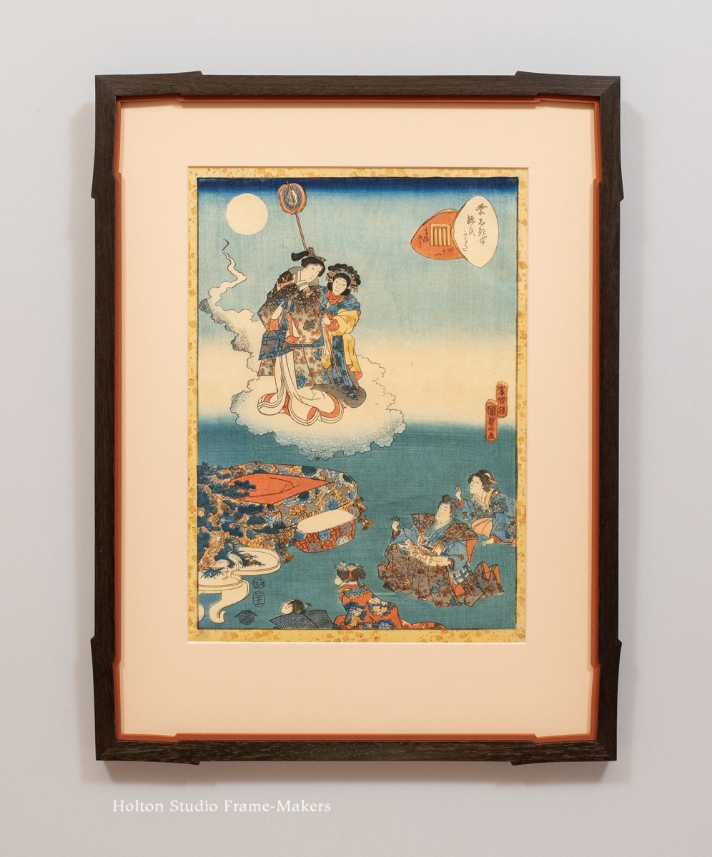
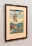
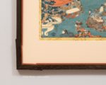
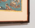
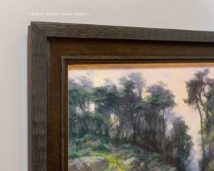
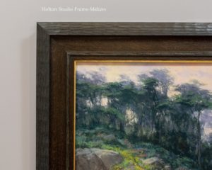
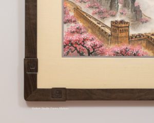
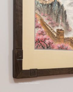
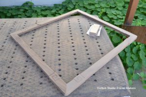
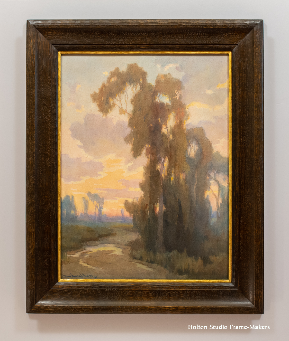
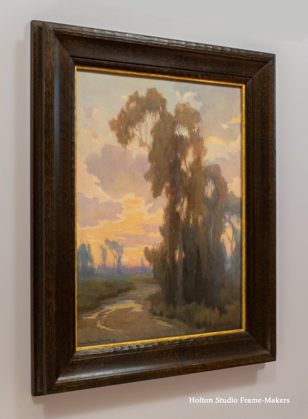
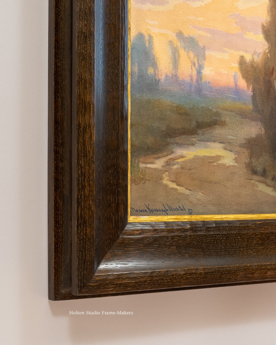
Below is the same poster as we framed it shortly after it came out in 2010. This is also stained quartersawn white oak, and another mortise and tenon design, our No. 1100, which has a chamfered sight edge. The sides are 2″ wide, and we made the top and bottom 2-1/2″ wide.

David Goines Peets poster in No. 1100

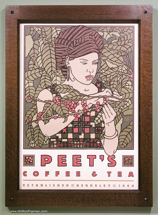
No. 1100 — 2″ – 2-1/2″ on David Lance Goines poster for Peet’s Coffee

Here is the linoleum block Mr. Goines used to make the print. (Found this image online.)Printing block for David L Goines Peet's Coffee poster

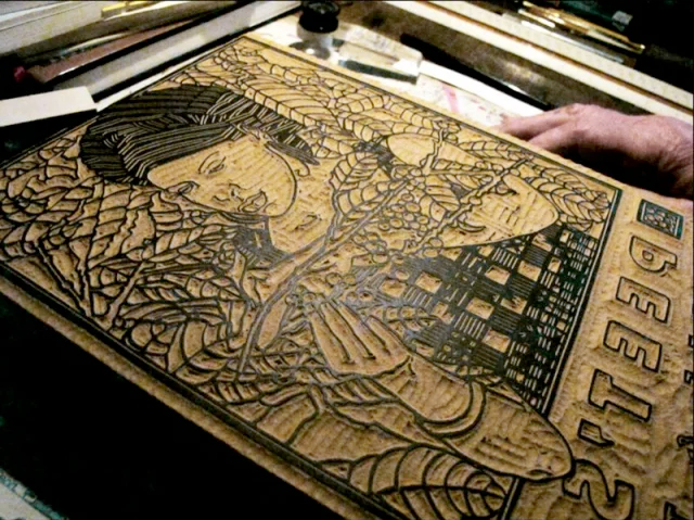
Peet’s Coffee, Chez Panisse, Holton Studio, and the Living Legacy of the Arts and Crafts Movement in Berkeley

“I came to the richest country in the world, so why are they drinking the lousiest coffee?”—Alfred Peet

One day in my early twenties a friend I was hanging out with decided he needed a cup of coffee, and I went along. I was not a coffee drinker. When I was a kid in the sixties and early seventies, my parents had drunk Hills Brothers and Folgers. 
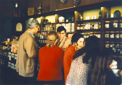
But when they were going to be entertaining, my mom would go down to the little shop on the corner of Walnut and Vine to get some real coffee from Mr Peet. I occasionally went with her and remember dark oak counters and cabinets framing myriad varieties of roasted beans behind glass. Too young to drink what Peet’s was selling, though, my prevailing impression of coffee came from the unappealing whiffs of bland bitterness normally brewed at home from the stuff that came in a can from the supermarket. But that day years later, standing on Vine Street, joining my friend Jeff in a cup of Peet’s coffee, that first sip brought on a revelation: Oh! This is what coffee’s supposed to taste like!

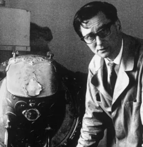
Born in the Netherlands to a family in the coffee business, Alfred Peet was once called “the Dutchman who taught America how to drink coffee.” In his own words, “I came to the richest country in the world, so why are they drinking the lousiest coffee?” His approach began with a mastery of the art of roasting and a conviction that “it was crucial to have the shortest distance possible between the roaster and the customer, underscoring the importance of freshness to flavor.”* Alfred Peet recognized that coffee had been debased by industrial farming, processing, marketing, and distribution. In other words, as an art form, it was dead, and his mission was to introduce that art form to America. I’d say what he taught America was what he taught me: that coffee was more than a caffeine fix; that everything about it, from growing and sourcing (celebrated in the Goines poster), roasting to brewing, to buying to drinking, should be done with care and integrity—and could be enjoyed. By teaching America how coffee should taste, he taught us that it matters how it’s roasted, brewed, and served.

Alice Waters, 1990

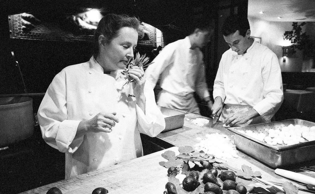
Alice Waters in the Chez Panisse kitchen, 1990

Which, in regards to food generally, is what Alice Waters would do around the corner at Chez Panisse. In the spirit of what we now call “farm to table,” Alice found good farms that grew their food carefully, as well as bakers, butchers and cheese makers devoted to their craft. Then she prepared meals in a simpler fashion that featured the natural flavor of fresh ingredients, and served her guests with the heartfelt conviviality and hospitality she regarded as indispensable to a good meal.

In the 1990’s, Alice Waters and Alfred Peet were exemplars to me as Holton Studio took shape and found its purpose. It made no difference that they were in food and I was in frames. Just as over-industrialization had threatened to debase the art of food, it had threatened to debase the art of the picture frame—along with many other arts. Like Waters and Peet, I saw the industrial system destroying an art that I knew, and turning out products that I knew to be inexcusably “lousy,” as Mr Peet said. We knew we could do better. And we knew that meant first and foremost good materials (or the culinary’s preferred term “ingredients”), because nothing we make is as good and beautiful as what nature makes; and, second, bringing the making, the actual art, closer to the customer. Those things were the vital roots and bases to which the arts had to be restored.

Patricia Curtan print, "Figs"

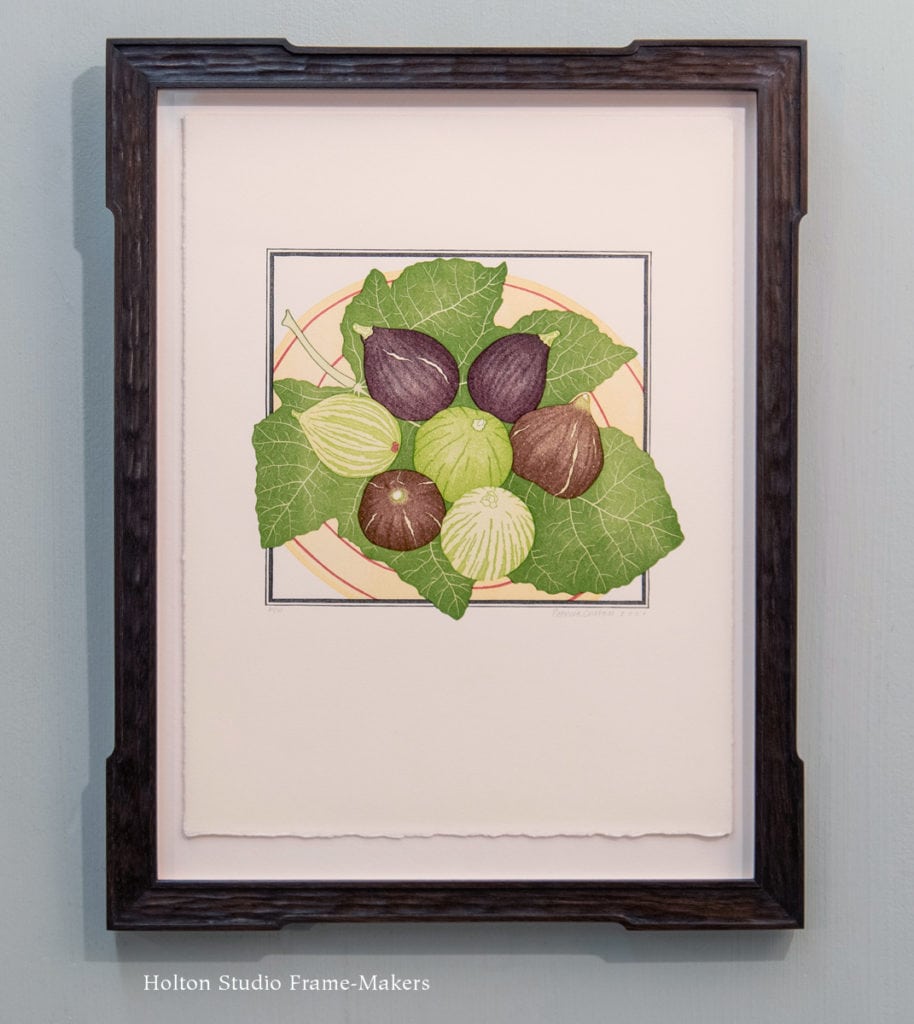
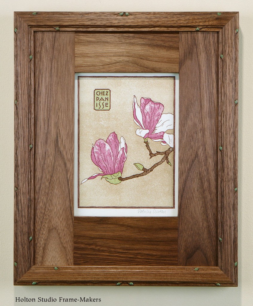
Patricia Curtan, linocut, “Figs,” for Alice Waters’s cookbook, Chez Panisse Fruit

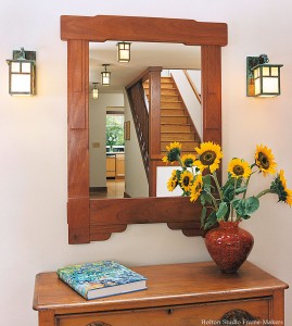
Peet and Waters were, to me, champions of a larger cultural current and force, a kind of counter-modernism, that has not always been acknowledged but is always at work. That current was certainly evident in Berkeley in the ’60’s and ’70’s; we called it the counter-culture. But more deeply, its greatest and most influential expression was the Arts and Crafts Movement which had begun eight decades before as a rebellion against what William Morris called “makeshift”: a widely felt “soul reaction”** to the age of money and machines and the consequent proliferation of “lousy” stuff. If the Movement was widely believed to have faded away by mid-century, Peet’s and Chez Panisse are proof that it had not. At least for some, its root impulses were as keenly felt and avidly followed as ever. It seems to me no coincidence that these two food businesses were started by two immigrants to Berkeley who chose to frame their endeavors in a city fundamentally shaped by Arts and Crafts ideals and work (especially the work of architect Bernard Maybeck), literally framed their own work in the craftsman vernacular architecture and decor born out of that movement, and turned to the heavily Arts and Crafts-influenced graphic style of David Goines to help establish their brands and public images. Nor is it surprising that both see fit to hang our hand crafted hardwood frames in their businesses. (A Holton framed Michael Schwab Peet’s poster hangs over the condiment counter at the original Peet’s; while Chez Panisse’s decor, as mentioned in the last post, includes several mirrors and framed Patricia Curtan prints.) Peet’s and Chez Panisse are examples and expressions of the Arts and Crafts Movement’s fundamental purpose: to take back into cultivating human hands arts whose essential nature and vitality was threatened by over-mechanized production and over-commercialization.

Just as Mr Peet couldn’t understand why the wealthiest country in the world had the lousiest coffee, I couldn’t understand why in America it was nearly impossible to find a decent, well-made picture frame. What Mr Peet strove for was to show people what real coffee tastes like. What I strive for is to show people what real frames look like and how they can serve and even transform a picture. I live for that reaction from the customer I’ve just presented with a newly framed—often re-framed—picture, that revelation analogous to mine upon tasting my first cup of Peet’s coffee: that’s how a picture should be framed.


* From the Peet’s Coffee website, here…

** The phrase is from Edward Pearson Pressey: “The Arts and Crafts [Movement] is a soul reaction from under the feet of corporations and the wheels of machines.” Pressey was the founder of the New Clairveux handicraft community. (Quoted in Fiona McCarthy’s William Morris: A Life for Our Time, 2010)

David Lance Goines, Chez Panisse and a Fifty Year Legacy Suitable for Framing

Fifty years ago this month, Berkeley graphic designer and printer David Lance Goines made this poster for a friend who was celebrating the first anniversary of her restaurant on Shattuck Avenue. Since then, Alice Waters and the “delicious revolution” she launched in 1971 have become famous worldwide, and every year Goines has made a poster to celebrate the birthday of Chez Panisse.

We just enjoyed the pleasure of framing both the first birthday poster as well as this year’s fiftieth. The original one from ’72, which is 24″ x 15″, we set in black stained walnut, in a 1-1/4″ wide plain flat profile with rounded corners and proud splines. The 1/8″ slip, which is also rounded at the corners, is painted to match the fetching plumed redhead and her aperitif. (We made a similar frame for Goines’s poster for International House.)

David Goines posterDavid Goines posterClearly referencing Toulouse-Lautrec, David Goines also says about this poster’s inspiration,

“I fell in love with this woman whom I’d drawn from imagination and dreams. Late at night I’d sit and look at her and wonder if anywhere there was a woman who had that wistful hopeful look, sipping an aperitif, making it last. Hands daintily folded waiting for me. I kept looking and then I found her and people said to her, ‘Did you pose for that poster?’ but it had been the other way around.”


This year’s 50th birthday poster got a carved cherry frame stained deep red-brown. The sloped profile sustains the radiating flowers, while the pattern of the carving echoes the shapes of the flower petals. A gilt slip repeats the gold highlights.David Goines poster


Cover, Thirty Recipes Suitable for FramingIn 1970, even before Waters opened Chez Panisse, she and Goines collaborated on a lovely portfolio of prints called “Thirty Recipes Suitable for Framing”—which to a frame-maker is a welcome invitation. (Cover at right.) Below is a set of three from that edition, which just came through the shop as well. All are simply presented in 3/4” No. 1 frames using our Everyday Framing.

David Goines Chez Panisse posterI couldn’t actually tell you how many Chez Panisse posters I’ve framed over the years. Alice Waters was a customer of Storey Framing when I worked there as a kid in the ’70’s and ’80’s, and she brought us quite a few to frame. As for how many the Studio’s framed, I’d have to scour 29 years of records to be able to say. (We have several for sale, here.) Certainly we’ve framed a whole lot of the birthday posters (have always liked the tenth, at right), as well as others such as those that originated as designs for book covers. Here are a couple, below.


Meeting David Goines

Not long after starting my business, I visited Mr Goines at his studio, St Heironymous Press. He was kind enough to give me several posters, and I reciprocated by framing for him a small drawing his mother had made of him when he was a baby. I told him about my ambitions for the Studio—to be a frame shop that was a real wood shop that made every frame from scratch. I must have felt self-conscious about sounding ambitious, because I quoted Robert Browning’s “A man’s reach should exceed his grasp.” Having seen such dreams come true, David smiled warmly and replied with the rest of the line: “Or what’s a heaven for?”

And More Holton Studio Connections to Chez Panisse…

Over my years, I’ve enjoyed celebrating some very special occasions at Chez Panisse (not least of all, beautifully festive New Year’s Eve anniversaries with my wife, Stephanie!). You’d be hard-pressed to find another business of any kind that is so deeply infused by its proprietor’s intense personal care—both for a cause and for her customers. (She’d probably say her customers are her cause.)

I’m fortunate to have five or six of my mirrors hanging in the restaurant and upstairs cafe. One just like the mirror below on the left hangs in the entrance. The one on the right hangs in the dining room.


And this menu below, by Patricia Curtan, remains a favorite. Patricia’s illustrations grace the restaurant’s new website, but her collaboration with Alice—and, as a printmaker with Goines, as well—goes back decades, beginning with a stint in the Chez Panisse kitchen as a pastry chef. But it was with her beautiful menu designs and illustrations for Alice’s cookbooks that she’s really made her mark as part of the restaurant’s formidable legacy. The magnolia menu here is from 1993—the year I started Holton Studio Frame-Makers. (Only 21 years to go to catch up with Chez Panisse!)

Chez Panisse menu, framed

“Magnolia Menu,” 1993. Click image for more…

Besides the mirrors, several Patricia Curtan prints I framed were also purchased by Alice Waters to hang in the restaurant. I posted those here.

The Edible Schoolyard

My most important connection to Chez Panisse and Alice Waters, though, may be the Edible Schoolyard at King Middle School, which was a great highlight of my daughter’s education here in Berkeley. (Alice was once a Montessori teacher and has an abiding love and concern for children.) After quickly becoming a model for school gardens all over California, it’s now inspiring educators worldwide and drawing teachers from everywhere to come and learn about gardens and school curriculum. Accessible to the public outside school hours, it’s also a wonderful contribution to the life of Berkeley; and for that too I’m thankful to Alice. 

Alice Waters beautifully framed by her brainchild, the Edible Schoolyard at King Middle School in Berkeley


To me, this picture (at right) from the Edible Schoolyard speaks volumes. Through the arts of cooking, teaching, farming, and running one wonderful restaurant and gathering place, Alice Waters has helped prove that the arts are how we—and, not least of all, children—join the world.

From Holton Studio Frame-Makers, congratulations to Alice Waters and Chez Panisse (and David Goines and Patricia Curtan, too) on a legacy most suitable for framing!


Many of David Goines’s Chez Panisse posters are available from the Chez Panisse online gift shop.

David Lance Goines’s website is here…

Read a profile of Goines in the San Francisco Chronicle, here…

View Holton Studio’s framed Goines posters here…

UPDATE, FEBRUARY 25, 2023: David Lance Goines died on February 19, 2023. Read Tim’s post, “R.I.P., Mr. Goines.”

“A Tabernacle for the Sun”: Framing Thomas Kegler

This is an oil painting by an extraordinary artist out of East Aurora, New York. Thomas Kegler (b. 1970) has very deliberately embraced the nineteenth century Hudson River School tradition, and it shows. We placed the 15″ x 30″ “Morning Has Broken, Psalm 19: 1-6″ in a 3-1/2” wide mitered frame in quartersawn white oak with Saturated Medieval Oak stain. The profile is basically our No. 134.1 but with a little carving. With the sight edge cushion repeating the gentle slope of the land, I saw fit to carve that element of the frame to also repeat the texture of the grassy hill. The fine quirk or fillet outside that carved cushion element picks up Mr. Kegler’s fine rendering, especially of the tree trunks. Another aspect of Kegler’s excellent rendering, the sensitive gradation of light, is served by the subtle way the broad flat of the frame curls up at the outside (that concave element complementing the convex form at the sight edge). A narrow 1/8″ slip with 23 kt gold leaf seems to reflect the sun. As a subordinate complement to the shadowy tone of the dark oak, the slip and frame together repeat the painter’s dramatic treatment of the most fundamental complement of all landscape paintings: light and shadow. Thos Kegler paintingLandscape paintings like this exemplify the deep understanding (made explicit during the Renaissance) that a painting is a window. And so the idea of a picture frame is to complete the painter’s window illusion by providing it with a window frame. When the design of that window frame is not arbitrary but alive to the landscape it was made for, the frame suggests an architecture in harmony with the land of which it is a part.

And when that land is viewed as a sacred creation, the frame, then, is not only a window but a kind of shrine—”a tabernacle for the sun,” to quote the Bible verse of the painting’s title.

Thomas Kegler’s website is here…

The artist has just been profiled in this article in the magazine Western Art and Architecture…

Thos Kegler painting

Framing a Famous Utagawa Hiroshige Print

In 1857, the same year that Utagawa Kunisada made the print in my last post, another Utagawa, Utagawa Van Gogh paintingHiroshige, produced his “Sudden Shower over Shin-Ohashi Bridge and Atake.” As part of the artist’s series “One Hundred Famous Views of Edo,” this already famous view would then become even more famous—and especially so after Vincent Van Gogh paid tribute to it with his “Bridge In the Rain (After Hiroshige)” (right). (Note how Van Gogh expressed his admiration with an emphatic frame.)

This is a through mortise and tenon frame with 3/4″ sides and 1″ top and bottom rails. As a modification of our very popular Yoshida frame, we call it the Flared Yoshida. This one for the Hiroshige is made in walnut with a black wash. Like the frame on the Kunisada, it has a slip painted to match the reds in the print. (Van Gogh had the same idea.)Framed Hiroshige print

Framed Hiroshige print We’ve also used it recently on the two oban size Shin Hanga prints below. The first by Tsuchiya Koitsu (1870-1949) is titled “Nikko Futarasan.” Like the Hiroshige frame, this one is walnut with a black wash. It also has a painted slip.

This one, “Hirosake Castle,” is by Hiroshi Yoshida (1876-1950) (for whom the Yoshida frame was named). The frame is in walnut with a clear finish.

Framing a Kunisada Illustration for The Tale of Genji

This is an 1857 woodblock print by Ukiyo-e master Utagawa Kunisada (1823-1900) titled “Illusion.” It is described as one of the Game Cards for the Chapters of Lady Murasaki’s Tale of Genji”—the eleventh century novel depicting the lives of Japan’s high courtiers during Heian period. The print is 14″ x 9-13/16″ (oban size). We gave it a simple 4-ply solid core mat and set it in a 5/8″ wide ebonized walnut frame with staggered and flared corners shaped to repeat the lines of the kimono. A 1/8″ wide slip (or fillet), painted to match the red in the the print, follows and accents the shaped corners.

Mabaroshi print, framed

The Mighty Earth: Framing Kim Lordier’s “Misty Morn” for Our New Exhibit

The mighty Earth is making her power felt this summer, once again reminding us—or, rather, commanding us—to pay attention to her and to her great creation on which we depend and of which we are a part. Can we picture a civilization that heeds the Earth’s pleas? Surely its architecture would subordinate itself to and harmonize with the landscape, honor the Earth’s materials, and reflect the forms, patterns, colors, textures of the land to which it strove to belong. And the pictures that adorned the walls of such an architecture (windows of memory, admiration and imagination to augment actual windows) would punctuate its reverence for the life of the Earth by depicting her creation.

Kim Lordier pastel, "Misty Morn"“The Mighty Earth” is the title of our new exhibit of larger paintings by our roster of artists. The display offers to an overheated world a bit of visual (and zero-emissions) air conditioning by master pastel artist Kim Lordier: an 18 x 24 painting of Pt Lobos titled “Misty Morn”. The painting is the work of one who loves the Earth—and in particular, Monterey pines. Kim’s admiration for these trees was a cue for the architecture of the frame, especially its form and texture: a carved cushion element at the outside edge aspires to join the canopy. The trees’ color was also inspiration for the frame. I echoed the artist’s cool greens and blue-greens with (solvent-free) linseed oil paint rubbed in to the coarse grain of the quarter sawn white oak frame. A gilt slip echoes the yellow and orange California poppies.

Kim Lordier at James Rieser’s gallery

Kim Lordier painting

Kim Lordier, “Bathed in Riches.” Pastel, 12″ x 24.”

Kim Lordier: Illuminated Impressions—A Visual Journey will open Saturday, August 6 at Rieser Fine Art in Carmel. More than 20 works are available, including this one at right in our frame. We’re grateful to Jim Rieser for asking us to frame several pieces for this show. (The two examples below have already sold!)

Kim put together this snazzy online overview of the Rieser show.

View our own inventory of Kim Lordier’s pastels here…


“Salinas Valley Abundance,” 24″ x 24″

“Ojai Splendor,” 22″ x 27″

Painted Chamfers: Framing a Calligraphed Poem

This lovely poem by Dawn Gross was expertly calligraphed by Ben Yates. We used a 1-5/8″ wide walnut frame on the 15″ x 11″ paper. By chamfering the outside edge I gave the corners an abstract leaf form. I painted the chamfer with green milk paint, which I’ve been enjoying playing with over the past few months. (More on that in upcoming posts.) The sight edge is also chamfered, and we gilded it with 23 kt gold leaf.

I’ll stop there so you can enjoy Dawn’s “Voice of a Hummingbird” in Ben’s exquisite hand. (Just click the image to enlarge enough to read.)

Ben Yates and Dawn Gross framed poemFramed poem—oblique view

Framing the Great Wall of China

Just framed this Chinese painting of the Great Wall of China. The painting is 17″ x 20″. The 1-1/2″ wide frame is walnut with dilute black stain. We used a silk covered mat with grey paper filets inside the sight edge. You probably recognize the spiral pattern as a classic Chinese design.

Painting of Great Wall of China

Process

Framing Marion Kavanagh Wachtel

Here’s a beauty from one of the state’s greats. In early California’s popular eucalyptus painting genre, this 24″ x 18″ watercolor by Marion Kavanagh Wachtel (1876 – 1954) is hard to beat. “Sunset,” is not dated, but is believed to have been done in the 1910’s.

Frame design sketchI proposed the frame design for the customer, California Historical Design, with the sketch at right, and Trevor Davis built the 3-1/2″ wide mitered frame in quartersawn white oak (Dark Chestnut Stain), with a carved gilt liner. Sam finished the frame and gilded the slip. Carved cushion forms on the sight edge and back edge complement the smooth low sloping cove, and repeat the rounded tree forms. As you can see in the sketch and the oblique view below, the back is cut in and sweeps out dramatically. The dark frame takes its color from the deepest shadows, enhancing the orange glow of the sunset.

Another Marion Wachtel watercolor we framed is in the Portfolio, here.

Marion Kavanaugh Wachtel painting

marion Kavanaugh Wachtel painting

Frame corner detail

Frame corner detail

We also recently framed this 10″ x 12″ oil painting by Marion Wachtel for California Historical Design (available here). This frame’s a 2-1/2″ wide slope with a carved back-beveled back edge and parcel gilt chamfer at the sight edge. Whereas the mood and tones of the watercolor above called for a softer, more graceful profile, the more rugged subject matter of this oil inspired a more angular form.

Marion Kavanaugh Wachtel painting

Marion Kavanaugh Wachtel painting