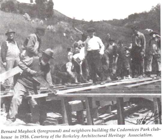
A couple of months ago, we were asked to frame a portrait of the architect Bernard Maybeck (1862-1957) to hang in the larger frame of Maybeck’s 1902 Faculty Club at UC Berkeley.
No portrait cries out for the architecture of a frame like a portrait of an architect. You might say that frames are architecture at its most refined. So making a frame for a portrait of an architect to hang in one of his buildings* is especially gratifying to a frame-maker. Frames, no less so than the portraits they complete, are inherently honorific. To be asked to frame this portrait, though, was not only gratifying but also a special honor for Holton Studio.
First, though, the painting.
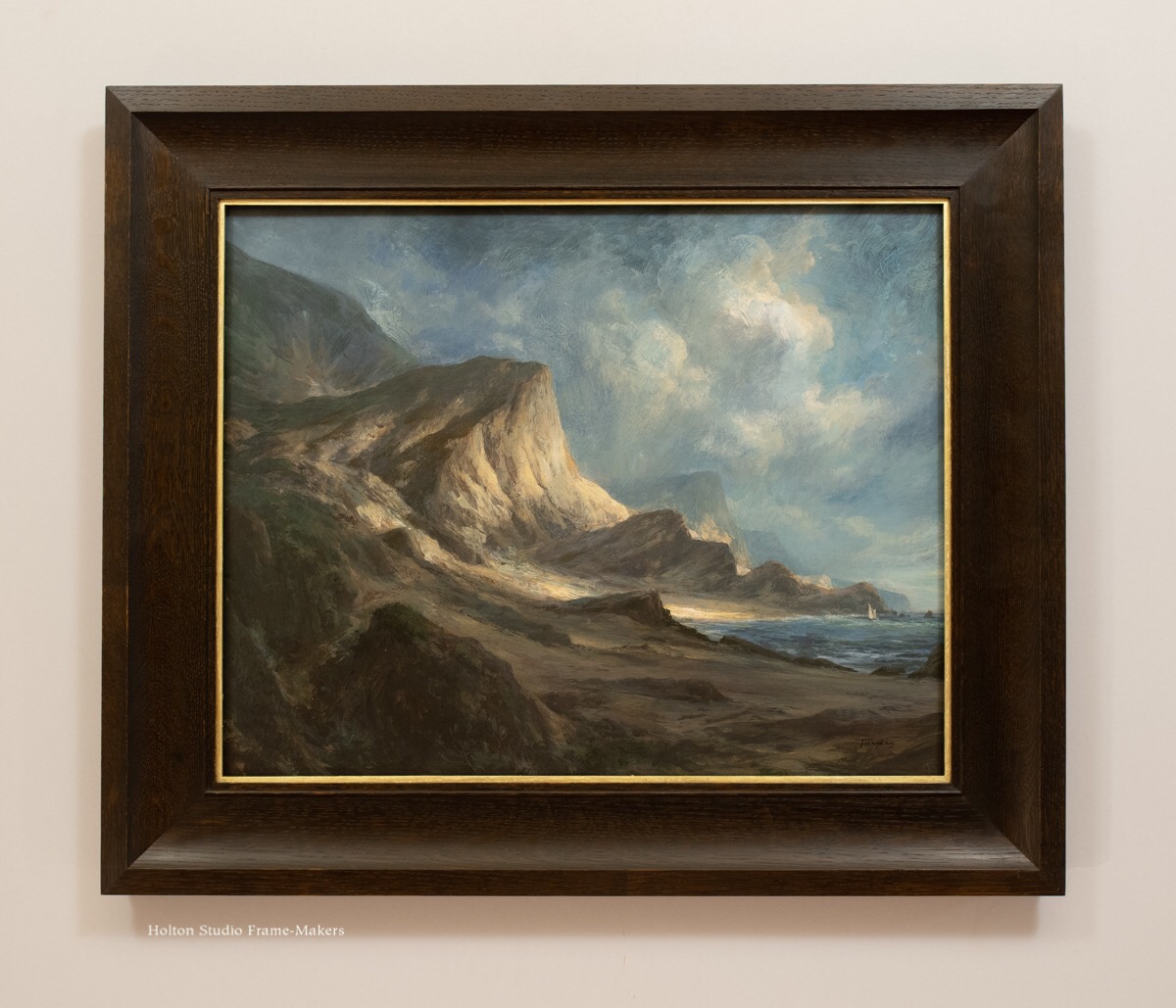
 The noted portraitist Winifred Rieber (1872-1963) painted this likeness of Maybeck in the 1920’s after the architect had gained fame for his Palace of Fine Arts, the most beloved building of the 1915 Panama Pacific Exposition in San Francisco. (In 1951, he would be awarded the Gold Medal by the American Institute of Architects.) Such portraits frequently become treasured heirlooms, as the original of this one is for the Maybeck family. (This copy we framed to hang in the Faculty Club is a print on canvas.)
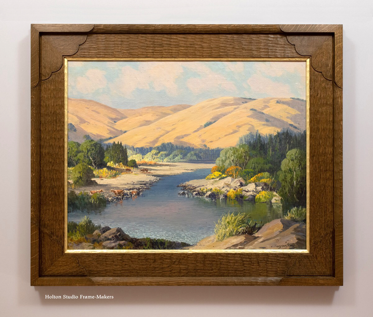
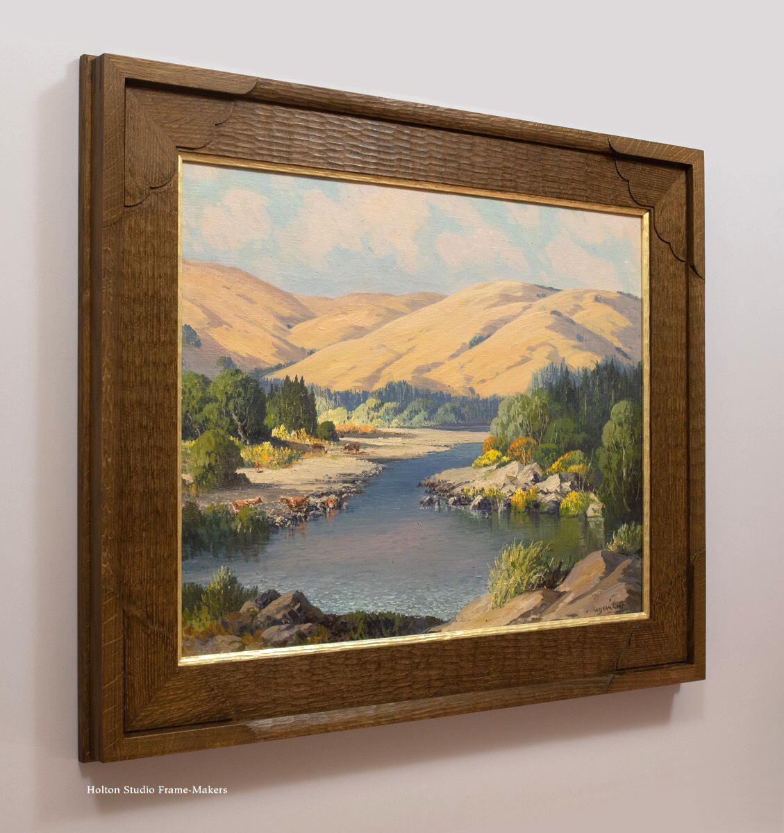
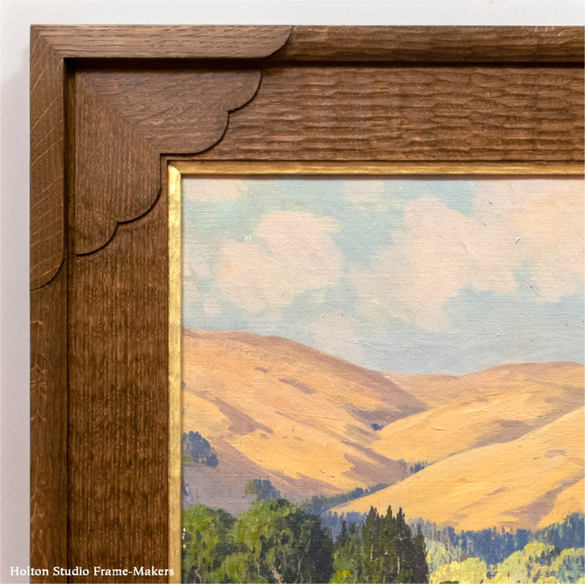
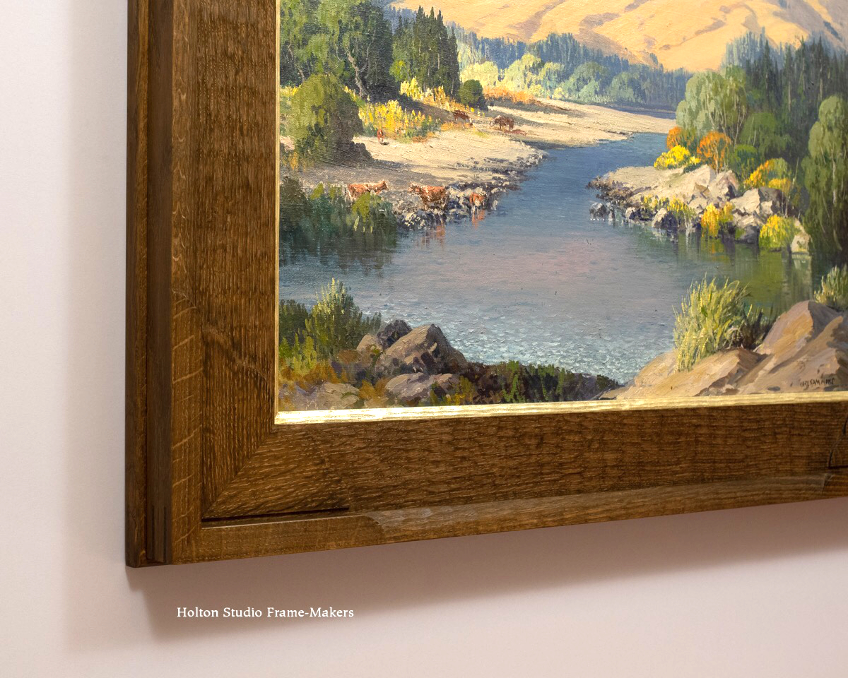
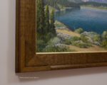
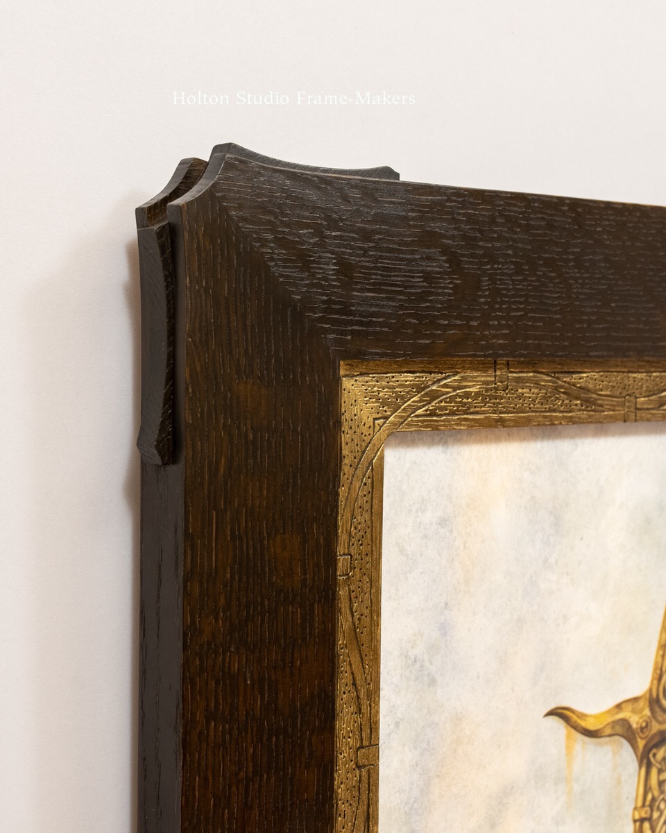
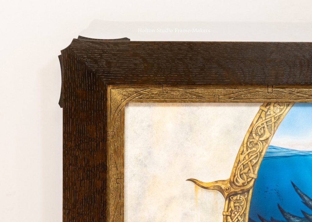
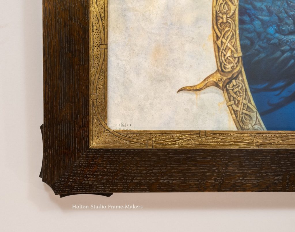
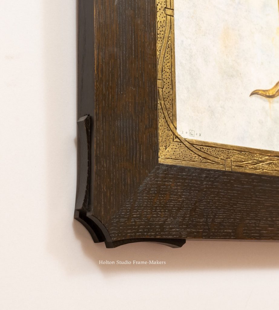
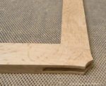
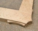
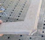
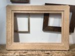
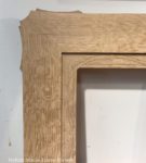
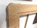
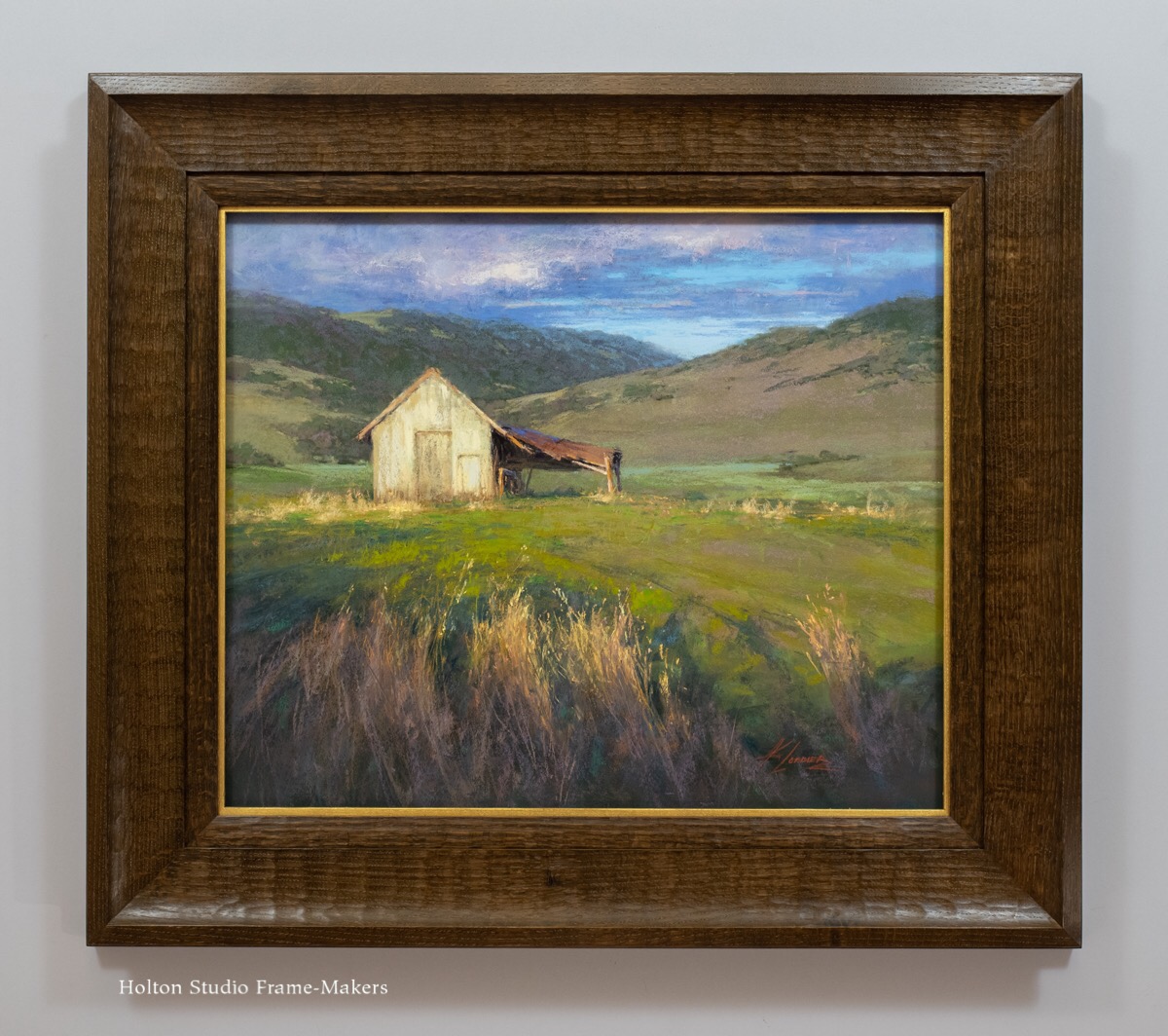
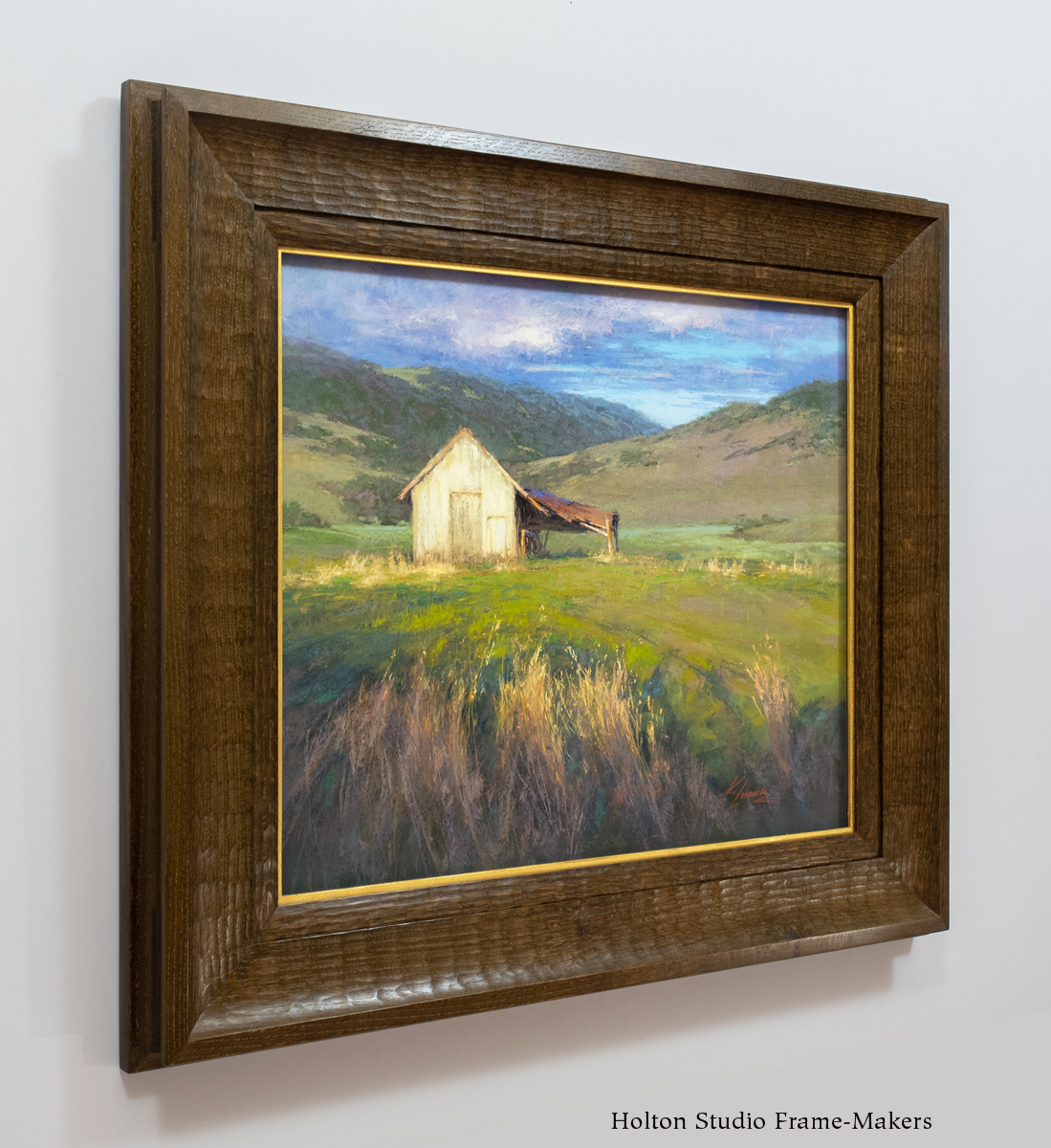
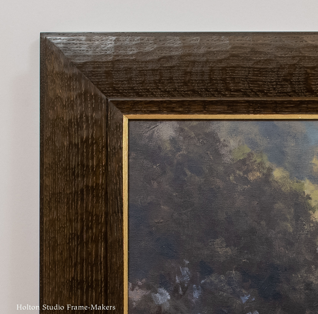
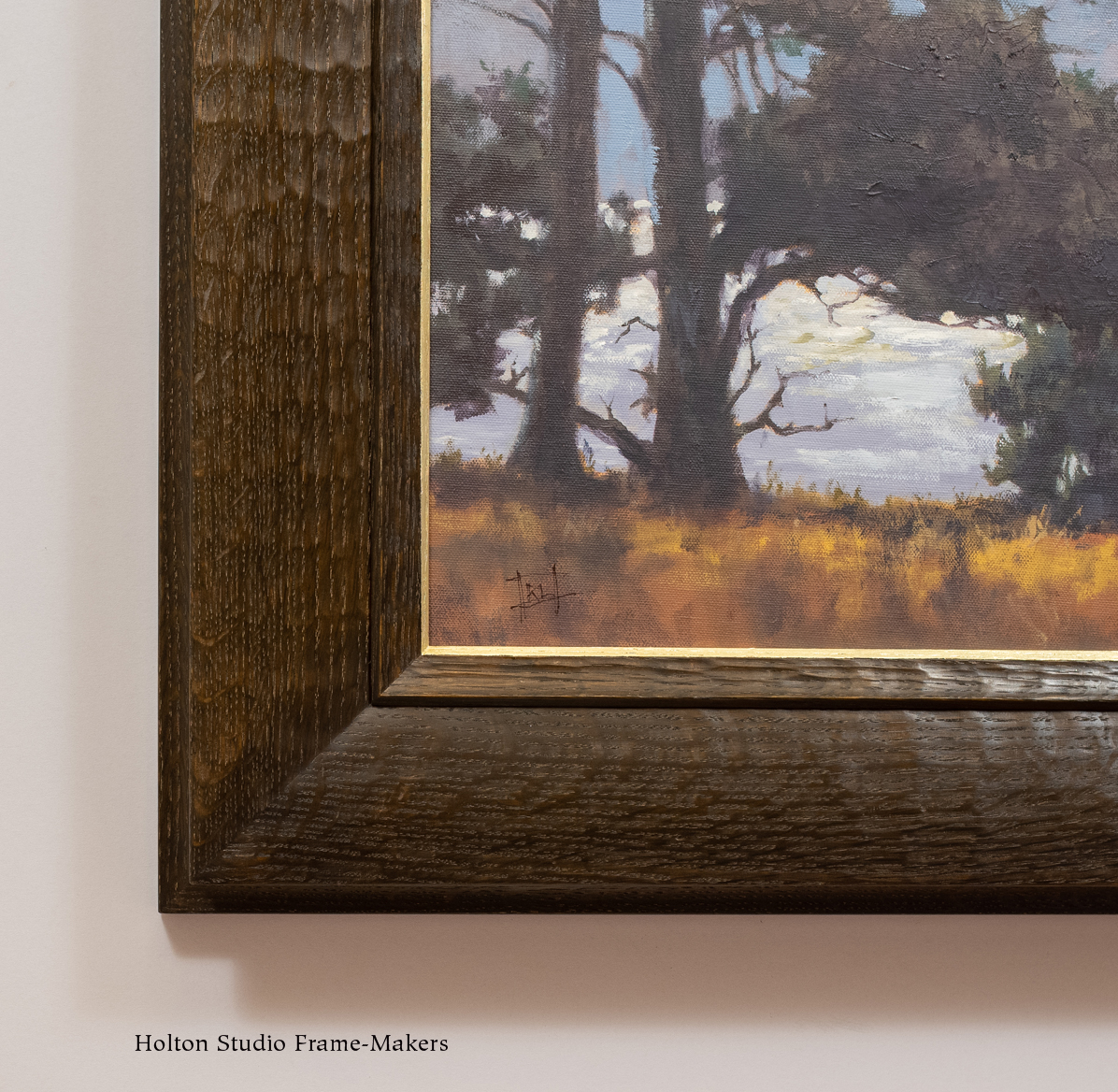
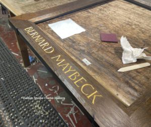
 We gave the 30″ x 25″ canvas a 4″ wide mitered frame. It is for the most part a plain flat, which allows the frame to rely above all on the inherent beauty of the wood. (That is to say, the quarter sawn white oak serves the frame the same way Maybeck’s raw redwood walls serve the architecture of the Faculty Club). We beveled the inside and outside edges of the flat face. The inside bevel leads the eye in to the picture, and also, along with the outside bevel, repeats the angularity of the rendering, especially the lines of the subject’s architectural setting. (Note how the sill of the window in the painting meets the miter of the frame.) Those bevels are carved. The tooled texture complements the smooth face of the frame and also echoes the loose, impasto brush work.
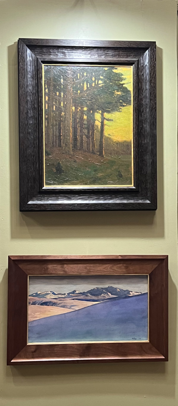
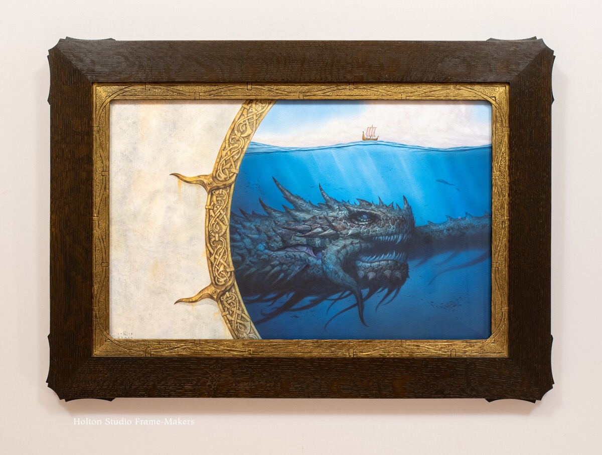
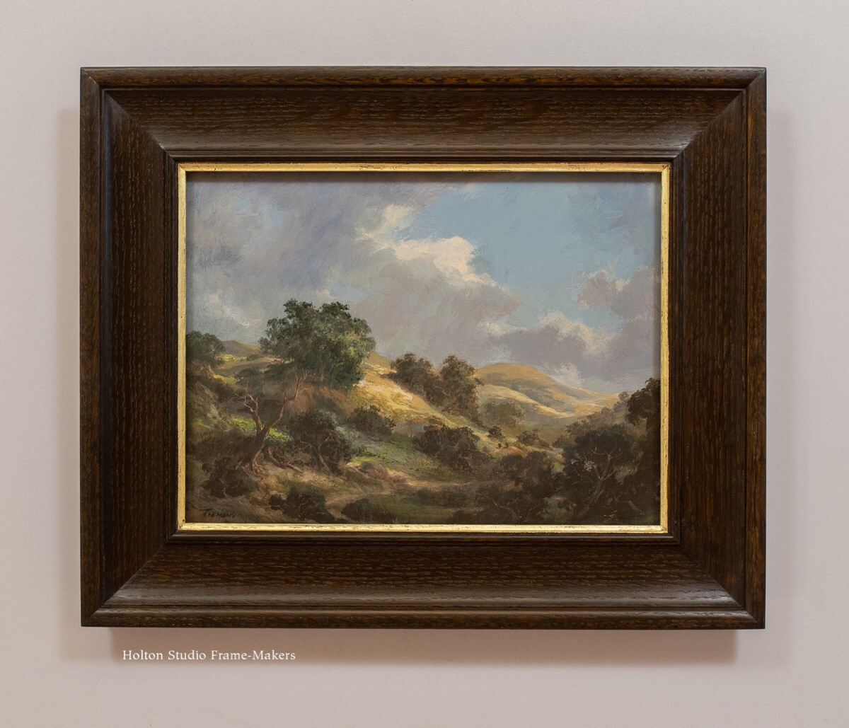
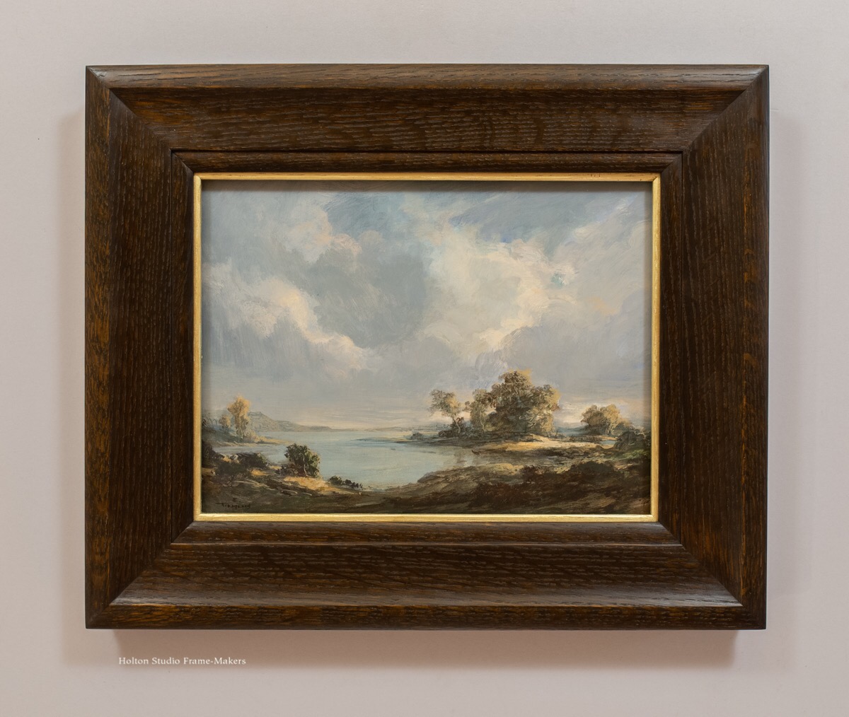
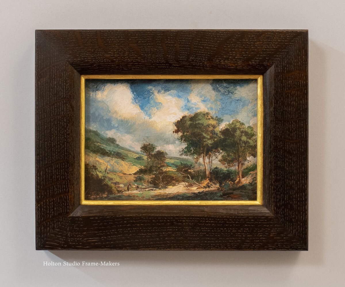
The outer bevel also serves the outset corners of the frame, which protrude slightly but have their radiating effect enhanced and accented by the outer carved bevel which stops where the corners step out. (Similar treatment can be seen on this frame, and this one. This Thomas Hill painting was the first piece we made this frame design for.)
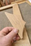
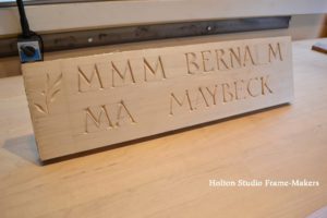
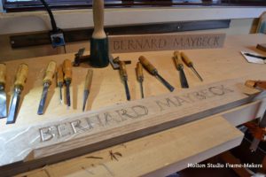
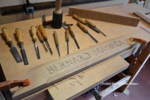
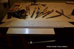
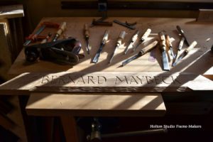
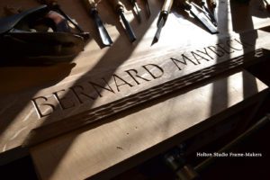
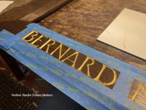
 Trevor Davis and I built the frame, and I carved the architect’s name across the bottom. The lettering is a simple Roman, but “waisted,” meaning the stems are all pinched a bit in the middle. Sam gilded the letters.
…
When the Maybeck Foundation asked me to help them honor my city’s great architect by framing a portrait of him to hang in one of the architect’s exemplary public buildings, and requested that I carve Maybeck’s name across the bottom, I don’t think they had any idea what the task would mean to me. For natives like me, the city is impossible to imagine without Maybeck’s architectural legacy.** And personally, it was a chance to express my admiration and appreciation for a great advocate of craftsmanship in architecture, and thus one of my heroes.

It’s not at all an elaborate frame. But that was part of the beauty of this opportunity—to provide a simple home to honor the master of Berkeley’s simple home ideal. Framed portraits are reciprocating: they not only represent a figure (that is, literally re-present the deceased, making the departed present again), thus honoring him or her; they also represent (and re-present and express) the admiration of the painter and the framer who are honoring the figure, and more broadly, the community that person has touched.

In any case, frames, as I said, are inherently honorific, and so is carving a person’s name in oak and gilding it—especially when the honoree is himself a carver (although in Maybeck’s case too self-effacing for us to ever know which carved details to attribute to him). The very act of carving is devotional. It’s not only the pinnacle of the art of frame making but the epitome of the ideal of work as “love made visible,” in the words of Kahlil Gibran.
Even apart from the carved lettering, though, the simple architecture, the simple home that the frame provides his portrait, offered the opportunity to honor Maybeck. “With four sticks of wood,” he once said, “you can express any human emotion.” Such wisdom, especially helpful to a frame-maker, is only a glimpse of the many elemental lessons Maybeck taught me in the art and architecture of the frame.
…
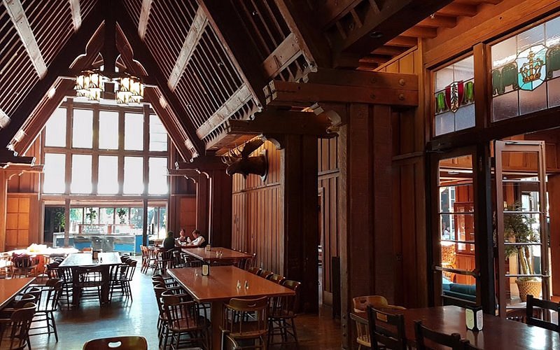
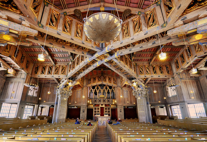
Speaking of the devotional nature of carving, in the Great Hall of the Faculty Club (right), carved into the supporting beams along the sides of the room, dragon heads keep watch over the proceedings. Maybeck said that carved dragon heads, a recurrent detail in his buildings, were his tribute to his father’s trade—and, we can surmise, the craftsman ethos that his father’s work impressed upon him. It’s hard to imagine Maybeck didn’t have a hand in their making.
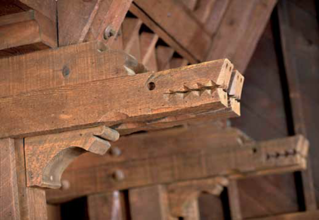 In any case, as dragons go, these appear remarkably friendly. That is to say, they express Maybeck’s own affable spirit. When the university decided it needed a building that would be a place for the faculty to enjoy “mutual good fellowship” it couldn’t have chosen a more suitable architect than Maybeck.
 Maybeck’s generous spirit and appreciation for craftsmanship in the art of architecture was once illustrated for me by Robin Pennell, whose father, Frank Pennell had been a contractor for Maybeck. Robin recalled his father’s story of meeting the architect on a job site to inspect the house’s just-completed framing. Maybeck was struck by the framers’ beautiful workmanship, admiring in particular the perfectly mitered and nailed stud braces. And he said to the contractor, “Forget about the paneling specified for the interior walls. I want to be able to see this workmanship. Just fill in between the studs with plaster and leave the framing exposed.”
First Church of Christ, Scientist, Berkeley
Pennell’s story tells us that for Maybeck, details like carved dragon heads are more than a quirky personal gesture.*** To walk through Maybeck’s masterpiece, The First Church of Christ, Scientist, Berkeley, is to witness not only the old understanding of architecture as the collaboration of trades, but also those trades practiced at their freest and most expressive. It is to experience the full meaning and truth of William Morris’s, “Art is the expression of man’s joy in his labor.” It is in the well crafted details, at the scale at which human hands are able to work at their most dexterous, expert and expressive, that the artisan feels his or her individual power and participation.
…
When we finished framing the painting, a friend picked it up from the shop and hung it at the Faculty Club. A few weeks later, the Maybeck Foundation hosted a small gathering to celebrate the portrait’s installation. In this building made for “mutual good fellowship,” I got to bask in fellowship with my hero—not only in the presence of his re-presentation that is the portrait, but also in his still-living architecture (that is a living reminder of the humane way of building that modern architecture might have been). Not least of all, I got to enjoy Maybeck’s presence in the friendly company of a number of his descendants.  A couple of family members, including Maybeck’s great-grandson, Scott Nittler, filled me in on what he regarded as the family’s main trait traceable to Bernard Maybeck: his optimism. And though Scott wouldn’t have pointed it out to me, I observed for myself that other oft-noted Maybeck trait: kindliness.
I love that the picture shows Maybeck in one of his simple wooden homes, one we could re-present and complete with the home that is a frame. And I love that the architect is seated at a window, a picture frame being a window as well, and windows being “the eyes of a house” and offering prospect—that necessary complement to protection and shelter, and of keen interest, therefore, to any architect, but especially to an optimistic one.
Maybeck looks a bit shy, and not too excited to be the focus of attention. There is no vanity in this portrait. The shadowy frame complements and enhances the sun shining through the window and falling significantly on the architect-artisan’s plain white shirt, and on this figure remembered for his sunny disposition. I was satisfied by how the slightly outset mitered corners of the frame suit Maybeck’s benevolent radiance, demonstrating for the master that I’d learned his lesson: “With four sticks of wood, you can express any human emotion.”
Process—the carved and gilded lettering
-
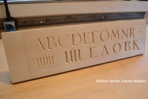
- My basswood practice board—front.
-
- My basswood practice board—back.
-
- Getting started on the carving. The final oak practice board’s in the background.
-
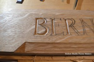
- Giving the Roman letters character by “waisting,” as shown on the long stem of the “B”
-
- Progress…
-
- The completed carving at the end of the day.
-
- Looks even better in the morning sun hitting my bench.
-
- …
-
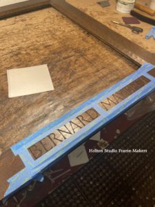
- Sam has masked the bottom rail of the frame in preparation for gilding.
-
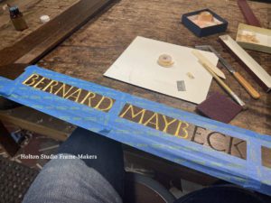
- Gilding the letters.
-
- Detail.
-
- Done!
Notes
*The room where the portrait hangs was in fact designed by John Galen Howard, and was added on to Maybeck’s original building adjacent to the Great Hall. Maybeck’s first biographer, Kenneth Cardwell noted that “Nothing would have please Maybeck more that this organic growth of a building.” At least for me, then, the whole building is, if not Maybeck’s, supremely Maybeckian in its social and collaborative spirit.
** See Ursula Le Guin, “Living In a Work of Art,” in Words Are My Matter, 2016. As tributes to Maybeck go, this account, by one of Berkeley’s best writers, of growing up in a Maybeck house is a brilliantly observant and insightful. Le Guin digs deep into the influence and meaning of houses and architecture, and the especially beneficent effect of Maybeck’s architecture on her as a person and especially as an artist. I would add that, given the architect’s influence on the city (at least its hillside neighborhoods), the essence of Le Guin’s experience in the surroundings of a Maybeck house applies nearly as much to those of us who didn’t actually live in a Maybeck but nonetheless grew up surrounded by Maybeck’s buildings and the whole architectural tradition in which he was the primary force.
***In On the Edge of the World, architectural historian Richard Longstreth attributes much of Maybeck’s fundamental concern with craftsmanship to his reading, while a student in Paris, the work of Gottfried Semper (1803-1879) and Viollet Le Duc (1814-1879). “Semper emphasized crafts…because he believed they provided the key to the laws of architecture. His underlying thesis, that the laws governing crafts and architecture were the same, may well have had the greatest impact in shaping Maybeck’s views.” Similarly, “Viollet repeatedly emphasized the construction process as a craft and principal contributor to the building’s spirit. Viollet believed that in the past creativity and discipline in design came from the builder… His portrayal of the artist as a liberated craftsman probably inspired Maybeck, as it reinforced his own inclinations.”