Take Me There: Framing Paul Roehl’s Poetic Landscapes

A couple of months ago, Paul Roehl came by with an astonishing batch of new work, including this one, “Antonelli’s Pond” (2009 & 2020; oil on panel, 16” x 20”). Jessie and I soon realized that a show had fallen in our laps. The show’s called “The Poetic Landscape: New Paintings by Paul Roehl,” and it’ll be here in the gallery the whole month of October. We picked “Antonelli’s Pond” for the postcard (which is at the printer right now), so I needed to frame it.Paul Roehl painting

The frame is basically a simple 3″ wide flat profile in stained quartersawn white oak, but I carved the inside and outside edges—the sight edge in a simple rhythmic pattern reminiscent of conventional beading that’s part of the common vocabulary of frames. Such conventions are often “dead,” arbitrary embellishments. But I adapted it to be alive to this painting, suiting it to the looseness of Paul’s painting style, and, more importantly, to respond directly to something in the painting: the shapes of the trees silhouetted against the sky. I added the pale gold liner to similarly silhouette and emphasize the flattened bead-like pattern. Otherwise, the frame is plain, flat and still as the surface of the pond. Its plainness also shows off the inherent beauty of the wood—the beauty of nature that was Paul’s inspiration.


Framing Paul’s work is always such a pleasure, in large part because the object of harmony that guides his compositions and tonalist-inspired palette makes harmonious frame design natural and easy. Also, what a frame does is deliver us to the picture, and Paul’s poetic landscapes are always places I want to go.

View The Poetic Landscape: New Paintings by Paul Roehl…

Framing Kawase Hasui with Proud Splines

With merciless wildfires raging throughout the West, it’s a good time to visualize rain.

Just finished this beautiful woodblock nocturne by the great shin hanga printmaker Kawase Hasui (1883-1957), and am very pleased with it. The oban size print (14-1/4″ x 9-3/8″), dated 1932, is titled “Rain at Maekawa Near Kozu.” I played some more here with proud splines. Looking to the architecture in the print for something to echo in the architecture of the frame, the shape of the thatched roofs caught my fancy, thus the shape of the splines. Otherwise, the frame is simple as can be—just a 1″ wide No. 1 in walnut stained Black. Oh—and an 1/8″ white gold slip to answer the light in the windows. The frame being itself a window, I guess that’s a second reference to the architecture. The mat is a very dark grey solid core rag mat. (Two other recent posts on framing Hasui are here and here.)

Framed print by Kawase Hasui

Click to view large…

Framing Selden Gile

This little 12-1/2″ x 10-1/2″ oil on board is by Selden Connor Gile (1877-1947). Gile was the central member of Oakland’s Society of Six, a remarkable and passionate group of plein air painters active in the teens and ‘twenties. The other members were Louis Siegriest, Bernard Von Eichman, August Gay, William H. Clapp, and Maurice Logan. We framed this painting in a No. 1.4 CV—2-1/2″ in quartersawn white oak with Medieval Oak stain, and it has a gilt slip. The loose painting style called for a simple frame, but I wanted to enhance the irregular dabs of paint with carving, and to echo the rounded tree forms. The No. 1.4 CV is a very versatile design we use pretty often, but this is one of the best examples of it on a picture.

Seldon Gile painting

Selden Giles seascape painting

The same customer had another Gile, shown at right, which we framed in a 3″ wide No. 22 CV frame with a gilt slip.

Below is a 1915 picture of Gile in his office at Gladding, McBean and Co. in Oakland (the 140 year old company is now in Lincoln, CA), where he started working just a year before the Great Earthquake. The firm, according to art historian Nancy Boas, “was a major supplier of ceramic building materials, from pipes and bricks to architectural adornments, and would play a major role in the rebuilding of San Francisco after the 1906 earthquake.” Gile is surrounded by his paintings in dark wood frames.

Selden Gile in his office

Boas, in The Society of Six: California Colorists, writes that “The force of Selden Gile’s personality was the most important impetus to the Six during (the group’s) formative era.” Member Louis Siegriest’s reminiscence of the group at the moment of its formal inception opens Boas’s excellent book, and captures its gregarious character, with Gile at the center:

Seldon Gile's home

Inside Seldon Gile’s Oakland home—the “chow house.” Again, we see the artist’s preference for dark wood frames.

Gile was standing at the stove cooking a big roast beef full of garlic smelling up the room and taking a drink every now and then of his home brew. Gay was sitting off in the corner with his cup of wine, and we were all crowded in as usual, jammed in because the whole room was filled with stacks of canvases, some wet ones that get on your clothes; then in came Mr. Clapp with his ho, ho, ho and a neat little pack of his day’s paintings under his arm. Sooner or later von Eichman would come crashing in with some wild story or other. Logan came in later because he ate dinner at home. Being the youngest, I was mighty glad to be included. I always came with a new painting or two, which we’d prop up on the floor and all take a crack at. It was a fairly large room full of paintings standing on the floor against the walls and tacked up. Every once in a while someone would pick one up and comment about it. Then there was always some argument going on about painters we’d run into during the day.
Well, this particular night we all crowded around the table, ready to dig in because we always liked Gile’s cooking, and Mr. Clapp was talking about this bunch of painters up in Canada he used to know who were now calling themselves the Group of Seven and were starting to show together. And Gile said why don’t we have a group, why don’t the six of us have a group and show together?

No doubt, to Percy Gray, the subject of my last post, who was just 8 years older than Gile, the Society of Six was infected with the “insanity” of modernism. But the enthusiasm with which the Six embraced the examples of the impressionists and post-impressionists—which, by the time they reached California, were already passé—is hard to resist. Who could complain about technical shortcomings in the face of such a exuberant passion for the land and life of California and all it promised?

The Re-Framings of Percy Gray

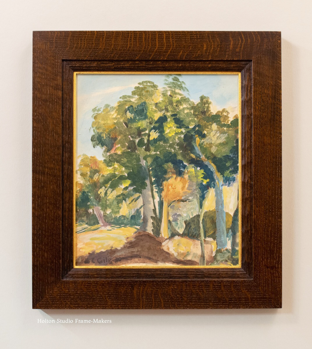
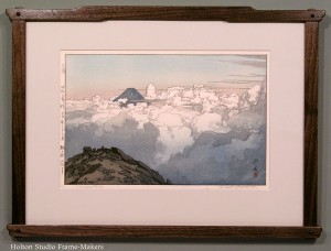
One of my favorite early twentieth century California painters is Percy Gray (1869–1952). We were very lucky recently to have three works by the great watercolorist come in to the shop in quick succession.

Percy Gray watercolor in period frame
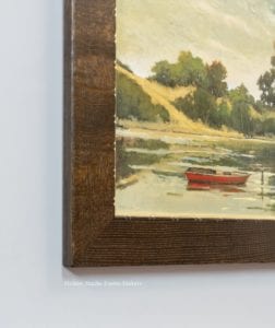
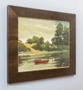
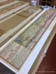
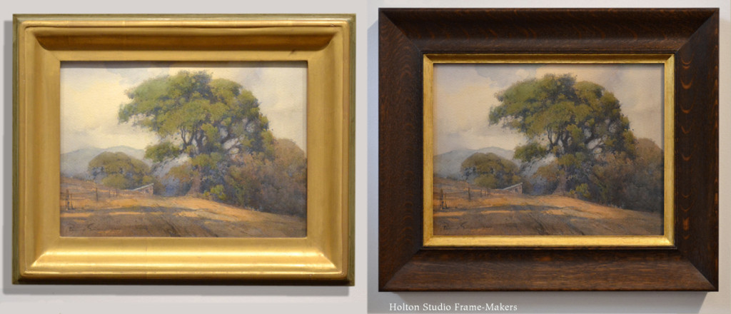
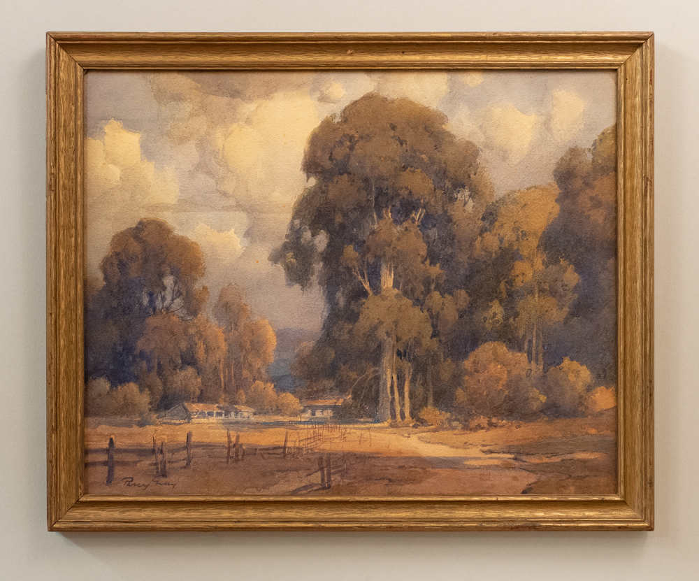
The first, which is 16″ x 20″, arrived like this. The frame wasn’t too bad. If you compare the blessedly humble frames like this (which seem to be original to Gray’s work) with the period frames found on paintings by his teachers Virgil Williams and Thomas Hill, it’s evident that frame design had substantially improved after the turn of the century. Just as the Progressive Movement went after the excesses of the Gilded Age, the Arts and Crafts Movement went after the excesses of the gilded edge—overwrought frames used to show off paintings as luxuries and trophies of wealth. Still, the frame felt utilitarian and indifferent to the picture. And as you can see if you click the image to enlarge it, the finish hadn’t worn well (it was metal, not gold, leaf) and the corners weren’t too sound. Probably a low-cost means of getting the painting into a gallery or exhibit, it pulled down the work of an artist at the height of his powers. Also, it lacked the architectural effect on which pictures—especially landscapes—depend for their illusion as “windows,” as well as for their integral role as parts of harmonious rooms. In particular, the gold color of the metal leaf, while in harmony with the painting’s palette, matched and repeated the color of light in the painting rather than the color of the shadows on which the light depends for its effect. In other words, it failed its job of complementing and enhancing Gray’s remarkable handling of the light the way dark wood does.
Percy Gray watercolor
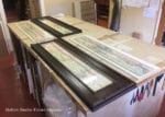
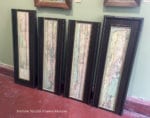
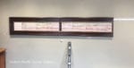
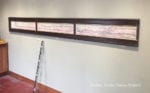
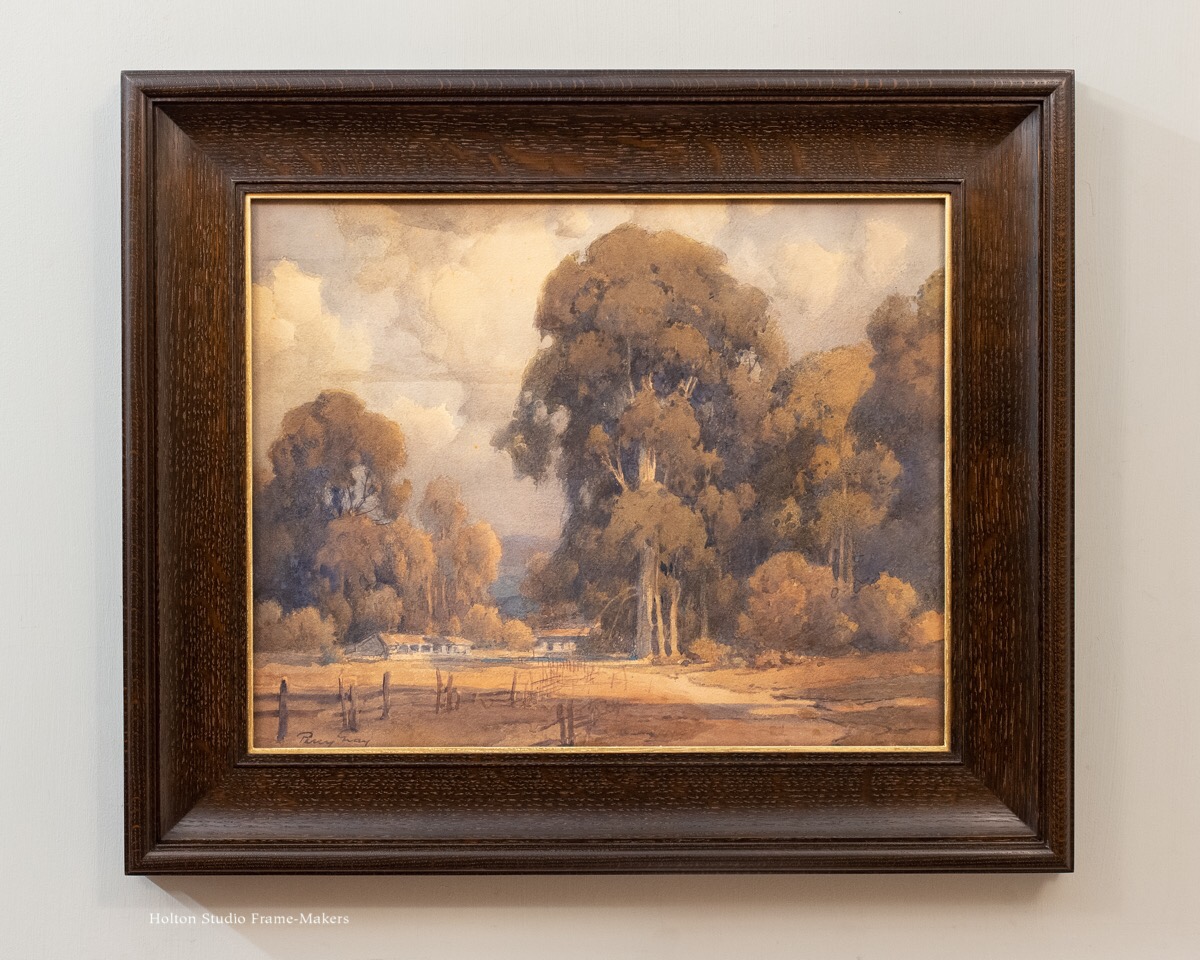
Normally, all things being equal, I’d use three different frames on the three pictures. But in this case, the successful frame on the first one became a model for the other two. So, since they’re all in the same frame, here they all are in one post. (Sadly, I didn’t get a picture of the third one in its original framing, which was a white mat and mediocre factory-made gold frame.)

Percy Gray watercolor

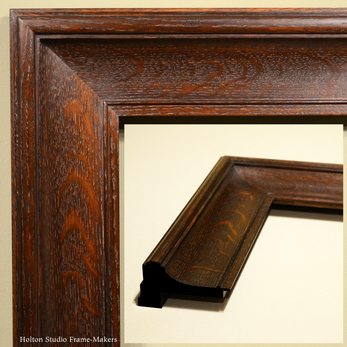
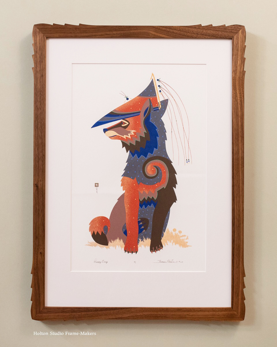
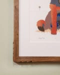
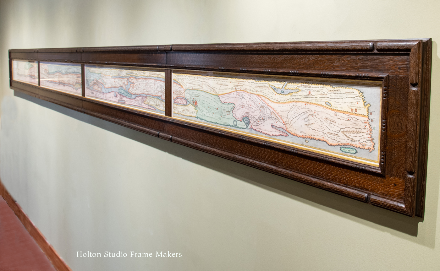
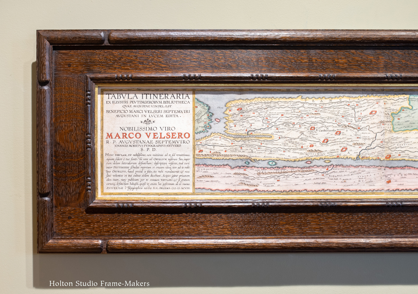
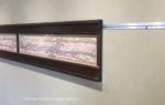
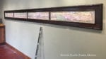
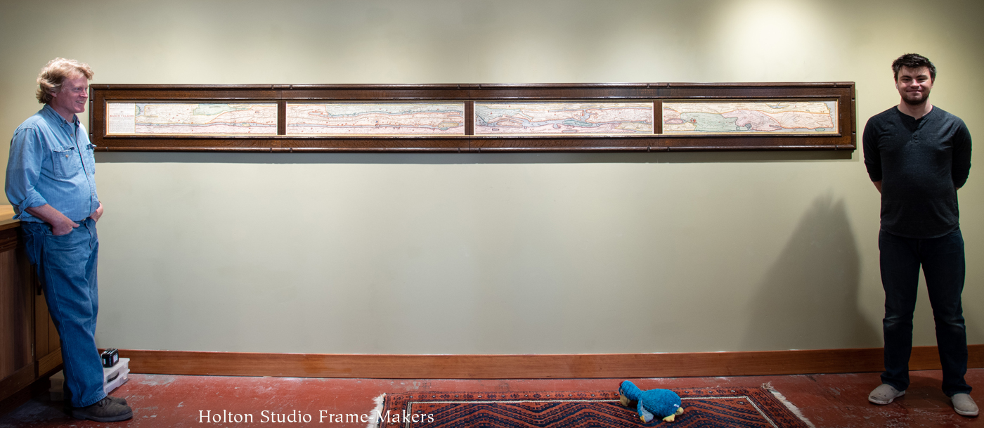
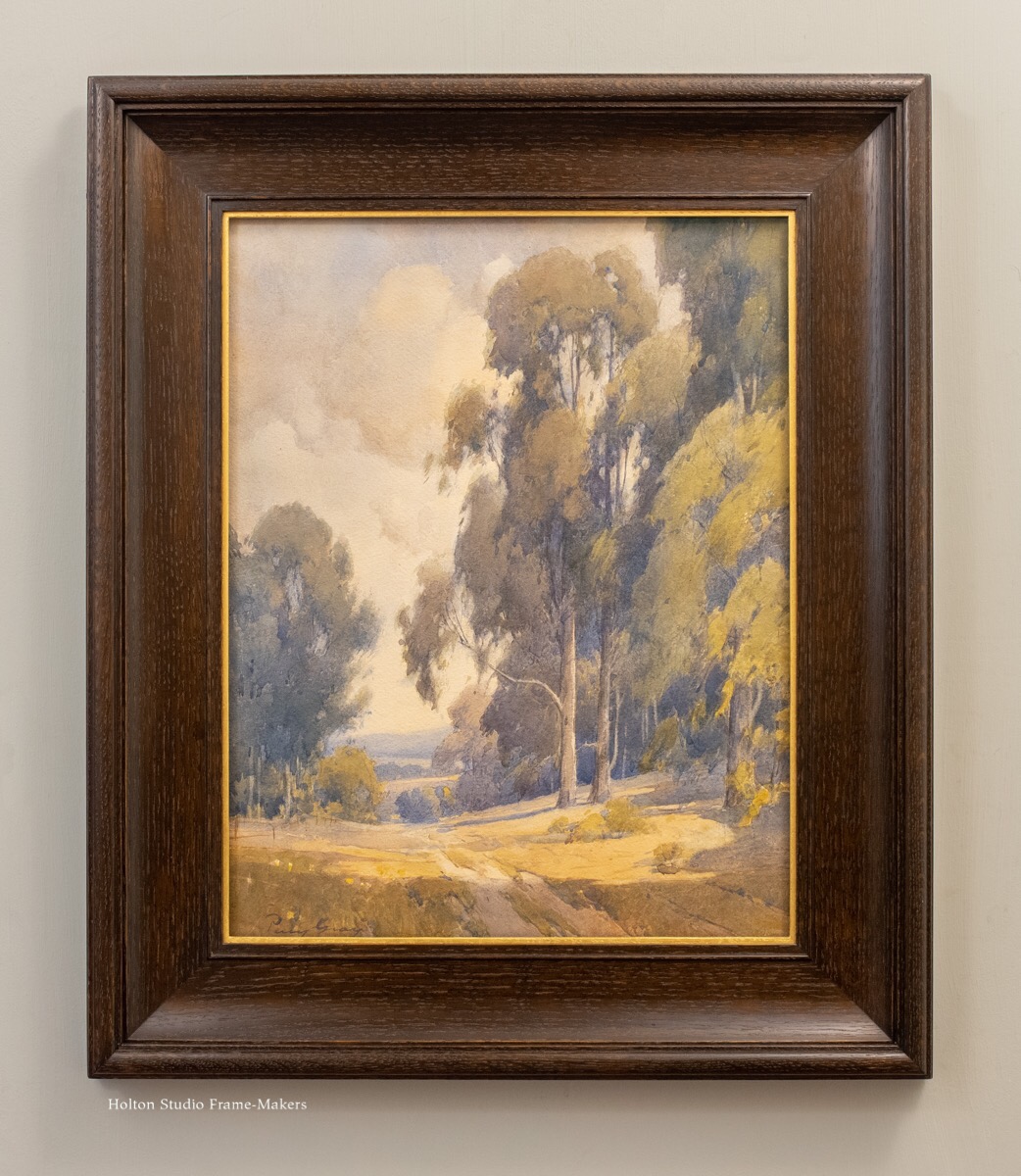
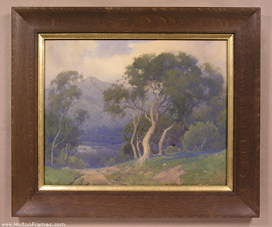
Our frames, all made by Eric Johnson, are a Compound Mitered profile No. 308 + Cap 811 at 3-1/4″ wide in quartersawn white oak with Dark Medieval Oak stain, with a gilt slip.

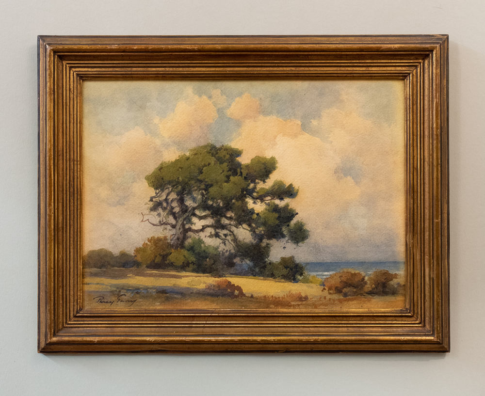
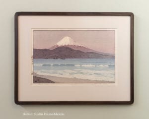
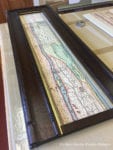
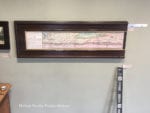
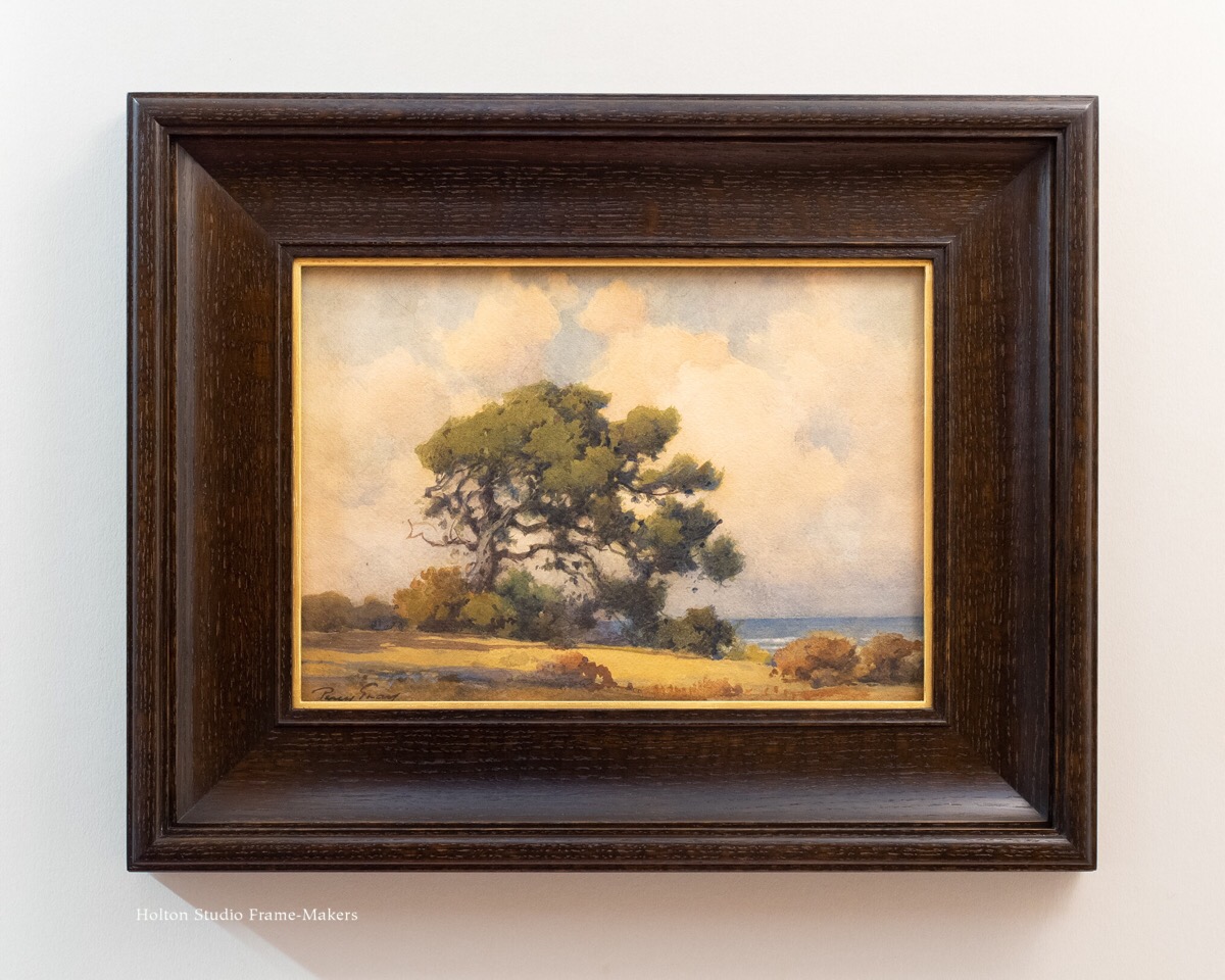
This second recent piece we re-framed, shown below (and, at right, as it came to us), Gray probably painted near the town of Monterey and the historic adobe he bought there in 1923. At about 10″ x 14″, it’s smaller than the others, but the customer like the same 3-1/4″ profile on it.

Percy Gray watercolor

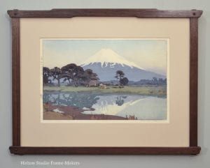
This third recent example (below), like the first, features the eucalyptus trees Gray became known for, inspiring generations of California painters (to the chagrin of the state’s naturalists who despise the non-native eucalypti for their damaging effects on the native habitat).

NOTE, Sept. 18, 2020: This painting is offered by California Historical Design, https://auctions.acstickley.com/lots/view/4-W0WS2/large-percy-gray-watercolor-eucalyptus-path-c1910s.

Percy Gray watercolor

Opportunities for Harmony

In Plein Air Painters of California: The North, Raymond L. Williams wrote, “The delicately veined limbs and wispy foliage of oaks and eucalypti, often colored in transparent shades of blue and green, were Percy Gray’s signature.” It may be Gray’s love of trees that makes it such a pleasure to provide his work with wooden frames. There’s a natural harmony.

No. 308.2—2-5/8" on watercolor

No. 308.2—2-5/8″ Percy Gray watercolor of Mt Tamalpais. Click image to go to Portfolio entry, showing second example as well.

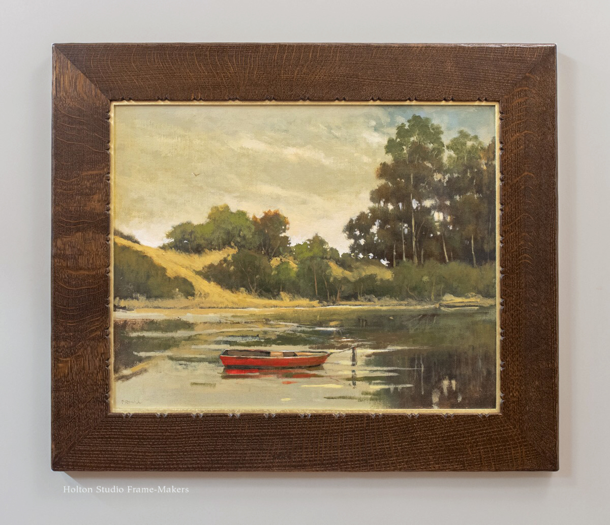
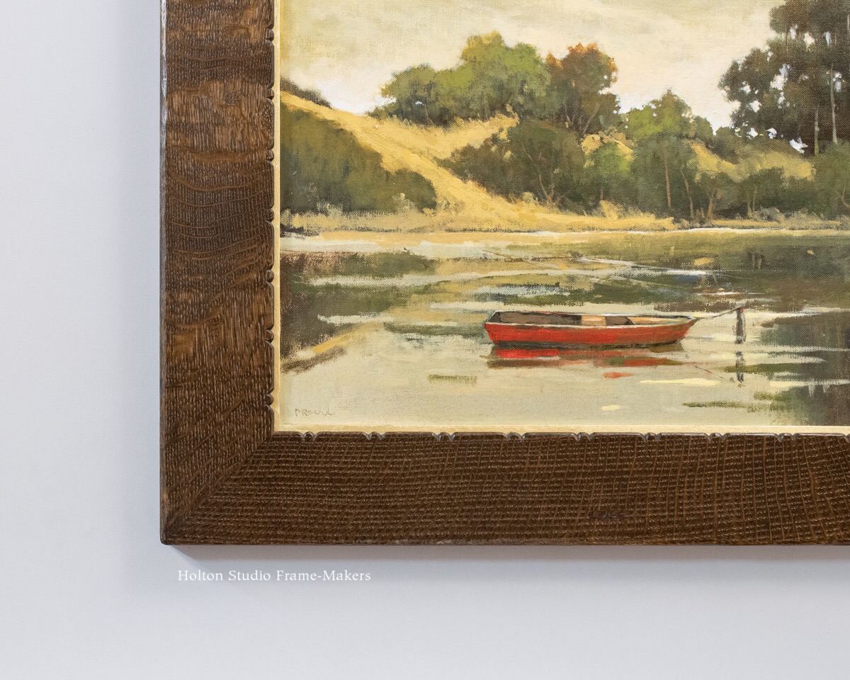
We’ve framed several paintings by this artist in the past—an example is here, at right—and have found that our simple coves with a fine bead or two always work best to sustain and amplify his delicate line work and muted, peaceful atmospheres. In addition to the complementary effect of a dark frame in relation to the captured effects of sunlight that are so crucial to a painting, each frame we’ve used on Gray’s work is wide enough to act as a convincing window frame in the room where we stand, looking through the frame at the scene beyond the plain of the wall. The profile used in every case is primarily a cove, which, leading into the picture, enhances and sustains Gray’s masterful use of perspective to draw us into the scene.

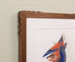
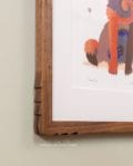
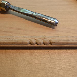
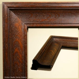
The soft, curved shape also reflects the light in like manner to Gray’s carefully rendered forms defined by subtle tonal gradations of sunlight and shadow. The cove section itself is unembellished, and the whole profile works on the simple principle of complements: the relationship between that broad, plain section and a few finer elements. In the case of the frame profile we used on the recent pieces, there’s a fine bead near the sight edge, and, at the outside, forming the outer cap molding, a wide bead bounded by two filets. The wide bead echoes the larger rounded tree forms (and as a convex form, also complements the profile’s primary concave form); and its fillets, along with the fine bead near the sight edge, pay regard to the painter’s extraordinary line work.

Percy Gray painting

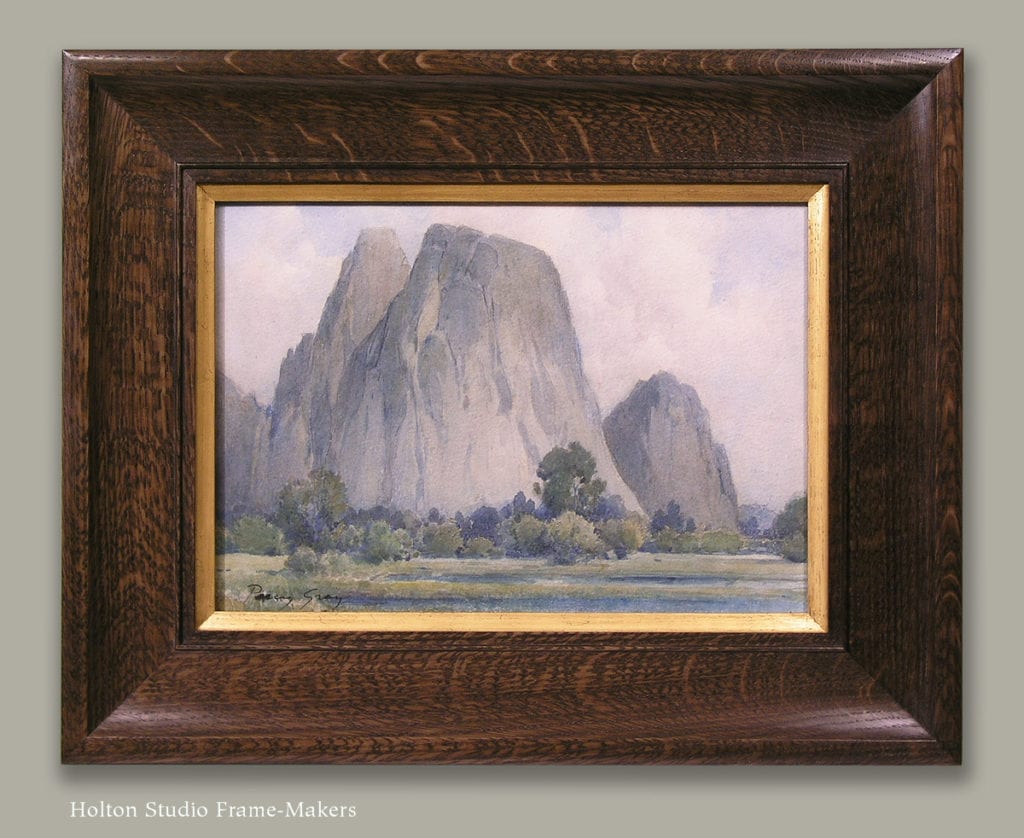
“Cathedral Rocks, Yosemite,” 10” x 14.”

We used an even simpler profile designed on the same principles for the previously framed painting of Mt. Tamalpais, shown above. In that case, the simpler shape, without the cap molding, was used to repeat the features of the landscape—the sweep of the hillside in the foreground as well as the silhouette of the distant mountain. Another simple cove profile, working on the same complementary principles, is shown on the painting of Yosemite, right.

While we can be impressed with Gray’s technical proficiency, if we focus on that, we miss the purpose of that proficiency which was the attitude of deep devotion and care that inspired the artist to refine his technique. Through such refinement, Gray was able to capture the complexity, nuance, and intricacy of the natural world of California. Above all, the beauty of Gray’s work stems from his humility in the face of California’s awe-inspiring landscape, and his insistence on subordinating his own work to nature’s. His remarkable skill demonstrates above all a commitment to an understanding that the most fundamental duty of the painter is to help people see nature’s beauty.

In keeping with that—in harmony with it—the beauty of the frame lies in three things: service to the picture and its objectives, nature’s materials, and careful workmanship. Regarding the first, the frame’s duty is to serve the artist’s purpose of helping people to see nature’s creation. Gray’s characteristically humble approach to painting is served well by frames that aim simply to serve the picture and honor the beauty of nature. That beauty is present—and this is the second thing—in not only the picture but the material of the frame, wood. The relatively plain profile is a counterpoint and complement to the wild figure—the “ray flake”—of quartersawn white oak. And thirdly, the success of the frame depends on its workmanship, which is, for the frame-maker as it was for artists like Percy Gray, not something arbitrary and merely technical, but a direct expression of care (and the theme of yesterday’s Labor Day post, that “work is love made visible”).

These sorts of concerns, as Gray understood them in relation to painting, represented a kind of “sanity” that he would feel compelled to defend in the face of forces of “insanity” that would consume the arts in coming decades. 
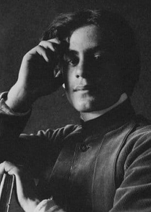
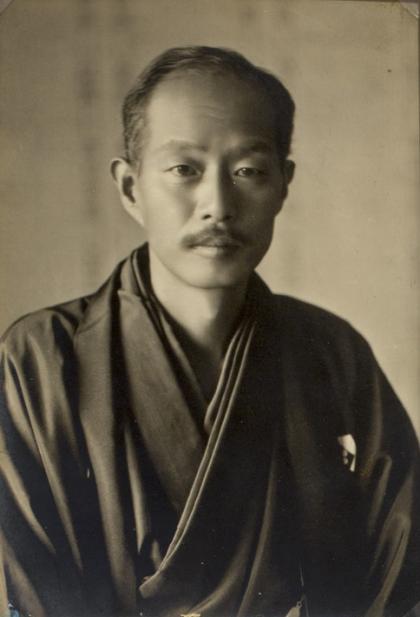
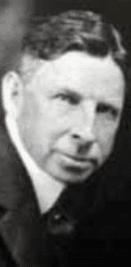
Percy Gray

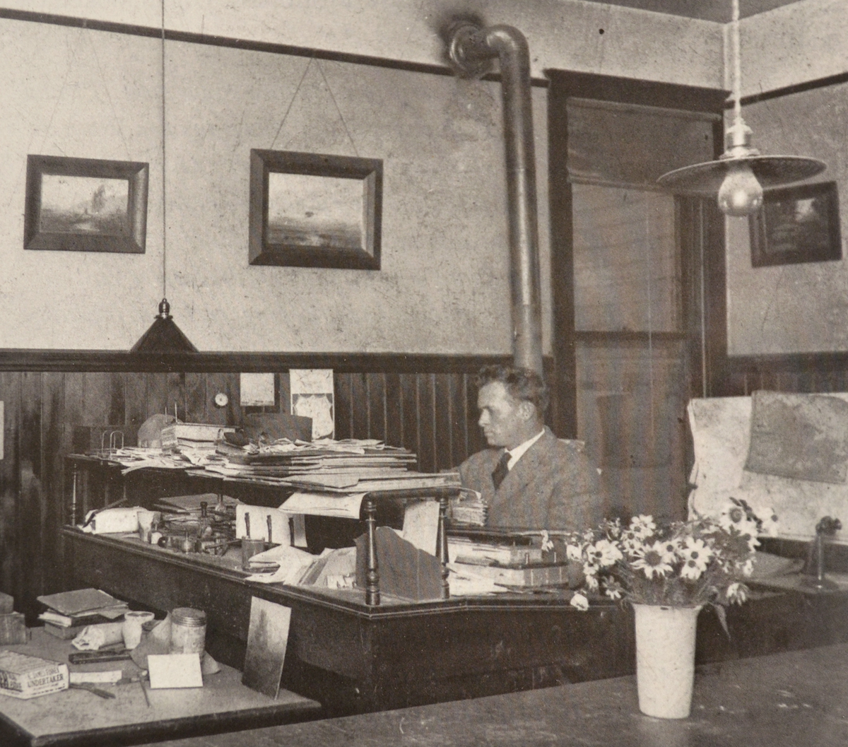
Henry Percy Gray’s biography suggests that he was single-minded in his life’s work as a pictorial artist. Gray was born into a family of artists in San Francisco in 1869, and enrolled in the California School of Design at age seventeen, studying with the school’s director Emil Carlson, as well as (as noted) Virgil Williams, and Thomas Hill. Later he would move to New York to work for the New York Journal, taking the opportunity to study with William Merritt Chase at the Art Students League, before being dispatched by the newspaper back to San Francisco to cover The City’s recovery from the 1906 Earthquake. He decided to stay, initially settling in Alameda and painting the island town as well as other East Bay sites, including Berkeley; but over his lifetime moved about the region seeking, one suspects, new scenery to paint.

Gray’s meticulous care served him well in his difficult quest to earn a living in commercial illustration, as he could apply his fine rendering skill to etching, photogravure, and the methods of photomechanical reproduction used by magazines and newspapers.

Arthur Mathews painting, California

Arthur Mathews, “California,” in carved oak frame

But fundamentally that capacity for careful detail was an honest, devotional expression of his deep love for his native land.

Accustomed as we are today to regarding California as at the leading edge of a rapidly changing world, I’m not sure we fully appreciate how removed from the maelstrom of industrialization California still was in the first decades of the century. At the same time, the state’s artists were acutely self-conscious about their role in shaping California’s place in history and the opportunity Californians had for redeeming a civilization that had become debased from nature. It was a view dating back at least as far as our city’s namesake George Berkeley’s early 18th century predictions that “the muse” would seek a world “Not such as Europe breeds in her decay,” but “happy climes” of “genial sun and virgin earth” where “The force of art by nature seems outdone,/And fancied beauties by the true.” In Gray’s own time, Arthur and Lucia Mathews sustained Berkeley’s hopes in allegorical depictions such as “California” that saw a new civilization tamed by nature and a renaissance of the ancient arts, working together in their full variety and scope.

A Bid for Sanity In a Transformational Age

But such hopes failed to account for the explosive forces of industry and commerce in the nineteenth century, which would eventually overtake the lives of the state’s nineteenth century immigrants—just as it had, in immeasurably more brutal ways, those of native Californians beginning a couple of centuries before. In his later years, Percy Gray helped found the San Francisco chapter of the Society for Sanity In the Arts which protested the rise of modernism after the Great War. The society’s chief founder, Chicagoan Josephine Hancock Logan, in her 1937 book, Sanity In Art described the landscape of the art world that so dismayed her—a description in which we can readily recognize the plight of an artist like Gray who’d spent a lifetime honing his skill:

Soon newspapers were filled with stories of untrained aspirants who had just been discovered to be great geniuses. The work of children was highly extolled and a new school of art instruction came into being wherein the youngster was supplied with the material and left to himself, the teacher being careful not to intrude on budding genius with the blight of such superior knowledge as he, or she, might have. With all this in the air, it was not difficult for the art student to impress a jury of modernistic temper. It was however very difficult for the man or woman who had acquired that ready, deft, facile manner of limning things which marks the professional. “The old ones would like to, but they can’t do this modern stuff,” was the gleeful cry of the wreckers of the art world. And they were right, because the true artist could not use his brushes to falsify his talent, since it would be impossible for him to attempt the new trend without giving it too much grace and balance. So the beginner crashed the barrier and felt he had arrived. He went no further; there was no further to go in this direction, and soon other beginners stormed in.

A conservative, perhaps even reactionary, response to such unsettling trends was certainly understandable. The world that had educated and shaped the values of artists like Percy Gray—a world in which nature still reigned; a world in which devotion to one’s art, one’s trade, was still assumed to be honored, respected and rewarded—had been leveled by the most revolutionary transformation in history. If the Society for Sanity In Art’s categorical rejection of the modernists betrayed a narrow-mindedness and stubborn refusal to see such current realities as the modernists were confronting, we can at least acknowledge the virtue of denouncing the modernists’ complicity with the age of money and machines in degrading, devaluing and destroying two things the arts had always treasured most highly: nature and manual skills. Living today with the consequences of our destruction of those life-generative powers, “insanity” does not seem like too harsh a word.

As in all transformational times, a great re-framing was underway—inevitably in picture frames, but more significantly and largely in a new zeitgeist, a new ethos. The world was governed by pursuit of the novel; by the ephemeral, private life of the psyche; by the short-lived relevance of experimentation. A world framed by trees and led by the pace of nature was transformed into one relentlessly man-made, framed by urban and industrial architecture and constant, head-spinning change. Fittingly, in his later years, after his wife died, Gray moved one last time, from a life among the oaks, bays and eucalypti of still-rural Marin County, to a life amidst the steel, concrete, and glass of booming San Francisco. There, he rented a room at the Bohemian Club and took a studio, alongside some of The City’s most illustrious artists and writers, in the famed Montgomery Block, where, in 1952, Percy Gray died at his easel, persevering in his belief that what is timeless and true will once again find real and substantial, enduring place in the world.


Finally, another Gray from several years ago, shown before-and-after re-framing. (The frame is the same No. 308.2 used on the painting of Mt. Tamalpais, above.) This is one on our page, “Fixing ‘a Very Prevalent Error’: The Cabinetmaker’s Answer to the Gold Frame Convention.”

Percy Gray watercolor

Percy Gray, “California Hillside,” 1914. Watercolor, 11″ x 15″.

More on Percy Gray…

See a beautiful later Percy Gray, apparently in its original frame, appraised by Aaron Bastion of Bonhams, on Antiques Roadshow—

“Love Made Visible”: Kahlil Gibran’s Frame for Labor

Do you know the painter and poet Kahlil Gibran? Labor Day is a good time to ponder this passage from his famous work, The Prophet, a passage that includes the words, “Work is love made visible.”

Then a ploughman said, Speak to us of Work.

And he answered, saying:

You work that you may keep pace with the earth and the soul of the earth.

For to be idle is to become a stranger unto the seasons, and to step out of life’s procession, that marches in majesty and proud submission towards the infinite.

When you work you are a flute through whose heart the whispering of the hours turns to music.

Which of you would be a reed, dumb and silent, when all else sings together in unison?

Always you have been told that work is a curse and labour a misfortune.

But I say to you that when you work you fulfil a part of earth’s furthest dream, assigned to you when that dream was born,

And in keeping yourself with labour you are in truth loving life,

And to love life through labour is to be intimate with life’s inmost secret.

But if you in your pain call birth an affliction and the support of the flesh a curse written upon your brow, then I answer that naught but the sweat of your brow shall wash away that which is written.

You have been told also that life is darkness, and in your weariness you echo what was said by the weary.

And I say that life is indeed darkness, save when there is urge,

And all urge is blind save when there is knowledge,

And all knowledge is vain save when there is work,

And all work is empty save when there is love;

And when you work with love you bind yourself to yourself, and to one another, and to God.

And what is it to work with love?

It is to weave the cloth with threads drawn from your heart, even as if your beloved were to wear that cloth.

It is to build a house with affection, even as if your beloved were to dwell in that house.

It is to sow seeds with tenderness and reap the harvest with joy, even as if your beloved were to eat the fruit.

It is to charge all things you fashion with a breath of your own spirit,

And to know that all the blessed dead are standing about you and watching.

Often have I heard you say, as if speaking in sleep, “He who works in marble, and finds the shape of his own soul in the stone, is nobler than he who ploughs the soil.

And he who seizes the rainbow to lay it on a cloth in the likeness of man, is more than he who makes the sandals for our feet.”

But I say, not in sleep but in the overwakefulness of noontide, that the wind speaks not more sweetly to the giant oaks than to the least of all the blades of grass;

And he alone is great who turns the voice of the wind into a song made sweeter by his own loving.

Work is love made visible.

And if you cannot work with love but only with distaste, it is better that you should leave your work and sit at the gate of the temple and take alms of those who work with joy.

For if you bake bread with indifference, you bake a bitter bread that feeds but half man’s hunger.

And if you grudge the crushing of the grapes, your grudge distills a poison in the wine.

And if you sing though as angels, and love not the singing, you muffle man’s ears to the voices of the day and the voices of the night.


Postscript

”Ask not what your country can do for you. Ask what you can do for your country.”

These words were made famous by President John F. Kennedy in his 1961 inauguration speech. He should have said, ”In the words of Kahlil Gibran … ” They are from an open letter the poet wrote to Lebanese parliamentarians in 1925, during the fall of the Ottoman Empire. ”Are you a politician asking what your country can do for you or a zealous one asking what you can do for your country?” he asked. ”If you are the first, then you are a parasite; if the second, then you are an oasis in the desert.”

Written 95 years ago, the challenge leveled at those in power is as timely as ever.

Framing Thomas Stream

This is a contemporary print titled “Puppy Gray” by Aleutian artist Thomas Stream. The large subject and strong contrasting colors and bold, graphic design on white paper made a white mat the best choice. The fun part was giving it a suitably bold, graphic frame—a flat 1″ profile, decorative corners flaring out in a pattern repeating the wolf pup’s fur. Walnut was a natural choice, matching the brown in the print. The print is about 16″ x 12″, the outside dimensions of the 1″ profile frame are 23″ x 17″.Thos. Stream print


Thomas Stream’s work is an example of the sort of graphic approach so many pictures take, accepting and embracing the flat plane of the paper or canvas. A flat frame profile honors and sustains this treatment, and can simply be shaped at the edges—especially at the all-important corners—to harmonize with it. A picture frame at its most elemental, is simply a strong emphatic line signaling significance for the picture. Therefore, on pictures using flat, strong, emphatic graphic lines and forms, the frame naturally lends itself to simply repeating and amplifying those elements. By doing so, it provides the picture with a unique immediate setting that’s alive and responsive to the picture.

framed Kunisada printAnother good example of this is the frame we made last year for the Kunisada print at right. (More on this frame here.) In the late nineteenth century, when European painters were first introduced to Japanese prints, they especially admired the flat compositional treatment of the prints. It may be surprising, then, how little this kind of frame design, which seems so obvious and natural, has been employed—then or now. But the explanation is in the nature of industrial frame production and modern commercial conditions, in which such design is impractical. In comparison, the older, more personal model of the frame-making studio allows the framer to work directly for the artist or owner of the picture, and to make frames from scratch. This kind of frame design remains a fertile area for a revived art of frame-making.

More on Thomas Stream…

Decorative Dovetails: Framing Hiroshi Yoshida’s “Grand Canyon”

My eyes lit up when this piece came in—one of the most prized prints by the great shin-hanga printmaker Hiroshi Yoshida (1876-1950) whose work I love and love to frame (and even named a frame design for). Yoshida was a mountaineer, so it’s no surprise that some of his most beautiful and reverential images are of mountains. “Grand Canyon,” (1925, oban size, 9-3/4″ x 15″) is an inspiration—and inspired me as a perfect opportunity to try out a kind of joinery I’d been playing with on paper: a decorative dovetail.

I don’t generally find the shape of a dovetail natural to picture frame joinery, at least when it’s visible on the face. But this is one instance where it felt perfect, offering a lovely way to marry the Japanese to the American Southwestern—the kind of fine wood joinery so highly developed in Japan with the patterns of Southwest Indian weaving culture, patterns that themselves resonate with the iconic geological forms and strata of the Grand Canyon, which Yoshida captured so beautifully in the print.

As I’ve discussed before on the blog, given the material the two art forms have in common, there’s a natural harmony between wooden frames and woodblock prints. Carefully designed and executed, the frame on a woodblock is an opportunity to sustain and amplify the picture’s effective traits.

This walnut frame is proportioned the same as our typical Yoshida frame that we make for oban size prints: the top and bottom are 3/4″ wide, the sides 1″. (The outside dimensions of the frame are 18″ x 22-1/2″ through the centers.) The profile too is the same as the Yoshida’s—a simple square with crisp edges. The decorative detailing is in the joint itself, which is a modified dovetail with a kind of haunch;Decorative dovetail frame being made and like the Yoshida, the horns are extended a little, in this case effectively repeating the strong theme of horizontal lines in the print, but here I’ve cut them with a decorative zig-zag pattern. The joinery and decorative cuts were both done with a Japanese dovetail saw and chisels—a fact that illustrates a principle I hold dear, which is that there is no hard line between the purely “functional” or “practical” work of joinery and the “artistic” work of decorating. Completing the frame is a little 1/8″ walnut slip, given a black wash to contrast with the frame and repeat the print’s line work.

We used an 8-ply mat for the stronger line its bevel would create compared to that of a more typical 4-ply mat. Its deep bevel also repeats the stepping perspective of the scene and the angular forms of the mountains. The solid core rag mat is a muted tan with the subtlest hint of green that’s a perfect cool complement to the print’s warm pinks and oranges.

Framed Yoshida printSpelling it all out that way makes it seem like a lot of details to what should be a simple presentation. But the approach is consistent with and suited to the amount of fine detail and care in the print, and subtle enough that it remains appropriately subordinate to the picture even as it fully honors it. I’m especially pleased with the subtlety of the dovetails.

One of my favorite discoveries as I’ve explored the art of the picture frame is the effectiveness of joinery. I’m convinced that joinery is something we’re drawn to instinctively, and that its natural attraction for us is due to the very nature of the arts that are the essence of our humanity—the word art, Merriam-Webster’s dictionary tells us, being rooted in the Latin ars, meaning “to join.” We are homo faber; we make things, which means we put things together. And in that work we bring together—we join—head, heart, and hand. The well-made frame is a perfect example of how there is no sharp line between “functional” and “artistic” work. Just as there is no sharp distinction between the structural and decorative function of a dovetail joint, there is no sharp distinction between “functional” and “artistic” work. They both flow with the common spirit of care. The well-made frame both protects and celebrates the picture, both aspects born of the same heart that cares for the picture. Care is beautiful.

Hiroshi Yoshida portrait

Hiroshi Yoshida, 1924

Furthermore, the instinctive appeal of joinery extends to the relationship of frames to pictures—to all the arts to each other, for that matter: they are most effective, most compelling and beautiful, when they are joined together, in cooperation and harmony (another word rooted in the Latin word meaning “to join.”)

The arts are how we join the world and discover and take part in its harmonies—as a Japanese mountaineer and artist joined his culture’s tradition of printmaking to the landscape and culture of the American Southwest; as a nearly hundred year old print is given a fitting place in our time; and as patterns created by and associated with the arts of two distant places can come together in the living art of the picture frame.


Other Hiroshi Yoshida mountain prints (3 we’ve framed + 1)—


Works: New and Recent Landscapes

We are happy to announce that we have reopened The Holton Studio Gallery—by appointment. Please come in to see the current exhibition, Works: New and Recent Landscapes. It’s up through September 12.

Poster for show of paintingsThis is a beautiful show of paintings by our outstanding roster of artists. Most of the works have come in during the pandemic, or shortly before. They include Mark Farina‘s moody and charming “Summit Road Water Tower” featured in the window poster, right. If you aren’t able to come see in person, or are more comfortable viewing online, the whole show can be seen on our site here. If there’s a painting you’d like more pictures of, please call and we’ll be happy to oblige.

For those who’d like to visit, if you’ve been in before, you know that the gallery is well ventilated and spacious, allowing for ample distancing. Masks are required, of course. For everyone’s safety, please call or email to make an appointment before you visit, 510-450-0350, info@holtonframes.com. We are available Tuesday through Saturday. Read more about our health protocols, here

You can also view the show online—

Works: New and Recent Landscapes

~ We look forward to seeing you! ~


The Long View: Framing a Renaissance Map of the Roman Empire

In tumultuous times as these, you’ve got to take the long view. And that’s what we’ve been doing—in more ways than one. We’ve had the honor and privilege to frame this extraordinary and very long 16th century map with a story that’s also long, reaching back, by way of the middle ages, all the way to the first century BC and the Roman Empire that it depicts. The engraving, dated 1598, is the culminating work in the life of the great Renaissance Dutch cartographer, Abraham Ortelius (1527-1598)—although not his crowning work; that would be Ortelius’s Theatrum Orbis Terrarum, the first modern atlas.

Ortelius map-whole

Abraham Ortelius, engraving, map of Roman world, 1598. Click image to view large.

Ortelius mapThe four panels are each about 8″ x 41″, and framed and hung together they extend almost fifteen feet. Forming a continuous map, the panels span the Roman Empire from Great Britain to India. More on the map and its fascinating history are below.

The Frame

The frame, which took around 90 hours, all told, is the polyptych cassetta I showed in its final stages in a post a couple of weeks ago, here. Made in quartersawn white oak, with Medieval Oak stain, it’s 3-1/2″ wide—the vertical side members are slightly more—and is composed of a mortise-and-tenon flat and carved cap and sight moldings. The sight mold is carved with beads in a pattern mimicking those of the printed border of the map. I also posted about that earlier, here. The design is finished off with an 1/8″ slip gilded in 23 kt gold leaf.

Ortlelius map

Left end of set, showing cartouche. (A translation can be found here. More history below.) Click for large view and to see border from which carved bead pattern is drawn.

The length of the whole thing, of course, presented a real framing challenge. Fortunately, the fact that it was in four separate panels allowed us to frame each panel individually, but in a fashion allowing the frames to be butted up to each other to present as a unit. (Scroll down for more process pictures, including ones of how the frames are aligned and hung on the wall.)

History of the map

Peutinger table

Detail, original Peutinger Table, 1265, in the Austrian National Library. Circle on left is Rome.

The story behind the map is as remarkable as the map itself. It is copied from the 13th century Tabula Peutingeriana, or Peutinger Table, created by a monk in Colmar, Alsace (modern-day France) in 1265. At 13 inches high and over 22 feet long, the Peutinger Table is, according to Wikipedia, “thought to be the only known surviving map of the Roman cursus publicus, the state-run road network.” (It’s now preserved in the Austrian National Library in Vienna. In 2007, this earlier map was placed in UNESCO’s Memory of the World Register.) But the history of Ortelius’s Renaissance map actually goes back even further than the medieval Peutinger Table, which itself was based on a map commissioned in the first century BC by the Roman general Marcus Vipsanius Agrippa during the reign of the first Roman Emperor, Augustus.

Thus, we have before our eyes not only a direct connection to the Renaissance, but a view of the world with direct lineage to antiquity—and a rather humbling window into ancient civilization.

Neither the Peutinger Table nor this Renaissance copy are, as you can see, conventional maps in the sense of being attempts at accurate geographical representation; but are distorted, especially latitudinally, to suit a more schematic purpose of indicating roads, landmarks and distances (which are, in fact, fairly accurate). This, I suppose, is why it’s called a “table.” If not quite so impressive in length as its medieval original, at about 14 feet long, Ortelius’s copy is a remarkable work which impresses one with the vast size of the Roman Empire—no doubt the intent of the imperious Romans who were responsible for the original.

Ortelius by Rubens

Abraham Ortelius by Peter Paul Rubens, 1633

Ortelius

Though he died before the work was completed, Abraham Ortelius supervised the engraving of the map, making it the final achievement of an illustrious and eventful life spanning the so-called Age of Discovery, the Reformation, and the first three decades of the Eighty Years War—which included the horrific 1576 Sack of Antwerp, Ortelius’s home. In addition to creating the first modern atlas, the Theatrum Orbis Terrarum (Theater of the World), Ortelius is believed to be the first person to hypothesize continental drift—the now accepted theory that the continents were once joined before drifting apart to their present positions.

Orteliusmaps.com has the following historical sketch of the map we framed, and fills in how the medieval version came to Ortelius:

Portrait of Ortelius

Phillip Galle’s 1579 portrait of Ortelius (obviously the source of Rubens’s posthumous portrait, above) is captioned “Ortelius gave the mortals the world to admire and Galle gave the world Ortelius to admire.”

[A]s early as 1578, Ortelius knew about the existence of a series of manuscript road maps, showing the Roman view of the world at around the third century [the Wikipedia entry indicates scholars now believe its sources are earlier]. The original, found by Konrad Celtes (1459-1508) in a library in Augsburg, came into the hands of Konrad Peutinger (1465-1547) and later went to his relative Mark Welser. Welser was the first to publish a copy of it in 1591 at Aldus Manutius in Venice. Ortelius found this copy inadequate. Therefore, in 1598 new manuscript copies were made at his request by Welser. [This significant role of Welser—”Marco Velsero”—explains the prominence of his name in the cartouche.] The present set of eight (adjacent) maps on four sheets were engraved following these copies. The original Peutinger maps disappeared, were retrieved in 1714, and are now in the Vienna National Library. Because of damage and progressive blackening of the 11 (once 12) sheets of parchment, Ortelius’ version is now the most reliable representation. Ortelius supervised the engraving, but did not live to see the result, which was first published separately in 1598 by Moretus.

More resources on the map’s history can be found at the bottom of the post.

Fitting and hanging the maps—

Fitting—

For the maps to be framed archivally, the frame rabbets were cut wide to accommodate gasket rag mats which separate the prints from the glass and also allow them to shrink and expand. The rabbets were lined with a metal barrier tape to keep the acids in the wood from migrating into the prints. Museum Glass was used. Sam Edie did the expert fitting (as well as most of the photography for this post).

Hanging—

Ortelius map of ancient Rome

Tim and Sam (and Barb the shop dog’s toy) with the completed project.

Resources on the map’s history—

Wikipedia has good entries on Abraham Ortelius and the Peutinger Table. An excellent short video on the Peutinger Table can be seen here. A much longer scholarly article, “The Medieval and Renaissance Transmission of the Tabula Peutingeriana,”  is here.

Earlier posts on this project—

Carving beadsMy post about carving the beads is here, and another post showing the cap molding being carved, the glue-up and finishing is here.