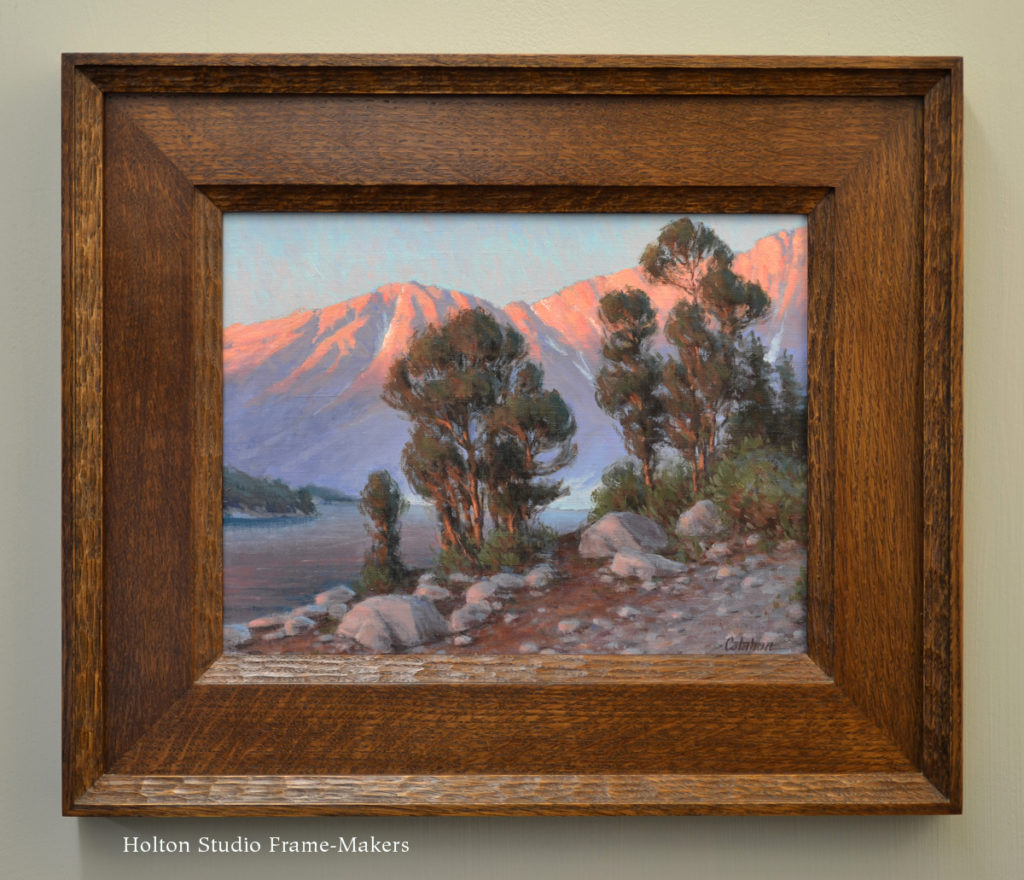
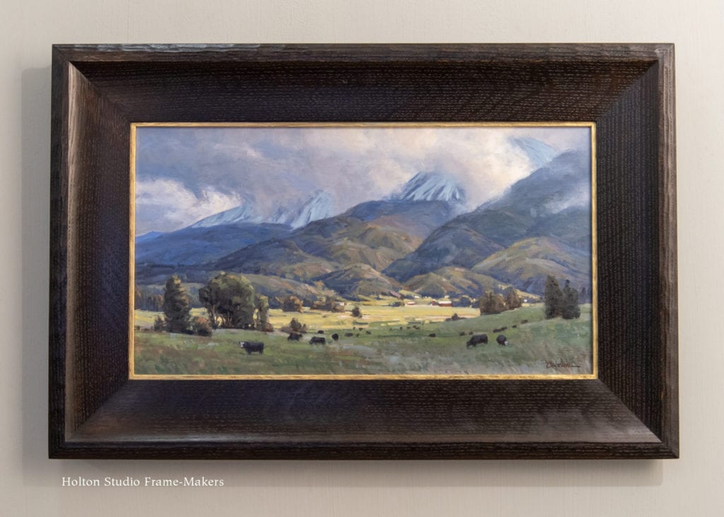
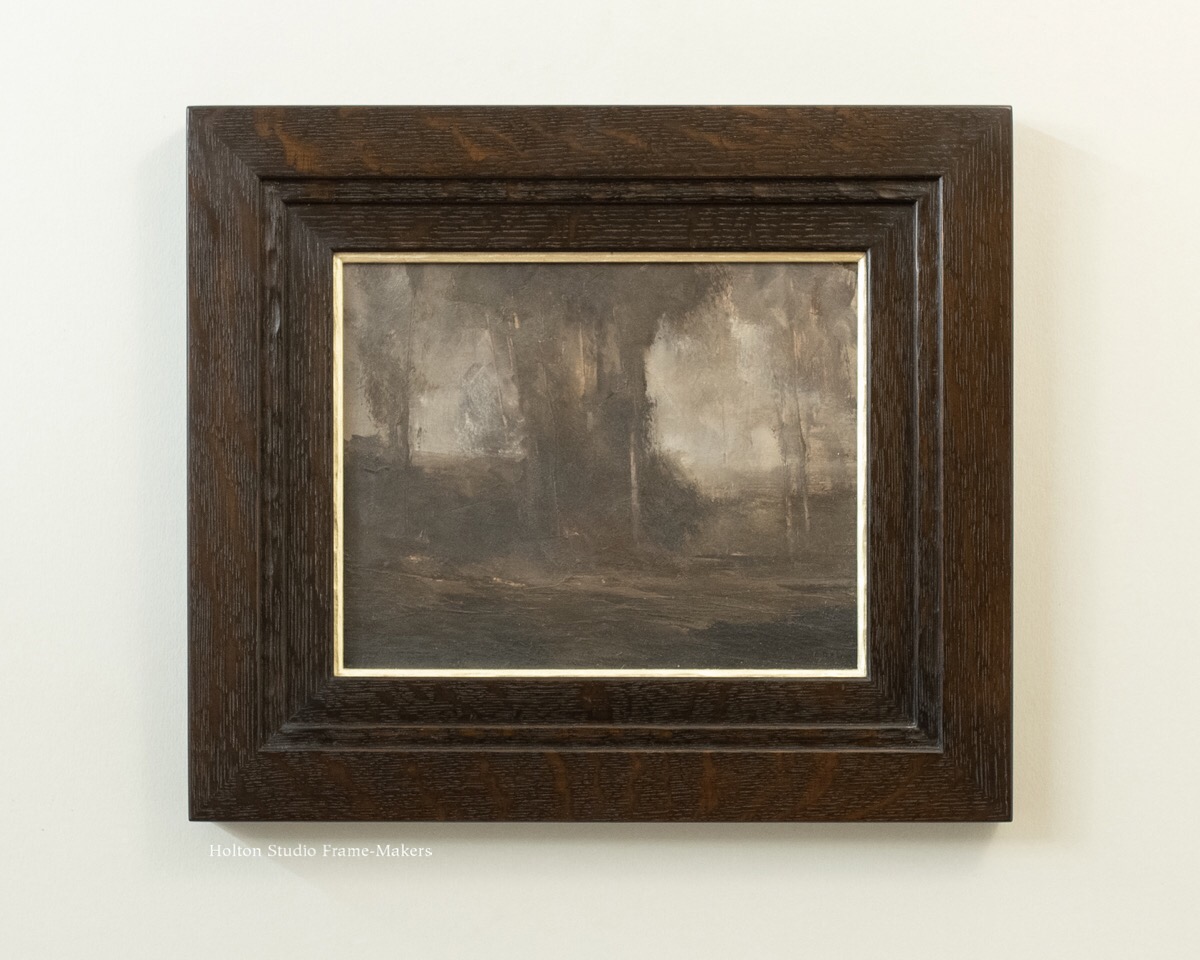
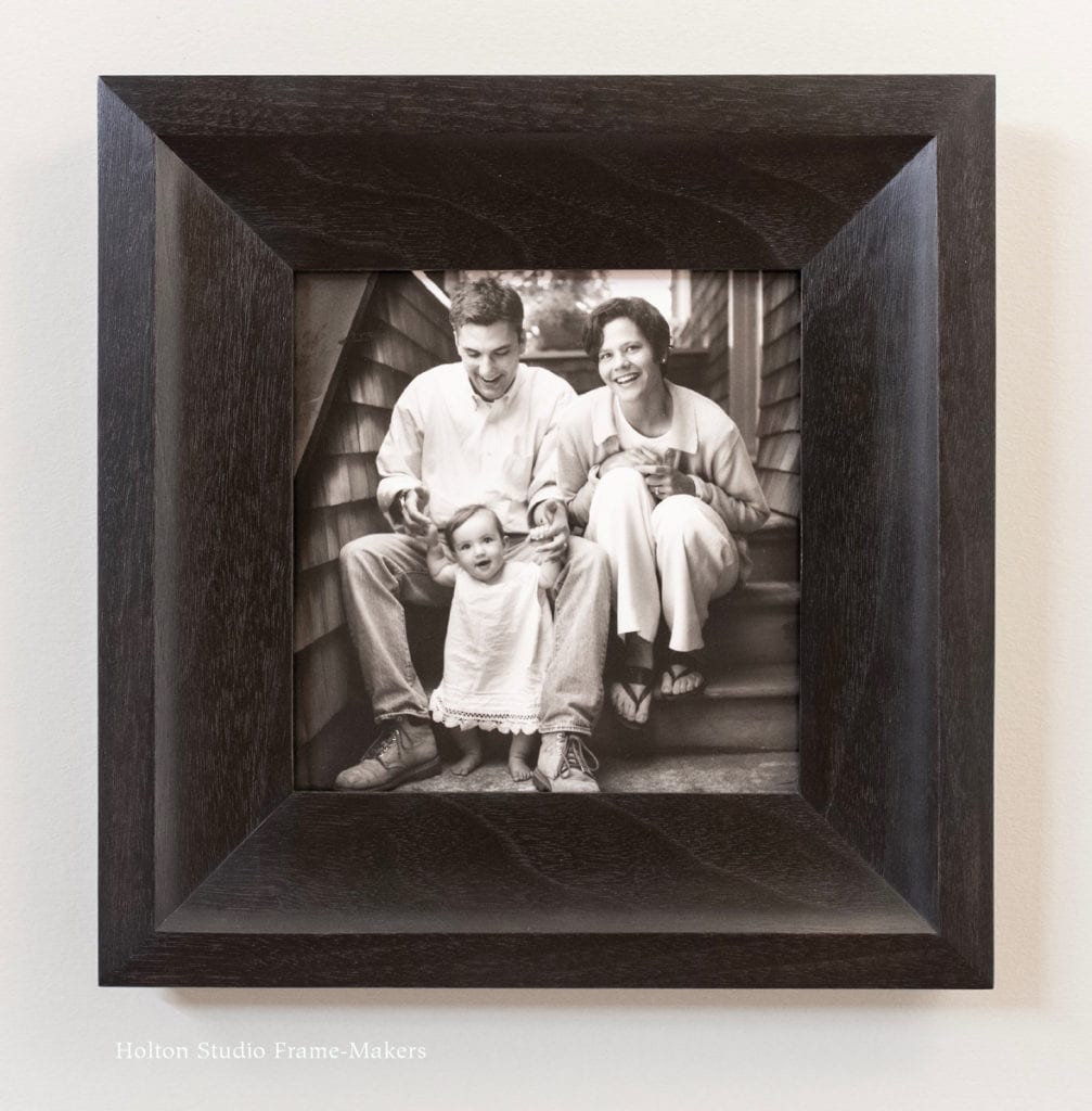
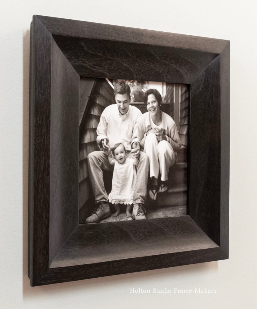
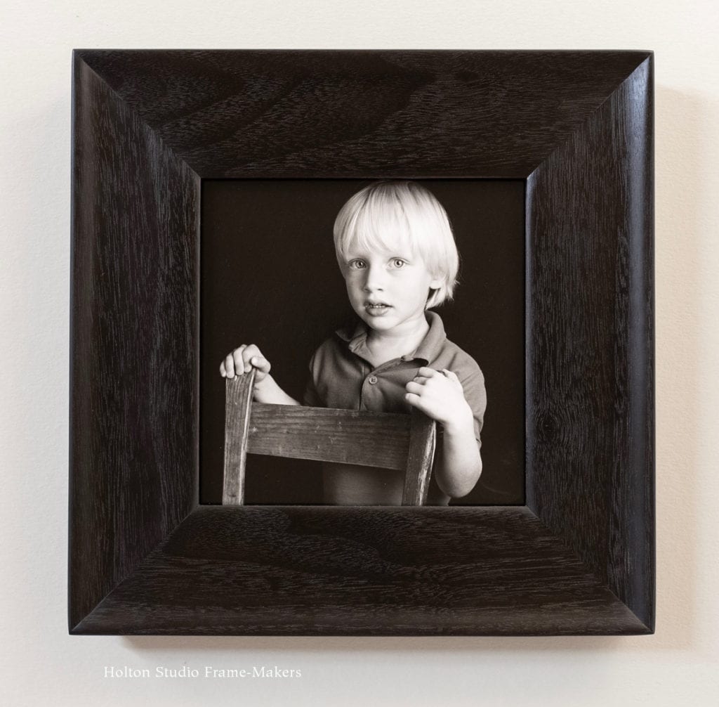
We’ve just hung a new show on the same idea of recent exhibits at the gallery, which have each featured a particular pictorial medium and emphasized our approach to framing it. Having covered antique Japanese prints, watercolors, and historical California paintings, our current offering is called “Black and White Portrait Photographs and How to Frame Them.”
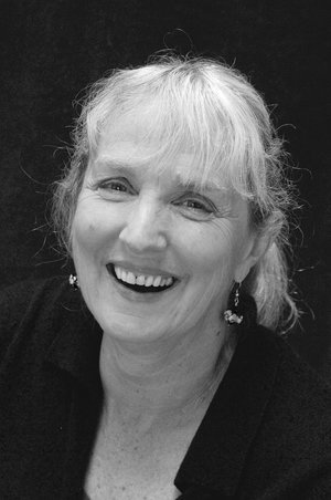
Nan Phelps
We couldn’t have chosen a better photographer to collaborate with than Nan Phelps, whose work in the genre and medium is exemplary. For more than three decades Nan has been photographing Bay Area families. I’ve admired her work since my days at Storey Framing, when she was a neighbor and customer of the shop.
Nan came to us last year to frame a set of photos of her family. Those pictures, like the ones in our current exhibit, are all silver gelatin prints developed by Nan with traditional darkroom processing. We got into an in-depth discussion about framing photography, and she ended up inviting me to speak on that topic at her studio (my blog post on that is here) and I suggested an ongoing exhibit for her at Holton Studio. It all just felt like something meant to be—and has come to be! Additionally, on October 10, Nan will be here at the gallery to talk about her work. And after Nan’s talk, I’ll say a few words about framing. As in the analogous presentations, I’ll be specifically describing a frame-maker’s approach to framing photographs—as opposed, that is, to how conventional frame shops frame this genre. The distinction is crucial, as I hope will become clear in the talk. (I touch on it in the post below.)
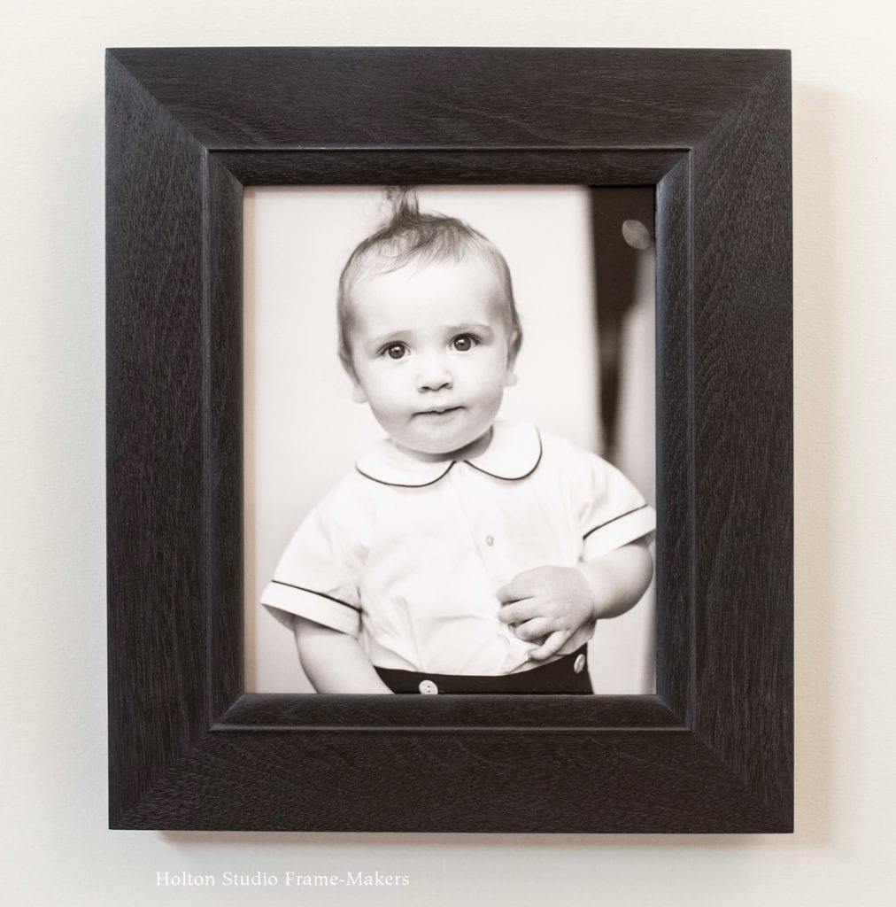
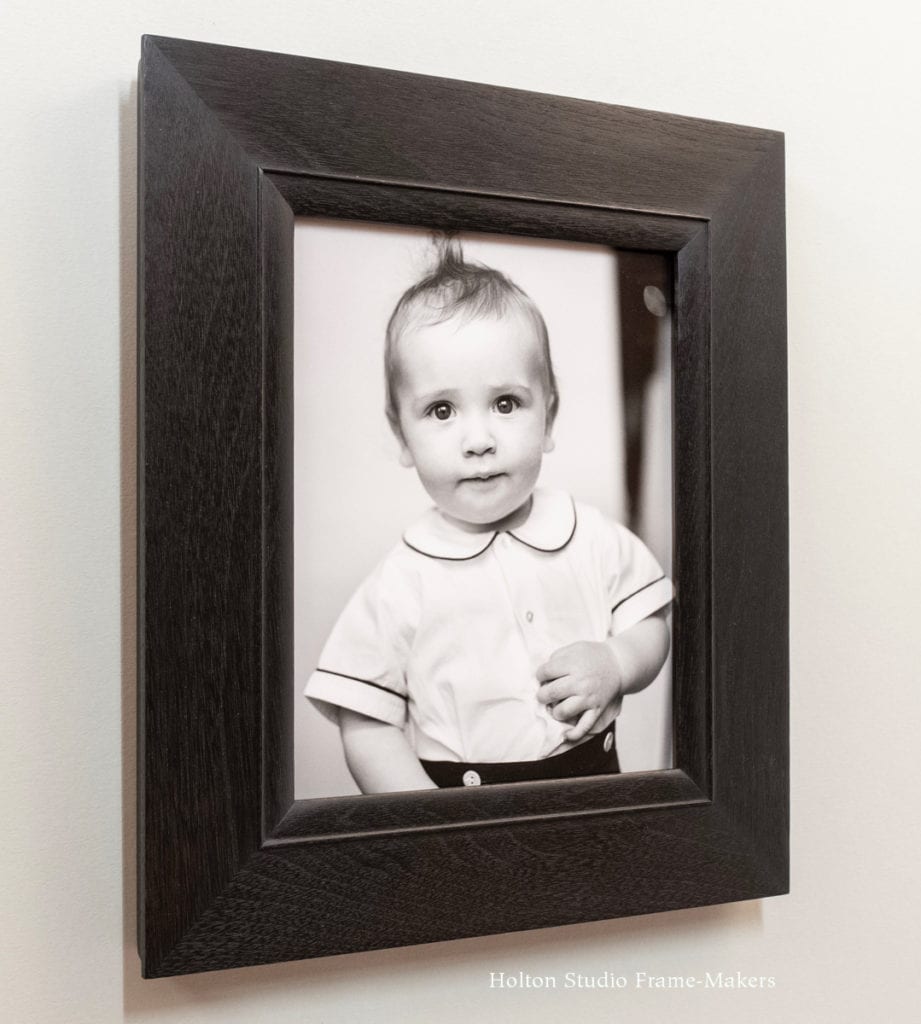
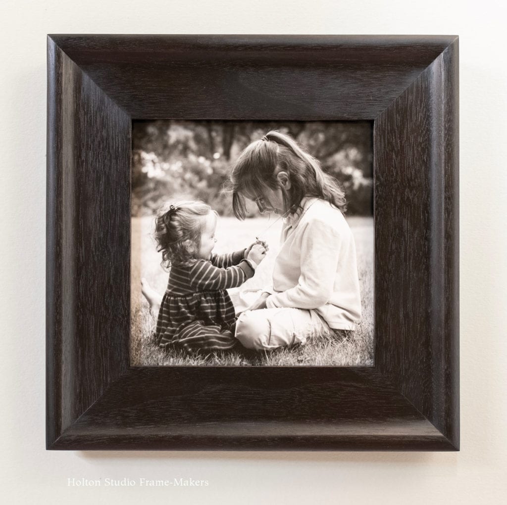
Scroll down to see the rest of the pictures in the exhibit.
Meant to Be
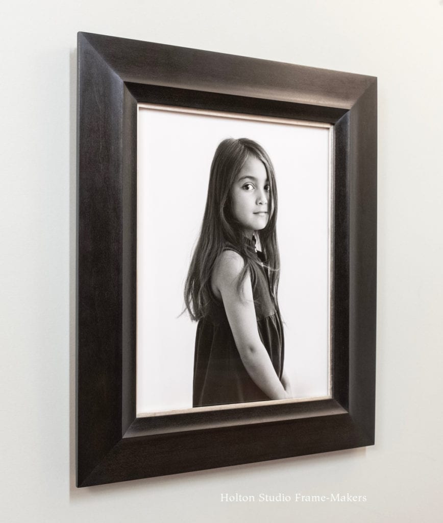
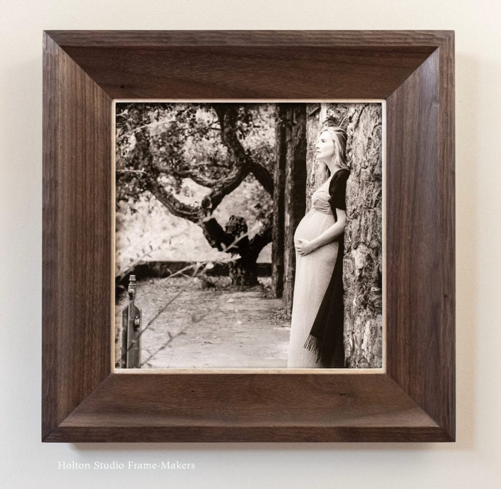
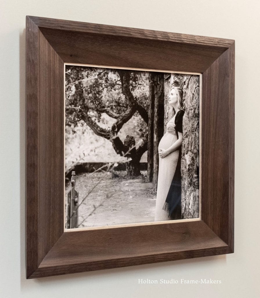
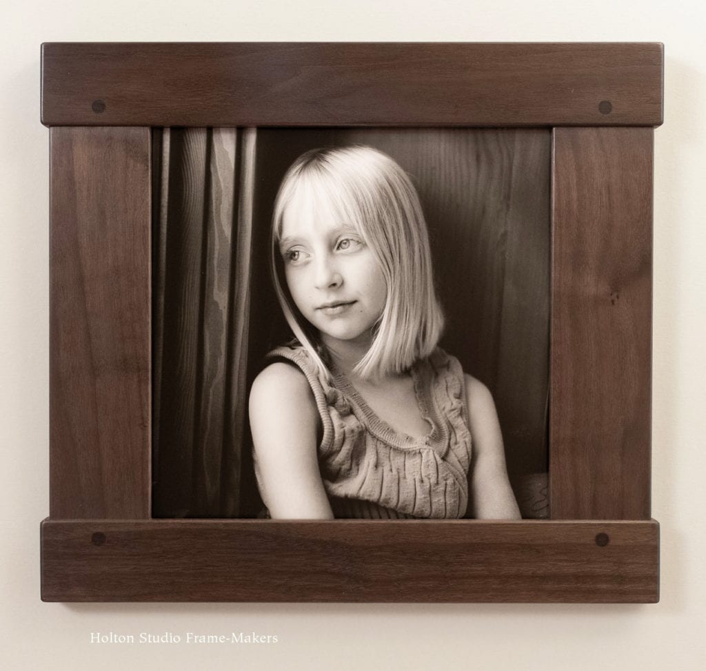
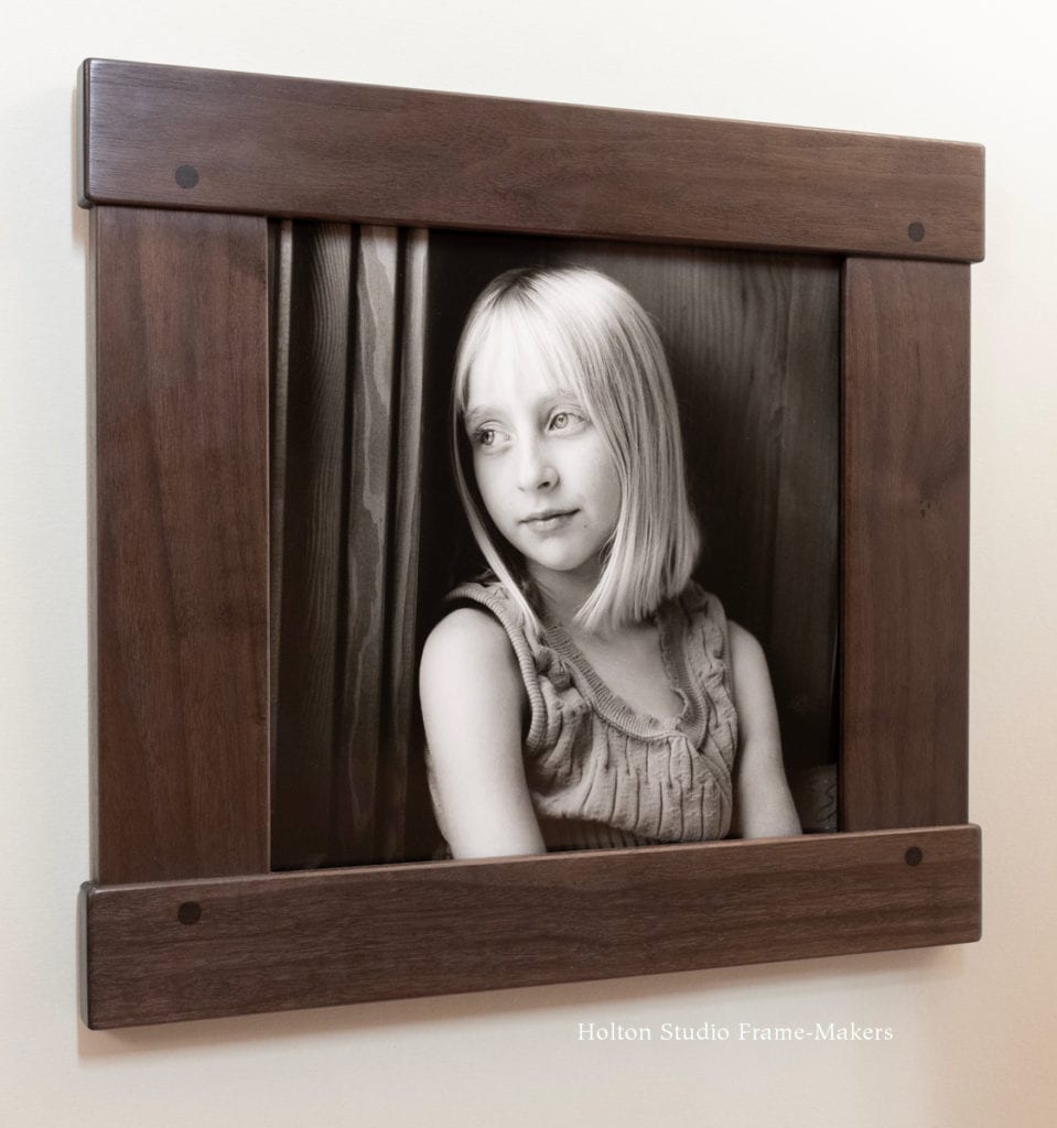
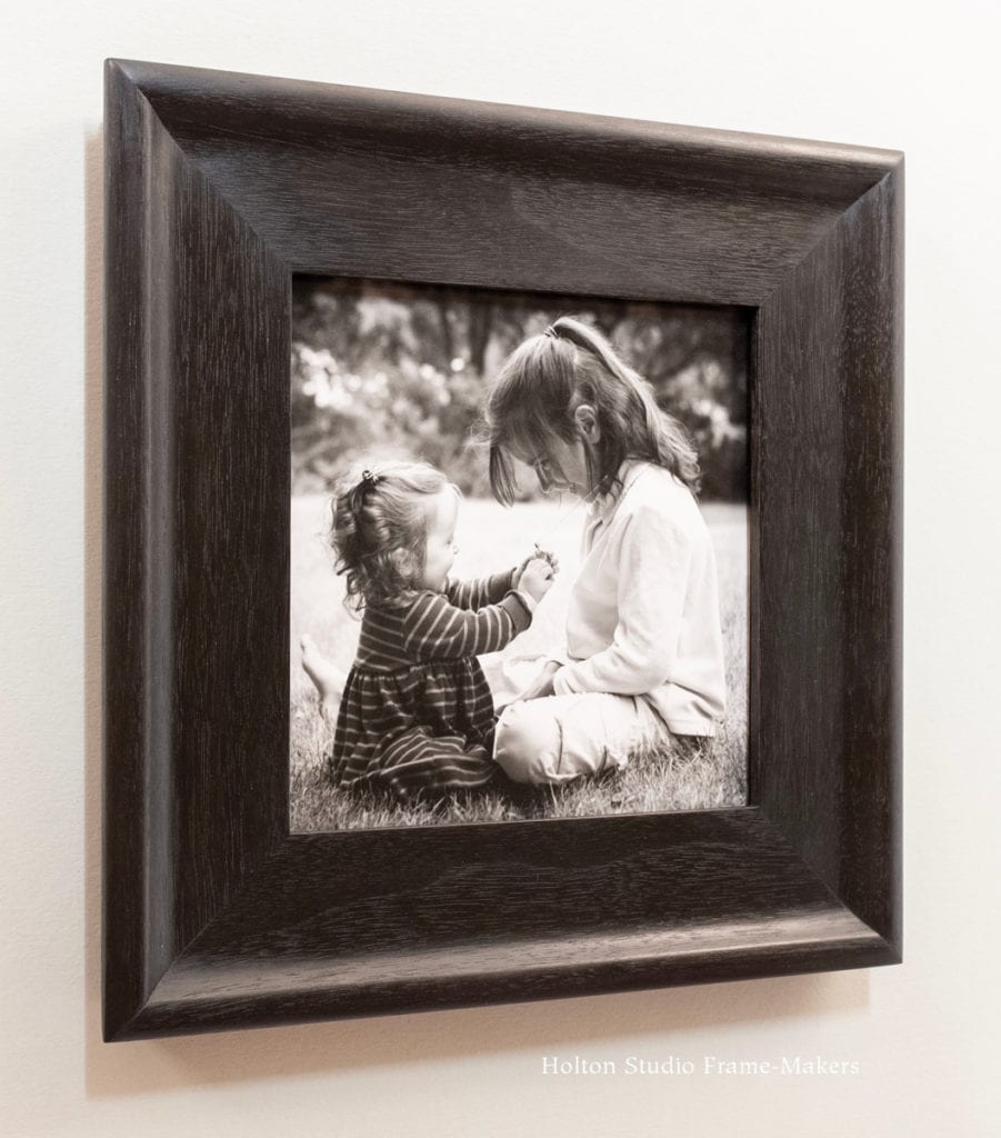
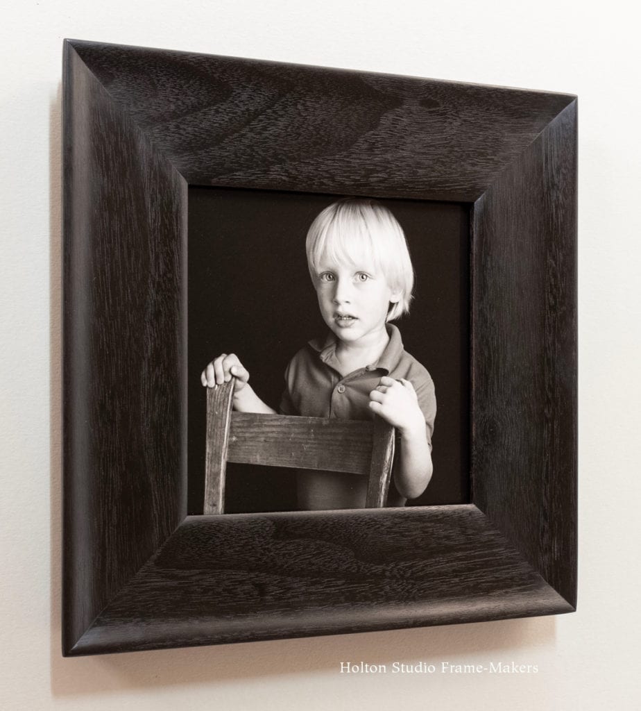
Speaking of things meant to be, Nan brought in an 11″ x 14″ print of this beautiful portrait, which graces the photographer’s homepage, and it just so happened to work perfectly with an 11″ x 14″ ready-made frame we’d just made.
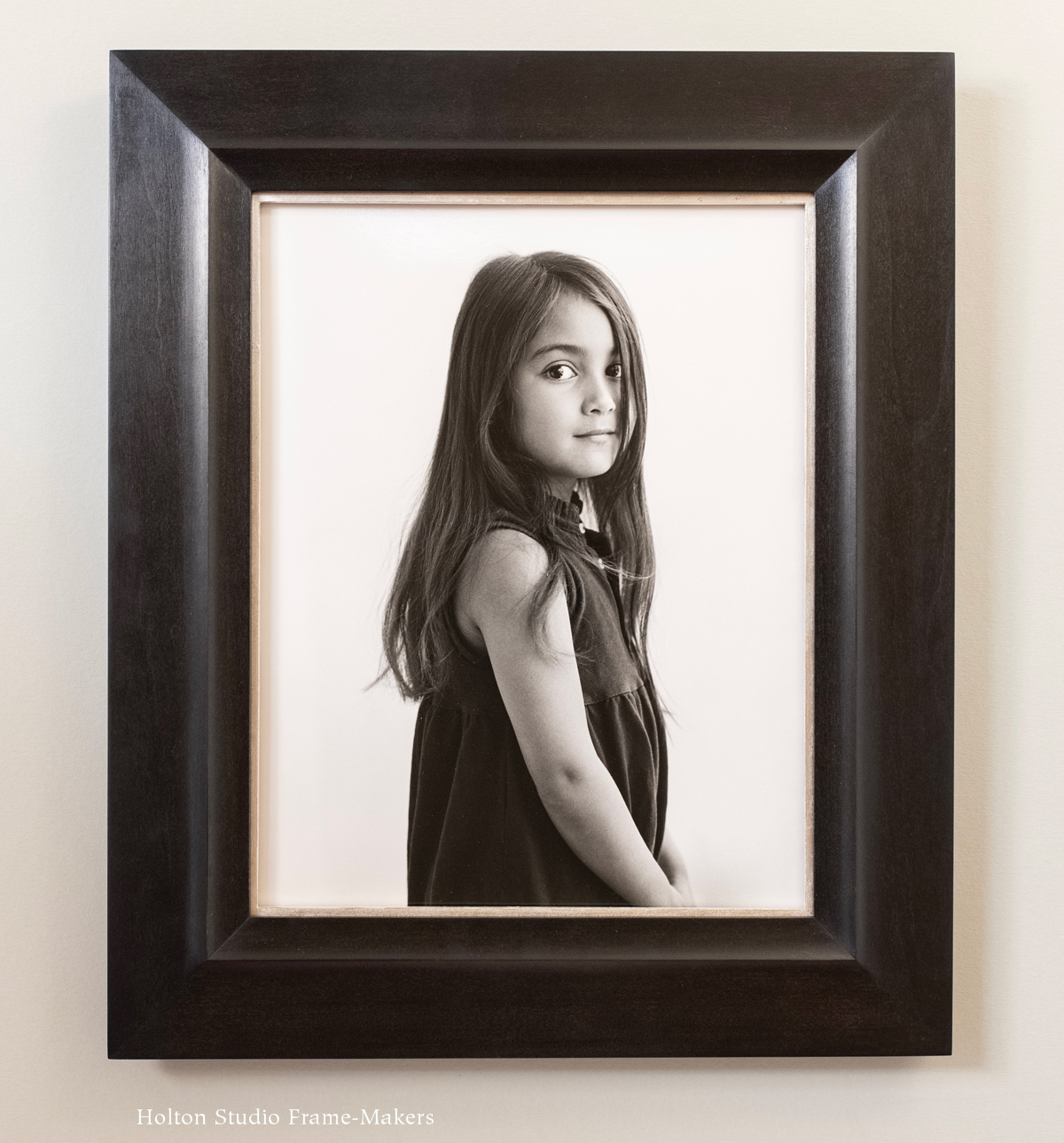
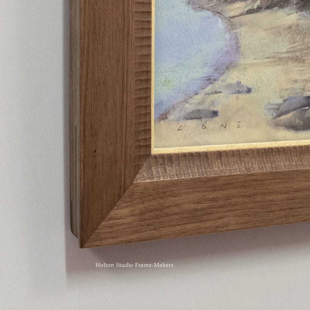
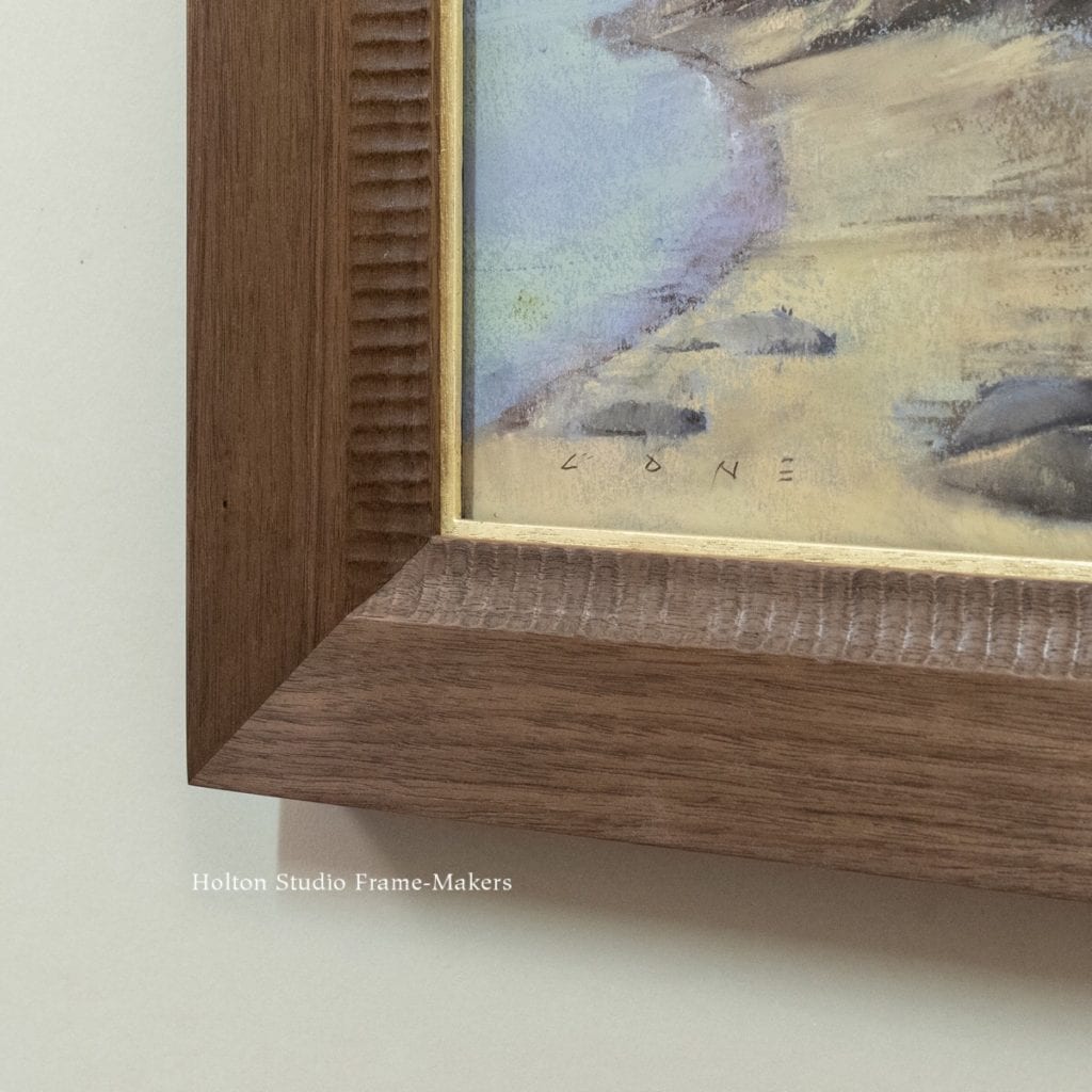
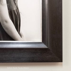
14″ x 11″ photograph by Nan Phelps. Silver gelatin print. In 2-1/2″ profile in cherry stained black, with white gold slip.
The great harmony between the ready-made frame and this picture is not a complete coincidence. There are three reasons why it worked so well, all following from the fact that the frame was designed to suit black and white photographs, most of which share three traits that a frame designed for a photograph can account for regardless of the specific photo. First, nearly all photographs capture with great subtlety the gradation of light and shadow that define form (especially important in figurative work, such as portraiture). Second, photography is capable of fine definition and capturing detail defined by sharp lines. Finally, photos printed on photographic paper all have smooth surfaces. For these reasons, any frame having (1) a fine line or two, (2) soft convex or concave overall form or elements, and (3) a smooth black finish (made in a close-grain wood like walnut or cherry, as this one is) is likely to harmonize with a black and white photograph and enhance it. The silver-colored—actually white gold—slip amplifies the black and white value scheme of the photograph, and also adds significance and emphasis to the presentation. The frame’s overall flat profile (as opposed to a slope, cove or cushion form) serves the stillness and simplicity of this picture as well as its relatively shallow depth of field. There is a little bit of depth suggested by the frame, however: the sight edge of the inner cove ends below the level of the flat outer portion of the face of the frame. The sense of depth this creates enhances the photographic illusion of the girl being just on the other side of the wall and looking at us through a window, from a little distance. But just a little distance—an important distinction, as I’ll explain below.
A Frame-Maker’s Approach to Framing Black and White Portrait Photography
Most pictorial media feel naturally at home on the wall because a picture is essentially something we expect to see as part of a wall: a window. That is, a picture is an illusion in two dimensions of something three-dimensional and real beyond the plane of the wall; it’s a work of imagination or memory outside the present reality of the room. So then the picture frame is, of course, a window frame and gains much of its power in convincingly completing the pictorial illusion of a window.
 But compared to other media, in the case of most photographs (I’d exclude large, especially color photos), such illusion is generally less tenable. This is mainly due to the fact that the genesis of photography had nothing at all to do with architecture. Whereas painting and even much of printmaking originated and largely evolved in the service of buildings, photographs were originally made to be portable and/or to be reproduced in print media—that is, to be framed not by walls but by the printed pages of newspapers, journals and books. In any case, they were too fine, subtle and detailed—these were among their most admired qualities—to command attention against the weight and mass of architecture, or have presence or the kind of decorative effect on the room as a whole that’s generally been intended in the case of paintings, prints and other media. A photo displayed on a wall is usually hard to enjoy unless one deliberately approaches it for close viewing. In their early days, when photographic portraits were framed, it was usually so that they could be propped on shelves, but also to protect them while being held in the hands of admirers or stashed into trunks and suitcases. The little, usually metal frames made for these early tintypes and daguerreotypes and cartes de visite were more like carrying cases made for portability—the very opposite of what architecture provides which is more or less permanent place as a part (even if only an illusionary part) of the wall.
Nevertheless, we commonly hang photos on our walls, and for very good reason: because they represent things significant to us—people, places and things we love and admire, and that we therefore want to keep before our eyes and alive in our hearts.
 So here’s the problem: We want photographs on the walls of our homes, and to be part of our homes; but photography is a medium that does not naturally feel at home on our walls. Certainly to a large degree the solution to the problem of making photographs suited to walls follows from consciously considering what it takes to make them feel more harmonious with architecture. Two things that help are, 1) the choice of photograph, and 2) where it’s hung. Brought up to a certain appropriate size (but not necessarily large), and when graphically bold enough, photographic prints can gain the sort of presence on the wall that other media do, especially with judicious placement, usually in smaller, intimate settings, such as hallways, offices and bedrooms. Even so, achieving the kind of architectural presence, the feeling of a window, that’s typically easier to accomplish with other media, depends on suitable framing.
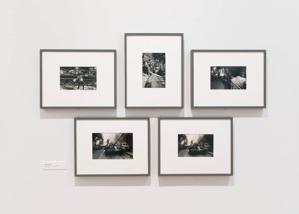
An example of the conventional, “gallery” or “museum” approach to framing photos: an exhibit of photographs at the Chicago Art Institute (from Tru Vue glass)
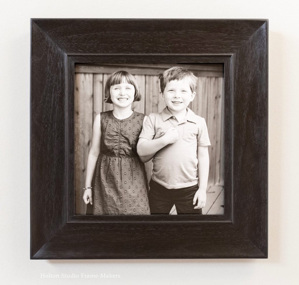
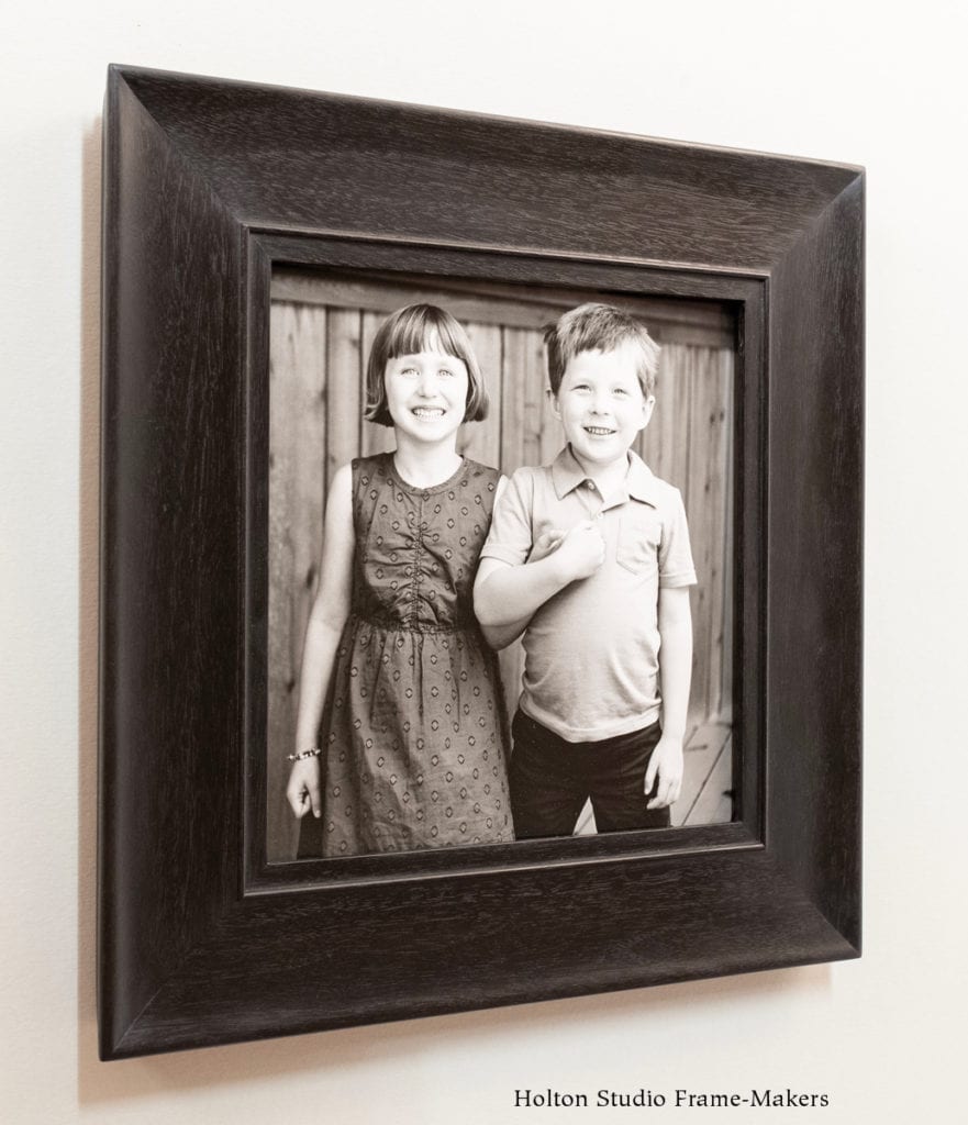
Sadly, for several historical and other intriguing reasons which I plan to touch on in my talk, the conventional, minimalist approach to framing photos in wide white mats and plain, narrow frames—often called “gallery” or “museum” framing—doesn’t serve their full potential for being part of our homes and part of our daily lives. Above all, its effect is to not only isolate the picture but, given the nature of perspective, to visually push away from us the photograph and its subject—the very opposite of what we want to do with images so dear to us. By contrast, what we demonstrate in this exhibit is the effect of framing “close.” This means having the frame up close to the picture by doing without a mat. (The approach is still archival: a narrow, hidden mat under a widened frame rabbet creates a space between the glass and the photo, and the rabbet is lined with a metal tape to prevent acids in the wood from migrating into the photo paper.) But framing close also means that the image and its subject appear closer to us, at just a little distance outside the window—close enough to keep them within our reach, and us within theirs.
Using the lovely, exemplary work of Nan Phelps and with a genre of photography widely enjoyed and common in the home, my aim for this exhibit is to demonstrate, by taking a frame-maker’s approach, just how to do that, and to give the kind of worthy and appealing place and presence deserving of photographs as beautiful and meaningful as these.
-
-
-
-
-
No. 134.0—2″ on black and white photo
-
-
-
-
-
-
-
-
-
No. 143—2″ on photograph*
-
-
-
-
-
-
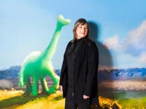 If you saw Pixar‘s 2015 animated film The Good Dinosaur (see the trailer here), you’ll recognize Sharon’s distinctive hand. This 2015 Wired Magazine artist profile, written after the release of the film, provides a good sense of how painting informs Sharon’s work for the animation studio. In 2014, her outstanding achievements earned her membership in the elite American Society of Cinematographers—”the first member,” according to her Wikipedia entry, “to be elected to that professional group who had worked only in animation, without also having done live action film.”