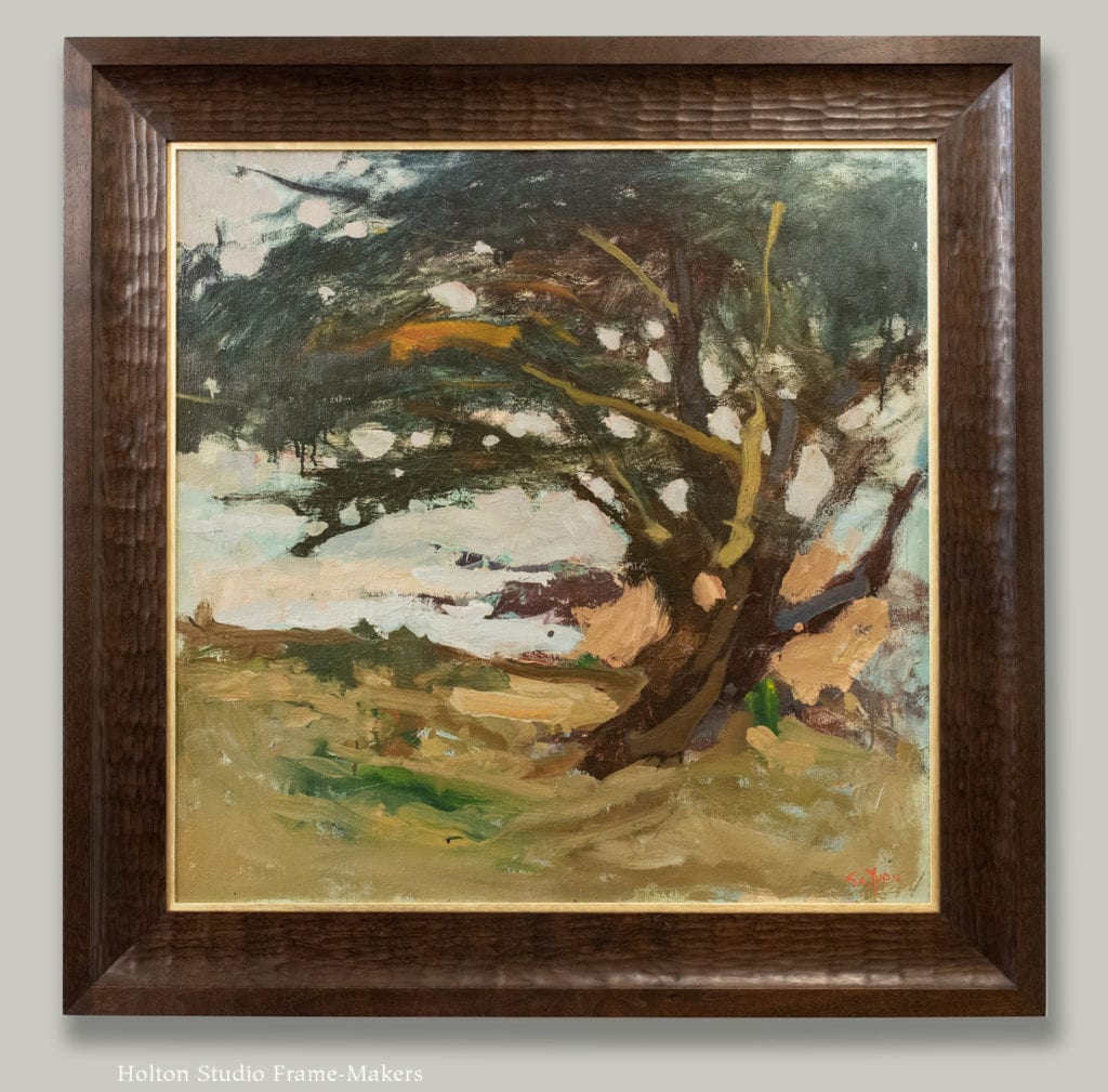
We recently framed this impressive oil painting by one of the most admired artists of the Monterey Peninsula in the late twentieth century, S.C. Yuan (China & California, 1911-1974). “Carmel Cypress” was painted in the 1960’s. The 26-1/2″ x 26-1/2″ painting (33-1/2″ x 33-1/2″ outside frame dimensions) is available from Rieser Fine Art in Carmel. The 3-1/2″ frame is in carved walnut stained to match the tree, which also informs its sweeping shape, and has a pale gold liner. The texture of the carved frame suggest the tree bark, and also echoes the texture of the paint on the canvas.
Author Archives: timholton
Framing Edgar Payne, and Exploring Proud Splines
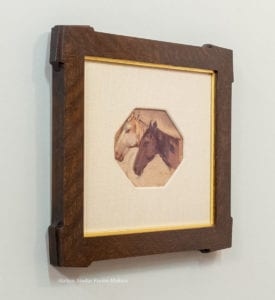
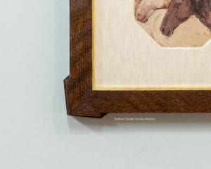
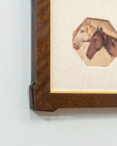
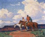
This little study, “Indian Ponies,” by famed Southern California painter Edgar Payne came to us in a linen mat with an octagonal opening. The outside of the mat is 9-1/4″ x 10-1/4″. I’d been doing more with proud splines—as can be seen in the post from last week, “Framing Eva Pietzcker”—and this piece suggested to me using a combination of outset corners and proud splines playing off the angles of the horse heads and composition.

The frame is quartersawn white oak with Medieval Oak stain, and has a 23 kt gold slip. It’s 1-1/4 wide (1-7/16″ at the corners). Details below. More designs with proud splines can be found on the Mitered Frames—Special Corners page of the catalog.
“Indian Ponies” is available from California Historical Design.
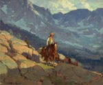
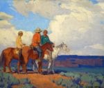
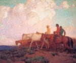
Below are a few works by Payne featuring horses—
Framing the Wedding Banners of Bertha Lum
The unusual imagery of wedding banners central to this 1924 print by Bertha Lum, and giving it its title, offered me an opportunity to use a joinery technique I’d been playing with. “Wedding Banners,” is available from California Historical Design.
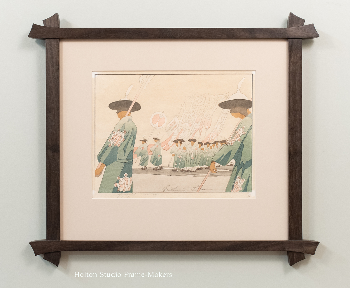
Bertha Lum, “Wedding Banners,” 1924. Woodblock, 9-1/2″ x 12″. Click image to view large.
The frame is in walnut with a black wash. The sides are 1″ wide, the top and bottom 3/4″. The corners are lap-joined.
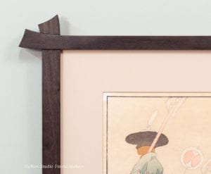
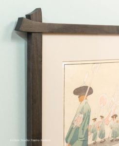
Below is a corner sample in a similar design, also walnut but with a clear finish.

We’ve enjoyed framing Lum’s work before. Another lovely print, along with information on the artist, can be found in my post, The Penetrating Imagination: Framing Bertha Lum’s Window on Distant and Hidden Things. You’ll also find a Lum print here in the Portfolio.
Again, the framed print, “Wedding Banners,” is available from California Historical Design in Alameda, California.

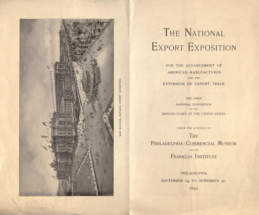
Framing the Hopes for American Commerce of 1899
The challenge in framing this beautiful 45″ x 20″ antique poster advertising the 1899 National Export Exposition in Philadelphia was to harmonize utilitarian and artistic concerns: to balance the simplicity and boldness of presentation naturally suitable to a poster frame, with the poster’s abundance of decorative detail. I’m pleased with the results.
The frame is made in quartersawn white oak with Weathered Oak stain, and its effectiveness relies first and foremost on the beautiful “ray flake” figure of the wood. The profile is basically flat, but the corners are decoratively treated using chamfers to emphasize and exaggerate and embellish the simple cut-in curve that articulates the corners.  My last post, on Framing Eva Pietzcker, showed what can be done with what I’m calling altered miters. Like Ms Pietzcker’s woodblock prints, this poster is elongated, and so likewise called for the frame to be in keeping with those proportions: its 3″ wide short sides (the top and bottom members) are 1/2″ wider than the vertical long sides, with the miters accordingly altered from the conventional 45 degrees. Again, the effect, meant simply to be consistent with the basic compositional character of the picture, should not draw attention, but be natural.
The design problem of the frame, harmonizing the utilitarian and artistic aspects of the poster, in fact goes to concerns expressed in a section from a promotional pamphlet for the Exposition regarding the relation of the decorative to the utilitarian in the architecture of the Exposition (as well, presumably, in the “American manufactures” promoted by the event). It reflects larger assumptions held more strongly at that time than today about the inherent harmony between use and beauty, between the practical and the aspirational:
Art In the Exposition Buildings
While the Exposition has in view a most practical purpose, there was not, in the planning of the buildings, any idea of subordinating the beautiful and the artistic to the practical end. On the contrary, the ornamentation and decoration of the structures, though of the temporary character which must of necessity be used in Exposition buildings, will delight the eye and appeal to the innate love of art and beauty which every person possesses.
Out of a composition, the basis of which is plaster and paper-mache, more durable than the “staff” which made the buildings of the World’s Columbian Exposition a delight to look upon, have been formed columns with capitals as beautiful as though carved in white marble. Cornices and friezes, panels and screens, the design of skilled sculptors, aid in giving the buildings rare architectural attraction.
Above the main entrance a large pediment contains a group of thirteen figures, representing Commerce. Other pediments typify the four continents. Numerous groups of graceful figures, symbolical of Transportation, Navigation, Labor, Electricity, etc., rest on pedestals beside the pediments, and over the main entrance there is a large quadriga—a chariot drawn by four horses, carrying the beautiful figure of Progress, whose proudly poised head looks with calm and confident eyes into the future.
The title spread of the pamphlet is shown below. (The pamphlet is available at archive.org, here.)
Framing Eva Pietzcker
We just framed three prints by an outstanding contemporary German printmaker, Eva Pietzcker. These prints are examples of her work using the Japanese woodblock technique (mokuhanga) which involves water-based inks, and therefore results in the more muted effects associated with watercolor.

Eva Pietzcker
Residing in Berlin, Pietzcker has studied papermaking and printmaking in China and Japan and traveled widely, including to the west coast of the United States. Two of the prints here draw on subject matter from those latter trips.
I’ve been doing more with proud splines, and two of these works inspired me to explore that technique. All three prints, being in elongated formats, use what I’m calling altered miters, joining two adjacent sides in different widths and thus requiring a miter at something other than 45 degrees. All three frames are stained walnut.

“Chistmas Roses,” by Eva Pietzcker, 24-3/4″ x 12″.
 This first example, shown above, is “Christmas Roses.” As with all three works, we floated the 24-3/4″ x 12″ print in the window of an 8-ply rag mat to expose the deckled edges of the handmade paper. The frame’s sides are 1″ wide, the top and bottom members 1-3/8″. The proud splines are shaped to a form harmonious with the forms of the print. The ends of the top member are slightly curved. (See corner detail at right.) The print is simple and masterfully subtle. The trick for me was to frame it in a manner consistent with that subtlety. That might, to some, have meant no detail at all—a minimalist treatment. But as logical as that sounds, it would not have actually been alive to—effected by—the print’s character, including its subtly interdependent, contrasting and harmonizing forms.

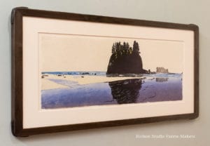
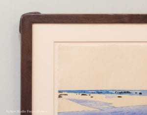
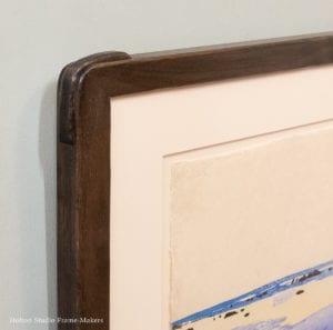
The 9-1/2″ x 26-1/2″ print “La Push,” above, is very similarly framed, but the rugged forms and their rough and irregular edges seemed to me to call for some carving. So the frame, otherwise flat, has carved inner and outer edges, and the shaped proud splines are also carved. The top and bottom members are 7/8″ wide, the sides 1-1/4″.
Carving is also the main feature of the frame on “Fallen Leaf Lake,” 13″ x 38″, below.
 It has 1″ top and bottom members and 1-3/8″ sides. We didn’t use proud splines, but did carve the corners in exactly the same fashion that the woodblock itself is carved—with a flat high surface, which, on a woodblock, would be inked.
The altered miters are a natural adaptation to the form of the picture and should feel natural and not attract attention to themselves. Conventional frame shops are rarely equipped to execute and provide this simple and obvious feature, but it is easy enough for the ordinary woodworker’s or joiner’s shop to do.
One of the first principles of frame-making is to find a harmony between the art of the frame and the art of the picture. Because both frame-making and woodblock printing entail wood and its shaping, that harmony comes especially naturally.
In the U.S., Eva Pietzcker is represented by Davidson Galleries (Seattle).
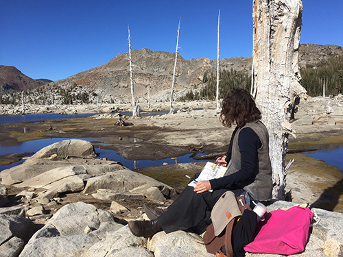
Eva Pietzcker in the Desolation Wilderness area in the High Sierra
Framing Gene Kloss, and a Small Picture of Vast Matters
“The system of the world is entirely one; small things and great are alike part of one mighty whole.” —John Ruskin, Modern Painters
Theologians of old used to speak of “this great frame of things,” meaning the comprehensive, whole—and holy—totality of creation. It seems to me that the picture frame’s function is to connect the particular, personal, and individual vision that is a picture to the world of which it’s a part, and thus to help make it, small as it is, a part of that totality. For that reason, imagery like leaves and clouds, the most commonplace and ubiquitous things populating the natural creation, have always felt to frame-makers especially suitable as decorative elements for the frame.
 The design of our small frame for this little 4″ x 7″ etching by Gene Kloss (1903-1996), called “Desert Clouds,” 1932, illustrates the point. The outside dimensions of the frame are about 10″ x 13″. It’s a 5/8″ wide profile in walnut with a black wash. We also gave the frame an 1/8″ walnut filet gilded with white gold leaf. The corners are carved in a cloud motif.
Such naturalistic decorative motifs as this help the frame in its work of relating the particular to the whole—first and foremost connecting the picture to the natural world that inspired it, but also to the other arts that comprise architecture, and the individual artist and his or her personal vision to the communal life that it touches. It’s reasonable to surmise that this power of naturalistic motifs, their power to connect the works of humanity to the works of nature, explains their ubiquity in human history and its arts, including the most utilitarian arts, going back to our earliest artifacts.
With respect to picture frames, this is a key way in which a frame complements—completes and perfects—another art form, that of the pictorial artist. But it may be only one expression and aspect of a more fundamental principle. The frame not only provides protection and a way of making it physically possible to hang the picture so that it can take its place and role in a room, but, as a decorative architectural setting made of beautiful natural materials and employing naturalistic motifs (and/or more abstract forms derived from nature’s), the frame expresses the picture’s significance in relation to the wider world—and truly and most compellingly, to the world as a whole. Certainly such a frame connects—joins—the picture to its surroundings in a satisfying fashion—much more satisfying than, say, push pins. But its effectiveness and meaningfulness—its evident power in elevating and bringing significance to a picture—may depend even more so on its inherently resonant nature as a powerful symbol, and sort of minor agent or emissary, of that comprehensive “great frame of things”—the vast creation that surrounds us. And perhaps the well-made, well-suited frame satisfies us because it satisfies our innate longing to see, grasp and recognize the connection of the particular to the whole; of each to all; of the individual and the personal to the whole of humanity, nature, and the universe.
The twentieth century propagated a myth of the separateness and autonomy of the “fine” artist and the “fine” art object—a fallacious myth that is, I believe, at the root of the degradation and demise of the “lesser art” of the frame over the past century. The myth broke with and violated a kind of primal unity inclusive of the arts and that didn’t differentiate “artist” from “artisan”; a habitual overlapping, collaboration and mutual aid and interest characteristic of the arts throughout the history of civilization. But more than that, the fallacy defied a natural harmony—a fundamental interconnectedness and interdependence—that ancient wisdom understood, and modern science has increasingly recognized, as a governing characteristic of the infinitely varied and complex, but ultimately unified system and “great frame of things” that is the observable world. We are learning, if too slowly, that, as Wendell Berry says,
Nothing exists for its own sake, but for a harmony greater than itself which includes it. A work of art, which accepts this condition, and exists upon its terms, honors the Creation, and so becomes a part of it.
In the case of pictures—no matter how small—it is the right frame, thoughtfully designed and carefully made, that allows us to see the picture as a part of the wider Creation. Simple though it may be, it is the opposite of the brutally bland, insensate and indifferent, minimalist twentieth century frame that was made for a disconnected, isolated conception of the autonomous work of art. With the help of frames, made again with thoughtfulness, craftsmanship and integrity, we may again learn to connect the visions we have of and for the world to that world. We may again learn to allow pictures—those most concentrated creations of the human imagination, memory, intellect and spirit—to help us attend to that world, to our world, and play our part in its harmony and its wholeness.
Gene Kloss
 Alice Geneva “Gene” Kloss was born in our neighboring Oakland, went to college and lived here in Berkeley. (See her page on the Berkeley Historical Plaque Project website, here.) But after honeymooning in New Mexico she fell in love with that state, longing for a life it offered, amidst the great frame of magnificent mountains, skies and wilderness—a life evident in this print. So she began living there a good part of the year. When Kloss made this etching, she and her husband were living in Taos, in an old adobe at the foot of the Sangre de Cristo Mountains. Wise to the great interdependence of our own creation with nature’s, she once wrote, “An artist must keep in close contact with nature and man’s fundamental reliance on nature in order to produce a significant body of work.”
The “Desert Clouds” etching dates from the Great Depression. According to Wikipedia, “Kloss received widespread recognition and awards during the 1930s. From 1933 to 1944 Kloss was the sole etcher employed by the Public Works of Art Project. Her series of nine New Mexico scenes from that period were reproduced and distributed to public schools across the state,” helping children connect to their place on the Earth and learn that, in the words of Woody Guthrie, “this land is your land, this land is my land.”
If the country might be said to have fallen apart with the economic collapse, setting millions of citizens adrift, Kloss’s work is an example of how a people puts things back together using their arts—which are, after all, how we join the world, each of us playing a small part in the whole creation, “this great frame of things.”

Tim to Teach Frame-Making at Marc Adams School
UPDATE SEPTEMBER 1, 2020: Due to the pandemic, I had to cancel plans to teach this class. It was nevertheless a great honor to be asked, and the school is certainly an impressive operation which I heartily endorse! After the school delayed the start of this year’s program, their classes are now underway with strict protocols in place.
I’m honored to have been invited by Marc Adams to teach a course next Fall at his renowned school just outside Indianapolis, The Marc Adams School of Woodworking—the largest school of its kind in North America. The week long course, “Picture Frame Making for Woodworkers”, will take place October 26-30, 2020.
Follow the links to read the course description—and maybe sign up!
Marc Adams is a master woodworker who founded the Franklin, Indiana school in the early 1990’s. In the last few years MASW has branched out to include a great range of crafts, including glass blowing, copper, calligraphy, bookbinding, basket weaving, and even paper sculpture and neon. Our good friend Ted Ellison taught stained glass & mosaic there this year and will return in 2020 to teach the same week as me.
Ted reports that the facility is truly amazing—as appears evident in this video tour of the school. Below is a photo of a classroom.
Looking forward to this opportunity!

Robert Flanary and Paul Roehl: A Harmony Continuing Still
 We are featuring in the Gallery, through February 22, paintings by Robert Flanary and Paul Roehl, two of our painters most influenced by the tonalist tradition which thrived in the Bay Area a century ago. We paired Robert and Paul five years ago for a show we called “A Continuous Harmony.” If tonalism sounds like an outdated idea, the lessons these two artists convey about our relationship to nature are, to the contrary, even more urgently needed today. In other words, the continuous harmony their work captures continues still. I’d even venture to say, it’s timeless.
The 2015 blog post‘s discussion of “Framing Tonalism” may be found below.
The show is up through February 22. We hope you’ll come visit the Gallery to see it.
Below are a few highlights by each painter.
Robert Flanary—
-
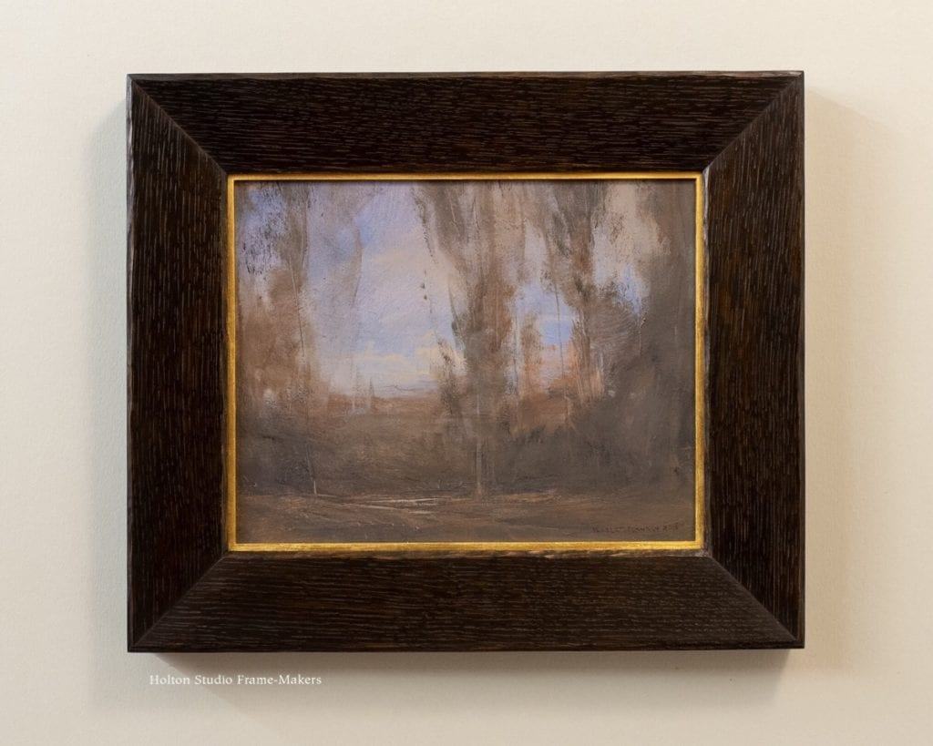
- “A Light Spring Day”
-
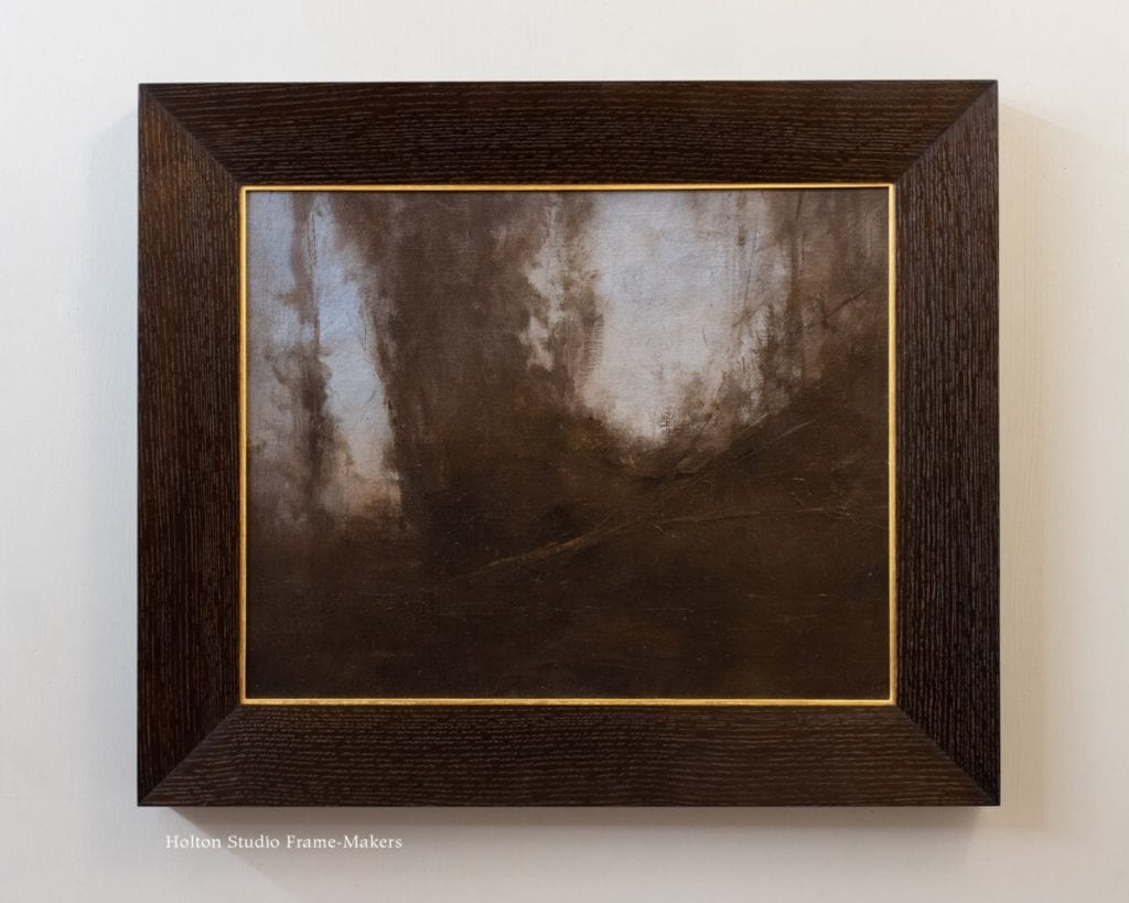
- “A Shadowed Thicket”
-
- “Glimpse of a Cow”
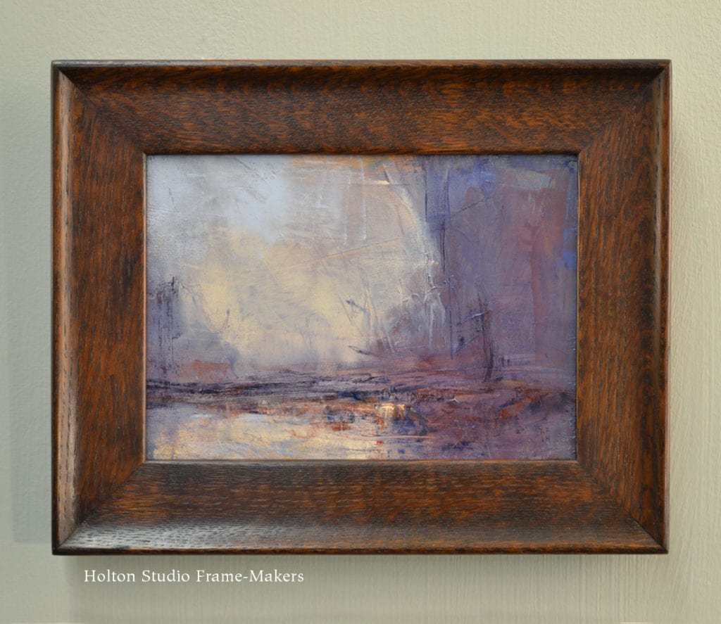
Paul Roehl—
-
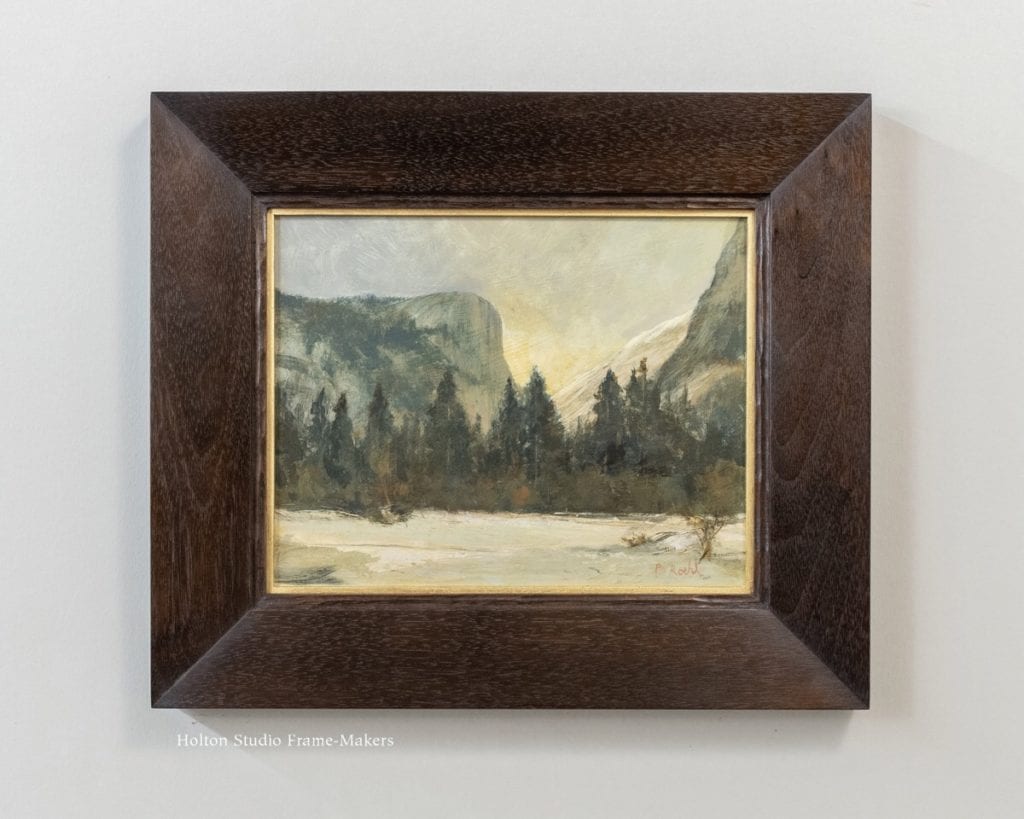
- “Winter, Yosemite—Mirror Lake & Mt. Watkins”
-
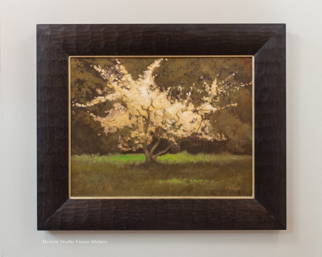
- “Spring”
-
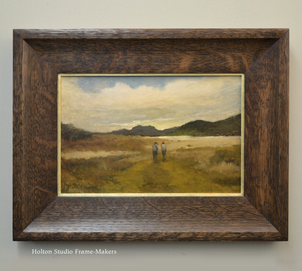
- “North Coast Hike”
Framing Tonalism
(Reposted from my Jan. 31, 2015 post on our show “A Continuous Harmony”)
If you’re a fan, as I am, of the writer Wendell Berry you may recognize the title of the show from the name of a collection of his essays (thank you to Sara Atwood for recommending them to me!). Yes, I stole the name, but Mr. Berry himself stole it: in the epigraph of the book he quotes the mountaineer Thomas Hornbein. Reflecting on his encounter with the Himalayan people and how they live in relation to the landscape, Hornbein wrote that
[T]here was no impression of nature tamed. It seemed to me that here man lived in continuous harmony with the land, as much and as briefly a part of it as all its other occupants. He used the earth with gratitude, knowing that care was required for continued sustenance…In this peaceful co-existence, man was the invited guest.
“Continuous harmony with the land” is a notion most of the modern world seems to have lost. And there’s no more plain evidence of that than the established so-called Art World’s abandonment of landscape painting and disdain for harmony. Yet we only need to go back a hundred years to find a vital instinct for finding and honoring the primal harmony and unity between the human race and the natural world that did, after all, give birth to us; and that artists and those concerned with art revered such things. For example, in 1913, Stanford University professor Edward Howard Griggs wrote in his book The Philosophy of Art: The Meaning and Relations of Sculpture, Painting, Poetry and Music that
“All art…draws its forms ultimately from nature. Thus the final principle of all appreciation of beauty lies in the relation we sustain to the nature world.” (My italics.)
Such views were commonplace, and I choose this one primarily for its local origin. The Bay Area and northern California naturally bred such views. My last post showed a couple of paintings by one of our greatest local painters, William Keith, one including his good friend John Muir. The two men shared a passion for sustaining that relation to nature which Griggs addressed. Keith, along with Arthur Mathews, played a significant role here in the Bay Area in the widespread tendency of the day—not properly a movement—often identified as tonalism. (Keith and Mathews were each students of leading tonalists George Inness and James McNeil Whistler, respectively.) Again, Professor Griggs wrote eloquently of its spirit:
“[T]he beauty of the landscape is not in the lake, river, forest, hills or sky; but in all these fused together in a harmonious whole. Similarly, the beauty of a Corot painting is not in the misty group of trees, the dancing figures, the mellow dawn light or the subtle atmosphere, but in the composition of these into a harmony.”
Such concerns strike many as not only outdated, but a betrayal of the iconoclastic mission they suppose has been eternally assigned to artists to subvert all that’s come before, transgress, and—for it’s a radically evolutionary mission—never repeat or produce even a semblance of what’s been done before. And yet, as Arthur Mathews wrote, “[W]oe to him who believes that he may cut loose from all precedent.” Evolution may have other directions in mind for us—such as cultivating the earth and the arts of living on it.
At least one artist, having thoroughly explored the modern art scene, has ideas of where to go from here. Paul Roehl writes,
My interest in a tonal approach to painting is predicated on a continuing interest in nature as something mysterious and beautiful and finally compelling, as well as a way out of what seems to me a kind of hopelessly fractured dead end in the world of contemporary art… I looked to the past as a way forward and I found the Barbizon painters, their legacy and influence in American and California painting, a resulting tonalism and ultimately an approach to art that seemed to defy temporary fashion and offer continued possibilities.
Continued possibilities are, after all, what we seek, aren’t they? Instead of the fractured world we’ve created, we need to restore harmony—from the Greek, harmos: “joining”. If landscapes “have been done” that hardly seems like a reason to ignore the landscape and “the relation we sustain to the nature world”—to stop seeing it, to stop seeking harmony in it. We cannot be done with nature as long as nature is not done with us.
The Holiday Frame of Memory—and a Mother’s Fruitcake
Yesterday, the San Francisco Chronicle Food and Wine section included a poem, “Mom’s Fruitcake,” by my wife, Stephanie McCoy, recounting the story of Steph’s late mother’s traditional Christmas fruitcake and its lasting meaning for her family. (That’s one thing we can all agree on about fruitcake—it lasts!) The poem is a beautiful read (I am not, of course, at all biased) and reminder, to those wearied by the excesses of the holidays, of some of the essential beauty of the season, the enduring power of what we make, and the enduring spirit of mothers, even those now passed, who make the season one of joy. Read it here…
Merry Christmas and Happy Holidays to all!
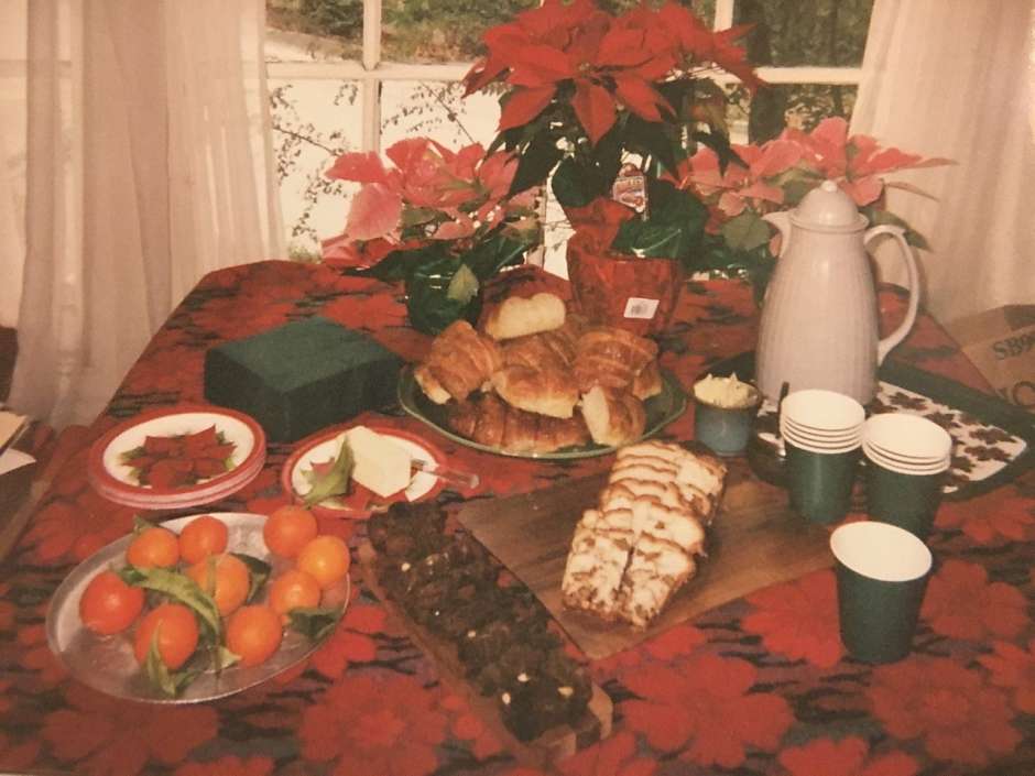
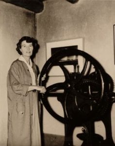
Jane McCoy’s Christmas table, featuring her fruitcake.