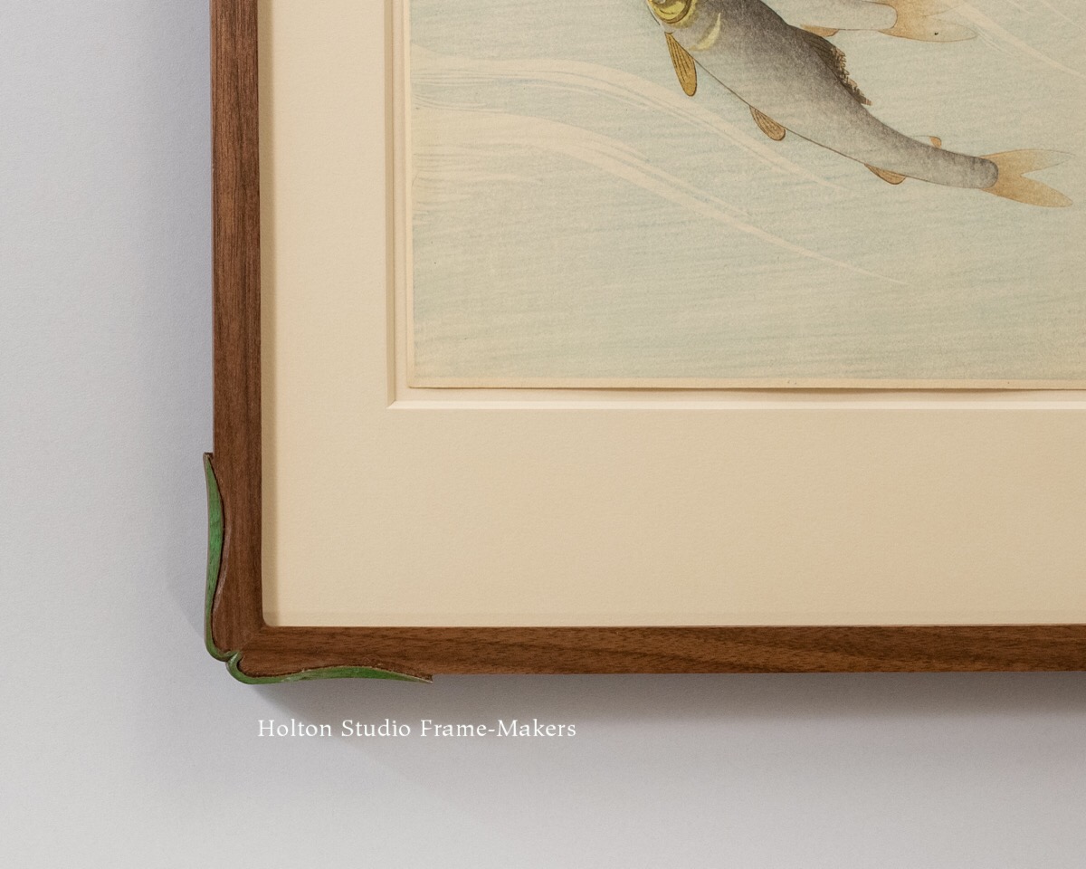
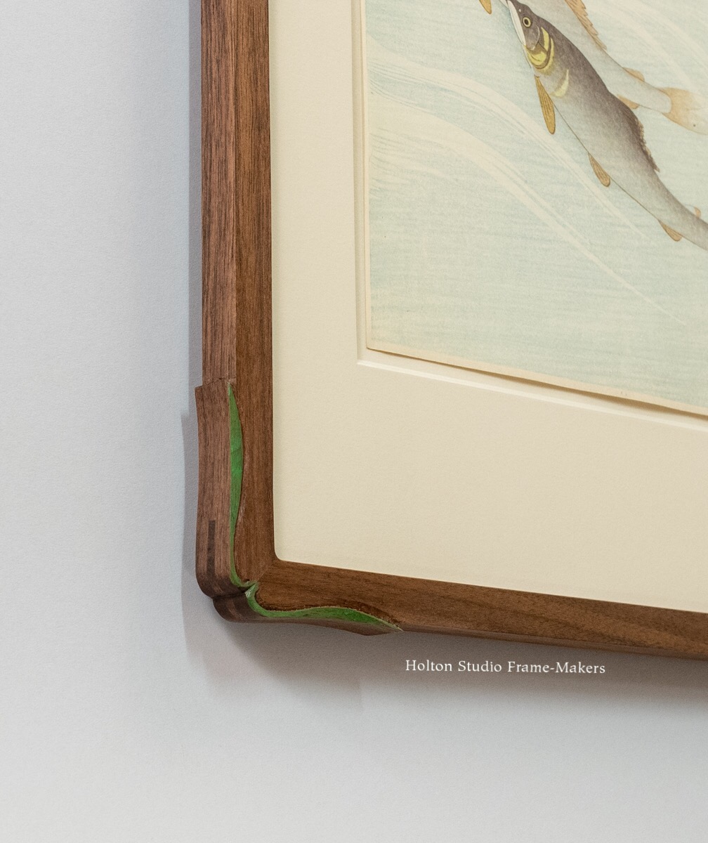
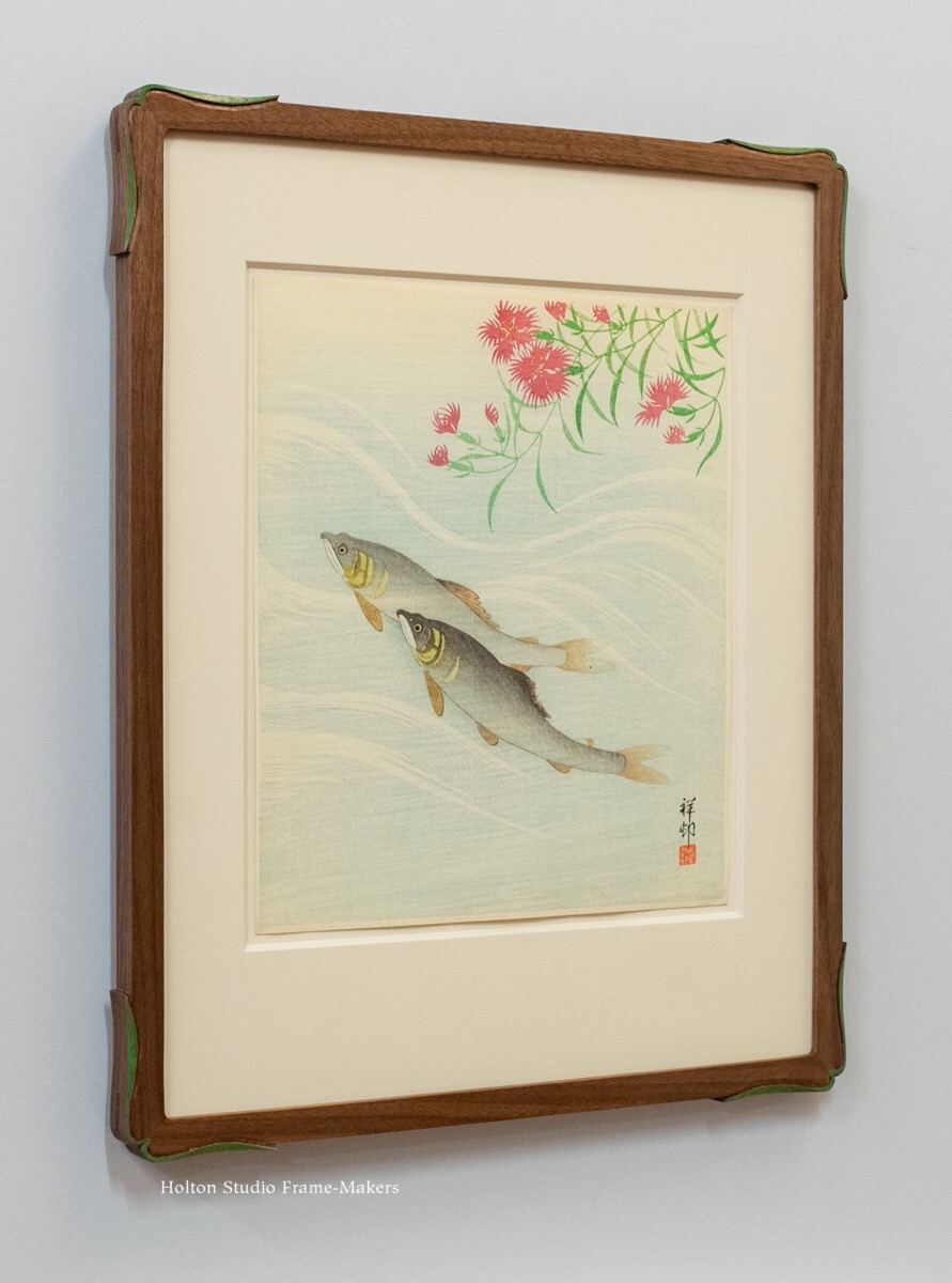
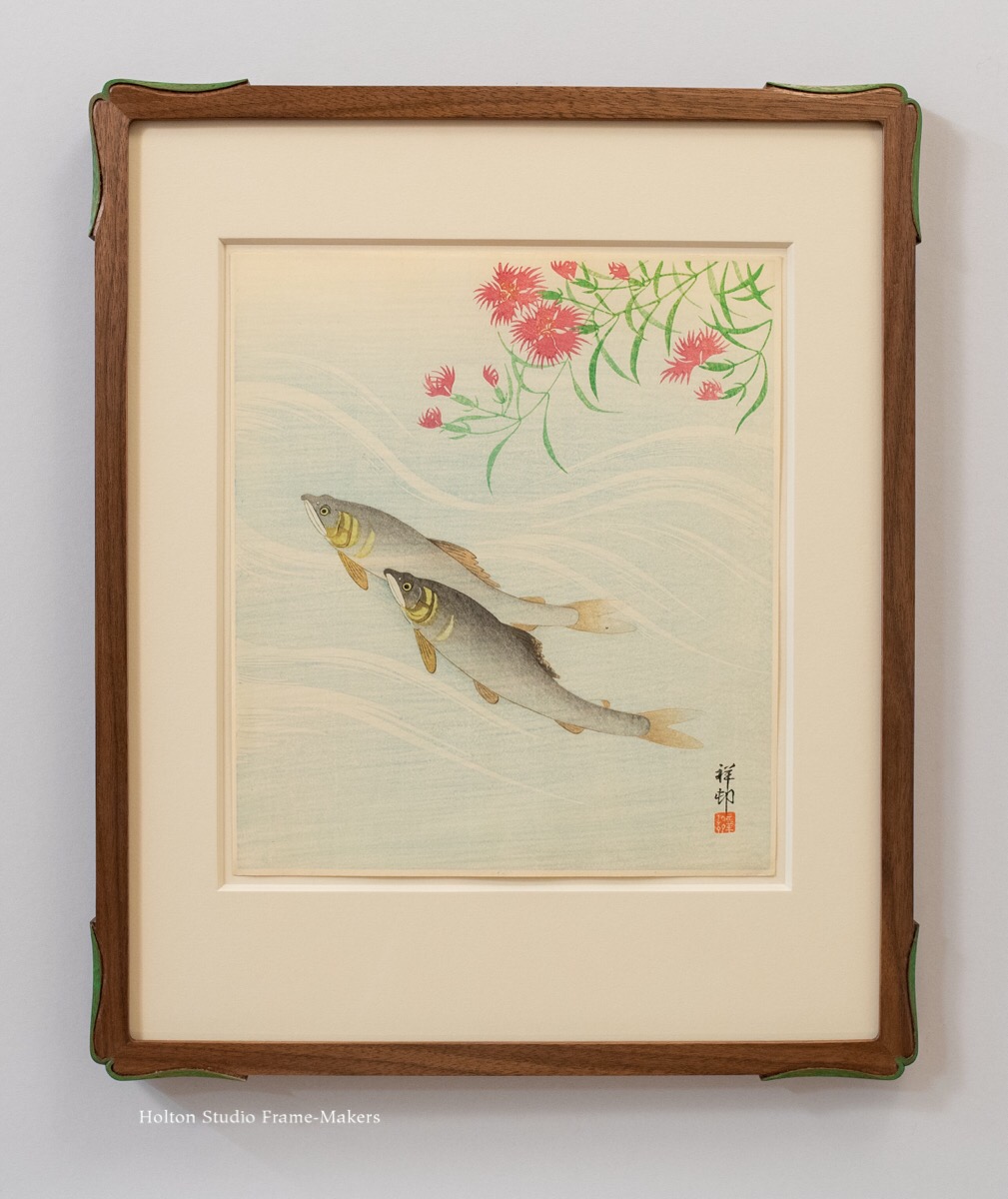
As part of the modern Japanese print movement known as shin hanga, Ohara Koson is not as well known as Hiroshi Yoshida or Kawase Hasui. But I, for one, couldn’t tell you why—and I can’t get enough of those other two guys. Koson was an unsurpassed master of wildlife. And for composition and technique as well he’s as impressive as any of his peers. So it was an honor to have the opportunity to frame this lovely example of Koson’s impossibly subtle and delicate work.
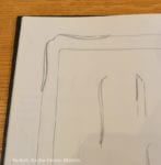
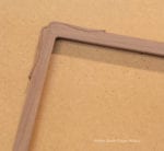
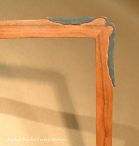
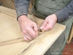
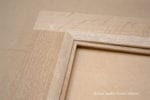
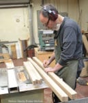
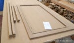
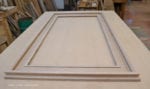
The woodblock print is about 13″ x 11″. Because there is almost no margin, we floated the sheet in the opening of an 8-ply mat, which is a very pale green. The 5/8″-wide walnut frame is like our Kobe corner frame (see the example at the bottom of the post), but I modified the corner shape by carving a leaf pattern taken from the print and painted the leaves green to match as well. I’m calling this style frame the Kobe Leaf. Scroll down to see a few process photos as well as corner samples of two other Kobe Leaf designs.
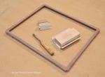
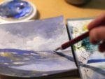
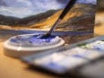
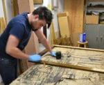
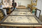
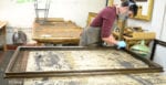
A few process photos—
Variations—
Cherry with painted green wavy leaf, 3/4″
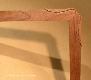
Walnut with (unpainted) serrated leaf, 1″
Another Koson—
Here’s another Ohara Koson print we framed a little while back. This is a Kobe corner frame with proud splines. The frame is walnut with black wash.
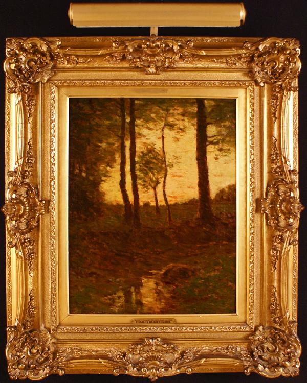
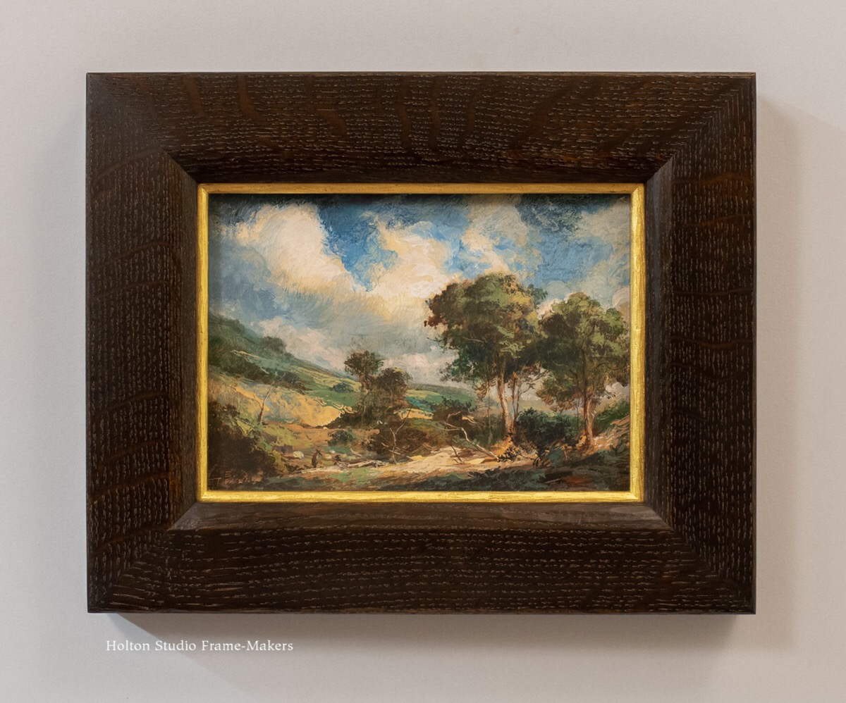
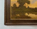
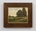
Our friends at California Historical Design are offering this lovely oil, “Entrance to the Woods, Bloomfield NJ” (ca. 1910), by the significant East Coast tonalist painter Charles Warren Eaton (1857-1937). We framed the 16″ x 12″ painting in a 3″ wide carved scoop profile in quartersawn oak with Saturated Medieval Oak stain, and a 23 kt gilt slip. The shape of the frame enhances the perspective in the painting and reflects the light in similar fashion as the trees. The profile is comprised of two pairs of alternating complementary forms: raised flats which are not carved, and concave carved elements. The gilt slip not only repeats the play of light and shadow but provides emphasis ensuring the otherwise dark ensemble doesn’t get lost on the wall. I always feel that the slim gilt slips we frequently use enhance the window effect of the frame by giving a sense that the edge of the window frame is catching the light emanating from the painting. That’s certainly the case here as the slip echoes the narrow line of sun catching the right side of each tree trunk.
The period in which tonalism arose and thrived—the late 19th and early 20th centuries—was one of great social disruption and discord. So it’s no surprise that painters responded with a painting style aimed at restoring some harmony to the world—or capturing nature’s harmony their age was losing sight of. Their ideals naturally led many tonalists, including San Franciscan Arthur Mathews and his certainly his teacher James McNeil Whistler, to embrace the art of the frame. The architecture of the frame was the painting’s first encounter with the larger architectural setting which these painters aimed to participate in in a humbler, more subordinate fashion than paintings of recent centuries had tended to do. But as the fate of another Charles Eaton painting shown at right demonstrates, the impressionist brushwork and spirit of simple rural scenes were often lost on the baroque, urbane tastes of galleries and collectors whose interests were not so much in the harmony of nature and the many and varied arts encompassed by architecture, but in paintings as singular and separate works of art turned into, regardless of artists’ intentions, eye-catching trophies.
The Montgomery Museum of Fine Art has a good introduction to Charles Warren Eaton and tonalism here.
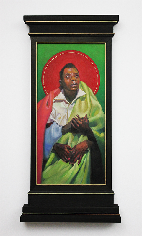
Here’s a recent job to commemorate the first day of Black History Month. This 13″ x 6″ portrait of James Baldwin (1924-1987) is a print of a painting by Carl Grauer. (See that original at right. The artist obviously understands the importance of frames!). The 2-1/2″ walnut frame, our profile No. 308.0, is a cove with a bead at the sight edge to harmonize in form with the fabric wrapping the famed writer. The frame also has a pale gold slip.
During the ’60’s and ’70’s, James Baldwin’s eloquent pleas to his nation and the world were at the center of public discourse on civil rights. Few spoke more forcefully—or beautifully—to the nation’s conscience as it struggled to face the legacy of racial slavery, terrorism, and abuse in America. And few writers of that era have remained as relevant, have left us such gifts as true to our time as they were to the time they were written. But that, arguably, speaks as much to our stubbornly persistent failures as it does to the power and beauty of Baldwin’s pleas to a deeply divided nation to reconstitute itself—or, rather, to constitute itself at last.
Carl Grauer, “James Baldwin (Giovanni’s Room),” giclee print of oil painting
Baldwin was a critic of his country, but, as he said, “I love America more than any other country in the world, and, exactly for this reason, I insist on the right to criticize her perpetually.” (I think he said that after self-exiling for some years in Europe. I recall reading Baldwin while in Europe myself, just after the Nixon and Vietnam years, not a little disenchanted with my country, and being hit between the eyes with a line that was something like, “When one leaves America one gives up the illusion that he hates it.”) Baldwin did not write simply as a critic or dissident, though, but as an artist who fully understood the place and role of the arts with respect to society and the human condition.
You think your pain and your heartbreak are unprecedented in the history of the world, but then you read. It was Dostoevsky and Dickens who taught me that the things that tormented me most were the very things that connected me with all the people who were alive, or who ever had been alive. Only if we face these open wounds in ourselves can we understand them in other people. An artist is a sort of emotional or spiritual historian. His role is to make you realize the doom and glory of knowing who you are and what you are. He has to tell, because nobody else can tell, what it is like to be alive.
Baldwin’s novels were portraits of people and neighborhoods and relationships, and, like all portraits, declared, “these lives matter.” But beyond sharp observation, Baldwin used his extraordinary social imagination to provide not only a lens for readers to view other peoples’ lives, but—especially for white readers—to provide a mirror on their own lives. His mind was indeed penetrating and revealing, but also brutally honest and unsettling—especially to whites: “Whatever white people do not know about Negroes reveals, precisely and inexorably, what they do not know about themselves.” Beyond revealing portrayals of American lives, Baldwin understood the great purpose of the arts: to join the world—to join often cruelly separated lives—beginning with joining the observer to the observed. His pleas to us were not only that we finally and truthfully see our fellow human beings—lives previously hidden, obscured or distorted—or even that we see ourselves. They were pleas for the connection we Americans have so often, in so many ways, lacked: connection through honest truth. “Art has to be,” he wrote,
a kind of confession. I don’t mean a true confession in the sense of that dreary magazine. The effort it seems to me, is: if you can examine and face your life, you can discover the terms with which you are connected to other lives, and they can discover them, too — the terms with which they are connected to other people.
And more than connection, Baldwin’s pleas were—miraculously, coming out of so much justified outrage—pleas for love.
Societies never know it, but the war of an artist with his society is a lover’s war, and he does, at his best, what lovers do, which is to reveal the beloved to himself and, with that revelation, to make freedom real. (“The Creative Process,” in The Price of the Ticket)
This is a reminder to Americans that freedom, that most sacred of all their ideals, isn’t the fragmenting individualistic thing we’ve tended to make it, but a matter of love. (As Martin Luther King, Jr, too, would remind us in the climax of his “I Have a Dream” speech.)
But Baldwin was in no way glib or sentimental about the love America needed to somehow conjure out of its hate-filled past. Even bare acceptance of one another is difficult:
I do not know many Negroes who are eager to be “accepted” by white people, still less to be loved by them; they, the blacks, simply don’t wish to be beaten over the head by the whites every instant of our brief passage on this planet. White people will have quite enough to do in learning how to accept and love themselves and each other, and when they have achieved this — which will not be tomorrow and may very well be never — the Negro problem will no longer exist, for it will no longer be needed.
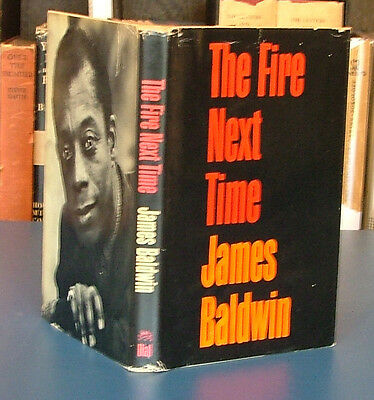
First edition of James Baldwin’s The Fire Next Time
Few writers have so bluntly challenged white Americans to face our nasty scapegoating habits. Observing the appalling rise of white supremacy in my country in recent years, I’ve often thought to myself, These people love America—it’s other Americans they hate. And Baldwin is there in my ear to add, Or is it in fact themselves that white Americans hate?—and saying it with love before going on to remind me of my grade school experience of integration here in Berkeley:
If the word integration means anything, this is what it means: that we, with love, shall force our brothers to see themselves as they are, to cease fleeing from reality and begin to change it. (The Fire NextTime, 1963)
The year just past convulsed the American body to greater extent and in more ways than I experienced in all my nearly 63 years, including those of the turbulent ’60’s here in Berkeley. Strained by viral pandemic, economic collapse, and fractious politics, cities across the country exploded with cries of “Black lives matter!” It is agonizing to reflect that it was 55 years ago that James Baldwin, in a now famous debate with the conservative writer and commentator William F. Buckley, eloquently described the discovery, while growing up black in America, that his life didn’t matter to his country:
“It comes as a great shock around the age of 5, or 6, or 7, to discover that the flag to which you have pledged allegiance, along with everybody else, has not pledged allegiance to you… It comes as a great shock to discover that the country which is your birthplace and to which you owe your life and your identity, has not, in its whole system of reality, evolved any place for you.” —Cambridge debate with William F. Buckley, 1965
The world witnessed the real—still real—truth of those words last year when it saw video of George Floyd lying on a Minneapolis street, his neck under the knee of a cop who, hands in pockets, glancing without concern at the horrified bystanders, was the picture of indifference to the life he was snuffing out, and to Floyd’s dying plea, “I can’t breathe!” In the subsequent days, weeks and months, those words, gathering up and transformed by countless voices—none stronger than Baldwin’s—of a people’s centuries-long, common brutal experience, crescendoed and transformed into a mass cry by an entire segment of America incredulous at having still to declare that it exists.
But the cry was, this time, voiced by strikingly multiracial crowds, and contained not only outrage but also that hope evident throughout Baldwin’s work, that Americans’ ongoing war for civil rights—a war we must continue to fight—will be after all “a lover’s war”; that maybe the fire this time will forge us at last into the strong, indivisible nation we have, each and all, pledged to each other to make together.
Watch James Baldwin’s extraordinary “Pin Drop Speech” in the 1965 Cambridge debate here:
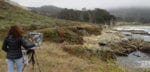
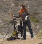
It seems to me that every time I see Kim Lordier she has just gotten back from another corner of California where she has taken her passion for painting her native state—or where her passion has taken her. Whether it’s in a eucalyptus grove on the Peninsula, on a bit of sandy Monterey Bay shoreline, in an eastern Sierra aspen forest, amidst a desert superbloom, along a mountain creek or a dusty San Joaquin Valley ranch road, Kim, with her box of pastels and easel, hasn’t so much captured on paper the unique local light and color of that place as she has channeled them—magically enough—onto and through a sheet of paper from which they will soon illuminate rooms with sun and the powerful love of the land that seems to possess this artist.
We’re lucky that for a few of Kim’s paintings those rooms are currently those of our Gallery, where they are part of Beloved California V: Twenty Painters with a Passion for Place. (The show closes on January 16 having been extended from the original December 30 closing). We’re also privileged to be able to provide the frames through which their light shines.
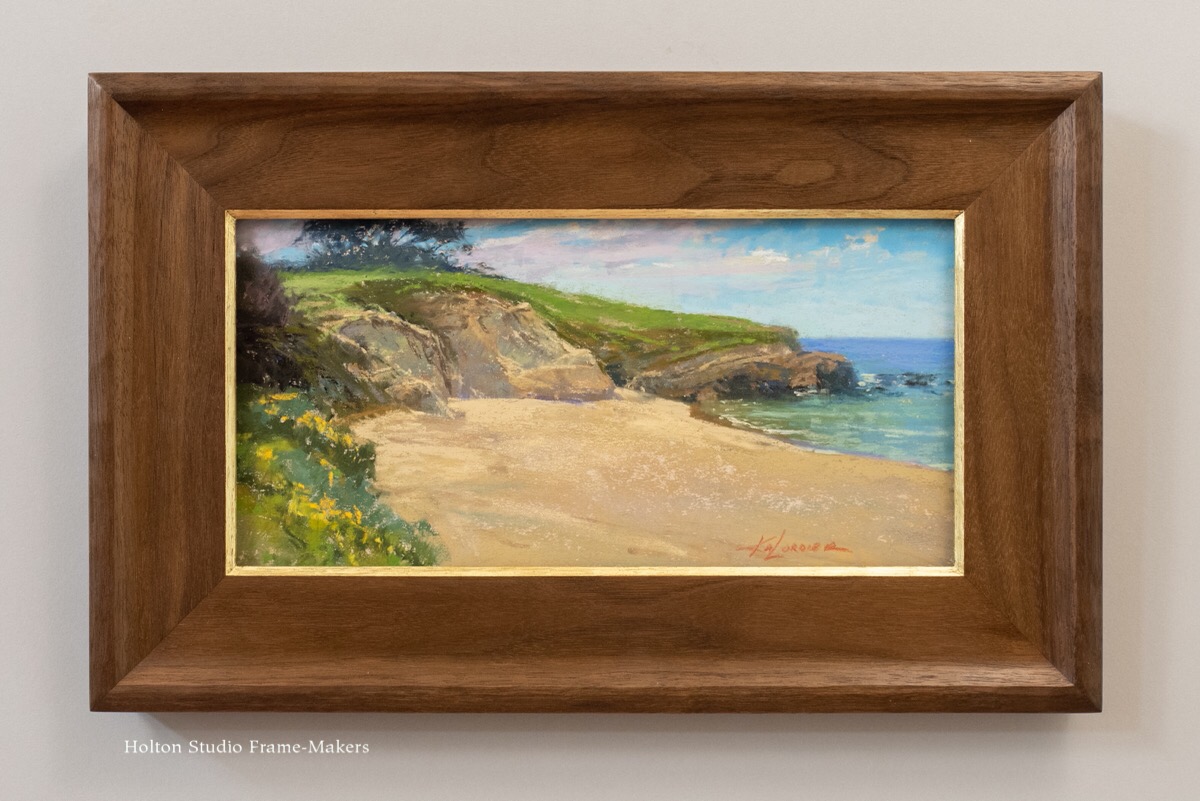
“Sparkling Sand and Cliff” delivers an idyllic sun-soaked central coast beach. At just 6″ x 12″, the painting called for something simple but nevertheless alive to the shoreline forms. The 2-1/2″ wide cove in walnut has a carved reverse cushion back edge and parcel-gilt carved chamfered sight edge.
“Sparkling Sand & Cliff,” Pastel, 6″ x 12″. $2,550 framed.
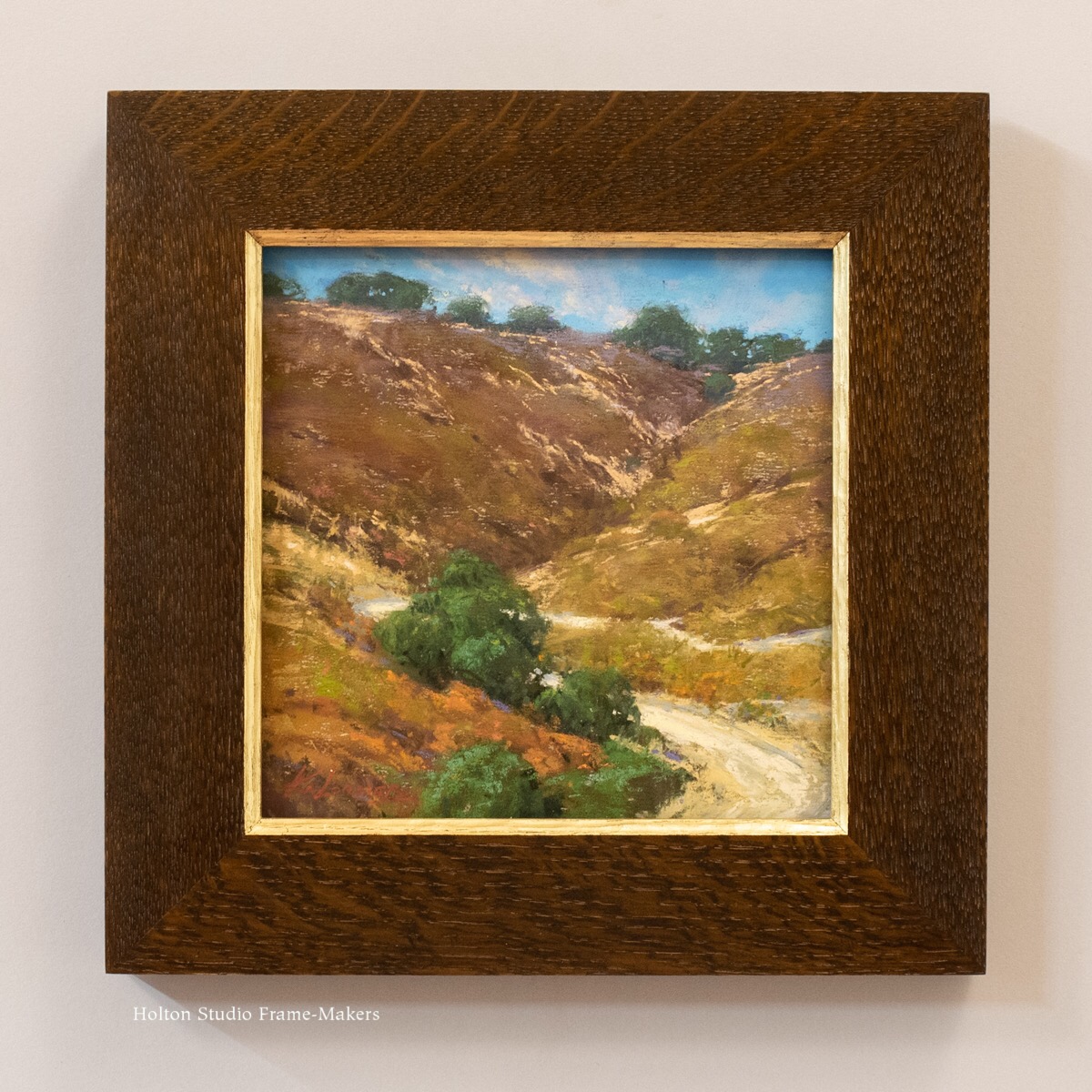
“Chaparral and Oak” is suitably framed in oak (stained quartersawn white oak), also with a carved and parcel-gilt chamfered sight edge. The frame is otherwise flat and plain. I don’t believe I’ve ever seen a California painting that captures as well the actual richness and depth of what we so inadequately describe as our “golden hills.” And the dusty path invites us to explore their allure.
“Chaparral & Oak,” pastel, 8″ x 8″. $1,750 framed.
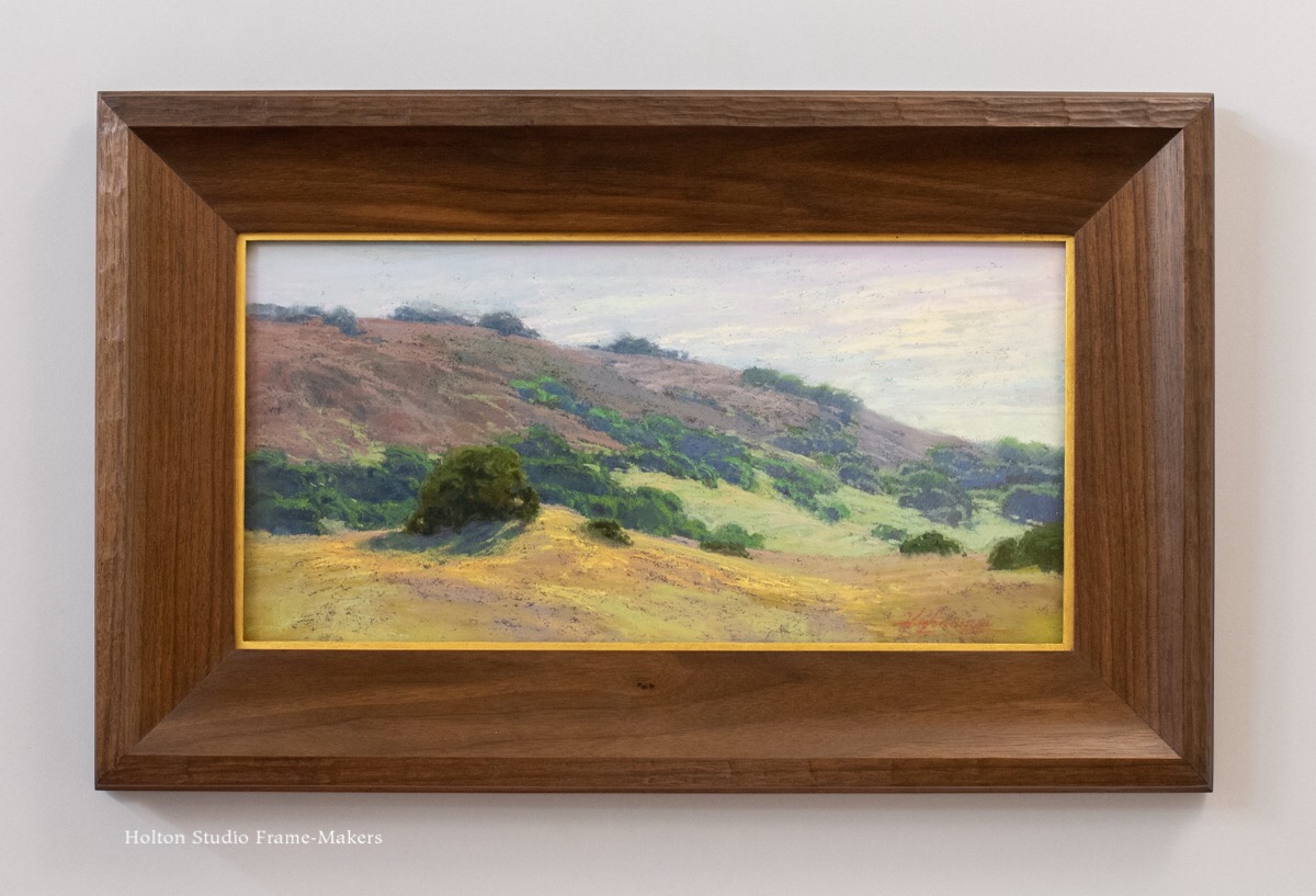
Although California is best known for dramatic postcard scenery like Yosemite, anyone who truly loves a place revels in the unique beauty of even its more commonplace sights. The subtle blending of colors and values in “Rolling In California”—our hills reveal more color than “golden”—demonstrates not only Kim’s mastery of pastel but her impressive powers of observation.
“Rolling in California,” Pastel, 8″ x 16″. $3,100 framed.
I can’t imagine a painter more captivated by her native landscape, more driven by sheer love of the land, or more capable of channeling to us it’s beauty than Kim Lordier. Her passion for place perfectly exemplifies the spirit of Beloved California.
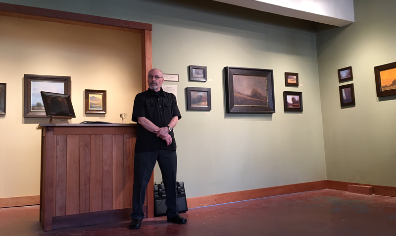
One day in the last century a painter showed up at the studio with a batch of canvases. He was in town from Spokane, Washington, and his name was Robert Flanary. Robert explained that in addition to being an artist, he dealt in antiques from the American Arts and Crafts movement of the early twentieth century, and that as a painter he had naturally developed an eye for the oak frames of the period. A friend of his had told him about us. She was a writer for American Bungalow Magazine, and was acquainted with our work from our ads in that publication. Robert liked what we were doing with the tradition and wanted some of our frames. When he laid out his paintings on the design table, Trevor and I were both instantly smitten with their extraordinary quality and uniquely shadowy, earthy palettes. We not only itched to frame them but to hang them on the showroom walls. I told Robert that if he wanted to leave some paintings with us, we’d frame them—at no expense to him—hang them up and maybe sell one or two. He was game, and that became the model for what would eventually become the Holton Studio Gallery.
So needless to say, Beloved California would just feel wrong without several Robert Flanary paintings on display. He’s part of our genesis. He’s family.
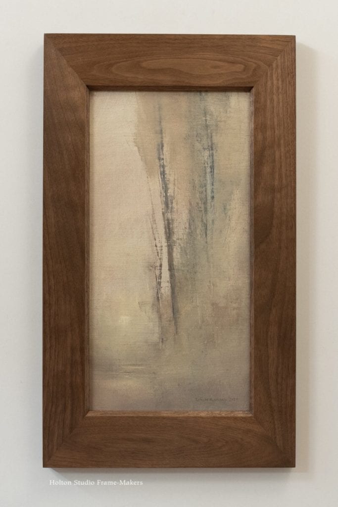
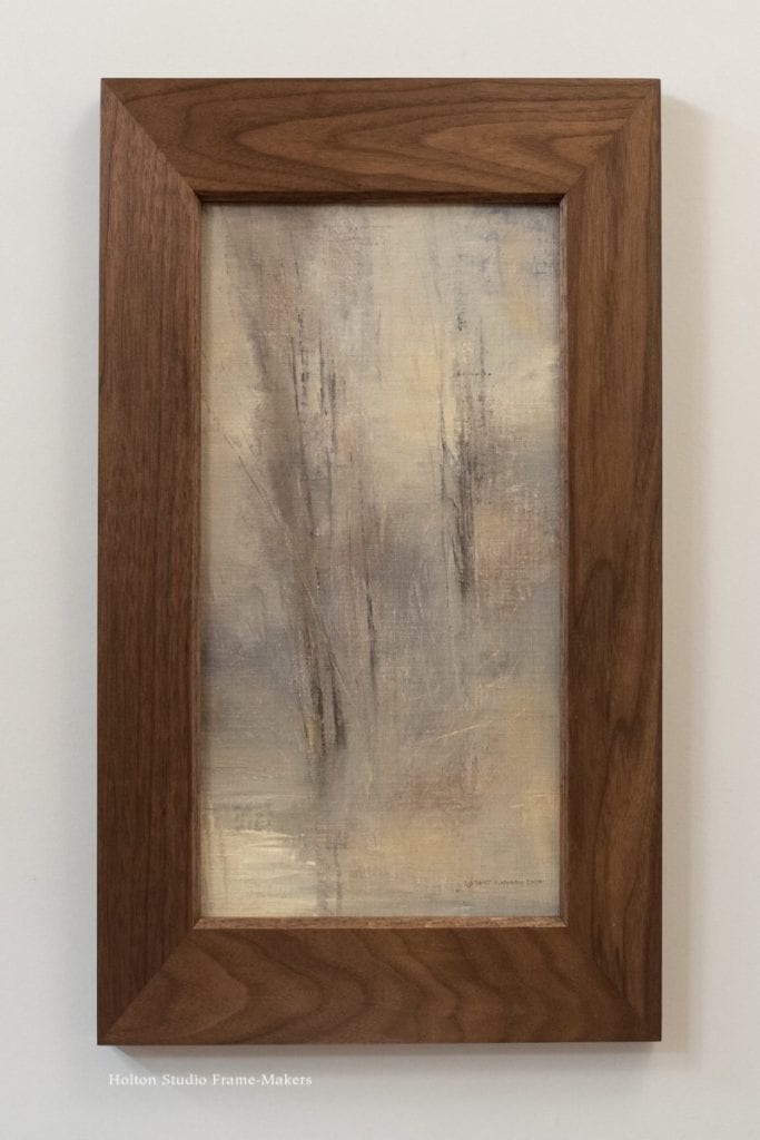
We enjoyed framing this pair to enhance their elongated proportions with wider top and bottom members. The lightly stained walnut frames are flat with carved sight edge chamfers.
“Dawn,” oil on canvas panel, 16″ x 8″. SOLD.
“Morning Along Scatter Creek,” oil on canvas panel, 16″ x 8″. SOLD.
Two more beauties in the show:
“April,” oil on copper, 8″ x 10″. SOLD.
“Riverbank,” oil on canvas, 9″ x 12″. SOLD.
A couple items from our Robert Flanary scrapbook—
Bob sent this picture of his studio, with the caption attached.
“Where the dirty work gets done. (There is a big sky light above.)”—Robert Flanary
Carol Peek is represented in Beloved California V with three paintings, including this new one, “Season of Gold.” We framed it in a simple 2″ cushion, our No. 440, with a gilt slip. The quartersawn white oak frame mimics the rolling Marin hills.
Carol Peek “Season of Gold” Oil on canvas panel, 6″ x 8″. $1,200 framed. BUY
Although Carol Peek has only been with The Holton Studio Gallery since we moved to Berkeley four years ago, she has been winning the hearts of Bay Area collectors and residents for decades. I owe it to North Point Gallery for my introduction to Carol’s work. Alfred Harrison, owner of that esteemed venue, had the sharp eye and wisdom to represent this extraordinary talent. I was flattered that for one of her shows at North Point she asked me to frame several paintings.
As it happens, Alfred just published a collection of writings, An Attack of theHeart, with a wonderful essay on the painter, not to mention two of Carol’s beautiful paintings on the cover (below). The essay is a tribute primarily to Carol but also to the whole revival of landscape painting of which she is an exemplary member. Alfred Harrison’s essay opens,
I always used to look forward to Carol Peek exhibitions at The North Point Gallery. The walls came alive with views of California scenery depicted at all seasons of the year. There were paintings of green springtime meadows seen through a gauzy layer of fog and hillsides cast in the rich ochre tints of the dry season. Animal paintings were a big feature of each show, with sheep, cows and horses grazing in pastures or standing mutely in barnyard settings.
Occasionally a visitor would confess that he or she disliked “cow paintings” and, as often as not, would go ahead and buy one of Carol’s anyway. Carol’s cows are no ordinary animals. They are transformed by her knowledge and inspiration into beautiful objects that harmonize with the background landscape and sky. Other visitors found themselves perplexed at liking the paintings at all, whether or not they have cows in them. “I’m not supposed to like this kind of art!” they would exclaim.
(Sadly, North Point Gallery is closing. We’ve greatly enjoyed a long and happy affiliation with them, and will dearly miss the gallery. Be sure to check out their closing sale. To purchase the book, contact North Point Gallery.)
Other works by Carol Peek in Beloved California V—
Carol Peek “Breakfast.” Oil, 8″ x 10″. $1,350 framed. BUY
Carol Peek “Her Eyes on Mom.” Oil, 8″ x 10″. $1,350 framed. BUY
Robin Moore first won us over with her views of Point Reyes featured in her 2008 show “Tomales Bay: A Shifting Light.” (Those works can all be found on Robin’s archive page.) We haven’t had a great deal of work from her since she moved to Abiquiu, New Mexico several years ago. But she always comes through for Beloved California, and this year was no exception. Below are three small watercolors featured in this year’s show, all exemplary of Robin’s exquisite and unique handling of that medium. (How many times have I heard admiring gallery visitors exclaim, “That’s a watercolor?!”)
Please note that Beloved California V has been extended through January 16.
Robin Moore “Twilight Abbott’s Lagoon” Watercolor on paper, 5 1/4″ x 7 1/4″. $975 framed. BUY
Robin Moore “Elk in Fog-Pierce Point” Watercolor on paper, 5 3/8″ x 7 3/8″. $975 framed. BUY
Robin Moore “Fall Moonrise Through Cottonwoods” Watercolor on paper, 5 1/2″ x 7 5/8″. $995 framed. BUY
Erik Tiemens is one of the Gallery’s artists who comes out of the Bay Area’s film and animation industry. Schooled at the ArtCenter College of Design in Pasadena, he spent a couple of decades at George Lucas’s Industrial Light and Magic (now part of Disney) working mostly on the concept level establishing the overall look of the films. He was instrumental in such projects as “Forrest Gump” and several “Star Wars” movies (see his imdb page). But Erik’s now focusing more on his own painting, applying his extraordinary skills to fuse his love for his native California with the European renaissance and Hudson River School landscape traditions.
We’ve been greatly privileged to show Erik’s work at the Gallery since 2011—for nearly a decade!—so Beloved California V wouldn’t be complete without him.
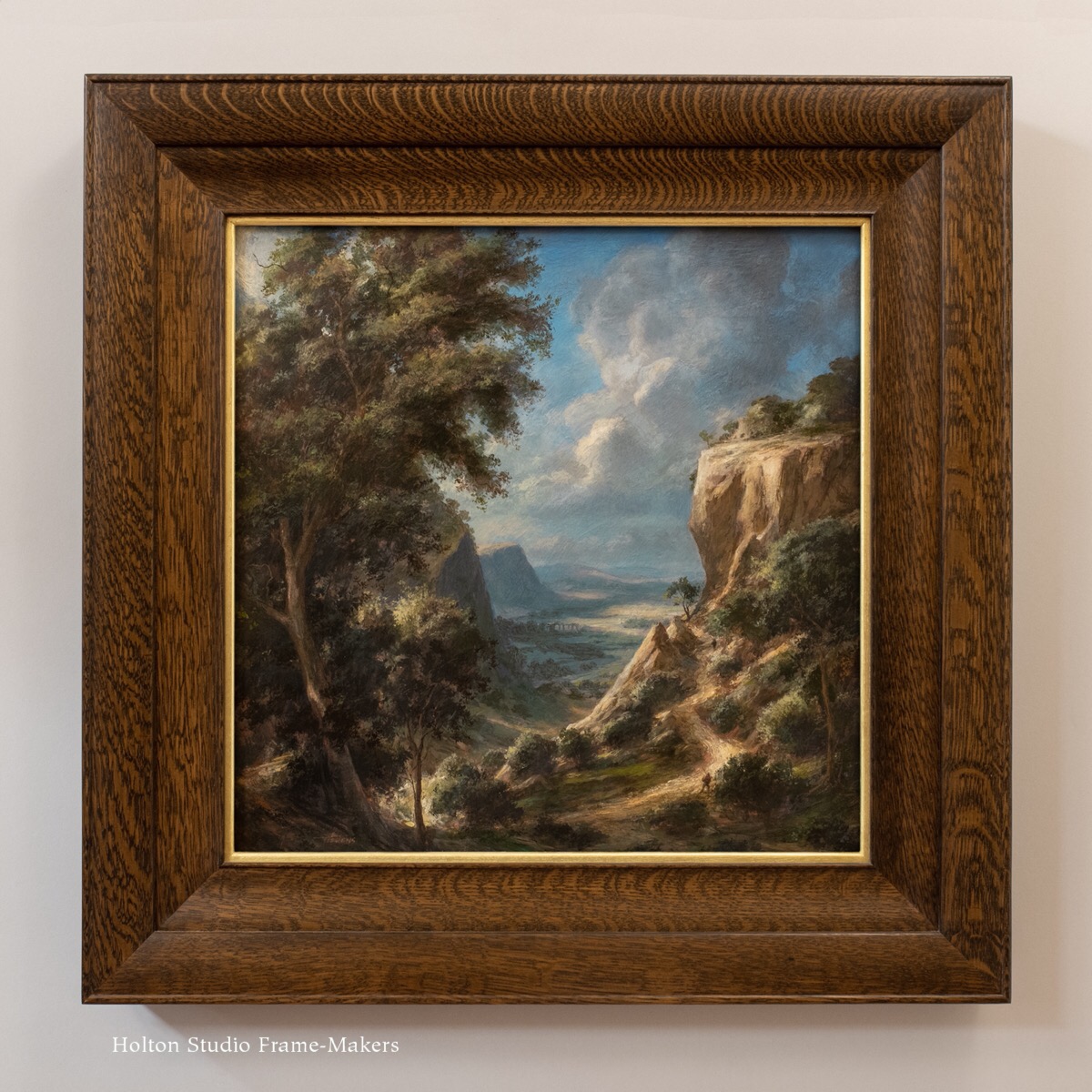
“Path to Limestone Canyon,” 18″ x 18″, was one of those happy marriages of a painting made for a frame—in this case a 3-1/’2″ wide quartersawn white oak compound frame Erik spotted in our inventory.
“Path to Limestone Canyon,” water soluble encaustics on wood panel, 18″ x 18″.
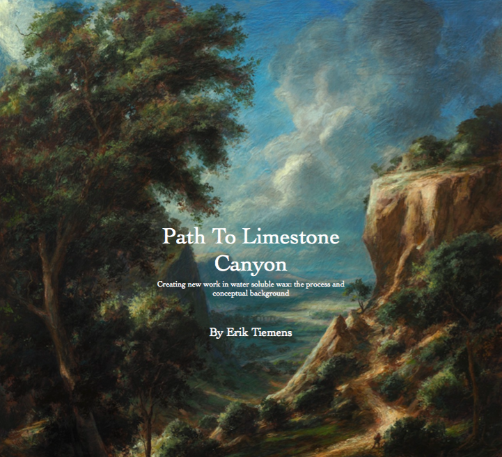
For “Path to Limestone Canyon” Erik used water soluble encaustic paint being made by Ceracolors in Willits, California. Though it’s a new product, Erik says,”Ironically, it is based on the ancient Punic wax of the past used in Greece and Rome; specifically the old plaster wax paintings in Pompeii that are found in the preserved rooms. So I would imagine these materials will last for a long time in the right conditions.” (Sounds like they should even survive volcanic eruptions!)
Erik was good enough to put together this short illlustrated description on painting “Path to Limestone Canyon.” Painters will especially appreciate the technical insights in the PDF, but the process photos will be intriguing to anyone.
And a couple of little gems—
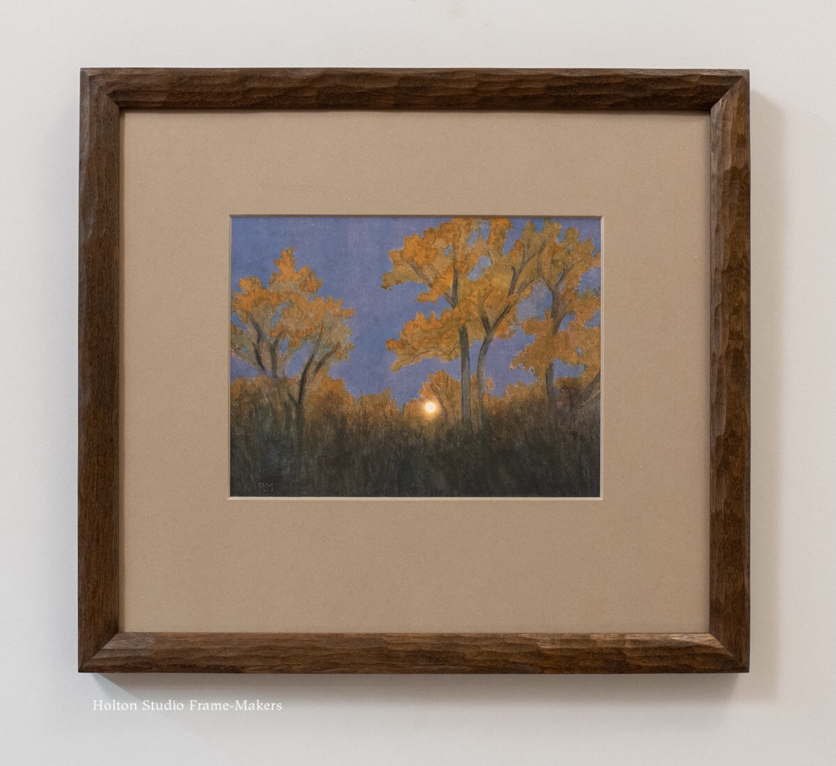
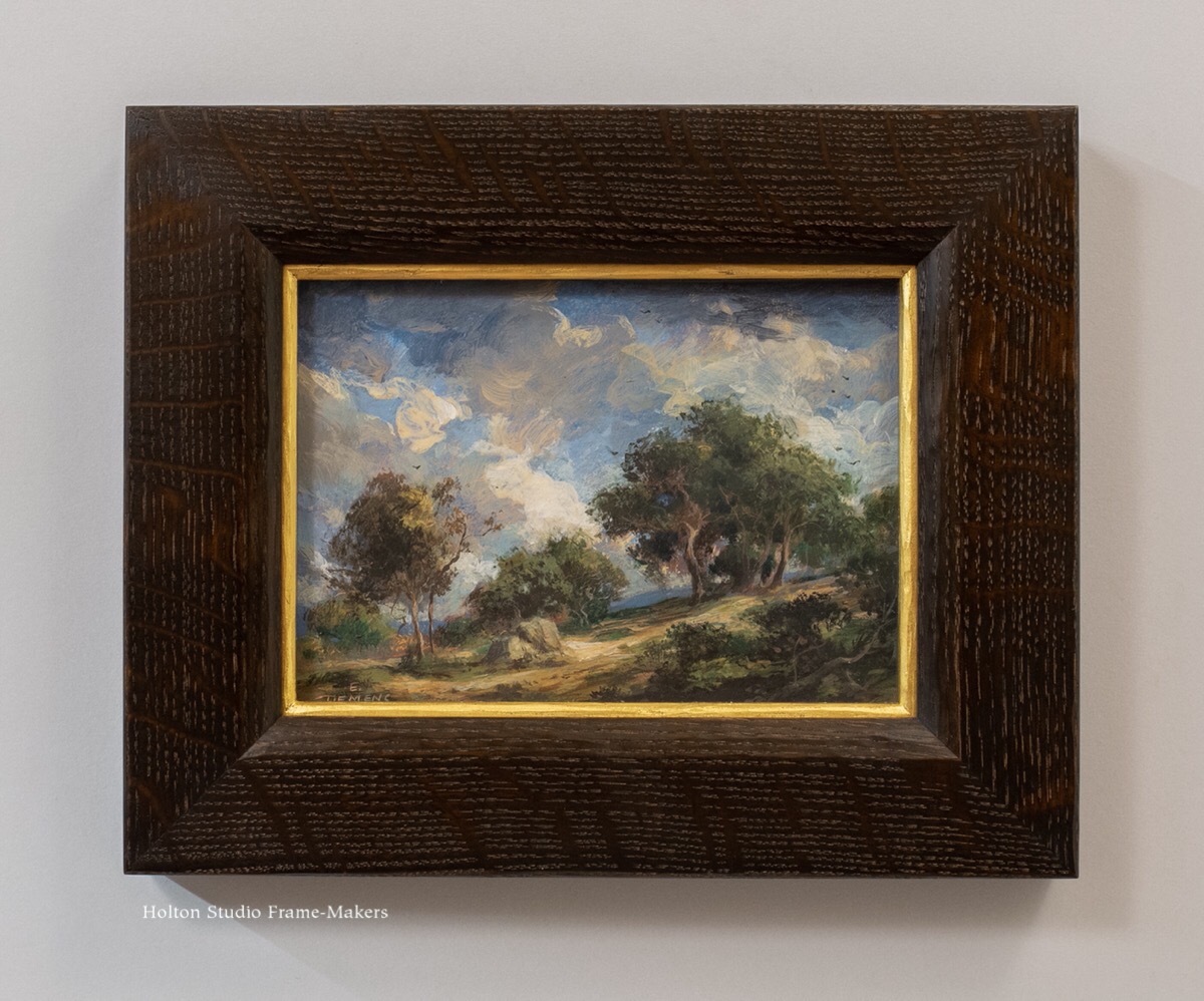
In addition to “Path to Limestone Canyon,” Beloved California V includes two smaller (5″ x 7″) paintings by Erik. For the frames, I decided to play up the rusticity and looseness of these two paintings with a little carving on the sight edge of the profile, the back edge of the frame, as well as the gilt slips. The sight edge and slips are gently rounded to harmonize with the forms in the paintings. Otherwise, the profiles are flat, and both are 1-3/4″ wide, and both quartersawn white oak with Dark Medieval Oak stain. Eric Johnson made them.
“Dance of the Clouds,” water soluble encaustics on wood panel, 5″ x 7″.
“Pastoral Spring,” water soluble encaustics on wood panel, 5″ x 7″.
From Erik Tiemens’s studio—
Erik recently shared these cool photos that get us up close to his work.
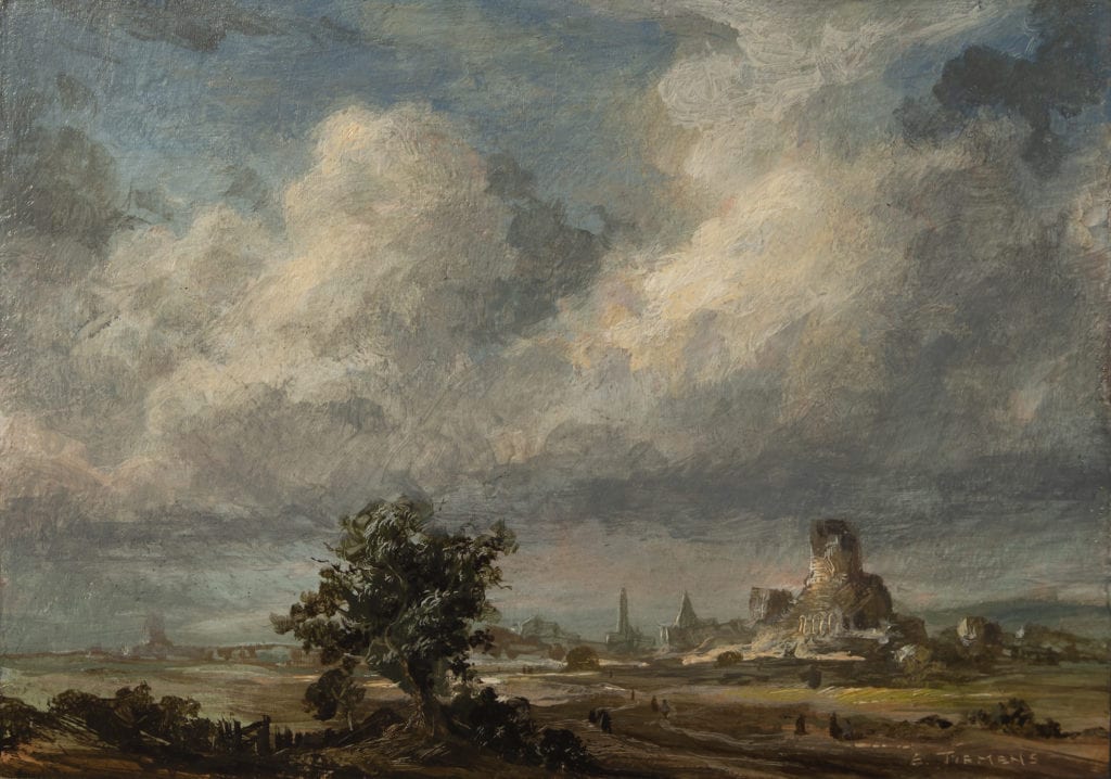
And here’s another recent beauty from this extraordinary talent. “Dutch Village Ruins” is available from the artist. You may be shocked to learn it’s only 5″ x 7″!
And finally, here’s to a finalist!—
Erik Tiemens, “Oak Lake.” 2019. Oil, 18″ x 24″. Not For Sale.
In our show for Paul Roehl this fall, we featured this painting, an oil on canvas called “Acheron” (24″ x 48″). But it wasn’t framed—unless you regard as a frame the pine lattice that painters wisely attach to the edges of their stretched canvases to protect the vulnerable fabric edges. Those strips are justifiable in serving the first and most important function of a frame: to protect the picture. But there is much else we require of frames; on that below. In any case, I became enchanted by this work, and decided that for Beloved California V we’d do it justice by having Trevor Davis design and make a proper frame for it.
You can compare “Acheron” here at right, shown “before” in the minimal strip frame, with the “after,” below, in our wider, more substantial frame. The comparison illustrates pretty well the transformative effect of what we might call, to distinguish it from mere slats, an architectural frame on a picture.
The Frame
The frame is a cassetta in stained quartersawn white oak. The profile is 4-1/4″ wide on the top and bottom and 1/2″ wider on the sides, thus enhancing the strongly horizontal proportions. The difference in width is in the flat, which has mortise-and-tenon joints. The inner and outer mitered moldings, both carved (in contrast to the smooth flat), also echo each other in their cushion form canting in toward the painting. The back of the cap is cut in with a deep cove which sweeps outward, projecting beyond the outside of the cap’s face. Scroll down to see a gallery of photos of Trevor making the frame, and Sam finishing it.
Protection and Prospect—
Comparing the effect of “Acheron” unframed to its effect in a substantial architectural frame illustrates not only the most satisfying reward of framing, but the most important lesson I’ve learned about the art of the frame. And it’s a lesson I got from the painter of “Acheron,” Paul Roehl. In a lecture Paul gave at the gallery in February 2017 called “Beyond Representation: The Poetic Landscape,” Professor Roehl (who’s long taught Art History at DeAnza College) explained a concept called “protection and prospect.” He described this idea as a compositional device landscape painters have often used, arranging the picture’s perspective to include a place of relative safety and shelter in the foreground (suggesting where the viewer is), against a wider and more wild and rugged distant land beyond. This arrangement seems to evoke a visceral effect in the viewer, tapping into two complementary primal human needs: security in our own particular place in the world—”protection“—along with a more comprehensive view of things and the sense of life’s possibilities—”prospect.” After writing about it in a blog post here, I followed up with the post here, on my epiphany when applying “protection and prospect” to not just the picture but its immediate architectural setting, the frame, to finally grasp the reason for that magical, transformational effect the right frame—a suitably architectural frame—has on the picture.
For all my years in framing, the true nature of that effect—that great reward for my work—had remained a mystery to me. I owe Paul a debt of gratitude for the key to solving that mystery.
Other Works by Paul Roehl included in Beloved California V—
“Overcast, “oil on canvas, 20″ x 24”. $5,000 framed. BUY
Paul Roehl “Berry Picker” 2020. Oil on panel, 8″ x 10″. SOLD.
Paul Roehl “Looking East” Oil on panel, 8″ x 10″. $1,275 framed. BUY
Paul Roehl “Solitary Walk V” oil on panel, 8″ x 10″. SOLD
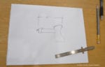
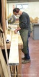
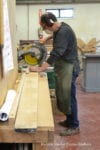
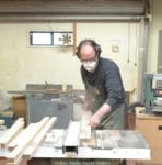
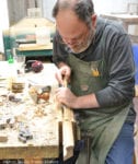
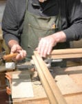
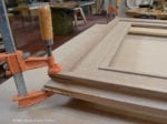
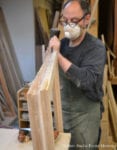
Process photos of Trevor Davis’s frame for “Acheron”—
Sketch of the profile.
Measure twice…
…cut once!
Edge jointing.
Ripping on the table saw.
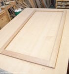
The flat.
Inner molding is splined.
The slip is lap-joined.
Flat, inner molding and slip are done.
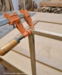
Trevor lays out the cap molding.
Carving the cap molding.
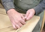
While joining the cap molding in the vise, Trevor cleans up the carving at the corners.
Cap molding is splined.
After the splines are dry, Trevor carves them down.
The whole frame ready for final sanding.
Sam stains the frame.
Sam varnishes.
Paul Roehl, “Acheron,” 24″ x 48″ (32″ x 57″ outside frame dimensions). $7200.
 The woodblock print is about 13″ x 11″. Because there is almost no margin, we floated the sheet in the opening of an 8-ply mat, which is a very pale green. The 5/8″-wide walnut frame is like our Kobe corner frame (see the example at the bottom of the post), but I modified the corner shape by carving a leaf pattern taken from the print and painted the leaves green to match as well. I’m calling this style frame the Kobe Leaf. Scroll down to see a few process photos as well as corner samples of two other Kobe Leaf designs.