If the Arts and Crafts Movement can be said to have a motto, it is surely “Als Ik Kan.” First assumed by William Morris—more famously in its French form, “Si Je Puis”—it was further popularized by Gustav Stickley through the marks on his furniture and in his magazine The Craftsman. What does the motto mean, where did it originate, and why did these re-framers of art find it so significant?
 The words are Dutch and mean literally “As I can,” but some say translate best into English as “If I Can” or “As Best I Can.” In any case they imply the virtue of hard work toward a goal that is simply one’s best effort, though inevitably falling short of perfection. (Stickley’s label at left implies not only earnest effort and admission of imperfection but the responsibility for correcting his imperfections, should the customer be for any reason dissatisfied.) They were invoked as a direct repudiation of the post-renaissance understanding of art—real art, great art, the masterpiece, art that’s worthy of museums and art history books—as something produced by individual genius and reaching perfection. Countering this ideal, in “The Nature of Gothic” John Ruskin drew attention to the “rude and wild” character of Gothic buildings—the trait he called savageness. This was no mere personal aesthetic preference on Ruskin’s part, but a deeply moral matter; part and parcel of the fact that nearly everyone in the middle ages engaged in the arts, this “savageness” was an expression, Ruskin argued, of the Christian spirit that built the Gothic cathedrals. He said, “…to every spirit which Christianity summons to her service, her exhortation is: Do what you can, and confess frankly what you are unable to do…” The corruption of art in his time, Ruskin believed, was manifested in large part by the rising arrogance of specialized “fine” artists and architects who turned their backs on the imperfections redolent in the arts practiced by the whole people. Far from elevating art, the misguided standard of perfection deprived it of its fertile social soil. In truth, “no good work whatever can be perfect, and the demand for perfection is always a sign of the misunderstanding of the ends of art.” The italics are Ruskin’s.
William Morris “Si Je Puis” tile at Red House.
This treatment of art and architecture is fundamental to Ruskin’s conceptual re-framing of Art. The tyranny of perfectionism was visible to Ruskin, not just in painting and building but in the arts in their true sense of the work of making, inherently expressive of the mind and condition of humanity. To this extent, Ruskin’s study of the Gothic was truly a critique of commercial industrialization in which workmen were not artists and artists were not workmen, a system bent on turning men into mere operatives working with a dehumanizing accuracy and precision:
[I]f you will make a man of the working creature, you cannot make a tool. Let him but begin to imagine, to think, to try to do anything worth doing; and the engine-turned precision is lost at once. Out come all his roughness, all his dulness, all his incapability; shame upon shame, failure upon failure, pause after pause: but out comes the whole majesty of him also…

Hephaestus, the “flawed god” of craft
Far from selectively interpreting historic architecture to support his complaints against his own times, what makes Ruskin’s ideals so compelling is that they are painstakingly based on observation and deep understanding of the history of material culture. Indeed, as an ideal for restoring art to a sounder, historically proven basis, it is important to note that the notion of the imperfect craftsman goes at least to antiquity, embodied for example in the ancient Greek “flawed God” of craft, Hephaestus, who was club-footed and homely, perennially sweaty and dirty from his work—work which produced, nonetheless, civilization itself.
William Morris, in his wanderings through the National Gallery, and primed by “The Nature of Gothic” (he called it “one of the very few necessary and inevitable utterances of the century”) came across the early 15th century portrait (at the top of this post)—believed to be a self-portrait—by Jan Van Eyck, “Man with a Red Turban.” As an antidote to the sterility and misguided perfectionism of academic painting of Morris’s own day, Van Eyck’s portrait leaped out at Morris as an achievement in acute, honest and truthful observation.
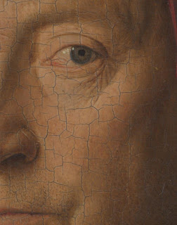
Detail, Van Eyck’s “Man With a Red Turban”
While many would identify the modeling and rendering as something near perfection, the irony, recognized by Morris, was that Van Eyck’s achievement came about through his embrace of his innate human imperfection—an embrace evident in the carefully depicted flaws in the artist’s skin (right). (Note their contrast with the icy, porcelain skin in the portrait by the French academic Jean-Auguste-Dominique Ingres below.) Van Eyck’s acknowledgment of his imperfection is also evident in the words he carved in the top of his frame (in archaic Dutch written in Greek characters)—”Als Ik Kan”. One aspect of this acceptance and even celebration of imperfection is the sense of freedom, playfulness, joy in labor and humor it enables: the “Ik” in the motto is a pun on the artist’s name, Eyck. (The explanation published by Stickley includes that “it has something of defiance and humor, as if offering a covert challenge to less skillful limners.”)
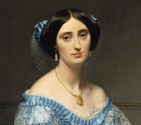
Detail of Ingres portrait, “Princesse de Broglie”
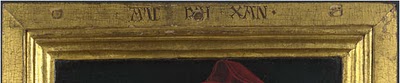
As a frame-maker, I can’t help pointing out the flaws in the top and bottom members of the frame—the pegs which time has exposed as the underlayment of gesso and clay have loosened from them. I point these out not for reasons of technical fussiness but because of the story they tell, which is key to understanding the centrality of picture frames in the Arts and Crafts mission of re-framing art. These exposed pegs themselves expose a recent innovation by artists like Van Eyck whose expertise in rendering was forcing them to refine the panels they painted on. Up until this time, paintings of this size had been done on a single solid panel—in northern Europe, usually oak—which were recessed, carved down, in the middle, leaving the edge raised to form a frame (see
Robert Campin painting, below). This is a key point in the story, central to Arts and Crafts ideals, of the primal unity of frames and paintings and the demise of that unity—a story I won’t go into here but invoke only to show how artists in Van Eyck’s time still saw frames as inseparable from their paintings. (Morris would not have failed to appreciate the painter’s interest in his frame as a lesser, decorative art nonetheless worthy of artistic effort.)
The problem, increasingly frustrating to the increasingly refined skills and naturalistic aims of Van Eyck, was in shaping these raised moldings on the two sides where the straight elements of the molding profile ran across, not with, the grain. Carving a suitably refined profile across oak grain was simply too hard. The artist’s solution to this (“confessing frankly” the limits of his skills confronted with the nature of materials) was to raise and mold just the vertical sides (in this case) of his panel, then make separate lengths of molding for the top and bottom, shaped with the grain, just as the side edges were molded, and to attach the top and bottom lengths to the panel with pegs. With this innovation, Van Eyck raised the standard of refinement for his moldings; as a lesson in frame design, the frame’s sculptural interpretation of the picture’s forms is exemplary. (One great aid to this step up in refinement was the use of hand planes.)
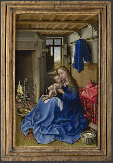
Robert Campin painting on solid panel
You can see, in contrast to the earlier Campin painting here, done in the older, single-piece method, how closely Van Eyck’s moldings relate to the subtly modeled, undulating forms of the man’s face and turban.
I probably risk over-emphasizing this framing innovation as an object of Van Eyck’s declaration, but can’t help recognizing how the statement preemptively addresses the critics of the artist’s innovation and craftsmanship—of his imperfect but joyful humanity. Convinced of the rightness of this improvement in the frame, Van Eyck accepted its imperfect necessity for driving pegs through the face of the frame, which he undoubtedly knew time would someday expose. It was a compromise solution—an imperfect one he would “confess frankly” in the words he carved on the frame, right over the center peg and “framed” themselves by the other two pegs! Serving at least to preempt future critics of his framing method, the words more importantly pronounce a spirit imbuing the artist’s labors. In so doing, he passed down to us the motto that embodies the humble folk spirit and obstinate vitality that would guide the Arts and Crafts movement—a spirit literally engraved by the frame-maker Jan Van Eyck in the art of the picture frame.
See Stickley’s explanation of his motto, here.