This is a haunting color photograph by award-winning cinematographer Stephen Goldblatt, depicting the decayed interior of a once-lavish aristocratic home in Mexico. It seemed to want a very different framing approach than most photographs. 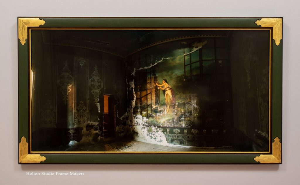 The thing to aim for in framing, Walter Crane wrote, is “mural feeling.” Frames, he argued, should help restore pictures to their original and natural architectural place and role as murals. In the case of easel paintings, which are direct descendants of murals, that seems like a reasonable goal. It’s much harder, though, with photography, the genesis of which has nothing to do with architecture.
But what if a photo depicts a mural? This was a rare case when Crane’s guidance actually serves photography.
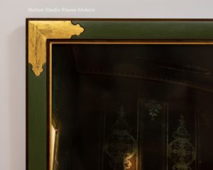
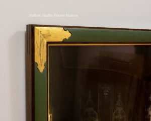
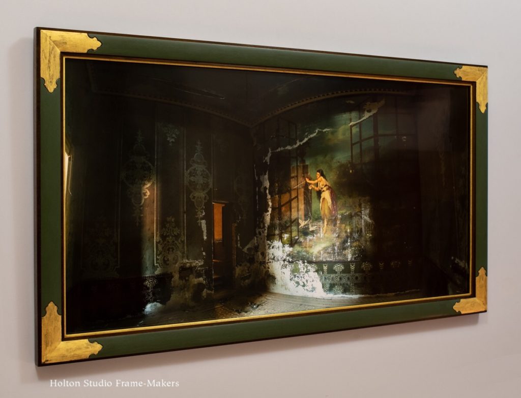 We set the large 21″ x 41″ photo in a 2″ wide walnut frame. The fish-eye lens distortion of the room’s straight lines and flat walls suggested the primary form of the frame, which is a convex, or cushion, shape canted in toward the picture and bounded inside and out by a narrow step, or fillet. The face of the cushion is painted (with those lovely solvent-free Swedish linseed oil paints again) in the same green that dominates the walls. After studying the extensive and elaborate decorative details in the picture, I devised a simple carve pattern for the corners and Sam gilded them, suitably rubbing down the gold a bit. There’s also a gilt slip which helps give emphasis and definition to the dark picture.
 Life and Death—and Life Again
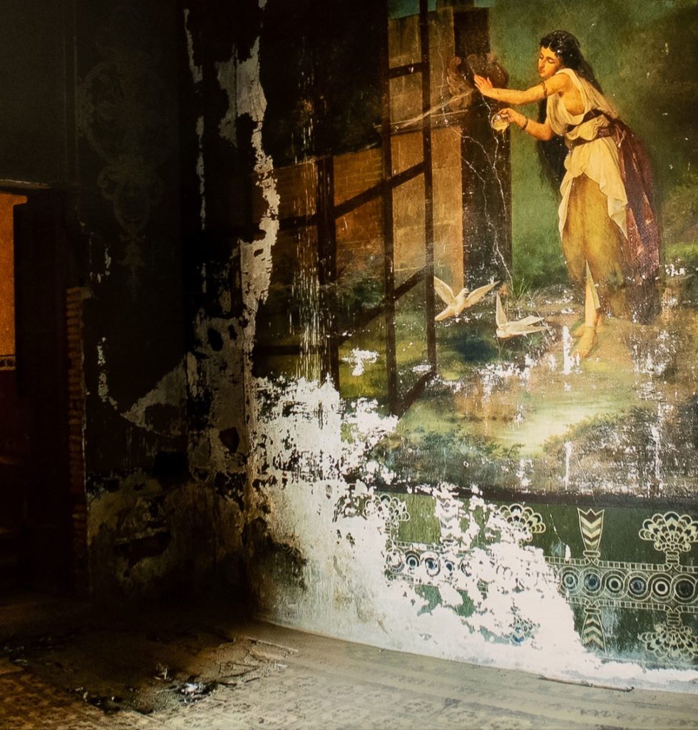
The mural depicts a great window opening up to a garden and a maiden at a fountain providing life-giving water to a pair of doves. The image’s theme of vitality sets it up perfectly for a role in a narrative about the cycle of life and decay. On the floor directly before the mural are several pigeon carcasses.
But a picture, and especially a framed picture, by re-presenting something, making it present again, makes it alive again, a participant in the world now. A scene of decay is transformed into a reminder of the fleeting nature of life—a memento mori. Though works of art inspired by that theme represent death, their point is to have us attend to the value of life. Thus they, themselves are not in decay, but are conscious works of art, made with care and in the full grasp of the vital, life-affirming truth they depict. For its part, the frame made in a manner sensitive to and alive to the picture in turn re-presents the picture. As an architectural element, it brings the photographer’s fixed, visual depiction into the tangible realm and architectural space our bodies occupy and move about in. There, it merges the relatively disembodied sense of vision (fixed on something distant and remote) with our other senses—our full, present, vital being.
The Still Photography of Stephen Goldblatt
Stephen Goldblatt may be best known as a director of photography on films like The Cotton Club, Julie and Julia, Lethal Weapon, The Help… The list goes on. But since we’re dealing with one of his still photographs, it must be pointed out that before he got into film Goldblatt had a career as a still photographer. His chief claim to fame was taking part, in 1968, in the legendary (to Beatles fans) “mad day out.”
A wonderful interview with Goldblatt on photographing the Beatles, and his photography generally, may be found here.
Picture Framing Magazine featured this piece as its Design of the Month in December 2023. More…
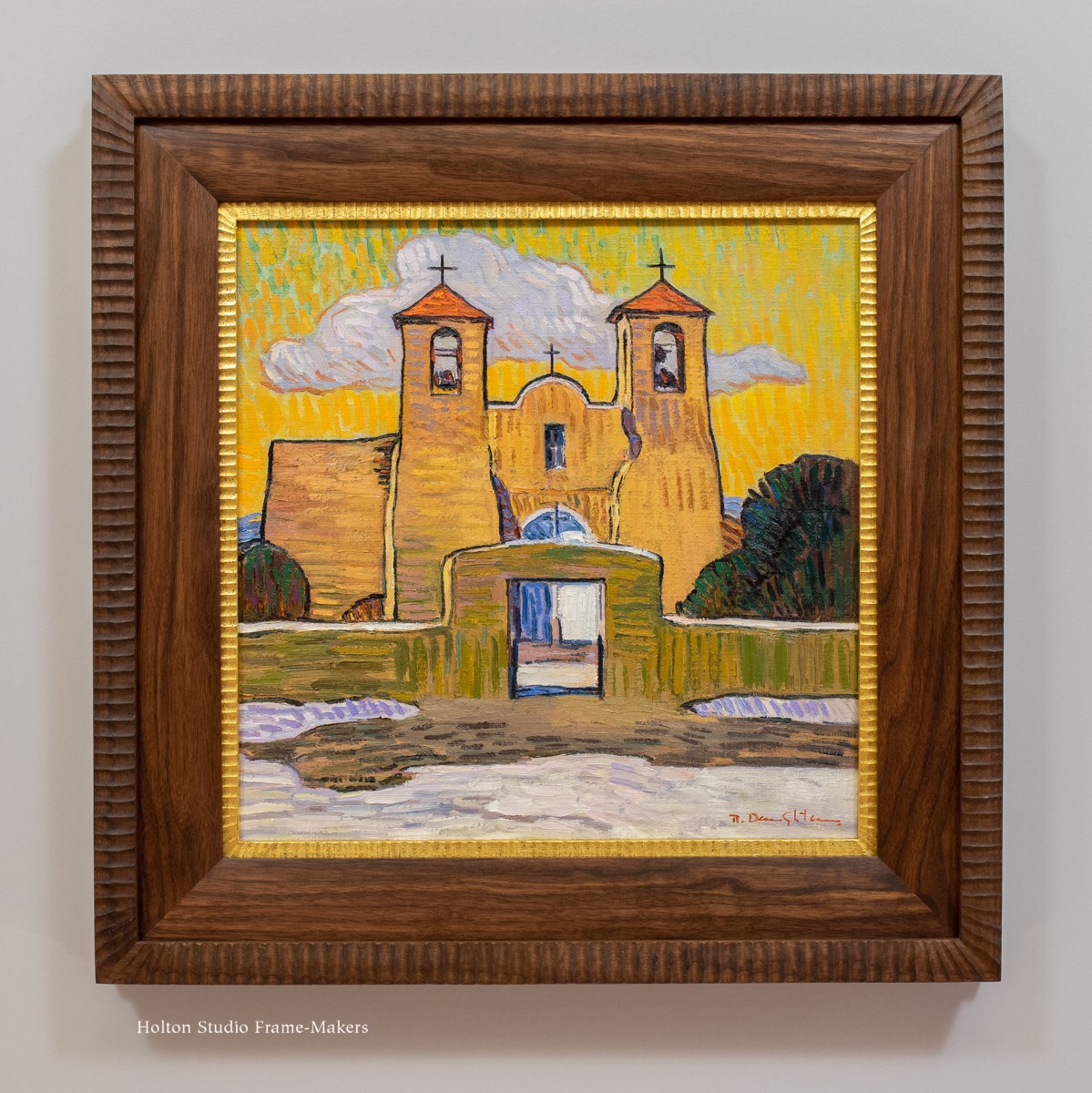
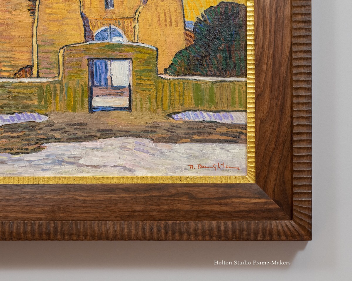
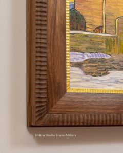
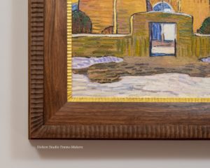
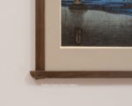
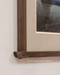
 in a frame design with carved flutes cut across the grain. Here are three corner samples I made a month or so ago, with that same idea. And on all of these the flutes round the corner, which I like.
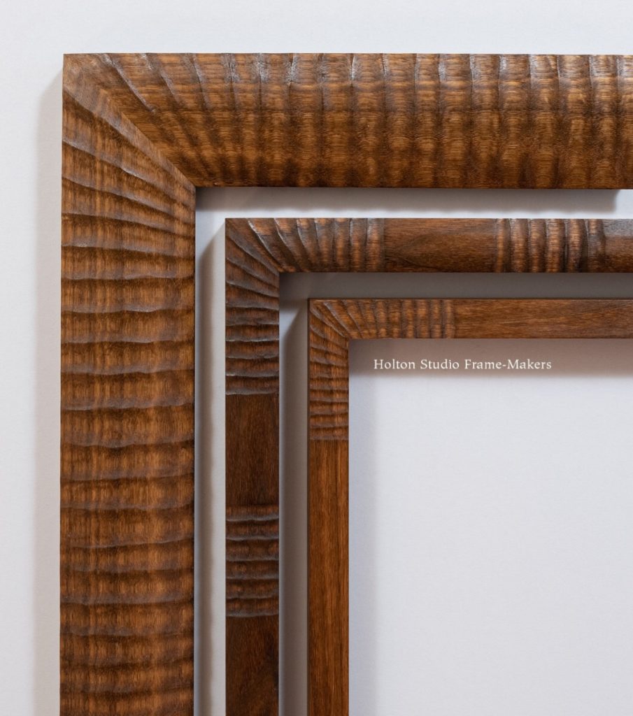
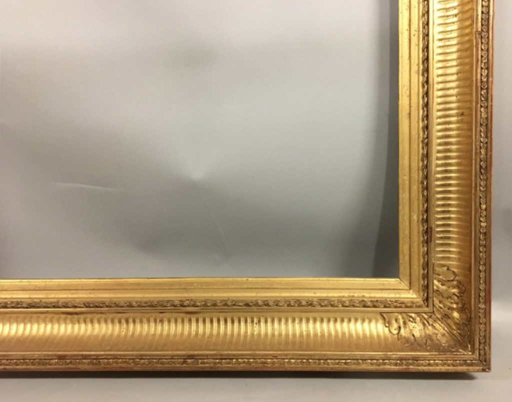 Flutes cut across the molding profile are a common convention. At right is a 19th century French example. This pattern’s popularity surely has to do with its effectiveness in directing the eye into the picture, as well as emanating the picture and its subject out into the surrounding world—twin effects instrumental to the essential function of the picture frame.