John Ruskin wrote that part of “the glory of a great picture” is that “it speaks with the voices of many; the efforts of thousands dead, and their passions, are in the pictures of their children today. Not with the skill of an hour, nor of a life, nor of a century, but with the help of numberless souls, a beautiful thing must be done.”* As a student of art in London during Ruskin’s day, it’s quite likely that the English artist Charles W. Bartlett (1860 – 1940) absorbed, directly or indirectly, the great art critic’s insight; in any case he practiced its wisdom. In 1913, Bartlett and his wife traveled to Asia, arriving in Japan in 1915. There he met Watanabe Shōzaburō, the great woodblock publisher, and benefited from the expertise of not only the master but the numerous carvers and printers he employed. Watanabe was the driving force of the Shin-Hanga movement—which he named—to revive the artistic efforts of those “numberless souls” who had contributed over centuries to Japan’s great ukiyo-e tradition.
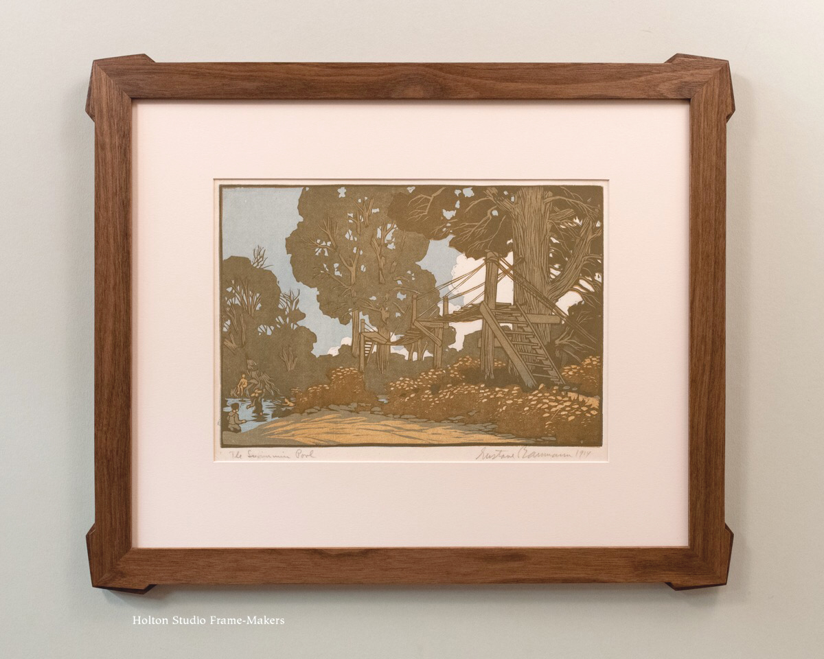
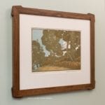
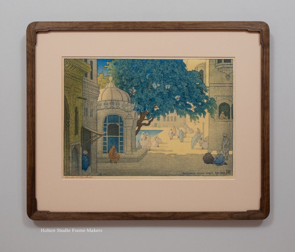 A couple of years ago I posted about framing this Charles Bartlett woodblock print, at right, of the Sikh temple at Amritsar. Recently, two more prints by the artist came our way. Both prints are dated 1916. Like the first one, these depict famous temples in India.
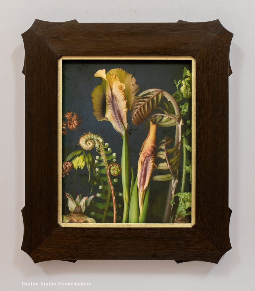
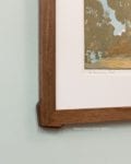
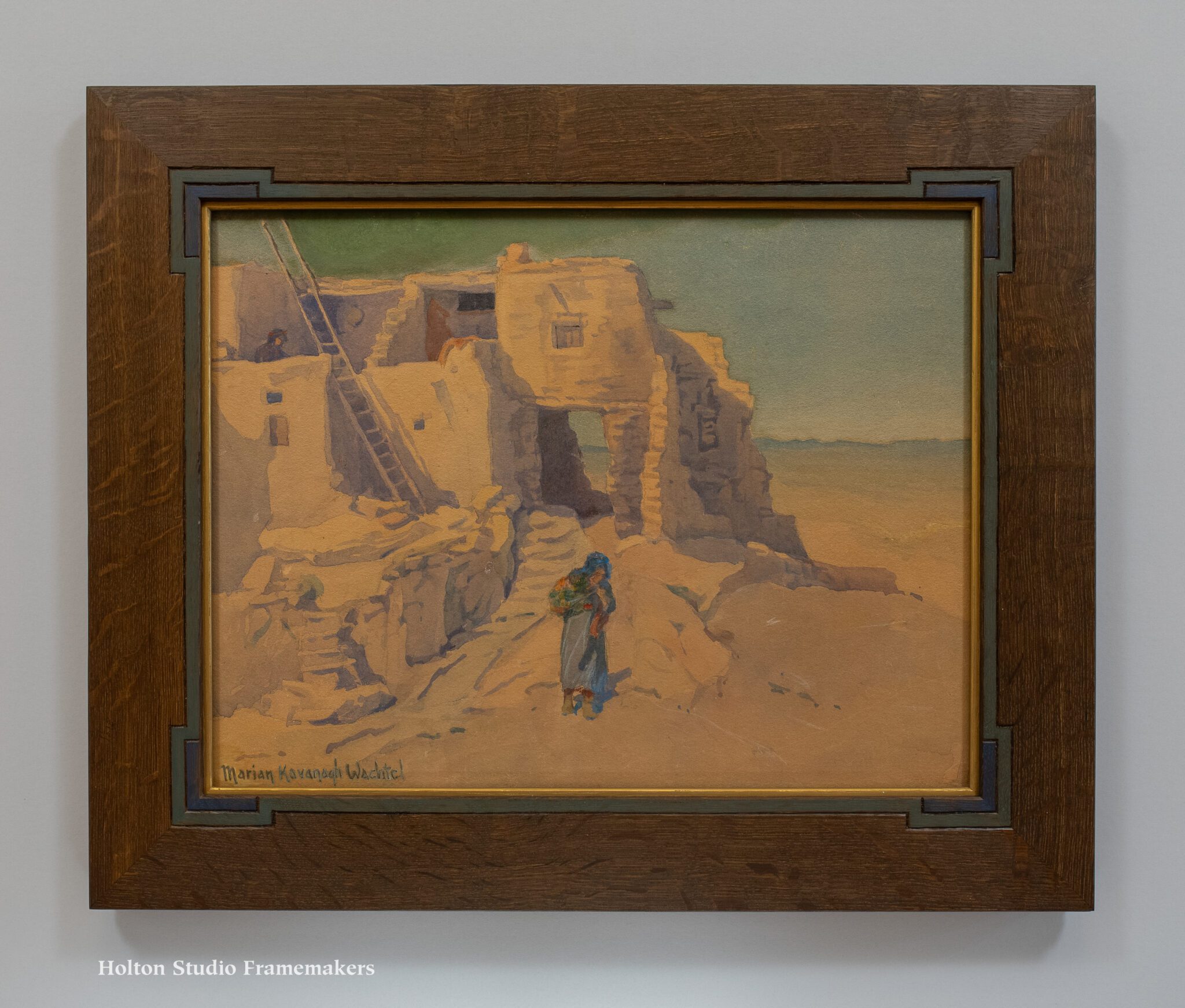
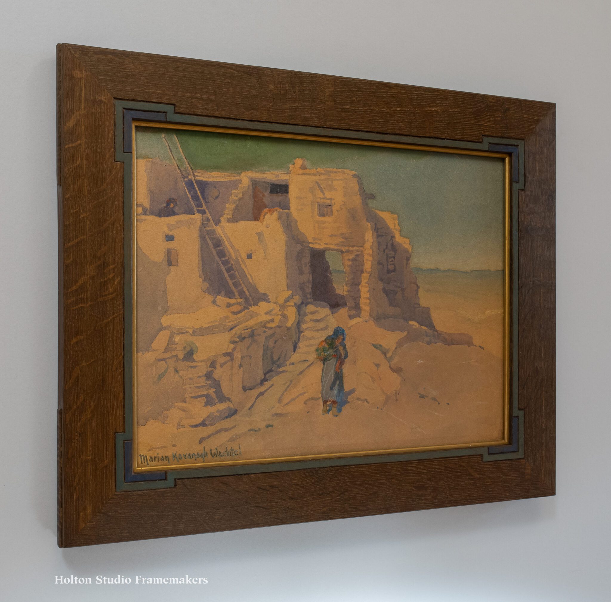
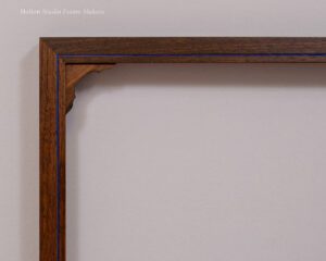
The 1″ wide flat frames are oiled walnut, and like the earlier frame, these have a blue painted groove echoing Bartlett’s exquisitely fine line work and gorgeous blue ink. The new frames also have special corners designed with an eye to the ornamented temple architecture depicted, but on these, that touch was accomplished with corner spandrels. It was the pattern of the arches on the little structure in this first print below that suggested the idea. The slightly different pattern for the Taj Mahal came from photos of that temple’s interior.
The architectural subject matter of the prints they house and Bartlett’s evident regard for such historic architectural sites essentially designed these frames. For frame making, the great well of tradition created by the “numberless souls” Ruskin praises is not only our vast heritage of pictorial arts but the entire world history of architectural ornament and decorative furnishings—an unfathomably deep well of help and inspiration for the frame maker and the architecture of the picture frame.

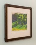
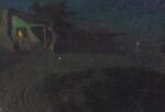
Charles W. Bartlett (1860-1940), “Udaipur,” 1916. 8 3/4″ x 11 3/4″.

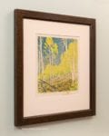
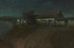
Charles W. Bartlett (1860-1940), “Taj Mahal, Twilight,” 1916; 9 15/16″ x 14 1/2″

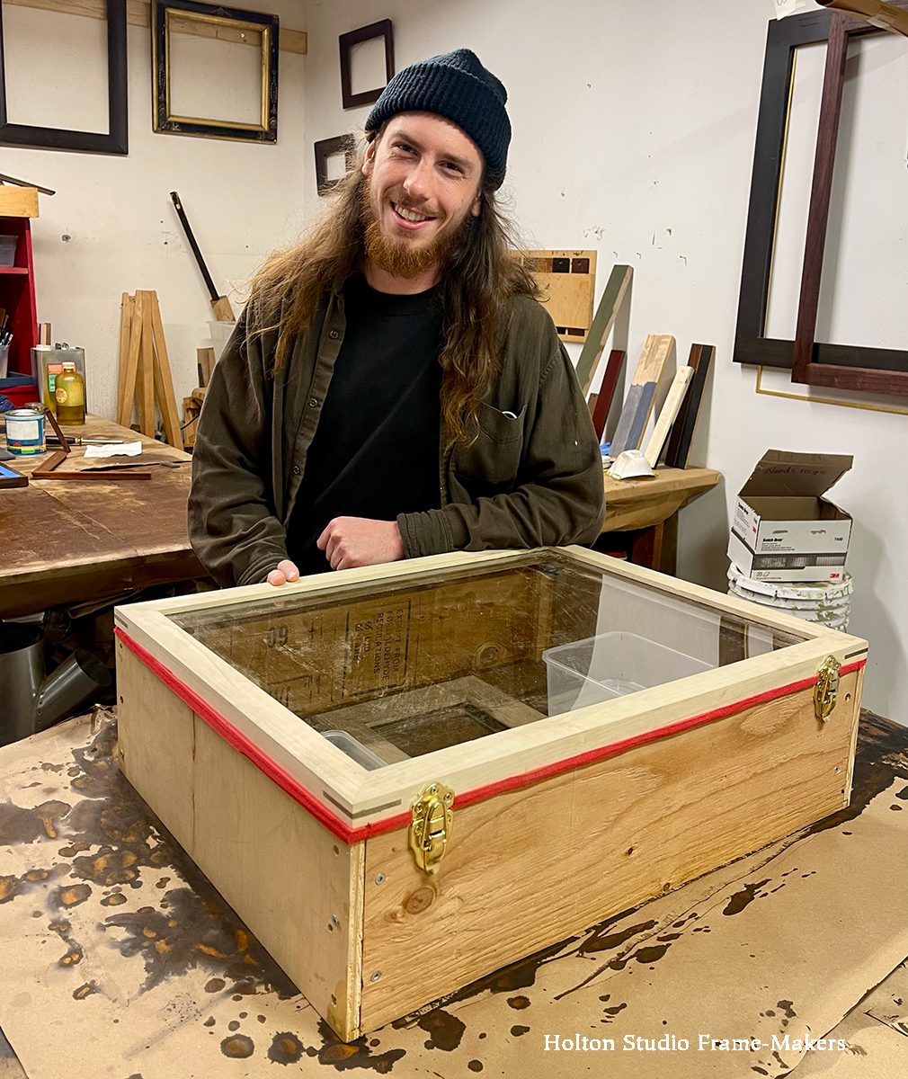
Process—
-
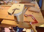
- Tools and set up for sawing spandrels.
-

- Set of spandrels ready to inlay into frame.
-

- Spandrel from back, inlaid into rabbet.
-

- Paint can go on loosely. Overpaint is scraped off later.
-
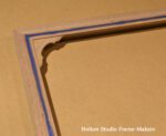
- Corner before excess paint is scraped off.
-

- Frame partially scraped after painting.
-

- Corner partially scraped.
* John Ruskin, The Laws of Fesole, ch. 1