Online Show “Little Windows” Starts Today

Today we’re starting our first online show ever! “Little Windows” features new and recent small paintings (9″ x 12″ and smaller) by our tremendously talented roster of landscape painters. Included is Terry Miura‘s “Eucalyptus in Earth Tones,” below. We’re also very excited to announce that the paintings for this show can all be purchased online through our new online store, shop.holtonframes.com. “Little Windows” may be viewed either here on our main site as a slide show, or on the online store, here. And to celebrate, through the month of June, we offer free shipping on all purchases on shop.holtonframes.com, including paintings in the exhibition!

Enjoy these beautiful works by our wonderful roster of painters!

Terry Miura painting

Terry Miura, “Eucalyptus in Earth Tones.”
Oil, 9″ x 12″. $1,750 framed.
BUY

Carving Beads

I’m in the midst of a big framing job—a polyptych of four abutted cassetta frames in quartersawn white oak to house a 17th century map in four panels.

carving beaded molding

A set of beads with the three basic carving chisels used.

Helping unify them is a sight edge molding with a running beaded pattern. Beads are part of the basic vocabulary of frame design. The pattern here—taken from the border of the maps—has three beads in a set, the sets spaced a few inches apart. The whole polyptych is about 15 feet long, so the beaded molding has 234 beads.

The first two steps, which aren’t shown, are, 1) selecting the wood, which is crucial to the ease of carving, especially in a coarse wood like quartersawn white oak; and 2) milling the shape, which is a 5/16″ wide bead with a narrow cove (see first photo below). Also critical to carving is keeping the tools sharp.

My bench, which I discussed a bit in my recent post, “Tools of the Trade,” but is more visible here, is designed for exactly this kind of work. It has two front-mounted vises with especially wide and long jaws for holding lengths of molding and providing a wide surface to rest my hands on, which is necessary to proper control.

Here’s how beads are carved.

Final note: For efficiency, each cut should be done in multiples, going down sequentially the length of the molding—or at least each set of beads. I tended to do the first three cuts (the v-tool cutting across the grain, and the two initial cuts into the valleys between the beads) down the whole length of molding, and after that focus on each set of beads, but still doing each cut in sequence on the full set of beads. With that approach, each set takes about five minutes.

Additional posts on this project—

A post on carving the cap molding, gluing up the frames, and finishing them is here. The final post showing the finished project is here.

When Lightning Strikes: Framing Karima Cammell

In 1470, fire from the daytime sky—the sun—allowed the young Leonardo Da Vinci to use parabolic “fire mirrors” to concentrate the solar rays to temperatures hot enough to solder copper plates together to form the ball that surmounts Brunelleschi’s dome on the Cathedral of Florence. Karima Cammell paintingIn 1601 fire from the night sky—lightning—hit the ball and knocked it to the ground. (The spot where it landed is marked to this day.) It wasn’t the first time the ball had been hit by lightning. It is, after all, metal and crowns one of the city’s tallest buildings. So before restoring it atop the dome, the church did the prudent thing and filled the cross on top of the ball with relics. The ball still attracts lightning, and due to the relics—and possibly the help of lightning rods installed in the 1700’s—it effectively protects the cathedral.

For artist and entrepreneur Karima Cammell, stories of lightning and Leonardo’s copper ball aren’t hearsay. One summer day when Karima was visiting Florence, a thunderstorm came up. The artist ducked into a doorway and turned around just in time to catch Leonardo’s ball serving its purpose.

Karima Cammell painting

Karima Cammell, “Blue Lightning,” 2020. Egg tempera, 8″ x 10″. Framed in quartersawn white oak (Van Dyke stain), in a 2″ profile No. 15.16 CV, with a chamfer pattern to articulate the corners; beveled gilt liner.

Karima frequents Italy, and especially loves to take part in Carnivale in Venice, but had to leave early this year due to the pandemic and the strict quarantine orders imposed on Italy. As she paints now, she tells me, many images, from Venetian “plague doctor” masks to lightning from out of the blue, have taken on new meaning.

My own feelings of poignancy sparked by this picture, and especially by framing it, are due to its depiction of Giotto’s Tower, at the far right. I wrote about it several years ago in my post, “What Ruskin Saw Framed In the Stones of Florence.” Before I visited Florence, I had studied the tower in books and online, becoming particularly familiar with John Ruskin’s 1872 lecture on the tower and its evidence of the natural and original—and now lost—unity of the arts. The argument is punctuated with a profound statement about the significance of picture frames: their relationship to paintings being, for Ruskin, emblematic of that primal unity of all the arts.* This deep understanding of the cooperative nature and history of the arts is, for me, one of the great revelations of Ruskin’s work—as well as a considerable inspiration and foundation for my understanding of my purpose as a frame-maker.

So when I finally visited the city and came around a corner to see the tower and its accompanying Duomo and Baptistry from exactly the point of view from which Karima painted them, you can imagine how I felt. It was something like being struck by lightning.


More Posts on Paintings by Karima Cammell—

* Directing his listeners’ attention to one of the hexagonal bas reliefs near the base of the tower—the one depicting the art of painting—Ruskin pointed out the frame that occupies nearly half of the composition and awaits the completion of the painting. It’s the reward of the painter, whose eagerness is suggested by the his tipping stool. Ruskin pointed to this representation of the art of painting, set in the larger context of the entire set of hexagonal bas relief panels that encircle the tower and honor the arts, and asked his audience, “Have you ever considered, in the early history of painting, how important also is the history of the frame maker? It is a matter, I assure you, needing your very best consideration. For the frame was made before the picture. The painted window is much, but the aperture it fills was thought of before it.” The whole lecture is here. My post “What Ruskin Saw Framed in the Stones of Florence” is here.

Framing Virgil Williams—and How Virgil Williams Framed “Art”

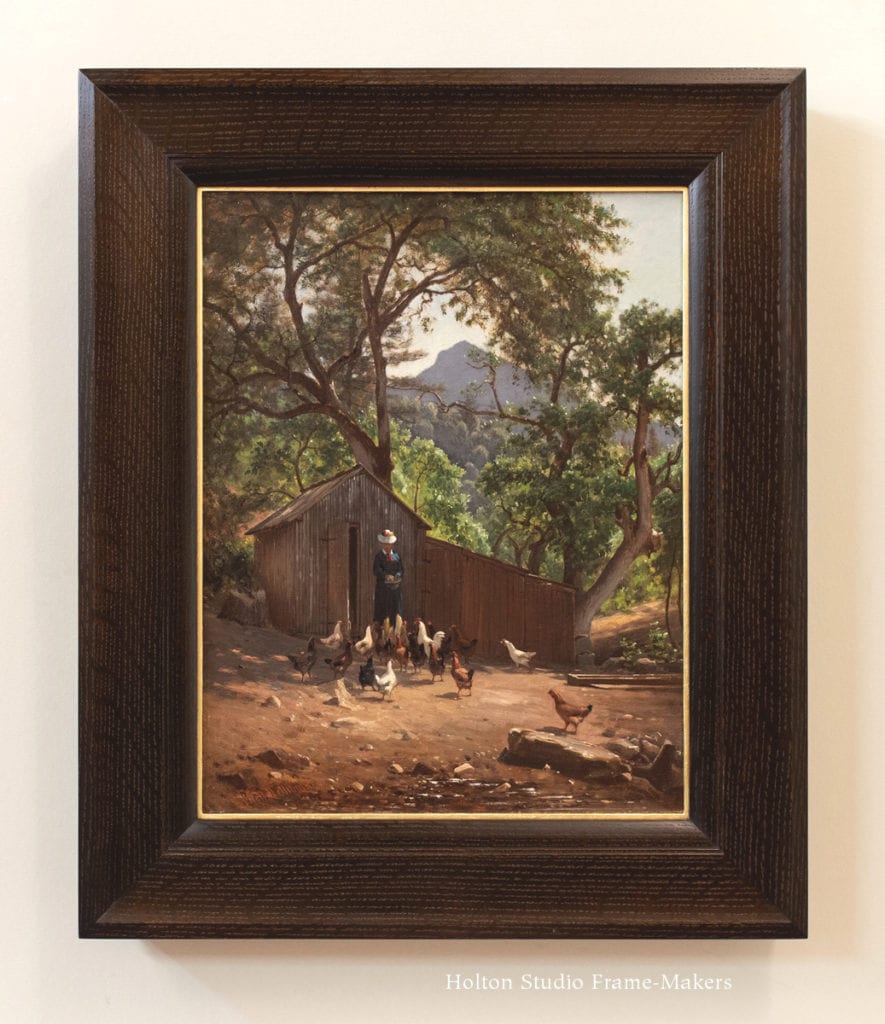
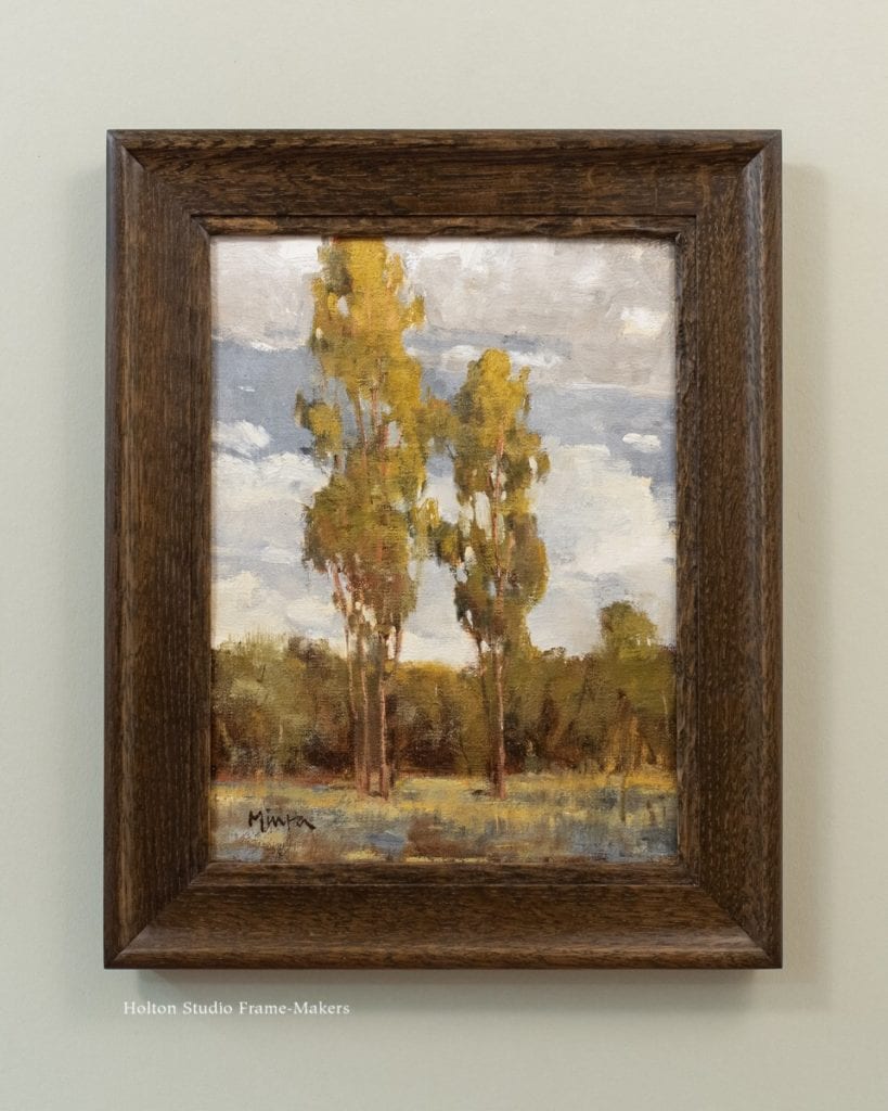
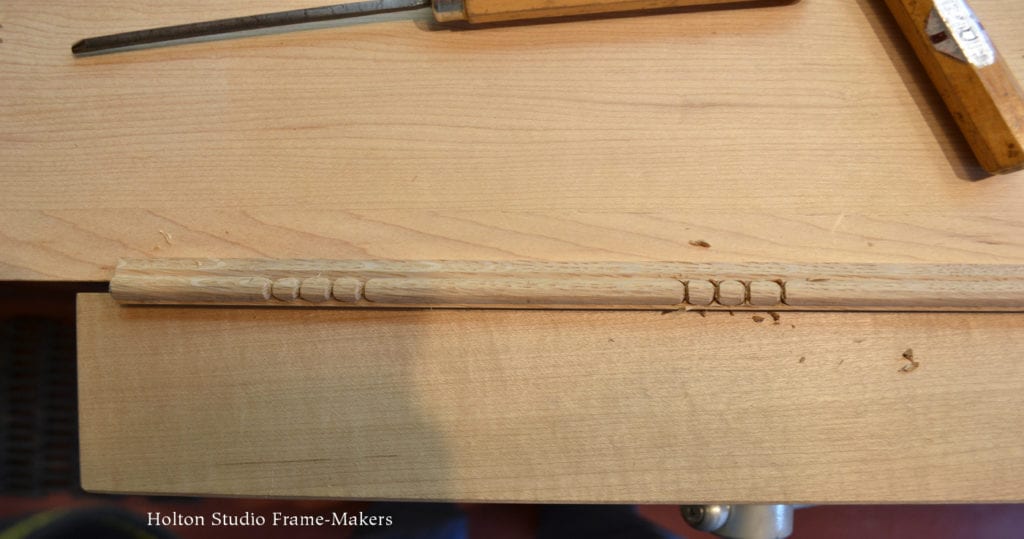
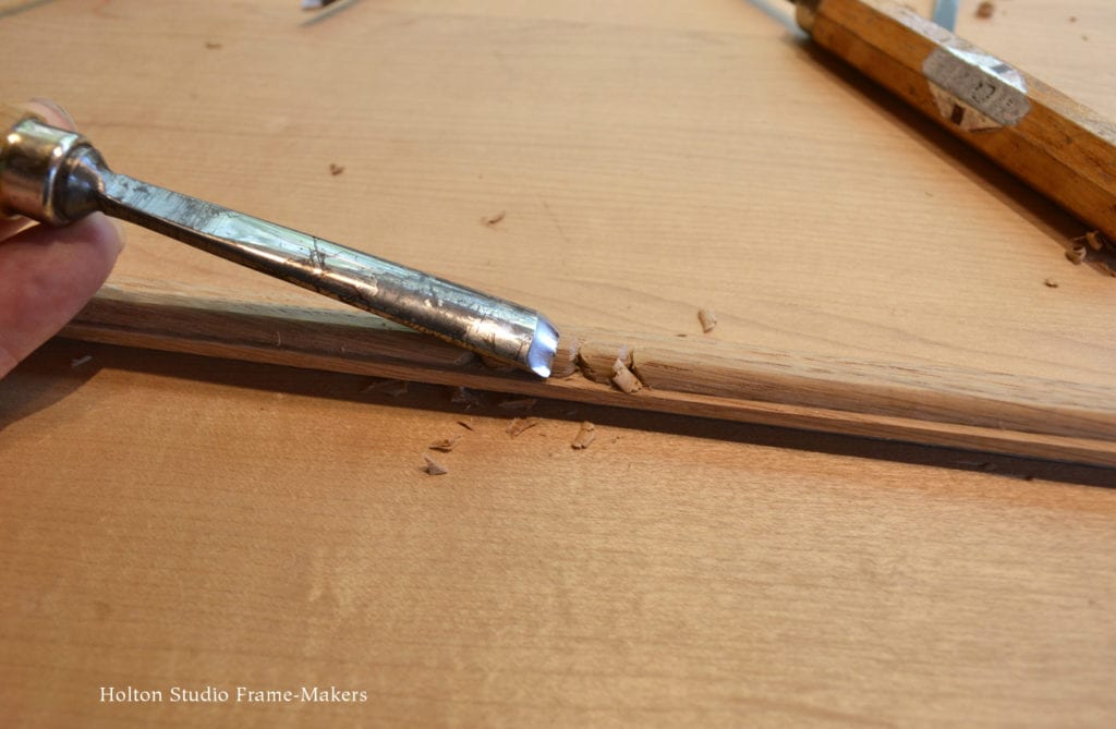
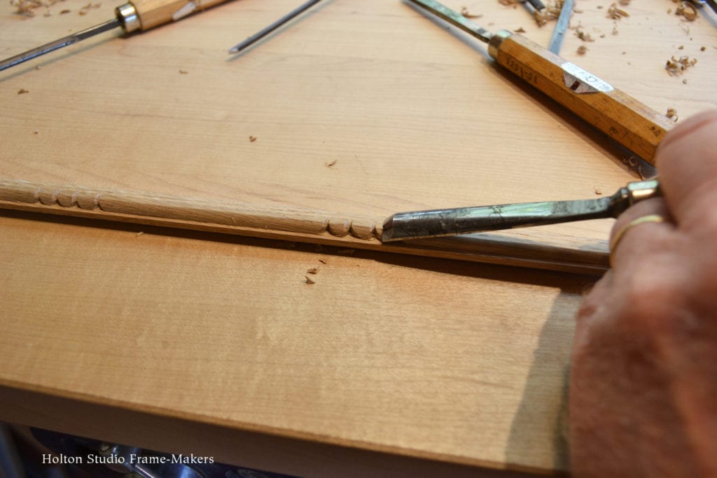
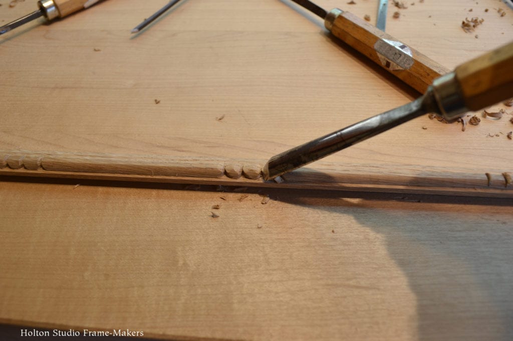
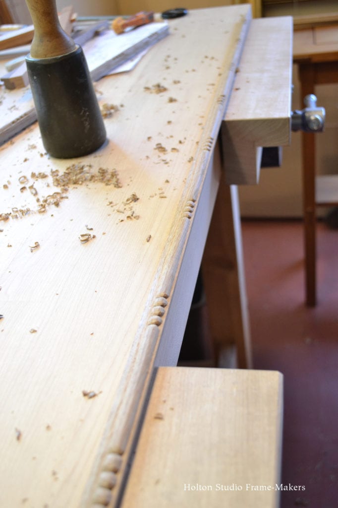
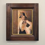
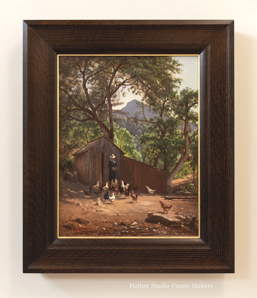
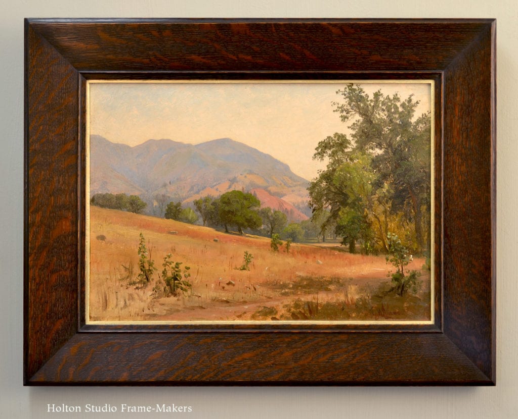
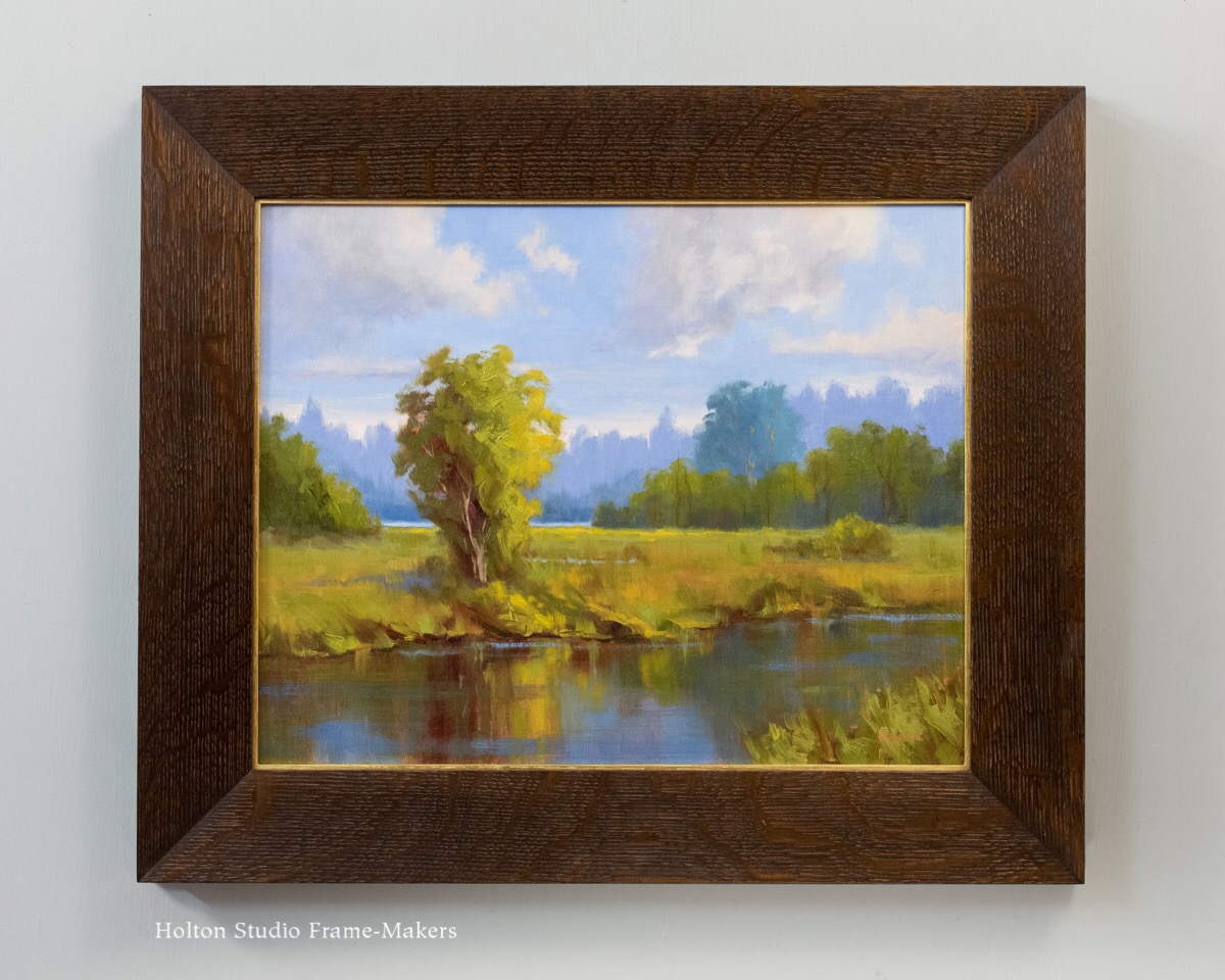
We recently re-framed this oil painting by Virgil Williams (1830-1886) of his wife Dora feeding chickens on their farm near Mt St Helena, which towers in the background. The 18″ x 14″ painting is undated but was probably painted in the 1880’s. The frame, in a 3-1/4″ wide profile, is in quartersawn white oak with Dark Medieval Oak stain. It has an 18 kt gilt slip. The idea was to suit the painting’s still mood with a simple profile, but one that would no less be a match for the refined lines and formal rendering of the painting. Note the harmony of the shed with its natural surroundings, its roof even echoing the lines of the mountain behind it. As architecture, the frame is naturally attuned to the characteristics of the shed. Its subtle elements gently lead you in to the quiet afternoon scene.

painting by Virgil Williams

More work by Virgil Williams

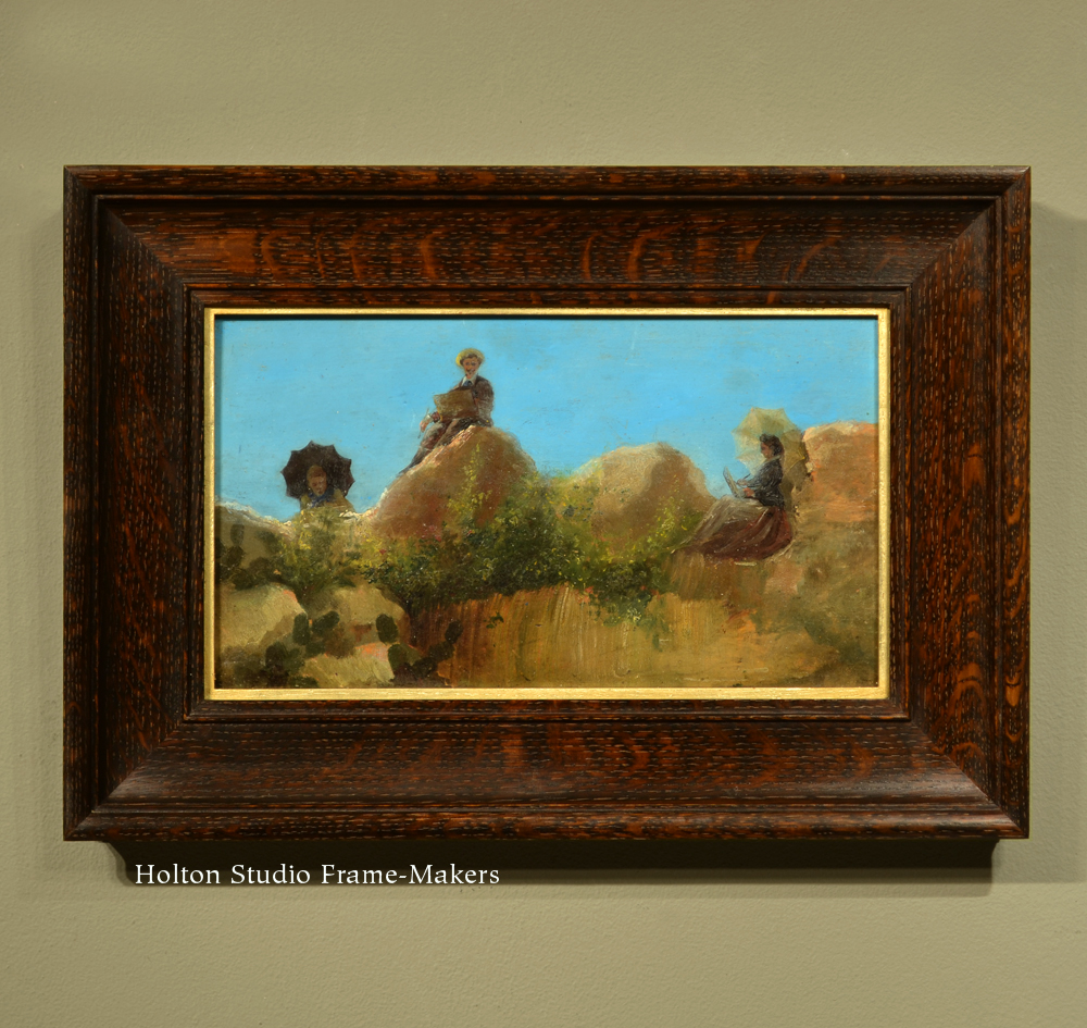
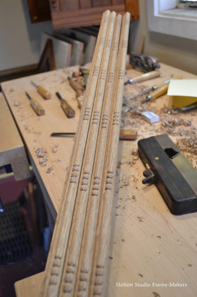
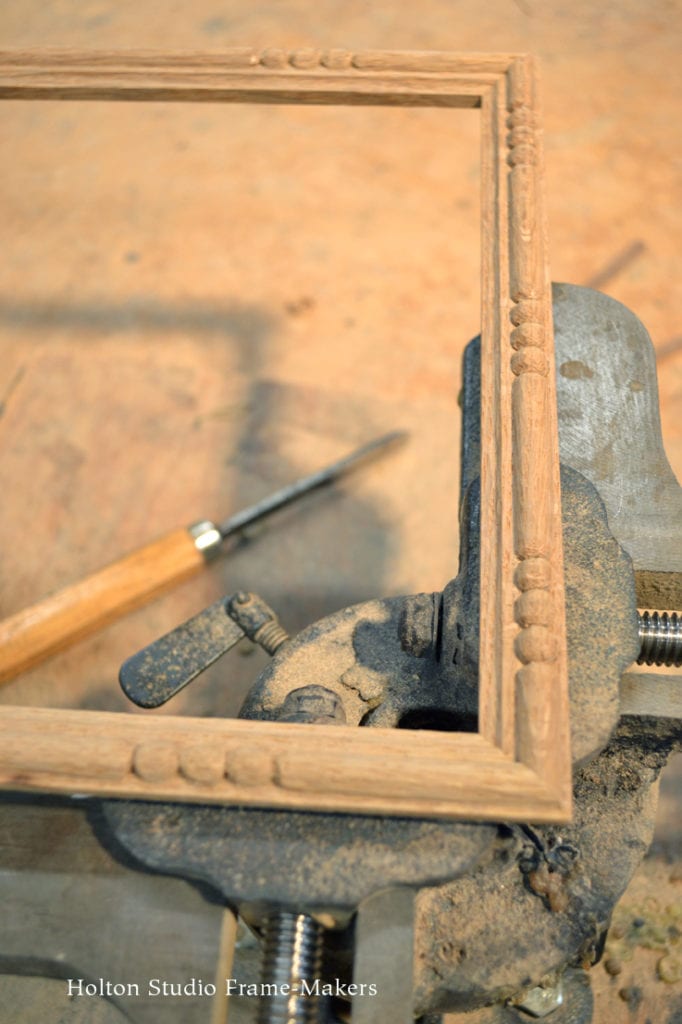
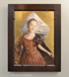
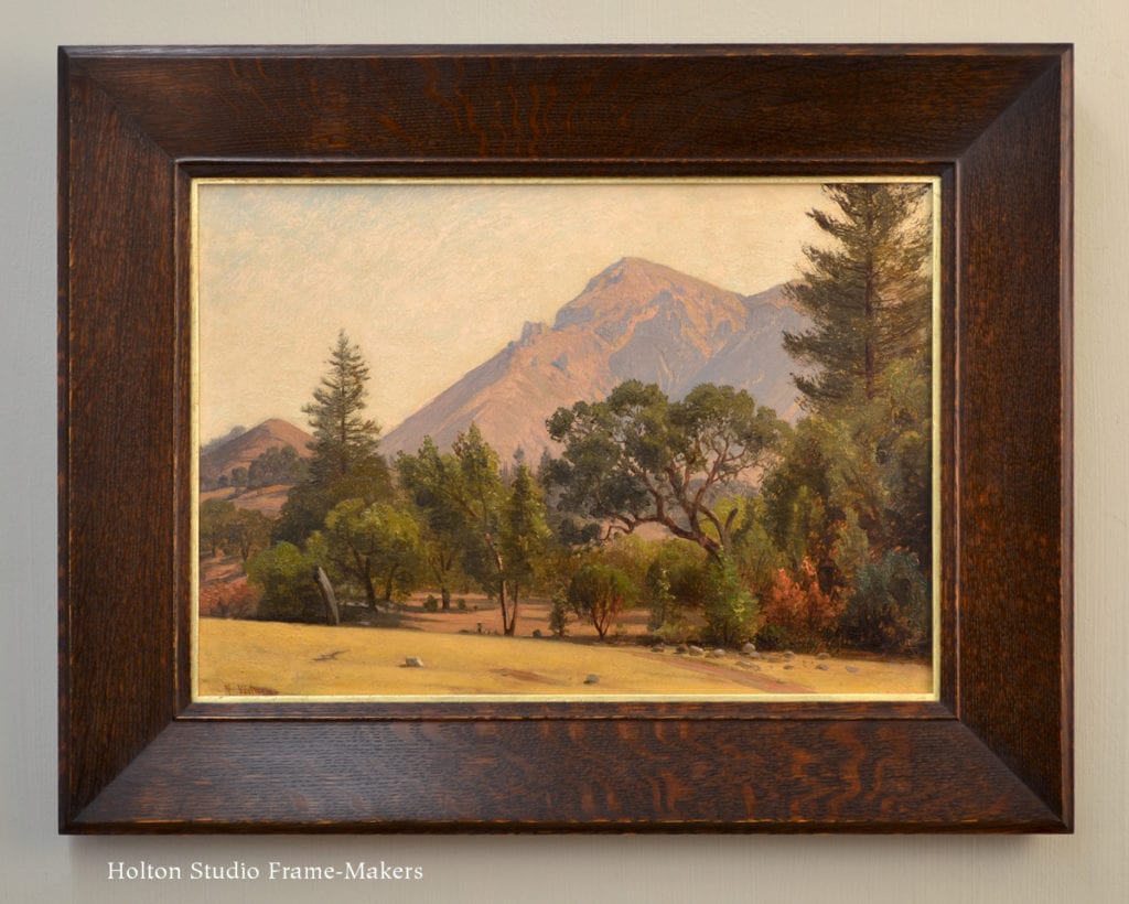
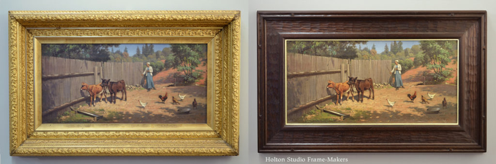
Here are two more paintings by the same artist, framed a year or so ago, both in our No. 238 at 3″ wide, in quartersawn white oak (Dark Medieval Oak stain):

Virgil Williams

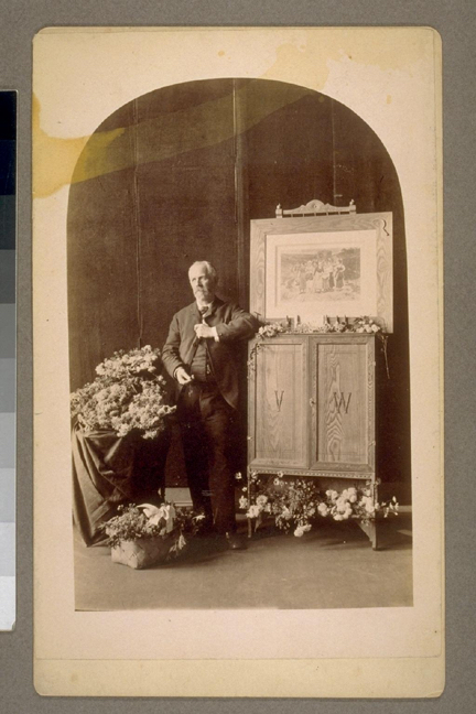
Virgil Williams on his 57th Birthday

Virgil Williams

The following notes on Williams, including how he framed the entire concept of “art,” are from a 1937 WPA monograph in UC Berkeley’s Bancroft Library, on leading painters of California. It includes some particularly interesting perspective on the social place of painting—with suggestions of how its dubious uses were reflected in their physical place, their frames.

Virgil Williams came from an old New England Protestant family—a direct descendant, in fact, of Roger Williams. “In such a family and such an atmosphere,” notes the monograph, “Virgil’s desire to become an artist entailed the shattering of tradition.” Thus, before coming West in 1871 to settle in San Francisco and play a key role in fostering the City’s especially lively world of painting in those burgeoning days, he spent a decade in Rome, immersed in Italy’s Catholic and Renaissance heritage. The experience was perhaps a necessary antidote to the artist’s inherited puritan austerity and distrust of “worldly” and even idolatrous occupations like painting. In any case, once reluctantly returning to Boston, “Something in the atmosphere of the more established East seemed to pall on Williams,” writes the same biographer, “There was that in the artist which sought to express itself… Artistically, Virgil Williams had not yet found himself.” The monograph suggests that for the painter, part of the charm of California was a climate reminiscent of his “beloved Naples and Capri.” Here his work caught on and found an appreciative audience.

Virgil Williams, Teacher

But finally, it was as a teacher perhaps more than as a painter, that Williams left his mark on this state.

“In 1874, a committee from the Art Association appointed to form and carry out plans for the opening of an art school,” the monograph says. “Virgil Williams was selected and they could scarcely have made a happier choice.” The school being founded was the California School of Design—what is now the San Francisco Art Institute. Williams enjoyed soaring repute as an instructor. “A great deal should be said of Virgil Williams,” a reporter exclaimed in 1885,

the man who has made this school his life-work, and who has as an instructor no superior and probably no equal in the United States. It is impossible for an outsider, or for such professionals as have no standards of comparison to appreciate the work this man has done single-handed… He spends his entire time with his pupils, is always accessible to them, and takes a lively personal interest in them all.

Williams’s students included Arthur Mathews, Charles Hittel, JE Stuart, Mary Curtis Richardson, Matilda Lotz, Chris Jorgensen, Guy Rose, Alice Brown Chittenden, William Hubacek, and Edith White. Testimony to his influence may well be measured by the plaque that, after he died, his students had installed at the school. The plaque included the epigraph, “He shaped the dawn of Western art and prophesied its noon.”

How San Francisco’s Early Elite Framed Art

But to return to the circumstances that welcomed Virgil Williams to early San Francisco, the monograph offers some interesting perspective on the place—reflected by the literal place—of paintings in the larger setting of the time. When Williams arrived in 1871,

The City of San Francisco was just entering on the period of her greatest artistic development. Conditions that fostered this period, were peculiar. There were many wealthy men in the community, nouveau riche though they were, who took pride in patronizing the arts. This generosity attracted many artists whose names became associated with the period. These nabobs were building their palatial homes on San Francisco’s Nob Hill. True[,] many of them were prone to judge a canvas by its size and the amount of gilt paint on the frame, but they felt it added to their cultural standing to buy paintings, good or bad. As a result the whole city became unusually art conscious…

Here we have an excellent window, from the vantage point of the far different era of the Great Depression, on social and cultural concerns—status consciousness of an insecure emerging urban elite—that helps shed light on the frame choices of the era. With “cultural standing” being the point in acquiring and displaying paintings in one’s “palatial mansion,” it’s not hard to see how pictures were judged by their “size and the amount of gilt paint on the frame”; and how even images of humble sheds and chicken yards wound up in such bizarrely incongruous and ostentatious settings with no evident concern for enhancing the picture’s inherent, particular character. It’s the picture, not as particular, close and penetrating observation of life, but the picture generalized as “Art”—a thing to be shown off as a trophy, evidence of one’s social prestige.

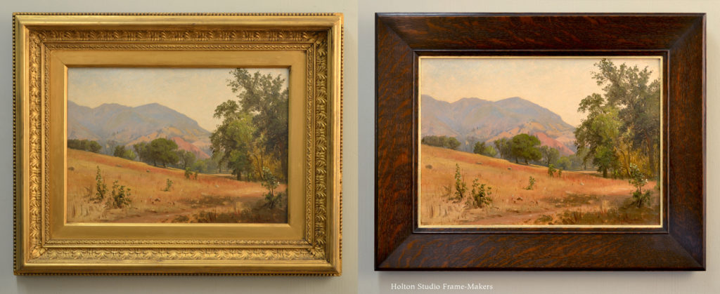
Those today who actually would like to enjoy these paintings themselves face an endless project in re-framing. Two examples may be seen below in before-and-after comparisons of other Williams paintings we re-framed. The first is another of Dora feeding the chickens, the second, one of the pieces shown above.


How Virgil Williams Framed Art

By the late nineteenth century, industrialization and its thorough disruption of the nature of human labor had obliterated the old integrated system of the arts, and along with that the original meaning of the word art. The age had witnessed the modern invention of “art,” a vague and debased social construct eluding definition. In this new regime, no one could blame even an acclaimed painting instructor for struggling with the idea, as Williams does below, in the quote I’ll end with.

In 1886, a young reporter for the San Francisco Chronicle, interrogated The City’s artists on a “definition of art.”

“What is art, Director Williams?”

“Art is long and time is fleeting,” merrily answer Virgil Williams, disengaging his attention from the arrangement of an adroit piece of mechanism designed to illustrate the principles of perspective to the pupils of the School of Design.

“Can’t you show any more respect to a subject you honor with the devotion a lifetime?”
“No one has ever defined it yet,” he said, contemplatively twirling a piece of chalk between his thumb and forefinger.

“But how do you define it, Mr. Williams?

“God bless me! I don’t know. Webster gives it a purely mechanical definition, but that isn’t right. The truth of it is, there are different kinds of art, and high art is a compound quantity. I cannot define it better than to say that judgment, skill and taste all enter into it.”

“There are ever so many fashions in art,” continued Mr.Williams, waxing retrospective.

“Thirty years ago the [Pre-]Raphaelite school was the rage in England; now the impressionist and realistic contend for the possession of the field. In twenty-five years more some other style will be in vogue. I may not live to see the day, but it is sure to come. It’s all nonsense, just like the eternal wrangle over straight and curved lines. I was taught to draw with curved lines, and now it is all in vogue to draw with straight lines; but we are sure to come back to the curved lines after another generation. Of course, there are certain methods with experience has proved effective, but the manner of painting is of small consequence, compared to what is achieved. By Jove! Let a man paint with his toes or his thumbs, or stand on his head and paint if he finds it more comfortable. All the public cares of after all is what kind of a picture he makes.”

Virgil Williams and Thomas Hill

Virgil Williams and Thomas Hill in Yosemite

Virgil Williams painting

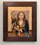
Virgil Williams’s 1880 painting of Robert Louis Stevenson and his wife, Fanny, at left. Painted during the couple’s honeymoon in Northern California. The woman on the right is Dora—not, this time, feeding chickens!


Framing My Thoughts On Framing Paintings: An Article in “Realism Today”

Realism Today’s online magazine has published an article of mine, “A Frame-Maker’s Thoughts On Framing Paintings,” which aims to help painters think through the problem of framing their work. It begins,

If you’re a pictorial artist, you probably see picture framing as a problem. If you show in galleries, the frame is a big and bothersome expense.

But more than that, it’s an artistic problem — something that undeniably affects how your work is perceived, and even whether it’s perceived — but the very nature of which is outside and foreign to the art of painting.

The difference between a good frame and a bad one seems almost arbitrary — a matter of chance. The problem of the frame, most painters seem to think, boils down to how to avoid choosing the wrong frame — especially if you’re paying a lot of money for it.

Every problem is also an opportunity. Avoiding choosing the wrong frame means a chance to choose the right frame. And a frame, as I will argue, cannot be indifferent. A frame that is neutral or indifferent to the picture is a bad frame; it has failed the picture and is harmful to it.

The reason that’s true goes to the very nature of paintings and their relationship to the world. To the extent that the life of a painting depends on a vital relationship to the life around it, that life depends first of all on its immediate setting — that is, on the frame.

Read more…

Tools of the Trade

“Man is a tool using animal. Without tools he is nothing, with tools he is all.”—Thomas Carlyle

On a visit to the shop in early March, Tia Kratter spied my workbench. Her eyes lighting up, she said, “There’s a painting!” The other day, she posted this beauty on Facebook. As one follower said, “What sorcery is this?” Well said! Within a week or two, the painting had sold. I’m hoping the buyer orders a frame made on “Tim’s Bench.”

Tia Kratter watercolor

Tia Kratter, “Tim’s Bench,” 2020. Watercolor 16″ x 16″

carving chiselsI have to admit that I was a little horrified to have been caught not keeping my tools more carefully arranged to protect their edges. As the Thomas Carlyle quote suggests, there’s a primal significance to a craftsman’s tools. They are, after all, a means of his livelihood. They also become an extension of his hands and body. The relationship defies description. Explain to me how you use a fork and I’ll explain to you how I use a plane. So, especially with edge tools like these, one should develop good habits (better than I have, clearly!) of how to set them down in such a way that their edges don’t get knicked—more like in the photo at right.

The hand plane in the painting is one of my very favorites. It’s a Lie-Nielsen No. 1 bronze bench plane I’ve probably owned for 20 years. So I’m pleased that happened to be what caught Tia’s eye. At just 5-1/2″ long, it’s handy for frame-making. In the background is an Australian rosewood and brass rabbet plane. There are also various chisels and carving tools, and a 4″ combination square I keep in my apron.

Here’s a photo of my bench with some of my most important tools (amidst shavings and chips from the tools).

Tim's BenchYou can see the little Lie-Nielsen No. 1 plane and the little 4″ Starret combination square that are in the painting. To the left of that square is a Bridge City 45-degree combination square I love and use frequently. Left of that are a few carving gouges and a skew (just a few of maybe a couple of dozen of my carving tools), with two rabbet planes behind those. Rabbet planes have blades that are the full width of the tool, so you can plane a rabbet, and are also especially handy in frame-making because you can plane the full width of a fillet or right up against a bead, as Eric’s doing at left. The smaller rabbet plane is another favorite I use all the time—an English Clifton No. 410, just 5/8″ wide. The one behind is the Australian rosewood and brass rabbet plane in the painting. It’s 1″ wide. At the center rear of the photo are a couple well used Sorby bench chisels from a set I have ranging from 1/8″ to 1-1/2″ wide. Tim carvingThose are indispensable, especially for joint-making, but I also sometimes use them for chamfering, as in the photo at right. At back right is a favorite German EC Emmerich pearwood bench plane with a lignum vitae sole. It has an adjustable mouth. In front of that is the Lie-Nielsen, and to the right of it is a classic old Stanley No. 4, which is 9-1/2″ long—a more common size. (I don’t know how old it is, but I bought it at a tool swap about 30 years ago. I use it less often than I do the small plane, but it’s definitely a stand-by.)

Finally, the bench itself, is a tool. I made this one maybe a year ago for the front studio off the showroom. Visible on the front is a Record vise I fit with an exceptionally wide and long maple jaw so I have a surface to rest my hands on when carving molding that’s clamped in the vise, as I’m doing in the photo above. There’s an identical vise to the right, out of the picture (behind me in the smaller picture here), so I can use the two for holding long moldings against the front edge of the bench.

Miter viseSpeaking of vises, I’ve got to include a miter vise, like the one at left. Maybe the most used hand tools in the shop, we have a half dozen or so of these classics on a big table. Sometimes they’re all in use. They’re primarily to glue up miters, of course, but we frequently use chisels, planes, gouges on the frame members in these vises, finessing the joints before gluing them to get them to meet just right on the face.

Here’s Trevor’s bench, below, with his favorite planes at his fingertips—including two great Lie-Nielsen rabbet planes—along with a few other crucial tools.

workbench and toolsMy least-used plane? About 30 years ago, when I first started exploring making hardwood frames from scratch, I became fascinated by the Stanley 55 Combination Plane and managed to lay my hands on the one below. Patented in 1894, this monster came with four boxes of interchangeable cutters for cutting all manner of moldings and molding elements. Did I use it much? No. But before I decided it was more trouble than it was worth, I sharpened all 52 of the cutters. It did reinforce lessons in the versatility that’s integral to handwork, and is especially vital for good frame-making. In any case, I learned to sharpen edge tools—including the knives we now use in molding heads on the table saw to shape moldings.

Had to blow a lot of dust off this baby to put it out to photograph!


Welcome Ellen Howard!

We’re proud to announce that Peninsula artist Ellen Howard has joined our gallery roster. We’ve had an eye on Ellen’s work for a while, and knew her a bit as the co-chair of the San Francisco Region chapter of the California Art Club, but really got to know her while planning our show, “Treasures from the Bay Area: New Paintings by the California Art Club.” We weren’t a bit surprised when her 12″ x 12″ oil “Evening Serenity” sold.

Ellen Howard painting

“Autumn Reflections,” 2019. Oil on board, 16″ x 20″.

Ellen Howard and Paul Kratter

Ellen Howard with CAC chapter co-chair Paul Kratter, at our March 7, 2020 CAC show opening. Ellen’s painting is at left.

As her artist page shows, Ellen is very active in galleries and plein air events and art organizations, including the Salmagundi Club and Society of Western Artists—in addition, of course, to the California Art Club, which has accepted one of her works in this year’s Gold Medal Show.

Ellen’s summed up her philosophy with these words:

“I strive for my paintings to engage the viewer and evoke a sense of connection, create a stillness that transports the onlooker to a tranquil space. Each painting is unique and an expression of that mood or energy expressed at that time.”

Welcome Ellen!

View Ellen’s paintings…

Framing an Alexander Phimister Proctor Bronze

This is a small (the base is 8″ x 8″) bronze of a kodiac bear by one of this country’s foremost animal artists (or “animaliers”), Alexander Phimister Proctor (1860-1950).

Proctor with panther sculpture

Proctor at 1893 Chicago World’s Fair

“I am eternally obsessed,” Proctor said, “with two deep desires—one, to spend as much time as possible in the wilderness, and the other, to accomplish something worthwhile in art.” Growing up in the West, he paired his great love of hunting in the Rockies with artistic ambition leading him to study at two academies in Paris. His prolific career earned him numerous commissions for prominent public statues, some of which you may have seen (more at bottom of post).

This piece gave me a chance to do one of my favorite decorative techniques—chamfering. The frame is quartersawn white oak with Dark Medieval Oak stain.

Statues by Proctor—

Learn more about the artist at the Alexander Phimister Proctor Foundation website…


Framing an Early 20th Century Woodblock

I have a soft spot for anonymous work people bring me to frame. Maybe that’s because most frame-makers are anonymous. But there are plenty of other reasons to love this woodblock. If I have to guess, I’ll say it’s from the 1920’s. (How do we sense such things? What is that distinctive mark and look of a time?) The print’s 10″ x 10″. The frame is 3/4″ wide, made in walnut with a clear oil finish. The corners take advantage of the frame’s form; it’s natural instinct to articulate the corners as radiance and growth, especially when they carry out and express (literally, press out) the spirit of the picture. And block prints, before they become ink on paper, are wood carvings. So they invite the frame-maker to carve. It’s all about harmony, joinery—the affinity of two anonymous artisans from two different times, joined by their love of the life of the Earth.