“Love Made Visible”: Kahlil Gibran’s Frame for Labor

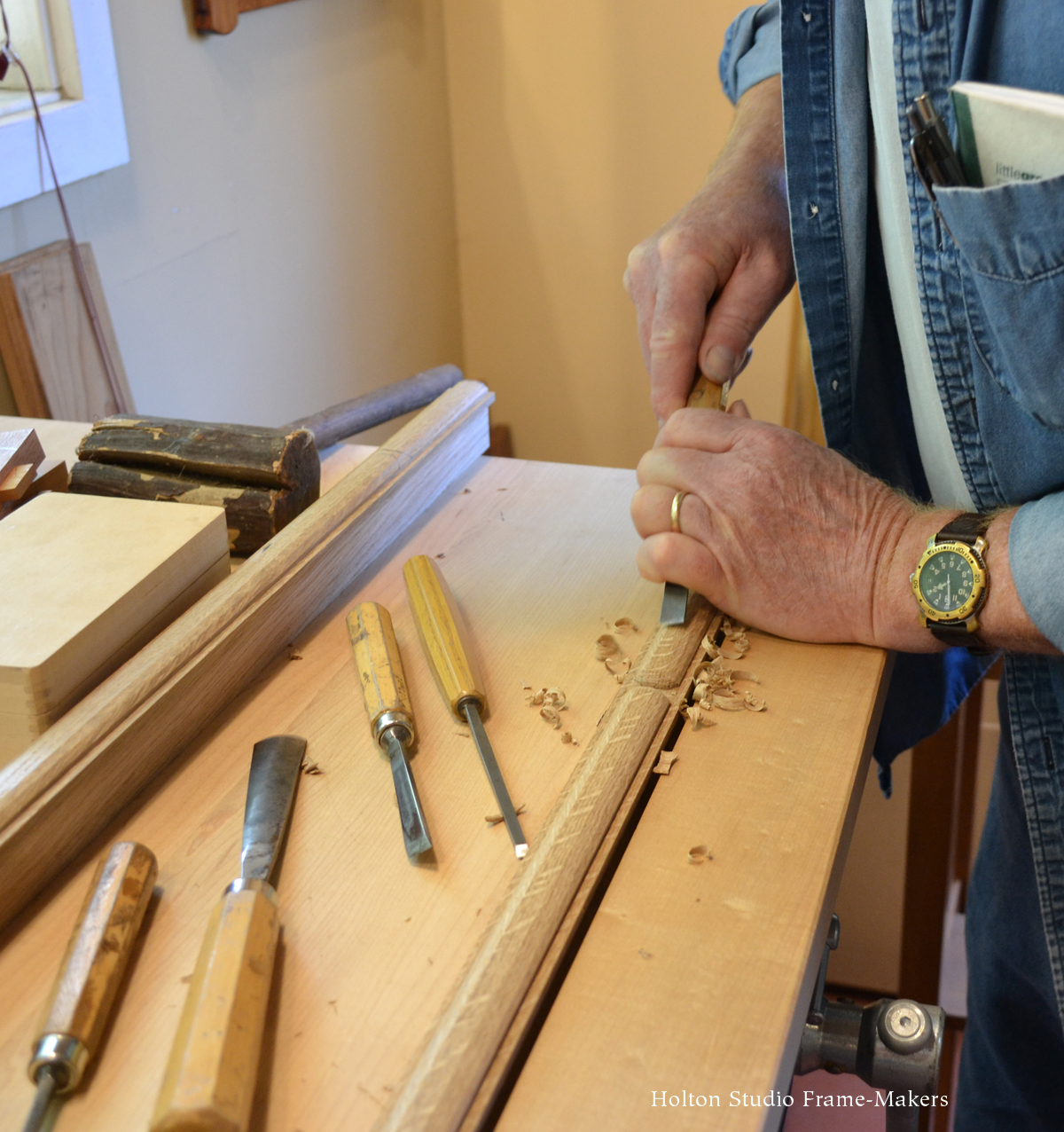
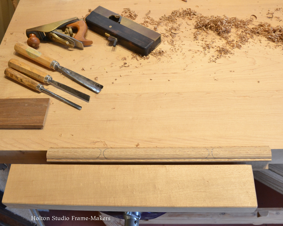
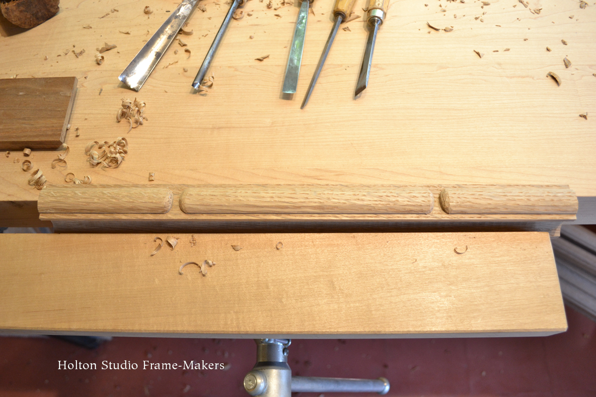
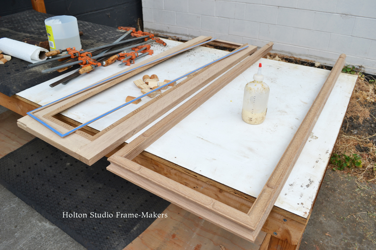
Do you know the painter and poet Kahlil Gibran? Labor Day is a good time to ponder this passage from his famous work, The Prophet, a passage that includes the words, “Work is love made visible.”

Then a ploughman said, Speak to us of Work.

And he answered, saying:

You work that you may keep pace with the earth and the soul of the earth.

For to be idle is to become a stranger unto the seasons, and to step out of life’s procession, that marches in majesty and proud submission towards the infinite.

When you work you are a flute through whose heart the whispering of the hours turns to music.

Which of you would be a reed, dumb and silent, when all else sings together in unison?

Always you have been told that work is a curse and labour a misfortune.

But I say to you that when you work you fulfil a part of earth’s furthest dream, assigned to you when that dream was born,

And in keeping yourself with labour you are in truth loving life,

And to love life through labour is to be intimate with life’s inmost secret.

But if you in your pain call birth an affliction and the support of the flesh a curse written upon your brow, then I answer that naught but the sweat of your brow shall wash away that which is written.

You have been told also that life is darkness, and in your weariness you echo what was said by the weary.

And I say that life is indeed darkness, save when there is urge,

And all urge is blind save when there is knowledge,

And all knowledge is vain save when there is work,

And all work is empty save when there is love;

And when you work with love you bind yourself to yourself, and to one another, and to God.

And what is it to work with love?

It is to weave the cloth with threads drawn from your heart, even as if your beloved were to wear that cloth.

It is to build a house with affection, even as if your beloved were to dwell in that house.

It is to sow seeds with tenderness and reap the harvest with joy, even as if your beloved were to eat the fruit.

It is to charge all things you fashion with a breath of your own spirit,

And to know that all the blessed dead are standing about you and watching.

Often have I heard you say, as if speaking in sleep, “He who works in marble, and finds the shape of his own soul in the stone, is nobler than he who ploughs the soil.

And he who seizes the rainbow to lay it on a cloth in the likeness of man, is more than he who makes the sandals for our feet.”

But I say, not in sleep but in the overwakefulness of noontide, that the wind speaks not more sweetly to the giant oaks than to the least of all the blades of grass;

And he alone is great who turns the voice of the wind into a song made sweeter by his own loving.

Work is love made visible.

And if you cannot work with love but only with distaste, it is better that you should leave your work and sit at the gate of the temple and take alms of those who work with joy.

For if you bake bread with indifference, you bake a bitter bread that feeds but half man’s hunger.

And if you grudge the crushing of the grapes, your grudge distills a poison in the wine.

And if you sing though as angels, and love not the singing, you muffle man’s ears to the voices of the day and the voices of the night.


Postscript

”Ask not what your country can do for you. Ask what you can do for your country.”

These words were made famous by President John F. Kennedy in his 1961 inauguration speech. He should have said, ”In the words of Kahlil Gibran … ” They are from an open letter the poet wrote to Lebanese parliamentarians in 1925, during the fall of the Ottoman Empire. ”Are you a politician asking what your country can do for you or a zealous one asking what you can do for your country?” he asked. ”If you are the first, then you are a parasite; if the second, then you are an oasis in the desert.”

Written 95 years ago, the challenge leveled at those in power is as timely as ever.

Framing Thomas Stream

This is a contemporary print titled “Puppy Gray” by Aleutian artist Thomas Stream. The large subject and strong contrasting colors and bold, graphic design on white paper made a white mat the best choice. The fun part was giving it a suitably bold, graphic frame—a flat 1″ profile, decorative corners flaring out in a pattern repeating the wolf pup’s fur. Walnut was a natural choice, matching the brown in the print. The print is about 16″ x 12″, the outside dimensions of the 1″ profile frame are 23″ x 17″.Thos. Stream print


Thomas Stream’s work is an example of the sort of graphic approach so many pictures take, accepting and embracing the flat plane of the paper or canvas. A flat frame profile honors and sustains this treatment, and can simply be shaped at the edges—especially at the all-important corners—to harmonize with it. A picture frame at its most elemental, is simply a strong emphatic line signaling significance for the picture. Therefore, on pictures using flat, strong, emphatic graphic lines and forms, the frame naturally lends itself to simply repeating and amplifying those elements. By doing so, it provides the picture with a unique immediate setting that’s alive and responsive to the picture.

framed Kunisada printAnother good example of this is the frame we made last year for the Kunisada print at right. (More on this frame here.) In the late nineteenth century, when European painters were first introduced to Japanese prints, they especially admired the flat compositional treatment of the prints. It may be surprising, then, how little this kind of frame design, which seems so obvious and natural, has been employed—then or now. But the explanation is in the nature of industrial frame production and modern commercial conditions, in which such design is impractical. In comparison, the older, more personal model of the frame-making studio allows the framer to work directly for the artist or owner of the picture, and to make frames from scratch. This kind of frame design remains a fertile area for a revived art of frame-making.

More on Thomas Stream…

Decorative Dovetails: Framing Hiroshi Yoshida’s “Grand Canyon”

My eyes lit up when this piece came in—one of the most prized prints by the great shin-hanga printmaker Hiroshi Yoshida (1876-1950) whose work I love and love to frame (and even named a frame design for). Yoshida was a mountaineer, so it’s no surprise that some of his most beautiful and reverential images are of mountains. “Grand Canyon,” (1925, oban size, 9-3/4″ x 15″) is an inspiration—and inspired me as a perfect opportunity to try out a kind of joinery I’d been playing with on paper: a decorative dovetail.

I don’t generally find the shape of a dovetail natural to picture frame joinery, at least when it’s visible on the face. But this is one instance where it felt perfect, offering a lovely way to marry the Japanese to the American Southwestern—the kind of fine wood joinery so highly developed in Japan with the patterns of Southwest Indian weaving culture, patterns that themselves resonate with the iconic geological forms and strata of the Grand Canyon, which Yoshida captured so beautifully in the print.

As I’ve discussed before on the blog, given the material the two art forms have in common, there’s a natural harmony between wooden frames and woodblock prints. Carefully designed and executed, the frame on a woodblock is an opportunity to sustain and amplify the picture’s effective traits.

This walnut frame is proportioned the same as our typical Yoshida frame that we make for oban size prints: the top and bottom are 3/4″ wide, the sides 1″. (The outside dimensions of the frame are 18″ x 22-1/2″ through the centers.) The profile too is the same as the Yoshida’s—a simple square with crisp edges. The decorative detailing is in the joint itself, which is a modified dovetail with a kind of haunch;Decorative dovetail frame being made and like the Yoshida, the horns are extended a little, in this case effectively repeating the strong theme of horizontal lines in the print, but here I’ve cut them with a decorative zig-zag pattern. The joinery and decorative cuts were both done with a Japanese dovetail saw and chisels—a fact that illustrates a principle I hold dear, which is that there is no hard line between the purely “functional” or “practical” work of joinery and the “artistic” work of decorating. Completing the frame is a little 1/8″ walnut slip, given a black wash to contrast with the frame and repeat the print’s line work.

We used an 8-ply mat for the stronger line its bevel would create compared to that of a more typical 4-ply mat. Its deep bevel also repeats the stepping perspective of the scene and the angular forms of the mountains. The solid core rag mat is a muted tan with the subtlest hint of green that’s a perfect cool complement to the print’s warm pinks and oranges.

Framed Yoshida printSpelling it all out that way makes it seem like a lot of details to what should be a simple presentation. But the approach is consistent with and suited to the amount of fine detail and care in the print, and subtle enough that it remains appropriately subordinate to the picture even as it fully honors it. I’m especially pleased with the subtlety of the dovetails.

One of my favorite discoveries as I’ve explored the art of the picture frame is the effectiveness of joinery. I’m convinced that joinery is something we’re drawn to instinctively, and that its natural attraction for us is due to the very nature of the arts that are the essence of our humanity—the word art, Merriam-Webster’s dictionary tells us, being rooted in the Latin ars, meaning “to join.” We are homo faber; we make things, which means we put things together. And in that work we bring together—we join—head, heart, and hand. The well-made frame is a perfect example of how there is no sharp line between “functional” and “artistic” work. Just as there is no sharp distinction between the structural and decorative function of a dovetail joint, there is no sharp distinction between “functional” and “artistic” work. They both flow with the common spirit of care. The well-made frame both protects and celebrates the picture, both aspects born of the same heart that cares for the picture. Care is beautiful.

Hiroshi Yoshida portrait

Hiroshi Yoshida, 1924

Furthermore, the instinctive appeal of joinery extends to the relationship of frames to pictures—to all the arts to each other, for that matter: they are most effective, most compelling and beautiful, when they are joined together, in cooperation and harmony (another word rooted in the Latin word meaning “to join.”)

The arts are how we join the world and discover and take part in its harmonies—as a Japanese mountaineer and artist joined his culture’s tradition of printmaking to the landscape and culture of the American Southwest; as a nearly hundred year old print is given a fitting place in our time; and as patterns created by and associated with the arts of two distant places can come together in the living art of the picture frame.


Other Hiroshi Yoshida mountain prints (3 we’ve framed + 1)—


Works: New and Recent Landscapes

We are happy to announce that we have reopened The Holton Studio Gallery—by appointment. Please come in to see the current exhibition, Works: New and Recent Landscapes. It’s up through September 12.

Poster for show of paintingsThis is a beautiful show of paintings by our outstanding roster of artists. Most of the works have come in during the pandemic, or shortly before. They include Mark Farina‘s moody and charming “Summit Road Water Tower” featured in the window poster, right. If you aren’t able to come see in person, or are more comfortable viewing online, the whole show can be seen on our site here. If there’s a painting you’d like more pictures of, please call and we’ll be happy to oblige.

For those who’d like to visit, if you’ve been in before, you know that the gallery is well ventilated and spacious, allowing for ample distancing. Masks are required, of course. For everyone’s safety, please call or email to make an appointment before you visit, 510-450-0350, info@holtonframes.com. We are available Tuesday through Saturday. Read more about our health protocols, here

You can also view the show online—

Works: New and Recent Landscapes

~ We look forward to seeing you! ~


The Long View: Framing a Renaissance Map of the Roman Empire

In tumultuous times as these, you’ve got to take the long view. And that’s what we’ve been doing—in more ways than one. We’ve had the honor and privilege to frame this extraordinary and very long 16th century map with a story that’s also long, reaching back, by way of the middle ages, all the way to the first century BC and the Roman Empire that it depicts. The engraving, dated 1598, is the culminating work in the life of the great Renaissance Dutch cartographer, Abraham Ortelius (1527-1598)—although not his crowning work; that would be Ortelius’s Theatrum Orbis Terrarum, the first modern atlas.

Ortelius map-whole

Abraham Ortelius, engraving, map of Roman world, 1598. Click image to view large.

Ortelius mapThe four panels are each about 8″ x 41″, and framed and hung together they extend almost fifteen feet. Forming a continuous map, the panels span the Roman Empire from Great Britain to India. More on the map and its fascinating history are below.

The Frame

The frame, which took around 90 hours, all told, is the polyptych cassetta I showed in its final stages in a post a couple of weeks ago, here. Made in quartersawn white oak, with Medieval Oak stain, it’s 3-1/2″ wide—the vertical side members are slightly more—and is composed of a mortise-and-tenon flat and carved cap and sight moldings. The sight mold is carved with beads in a pattern mimicking those of the printed border of the map. I also posted about that earlier, here. The design is finished off with an 1/8″ slip gilded in 23 kt gold leaf.

Ortlelius map

Left end of set, showing cartouche. (A translation can be found here. More history below.) Click for large view and to see border from which carved bead pattern is drawn.

The length of the whole thing, of course, presented a real framing challenge. Fortunately, the fact that it was in four separate panels allowed us to frame each panel individually, but in a fashion allowing the frames to be butted up to each other to present as a unit. (Scroll down for more process pictures, including ones of how the frames are aligned and hung on the wall.)

History of the map

Peutinger table

Detail, original Peutinger Table, 1265, in the Austrian National Library. Circle on left is Rome.

The story behind the map is as remarkable as the map itself. It is copied from the 13th century Tabula Peutingeriana, or Peutinger Table, created by a monk in Colmar, Alsace (modern-day France) in 1265. At 13 inches high and over 22 feet long, the Peutinger Table is, according to Wikipedia, “thought to be the only known surviving map of the Roman cursus publicus, the state-run road network.” (It’s now preserved in the Austrian National Library in Vienna. In 2007, this earlier map was placed in UNESCO’s Memory of the World Register.) But the history of Ortelius’s Renaissance map actually goes back even further than the medieval Peutinger Table, which itself was based on a map commissioned in the first century BC by the Roman general Marcus Vipsanius Agrippa during the reign of the first Roman Emperor, Augustus.

Thus, we have before our eyes not only a direct connection to the Renaissance, but a view of the world with direct lineage to antiquity—and a rather humbling window into ancient civilization.

Neither the Peutinger Table nor this Renaissance copy are, as you can see, conventional maps in the sense of being attempts at accurate geographical representation; but are distorted, especially latitudinally, to suit a more schematic purpose of indicating roads, landmarks and distances (which are, in fact, fairly accurate). This, I suppose, is why it’s called a “table.” If not quite so impressive in length as its medieval original, at about 14 feet long, Ortelius’s copy is a remarkable work which impresses one with the vast size of the Roman Empire—no doubt the intent of the imperious Romans who were responsible for the original.

Ortelius by Rubens

Abraham Ortelius by Peter Paul Rubens, 1633

Ortelius

Though he died before the work was completed, Abraham Ortelius supervised the engraving of the map, making it the final achievement of an illustrious and eventful life spanning the so-called Age of Discovery, the Reformation, and the first three decades of the Eighty Years War—which included the horrific 1576 Sack of Antwerp, Ortelius’s home. In addition to creating the first modern atlas, the Theatrum Orbis Terrarum (Theater of the World), Ortelius is believed to be the first person to hypothesize continental drift—the now accepted theory that the continents were once joined before drifting apart to their present positions.

Orteliusmaps.com has the following historical sketch of the map we framed, and fills in how the medieval version came to Ortelius:

Portrait of Ortelius

Phillip Galle’s 1579 portrait of Ortelius (obviously the source of Rubens’s posthumous portrait, above) is captioned “Ortelius gave the mortals the world to admire and Galle gave the world Ortelius to admire.”

[A]s early as 1578, Ortelius knew about the existence of a series of manuscript road maps, showing the Roman view of the world at around the third century [the Wikipedia entry indicates scholars now believe its sources are earlier]. The original, found by Konrad Celtes (1459-1508) in a library in Augsburg, came into the hands of Konrad Peutinger (1465-1547) and later went to his relative Mark Welser. Welser was the first to publish a copy of it in 1591 at Aldus Manutius in Venice. Ortelius found this copy inadequate. Therefore, in 1598 new manuscript copies were made at his request by Welser. [This significant role of Welser—”Marco Velsero”—explains the prominence of his name in the cartouche.] The present set of eight (adjacent) maps on four sheets were engraved following these copies. The original Peutinger maps disappeared, were retrieved in 1714, and are now in the Vienna National Library. Because of damage and progressive blackening of the 11 (once 12) sheets of parchment, Ortelius’ version is now the most reliable representation. Ortelius supervised the engraving, but did not live to see the result, which was first published separately in 1598 by Moretus.

More resources on the map’s history can be found at the bottom of the post.

Fitting and hanging the maps—

Fitting—

For the maps to be framed archivally, the frame rabbets were cut wide to accommodate gasket rag mats which separate the prints from the glass and also allow them to shrink and expand. The rabbets were lined with a metal barrier tape to keep the acids in the wood from migrating into the prints. Museum Glass was used. Sam Edie did the expert fitting (as well as most of the photography for this post).

Hanging—

Ortelius map of ancient Rome

Tim and Sam (and Barb the shop dog’s toy) with the completed project.

Resources on the map’s history—

Wikipedia has good entries on Abraham Ortelius and the Peutinger Table. An excellent short video on the Peutinger Table can be seen here. A much longer scholarly article, “The Medieval and Renaissance Transmission of the Tabula Peutingeriana,”  is here.

Earlier posts on this project—

Carving beadsMy post about carving the beads is here, and another post showing the cap molding being carved, the glue-up and finishing is here.

“Another Work Is Possible”

I like to say that picture frames are architecture at its most refined. Mortise-and-tenon picture frames are a refined form of mortise-and-tenon architecture, also called timber-framing.Still from "Another Work Is Possible"

From Mortise & Tenon Magazine comes what looks to be a wonderful book and film by the magazine’s editor, Joshua Klein. “Another Work Is Possible” documents the French-based Carpenters Without Borders as they raised a completely hand-hewn timber-frame blacksmith shop last summer in Maine. As the structure comes together and rises from a clearing in the woods, what also arises is an understanding of the deeper social meaning of hand work and how it connects us, even in a disconnected world, to nature, tradition, and our fellow human beings.

From Mortise & Tenon Magazine’s description of the book:

Weaving together stunning images along with technical explanations of tools and tasks, Klein draws on the thoughts and words of many of the carpenters themselves, as well as modern philosophers and thinkers, to build a vibrant argument that another way of working is possible ­­– a way that reawakens our hands and minds. Much more than a simple how-to, this book is a celebration of the beauty of skilled manual labor, of slowing down and reconnecting to handcraft, sustainability, and fellowship in our increasingly distracted world.

Here’s the book trailer, with the film trailer below.


Framing Lindsay Kustusch

I don’t typically show two such similar frames in a row on the blog, but it might be interesting to compare two similar frames on two very different paintings—two beautiful paintings in any case.Karl Yens painting This one, an oil on canvas called “Two Old Birds,” was commissioned by a couple as an anniversary gift to themselves. It’s 16″ x 24″. The artist is Lindsey Kustusch, and she’s remarkable; check out her site. The frame is a 3-1/2″ wide carved compound very much like the No. 16 CV + Cap 16 CV on the Karl Yens posted a few days ago (and shown at right). But Trevor added his own touch to the design with a stopped chamfer at the outside of the cap; the stops articulate the corners. We also gave it a carved gilt liner.

Framing Karl Yens

Here’s a painting we just framed by notable Laguna Beach painter Karl Julius Yens (originally Jens) (1868-1945).

Karl Yens painting“Hounding Hour in the Desert,” n.d., is an oil on canvas, 26″ x 22″. The 4″ wide frame, in quartersawn white oak (Saturated Medieval Oak stain), is a Compound Mitered Frame No. 16 CV + Cap 16 CV with a 1/2″ wide pale gold liner in similar profile to the frame and cap.

Yens was born in Germany, and studied widely in Europe and Scotland before moving to the U.S. in 1901. In his first decade in this country he worked in New York and Washington, D.C. as a mural painter. He moved west to Southern California in 1910, finally settling in Laguna Beach in 1918. (See biography…)


Karl Yens painting

Finishing a Polyptych Cassetta

A few weeks ago I posted about carving the beads for a big polyptych cassetta frame we’re making. Here’s an update on the frame. It’s now in the finishing room, where yesterday Sam Edie stained it (below) and gilded the slips, and today applied the first of two coats of varnish to it. Here are some pictures of the frame(s) being made since the beads were carved. Finishing a picture frame

Carving the cap moulding—

A cassetta frame is a flat with an inner and outer molding. The smaller beaded molding in the earlier post was the inner molding. Next I made the heavier outer, or cap, moulding. It’s a carved flattened bead with stops. The cut-in back was shaped with a molding head, everything else with a rip blade on the table saw.

Gluing the cap to the flat—

This is one of the end frames, so the flat and the inner and outer moldings are “U”-shaped. The two corners of the cap were only glued. So the joints wouldn’t break while slotting on the table saw, I slotted and splined it after gluing to the flat.

Finally time to finish—

Sparing you pictures of me sanding (there was a lot of that; not very interesting) and jumping ahead to finishing.

I got the slips into the finishing room first. Those were gilded with 23 kt gold leaf. The blue tape is to leave raw wood for a glue surface, since they’ll be glued into the rabbets.

The quartersawn oak frames are stained Medieval Oak.

How’s it look?

After staining, Sam put the slips in and butted the frames all together. Total length, almost 15 feet. Sam did a beautiful job (as always).

Stay tuned!

NOTE: A final post on this project showing the finished framed Renaissance map of the Roman Empire is here.