Window on the Dooryards: Framing another Gustave Baumann Print

This is a woodcut made in 1910 by Gustave Baumann (1881-1971) titled “The Dooryards,” (9-1/8″ x 13-1/4″). The lightly stained walnut frame is 2-1/2″ wide, and has a 1/8″ pale gold slip. The frame profile is basically flat, but has a strap design near the sight edge, with a carved cable pattern. Trevor made it.

Framed Gustav Baumann print

“The Dooryards” is from a set of twelve prints titled “In the Hills o’ Brown,” depicting views of Nashville, Brown County, Indiana. (View the full set here.) Work from this period is very different from Baumann’s better known prints produced after the artist moved to Santa Fe, New Mexico in 1918.

Framed Gustav Baumann printMaybe my fondness for framing Baumann’s prints has to do with the love they often reveal for architecture, architectural ornament, and woodcarving. Gala Chamberlain writes,

Baumann was the ultimate craftsman, as he loved the feel of the wood, the tool and the handmade paper he selected. His hands controlled every aspect of his craft: the carving of the blocks, the mixing of the inks and the printing of the blocks.


The home he built in Santa Fe has many wonderful carved details—including blocks from printmaking re-purposed for radiator covers.

Click this view of the house below to get a close look at Baumann’s gate. And note the carved posts for his front porch.

Gustave Baumann house

Another Simple Home for a Charles Rollo Peters Moonlit Adobe

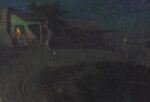
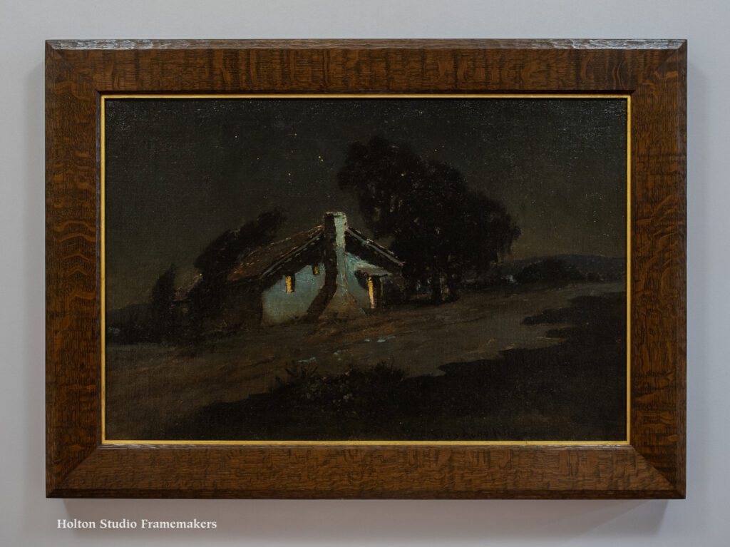
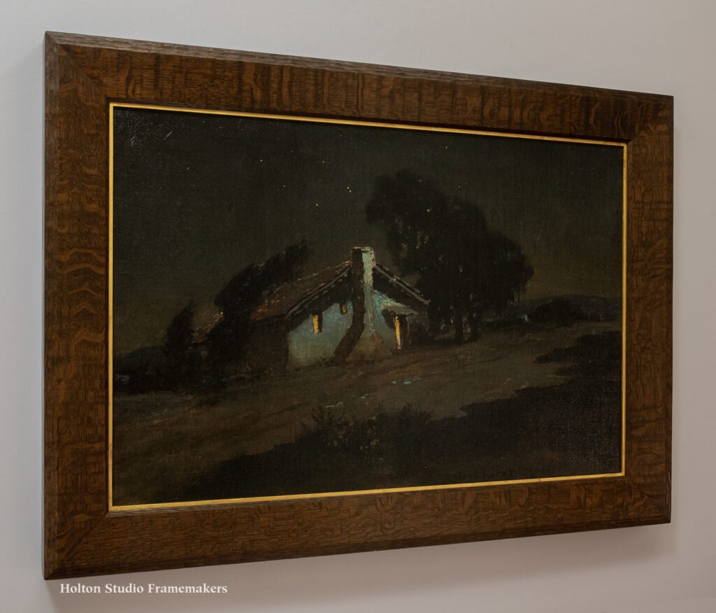
I seem to have a theme going. Today’s post is my third in a row featuring a painting of an adobe. This one, an oil on canvas titled “Moonlight Adobe,” (no date; 20″ x 30″) depicts a simple dwelling dating from the era of Spanish and Mexican settlement on the Monterey Peninsula. It beautifully typifies the work of Charles Rollo Peters (1862-1928), a key figure in the artist colony that thrived at the turn of the twentieth century amidst the remains of that settlement. It also typifies the admiration California’s artists, writers, and architects felt for pre-industrial vernacular architecture and for the simpler, more harmonious way of life it stood for. As Peters told Frank Norris (in the interview quoted at length below), moonlight paintings were, in an age of specialists, simply his specialty. But to accept this explanation for his fixation at face value would be a mistake. Given the vast number of paintings he did on this theme—some of which are shown at the bottom of the post—they amount to a sustained meditation during a rare still moment in an age of rapid and relentless change.

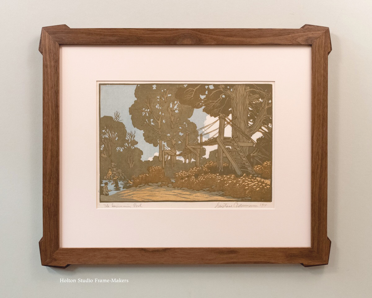
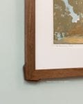
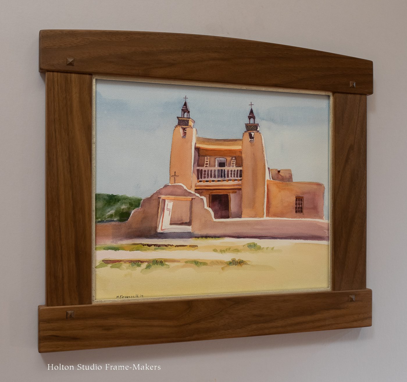
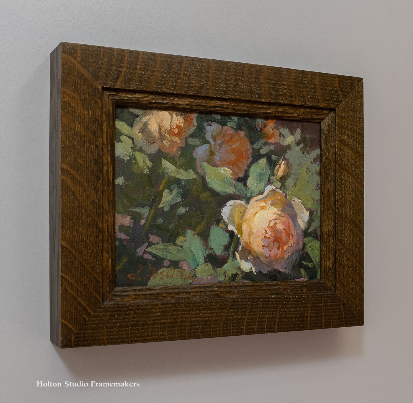
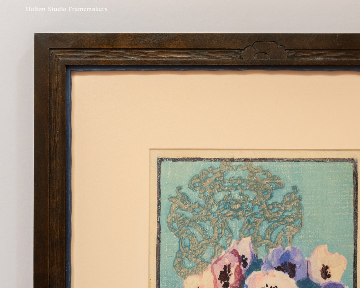
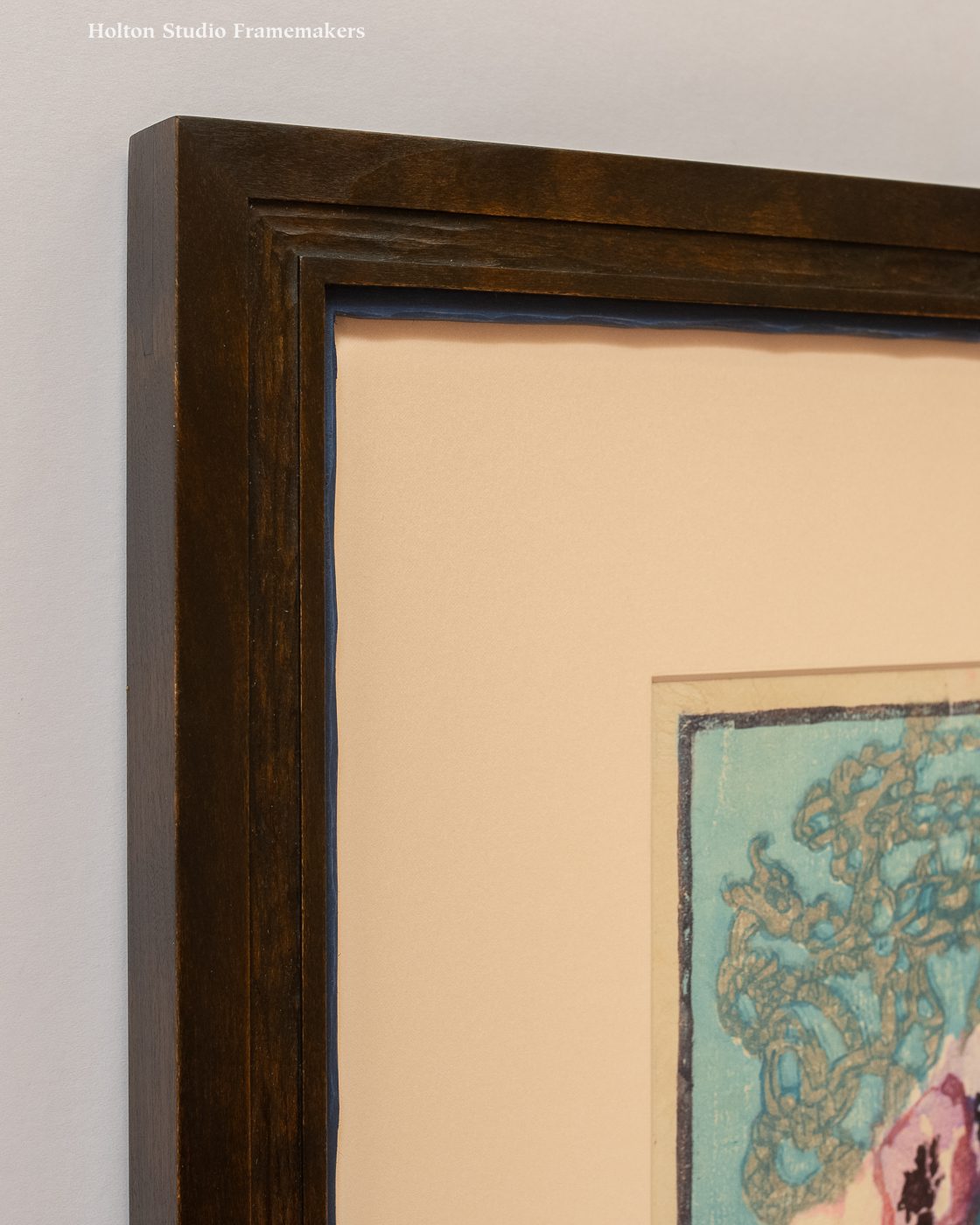
We framed “Moonlight Adobe” in a stained quartersawn white oak frame, No. 22.6 CV at 3″ wide (at right). To suit the simple architectural subject of the painting, the architecture of the frame had to be simple and reflect what’s so appealing about the adobe home: that our part in its making is subordinate to nature’s part—the beauty of the wood it’s made from. The overall form is a slope that repeats the angle of the hillside as well as the home’s tile roof. A sight edge chamfer and reverse bevel at the back edge add to the theme of angularity. Those two elements are carved, which picks up the textures of the surfaces depicted as well as that of the painted canvas. The hand carving is also a nod to a key virtue of these old structures that artists like Peters deeply admired: that they were, as Charles Keeler put it, “the work of hands instead of machines.” The slender sight edge slip is finished in bronze wax to echo the inviting lights inside the house and to give the dark painting emphasis on the wall.

Framed painting by Chas. Rollo Peters

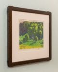
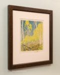
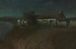
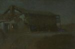
Other Charles Rollo Peters Moonlit Adobes We’ve Framed—

Read more here…

Frank Norris on Charles Rollo Peters

In 1897, the young novelist Frank Norris sought out Peters at his home in Monterey, writing a short profile of the painter for the San Francisco magazine, The Wave. Below is my abridged version of that article. The full text may be found here.

Peters met us at the gate, standing on the steps that were the vertebrae of a whale. He was booted to the knee, and wore a sweater and a sombrero, and looked just as picturesque as I had hoped and expected an artist should look… In Brittany he would have worn sabots and a beret, and perhaps a “blouse.” In England it would have been a velvet jacket, but in Monterey, mark you, the artist wears a sombrero and high boots, and stands on steps that are the joints of a whale’s spine. Where else would you see an artist with such attributes?

We went into the studio.

Redwood, unfinished, and a huge north light, a couch or two, a black dog, lots of sunshine, and an odor of good tobacco. On every one of the four walls, pictures, pictures, and pictures. Mostly moonlights, painted very broad and flat…

Peters told me he was “going in” for moonlights.

That’s a good hearing for his style, as the art critic would say; is “admirably adapted” for those effects where all detail is lost in enormous flat masses of shadow. Just the effect to be seen on a moonlight night.

“You would be surprised,” says Peters, “to see how many different kinds of moons there are.” He illustrated what he said by indicating one and another of the sketches. “There is the red moon, when she’s very low, and the yellow moon of the afternoon, and the pure white moon of midnight, and the blurred, pink moon of a misty evening, and the vary-tinted moon of the drawing. She’s never the same…

“It’s the specialists,'” Peters continued,”that ‘arrive’ now-a-days, whether they specialize on diseases of the ear, or on the intricacies of the law of patents, or on Persian coins of the 14th century.”

“Or on pictures of moonlight,” said I.

“Precisely; that’s my specialty.”

Peters lives in Monterey on a hill-top, and paints from dawn to dark. After dark he goes out and looks at the moon, and the land and the shore in her light, and at the great cypresses. He don’t paint there. Just looks and looks, and takes mental photographs, as it were — impressions he remembers and paints the next day. Singularly enough Peters, though going in for moonlights, does not paint them en plein air — how could he, for the matter of that, without any light to see by — but he does take a sort of combination note and sketch book along with him…

Peters thinks Monterey should be a great place for artists. He has sketched nearly everywhere, and maintains that there is more artistic “stuff” right down there in the old town than there is in Barbizon, even, or in the artist towns of Brittany. A few artists, in fact, have already “discovered” the place…

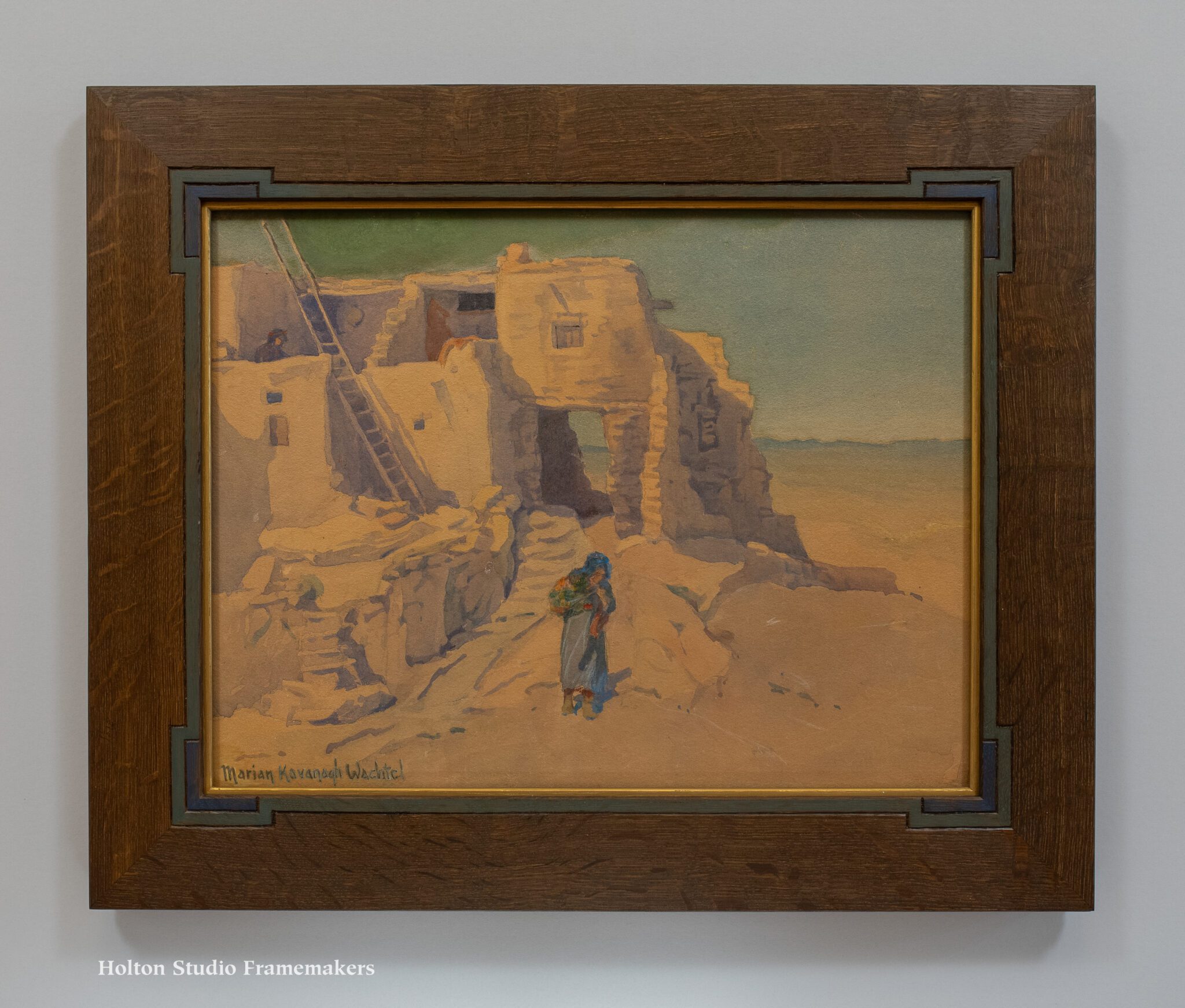
Other Peters Moonlit Adobes from Around the Web—

Framed painting by Chas. Rollo Peters

Framing the Old Church in Las Trampas

Here’s a watercolor we framed earlier this year. Signed “M. Fitzgerald” (the artist is a friend of our customer), the 13″ x 15″ painting depicts San Jose de Gracia Church in Las Trampas, New Mexico. The church, a national historic landmark, was built in the 1760’s. Our 2-1/2″ wide mortise and tenon frame is in walnut with inlaid square plugs accenting the joints, and a white gold slip to repeat the highlights of bright sun on the church’s adobe walls. I’m pleased with the resonance between the architecture of the frame and the historic architecture of New Mexico.

Watercolor of San Francisco de Asis Mission Church in Taos, New Mexico

The National Park Service’s page for the church notes the the simple nave is adorned with paintings. I found this picture below online, showing the well-adorned nave—and some intriguing frames.

Church interiorHere’s part of the ceiling. Looks like a lot of symbolism to decipher. But architectural decoration like this is always interesting as part of the lineage of frames. I suppose this is another direction we could have taken in framing our little watercolor. A little busy, though.

Decorated church ceiling

San Francisco de Asis Mission Church in Taos, New Mexico

A Carved and Painted Frame for Marion Kavanagh Wachtel

This is a watercolor by Pasadena artist Marion Kavanagh Wachtel (1870-1954), “Walpi – On the First Mesa” n.d. (after 1904), 13-3/4″ x 18″. The 2-1/2″ wide flat frame profile is in fumed quarter sawn white oak. I incised a simple line pattern, outset at the corners, and painted it blue and green to harmonize with the painting. Proud splines articulate the corners and subtly repeat the corner pattern on the face. We finished the frame with linseed oil and wax. A 1/8″ slip or fillet finished with bronze wax provides emphasis.

We framed the painting for California Historical Design, and it’s available from them, here.

MK Wachtel watercolor, framed

MK Wachtel watercolor, framed, detail

Marion Kavanagh Wachtel—

Marion Kavanaugh was born into an artistic family in Milwaukee, Wisconsin on June 10, 1870. She studied at the Art Institute of Chicago under John H. Vanderpoel and in New York City with William Merritt Chase. She was popular in Milwaukee as a portrait painter, and for several years taught at the Art Institute of Chicago.

In 1903, she was commissioned by the Santa Fe Railway to paint scenes in their California ticket offices. In San Francisco, her landscapes gained notice, and she became a pupil of William Keith. When Keith learned of her intention to move to southern California, he suggested that she study with Elmer Wachtel. A romance blossomed and she and Wachtel married in 1904. (It was soon after her marriage that she dropped the “u” from her maiden name.)

Marion Kavanagh Wachtel paintingOne biography says that “In deference to her husband, she painted exclusively in watercolors, ” while another states that Elmer worked in oils “and Marion in watercolors to avoid competition between each other,” implying a bit more equity in the decision. In any case, Marion established a strong reputation in watercolor on both coasts. In 1921, she helped found the California Water Color Society.

The couple’s home was in an art community near the Arroyo in Pasadena, a favorite location for landscape painters of that era. There were beautiful oak, sycamore, and eucalyptus trees lining the valley, and a clear view of the Sierra Madre Mountains. These local scenes became the subjects for many of her watercolors. The Wachtels enjoyed extended painting trips to remote areas of California and the Southwest. Often camping, Marion Kavanaugh Wachtel paintingthey explored areas near the coast and inland valleys, seeking out California’s beautiful landscape and unique natural light.

After Elmer’s death in 1929, Marion continued to live in the Arroyo Seco home, but was inactive as an artist for a few years. By the early 1930s, though, she was painting and exhibiting again—and had returned to oils.

She died at her home in Pasadena on May 22, 1954.

(Adapted from AskArt.)

—Tim Holton

MK Wachtel watercolor, framed

Walpi Village—

The website of the World Monuments Fund describes the village:

Perched on a narrow finger of First Mesa in the heart of the Hopi Nation in northwest Arizona, Walpi is the mother village of 11 surrounding Hopi settlements. Originally established in the thirteenth century at the base of the mesa, Walpi was moved to its current location as a defensive measure after the Pueblo Revolt against the Spanish in 1680. The village was built using hand-trimmed sandstone and earth. The roofs consist of lestavi (structural beams) and wu’na o’ye (smaller poles resting on the lestavi) capped with layers of brush and clay. The village has retained its historical integrity by avoiding the introduction of running water and electricity, and the walls of its buildings are still hand-plastered by local women. Walpi leads the surrounding First Mesa villages in religious rituals and is also the residence for the Kikmongwi, the village leader. It is a significant Native American site that represents traditional Hopi architecture and identity. Continue reading…

Highlighting Inga Poslitur

During our last show, visitors walking in the door were often stopped in their tracks by one of the larger paintings directly facing the entrance, a field of poppies titled “California Superbloom.” This perfect welcome to “California Wildflowers” was painted by guest artist Inga Poslitur. That show having closed, Jessie has re-hung the gallery with paintings by our roster of premier landscape painters, and highlighted at the center of the display a lovely array of Inga’s delightful recent work. One of my favorites by this San Francisco painter (scroll down for her bio) is the sweet little 6″ x 8″ titled “Lizz Roses,” shown here. It’s in a hand carved quartersawn white oak frame (No. 1.4 CV).

All of Inga’s paintings may be viewed online, both here on our main website and on our e-commerce site, here.

Please come by Saturday—tomorrow!—from 2 to 4 to meet Inga Poslitur!

—Tim Holton

Oil painting by Inga Poslitur

Inga Poslitur
“Lizz Roses”
Oil on board, 6″ x 8″. $650 framed.
BUY

Inga Poslitur

Inga Poslitur

About Inga—

Inga Poslitur is a representational artist, illustrator, and muralist who brings a high-level of technical skill and aesthetic sensibility to both her landscapes and narrative-centric fantastical paintings. Inga’s passions are outdoor painting, traveling, and teaching art. Born in Russia, she has a BFA from the Fashion Institute of Technology in New York City and an MFA in Illustration from the University of Hartford. She enjoys honing her skills by consistent, intentional practice in the studio, by painting directly from life, and learning from her favorite contemporary artists. Inga has exhibited in many museums, galleries, and art institutions. Her work is in numerous private collections in America and abroad. She is a full-time working artist and educator, and lives with her family in San Francisco. Learn more about Inga on her website.

Again, you can meet Inga at the Gallery tomorrow, Saturday, from 2 to 4.

View the show online here and here.

View Gallery location and hours…

Inga Poslitur painting

Framing Heinrich Carl’s “The Oakes”

Another “printable” frame for a woodblock, as was the frame in my last post. This one’s for a print made around 1920 by the little-known Heinrich Carl. The image size of “The Oakes” is about 10-1/2″ x 8″. For its muted palette, we used a brown solid core rag mat, and a lightly stained carved walnut frame, 1″ wide, with a narrow slip painted to match the green in the print.

—Tim Holton

Framed woodblock print by Heinrich Carl

A Frame Is a Kind of Flower: Framing Margaret Patterson’s Anemones

This is a colored woodcut titled “Anemones,” (ca. 1920, 9-3/4″ x 6-7/8″) by New England print maker and painter Margaret Jordan Patterson (1867-1950).

Margaret Jordan Patterson, photo

Margaret Jordan Patterson

The 1-1/8″ wide frame is cherry with a deep red-brown stain matching the blossoms’ clustered anthers. It has a carved slip painted in the print’s darkest blue. The design is in one way typical of what I like to do with block prints—carving a flat frame in the same fashion as the carved woodblock used to make the print. I call these “printable” frames. My craftsman’s understanding of the nature of the frame has led me to emphasize the frame’s joinery, its corners, as points of power and significance. But centers of the frame’s members also have their power and significance in relation to the composition of the picture the frame serves. In this case, Patterson’s frankly centered arrangement strongly suggested the centers of the frame’s sides are where I should place a decorative accent, mimicking Patterson’s anemones with a floral touch.

Framed for California Historical Design.

See other Margaret Patterson block prints we’ve framed…

—Tim Holton

Framed Margaret Patterson block print Framed Margaret Patterson block print Framed Margaret Patterson block print—detail Framed Margaret Patterson block print—detail


Final Week of Our “Superbloom of Local Talent”

Our current show, “California Wildflowers,” enjoyed some publicity and lavish praise in last week’s issue of our local print paper, The Berkeley Times. Reviewer Todd Kerr called it “a superbloom of local talent,” and “eye-dazzling.” Maybe we should get one of those lit-up Broadway-style theater marquees out front for showing off such critical acclaim! In any case, below are are three paintings the paper picked out as favorites.

The show closes this Saturday, so if you haven’t seen “California Wildflowers” yet, don’t let this “must-see exhibit” pass you by!

—Tim Holton

Framed Terry Miura painting

Terry Miura
“California Brittlebush”
Oil on panel, 12″ x 12″. $2,000 framed.
BUY

Framed Christin Coy painting

Christin Coy
“Springtime – Giacomini Barn, Pt. Reyes Station”
Oil on canvas, 9″ x 12″. $1,550 framed.
BUY

Framed James McGrew painting

James McGrew
“Pacific Dogwood and Bridalveil Fall”
Oil on panel, 11″ x 14″. SOLD

Framing Dard Hunter and the Roycrofters

This is a set of six hand-colored prints by Dard Hunter (1883-1966), framed in pairs. Made in 1909-1910, they depict the architecture of the Roycroft campus in the heyday of the Arts and Crafts Movement. Dard Hunter was a major Arts and Crafts figure, especially in the realms of graphic design and printing. Picture frame corner sampleSo for me, as a great believer in that movement, it was a treat to get to frame these.

Each image is about 3-1/4″ x 5-1/4″. The fumed quartersawn white oak frames are 3/4″ wide. Their outside dimension are 15″ x 11″. The frame design follows the obvious cue provided by Hunter’s borders of little squares. The profile is our No. 15, which we embellished with some carving and painting: squares carved at the corners (a simpler version of this design is shown at right), the panels between the corners gouged for some texture, and then those panels and the corner squares painted in complementary green and red to celebrate Hunter’s vivid coloring. Trevor made the frames, and Sam and Avi finished them.

Set of framed Dard Hunter prints

Dard Hunter

Dard Hunter

Dard Hunter III of Dard Hunter Studios writes that in 1903, his grandfather’s eyes were opened to Arts and Crafts architecture by a stay at The New Glenwood Hotel—now The Mission Inn—in Riverside, California. Soon after, he offered his services to the prominent Arts and Crafts leader Elbert Hubbard and joined Hubbard’s Roycroft community in East Aurora, NY. There, swept up in the spirit of the movement, he explored a range of arts, including furniture, stained glass, pottery, and jewelry, as well as the book arts he would later focus on, securing for himself an enduring legacy as one of the most important modern figures in that field. (In his lifetime, he wrote an incredible twenty books on papermaking, for example.)

Hunter also took to perusing “journals such as Deutsche Kunst und Dekoration, gaining a sense of design in the Viennese fashion,” according to Dard III. When Hunter married pianist Edith Cornell in 1908, “he was so enamored with the work of Josef Hoffman and the Wiener Werkstatte that they spent their honeymoon in Vienna. For the next few years, Hunter incorporated the geometric patterns and highly stylized figures into his work with the Roycrofters.” You can see the influence on Hunter of Hoffman’s interior drawings shown at the bottom of the post.

These prints, then, are an important expression of international cross-fertilization in the history of the Arts and Crafts Movement in America. They also point to the significance of architecture in the Movement, and its place at the heart of Arts and Crafts ideals—the mother of the arts under which they are all practiced. Framing depictions of architecture always carries special opportunity for harmony between the pictorial subject and the architecture of the frame. But in the case of these images of the iconic Arts and Crafts campus of the Roycrofters, imbued as it is with the unifying ethos of the Movement, that’s especially true.

Below are interior designs by Hoffman, clearly showing his influence on Hunter. In particular, note Hoffman’s fondness for patterns of squares.

Learn more about Dard Hunter at Dard Hunter Studios. (Dard III’s excellent short biography is here.) If you’re ever in the vicinity of Chillicothe, OH, south of Columbus, it’s worthwhile visiting Dard Hunter’s home, Mountain House to see the wonderful museum Dard III has set up in tribute to his grandfather.

Learn more about the Roycroft community here and here. And watch PBS’s “Head, Heart, and Hand: Elbert Hubbard and the Roycrofters.”

—Tim Holton