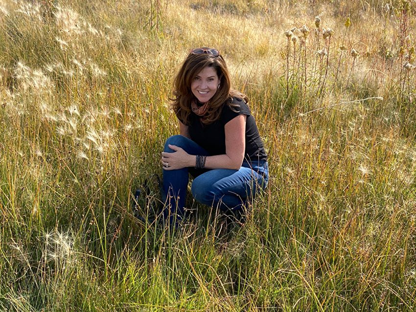
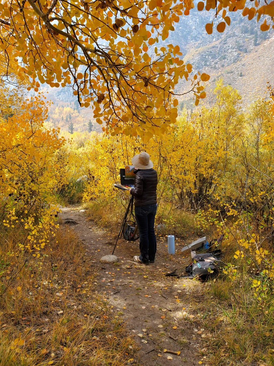
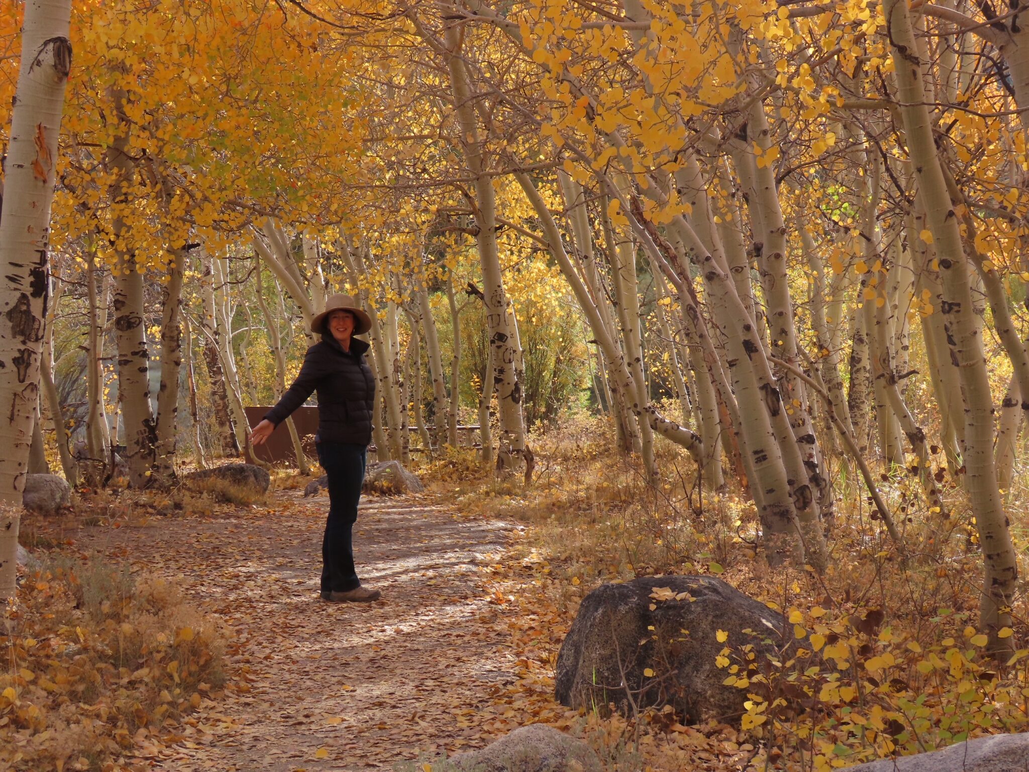
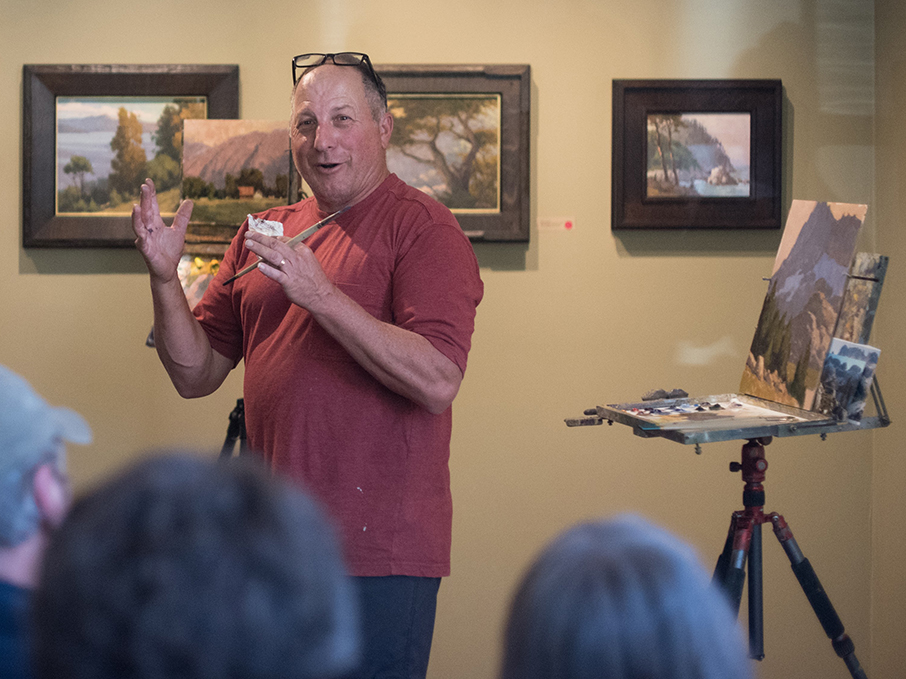
“This series of paintings is based on the exploration of dusk to dawn,” Kim Lordier says of her work in our new show opening this coming Saturday. The show is titled “On the Threshold,” and Kim has captured its theme with her representations of “illuminated crossings through a threshold of light and absence of detail.”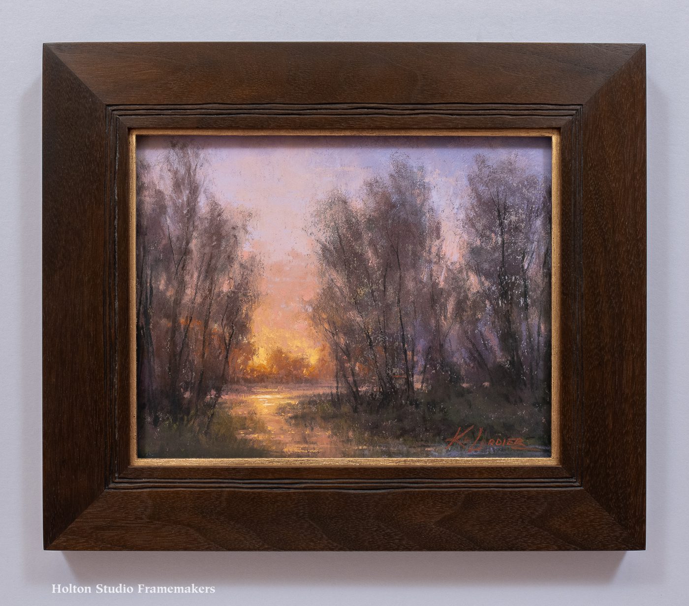
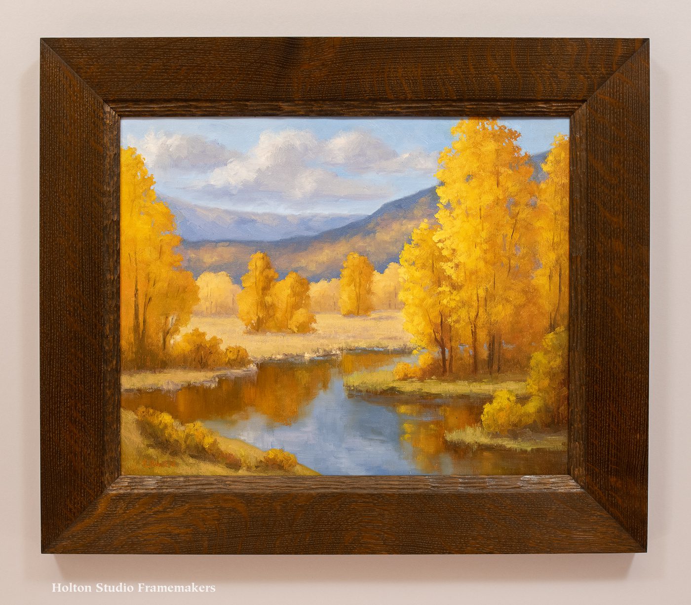
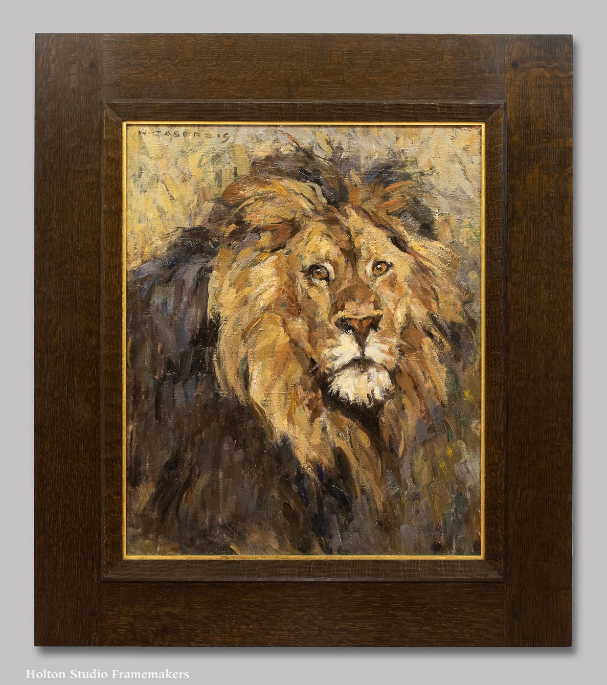
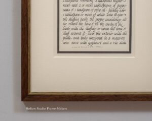
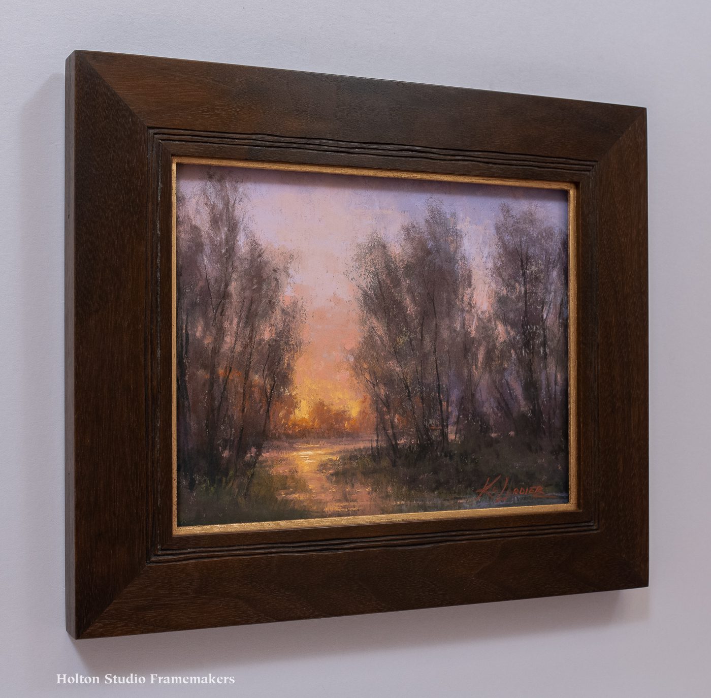
 “Intersection,” which is 8″ x 10″, offers just a little taste of the gorgeous grouping of Kim Lordier’s landscapes we’ll have on display. We set it in a 2″ wide mitered mahogany flat which Trevor Davis carved with three fine freehand flutes. A rose gold slip catches the setting sun’s rays.
In the past two decades Kim has steadily risen in her artistry and the esteem of her peers, winning awards—most recently receiving the American Tonalist Society’s Curtis Hanson Best in Show Award at the Salmagundi Club—and being showcased in magazines and online.
“Mother nature is my church,” Kim has said. And indeed, her reverence for the land and the natural creation permeates every picture she makes.
 Come meet Kim Lordier at the opening reception for the artists next Saturday from 2 to 4. “On the Threshold: Ellen Howard, Tia Kratter, and Kim Lordier” will run till August 26.
Kim has put up a beautiful digital lookbook for the show here…
See Kim interviewed by Carl Olson on the Artful Painter Podcast…