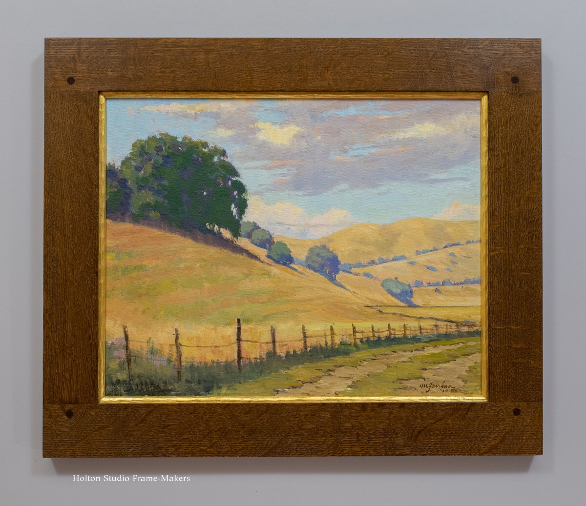
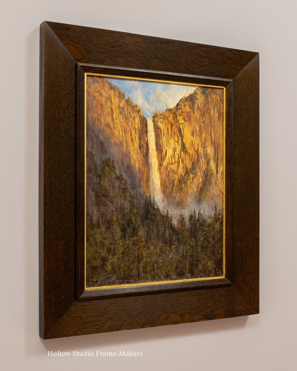
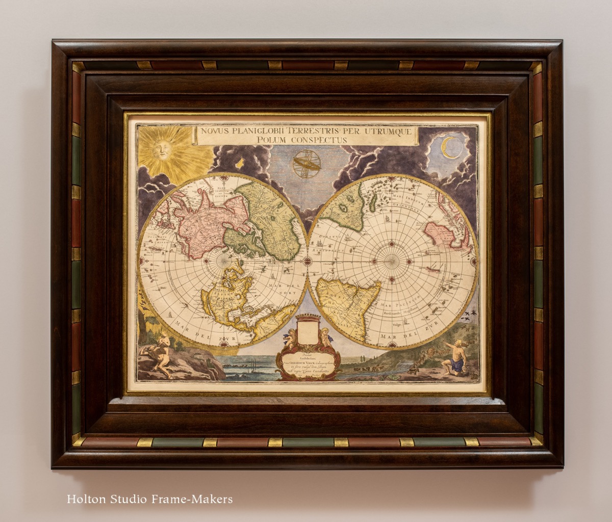
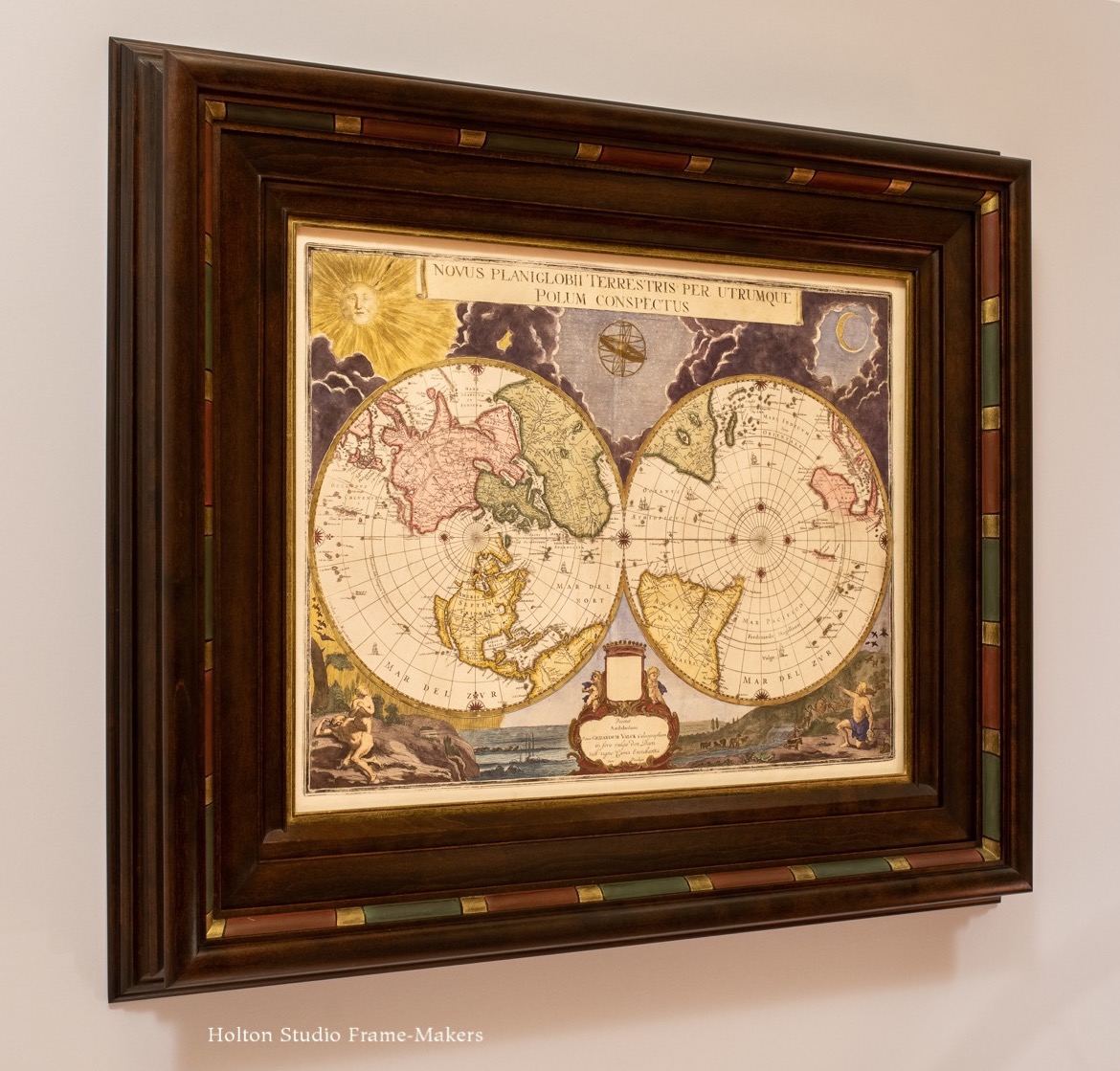
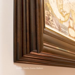
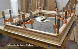
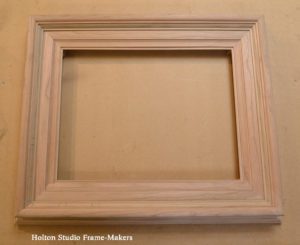
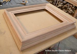
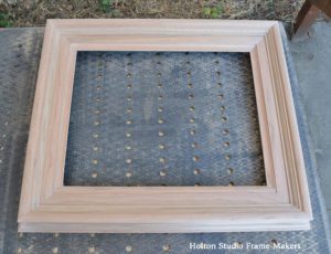
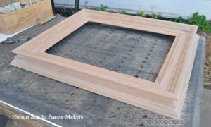
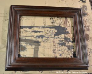
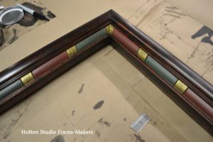
This double polar projection, printed and colored in the 1670’s, is an extraordinary specimen of the Dutch Golden Age of mapmaking. It was printed from a copper engraving produced in the previous decade in the studio of Joan Blaeu (1596-1673), chief mapmaker for the Dutch East India Company. The Dutch Golden Age was not only a high point for mapmaking but also for the art of the picture frame, so there could be no holds barred in fabricating a suitable setting for this important and beautiful piece. For the 16″ x 21″ intricately decorated map we designed an equally decorative frame reminiscent of the ebony and ebonized fruitwood frames of the time. But instead of a black wood, we used cherry stained deep red-brown to better suit the print’s splendid coloring. The frame, including the slip, is 5″ wide.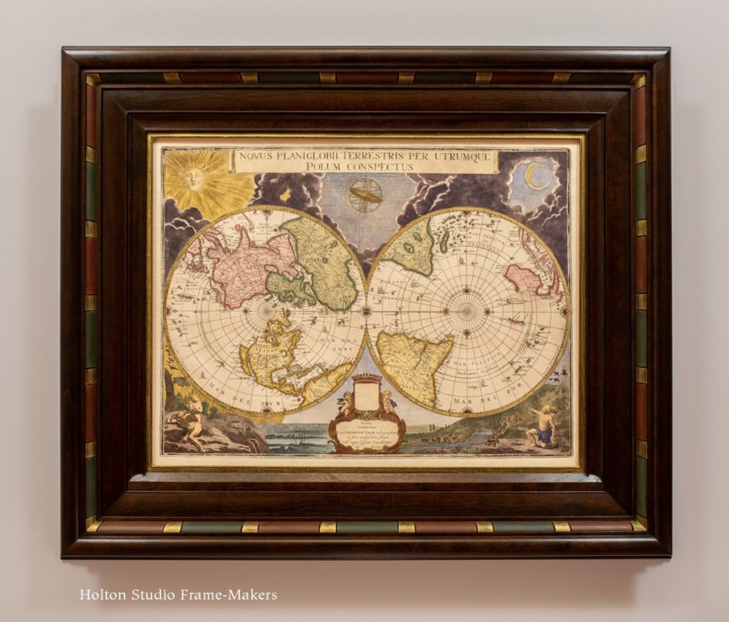
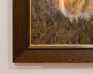
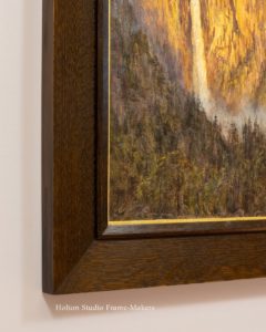
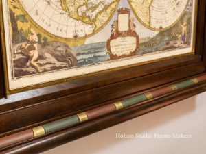
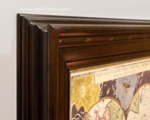
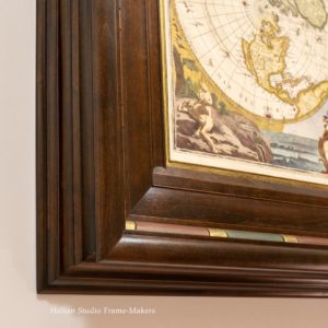
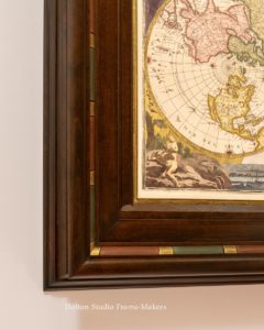
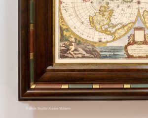
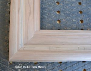
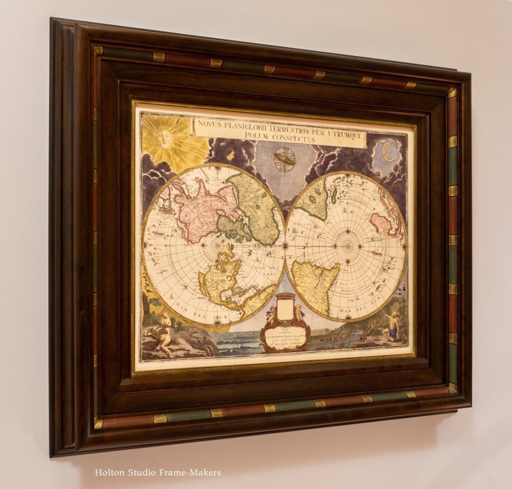 Although elaborate, everything about the frame is justified by the print, beginning with its curvaceous profile inspired by Blaeu’s billowy clouds. (My customer loves deep profiles with dramatic backs, and I’ve grown fond of the effect myself.) The refined line work and detail characteristic of maps is acknowledged by the frame’s fine beads, subtle complementary elements, and its intricate back. And of course the exuberant use of color could not be ignored—thus the rich stain and red and green painted ovolo on the inside of the cap molding. The gold bands between the red and green sections and the gold slip are, rather than gold leaf (which would have been too bright), metallic powders suspended in wax. They match exactly the gold ink of the print. Note how those bands, instead of being straight, are subtly angled to carry out the radiating features of the print.
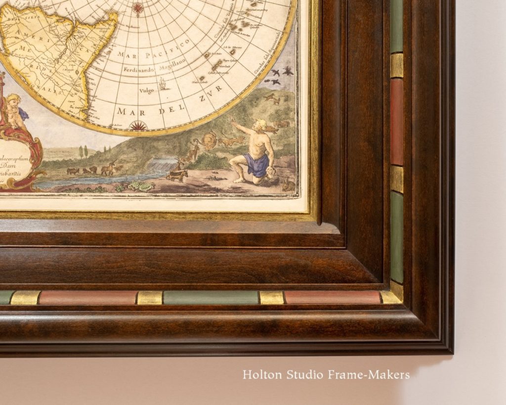
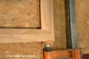
One key detail of the frame is the diminutive sill on the bottom rail’s inner molding. Dutch and Flemish sill frames were part of the sophisticated perspectival strategy of Northern Renaissance painters; they were not, I don’t believe, generally used for framing maps. But my customer, who was intrigued by
the sill frames we explored for our Karima Cammell show last year, felt that the naturalistic landscape in which the projections are set, and especially the crucial foreground of the map (which shows, on the left, Eve emerging from Adam’s rib and, on the right, a postlapserian clothed Adam waving farewell to the creatures of Eden) justified the sill in the same way the naturalism of portrait and landscape paintings did. By continuing Blaeu’s carefully rendered foreground, the sill, in other words, offers us a threshold across which to enter the world of the Dutch Golden Age.
Some history of the map
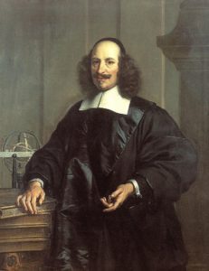
Joan Blaeu (1596-1673)
In the 1660’s Joan Blaeu had produced his eleven-volume masterpiece, the Atlas Maior, still considered today one of the most beautiful and expensive books ever made. The cartographer planned to follow up on the atlas with a cosmology, and had apparently planned to include this polar projection in that work. Sadly, however, in December 1672 a fire destroyed Blaeu’s Amsterdam studio. A contemporary source reported that “Mr Blaeu’s loss is great. All the plates were in the fire and are considerably damaged.” Indeed, all the presses, paper stock, ink and a large warehouse of books were lost as well. Devastated, Joan Blaeu died the next year. But somehow, the plate for our map survived and found its way to the publisher Gerard Valck. In his notes to me, my customer points out that, “The cartouche shows evidence of faint missing text, where Valck has carefully scraped out Blaeu’s name.” In any case, the map’s story demonstrates that such works must not be taken for granted, but treasured—an understanding justifiably expressed by framing.
In the seventeenth century mapmakers were acknowledged artists as much as painters were. Painters like Vermeer not only included maps in their paintings but rendered them with a level of detail and attention that betrayed great regard. As art historian James Welu explains,
“Cartography and visual arts were related activities: art and mapmaking interacted with each other: many cartographic elements, such as images, color, and lettering, were shared with art; tools and methods used to produce maps and artistic works were very similar in printmaking and in mapmaking: copperplate engravings, which were hand colored in later, required specific artistic skills; a significant number of both little-known and the most outstanding artists were involved in decorating maps; maps and art works were often performed by the same artists, engravers and publishers who worked for both areas; artists, engravers and mapmakers belonged to the same group of society that determined the development of culture in many areas.” (From
“Vermeer’s Maps.”)
In this age when the division of the arts had not yet become entrenched, frame making too was recognized as an art no less than painting. It’s only fitting that such attention be lavished on the framing of a fine map such as Joan Blaeu’s.


.jpg)