Last Saturday’s opening for our show “David Lance Goines: Posters and Prints” was a rousing success. The resonance of Goines’s work for Berkeleyans was palpable, and many memories of the artist were shared. I met a man who’d gone to high school with Goines. At least two models for his posters were here. A longtime employee of Peet’s Coffee remembered Goines coming in 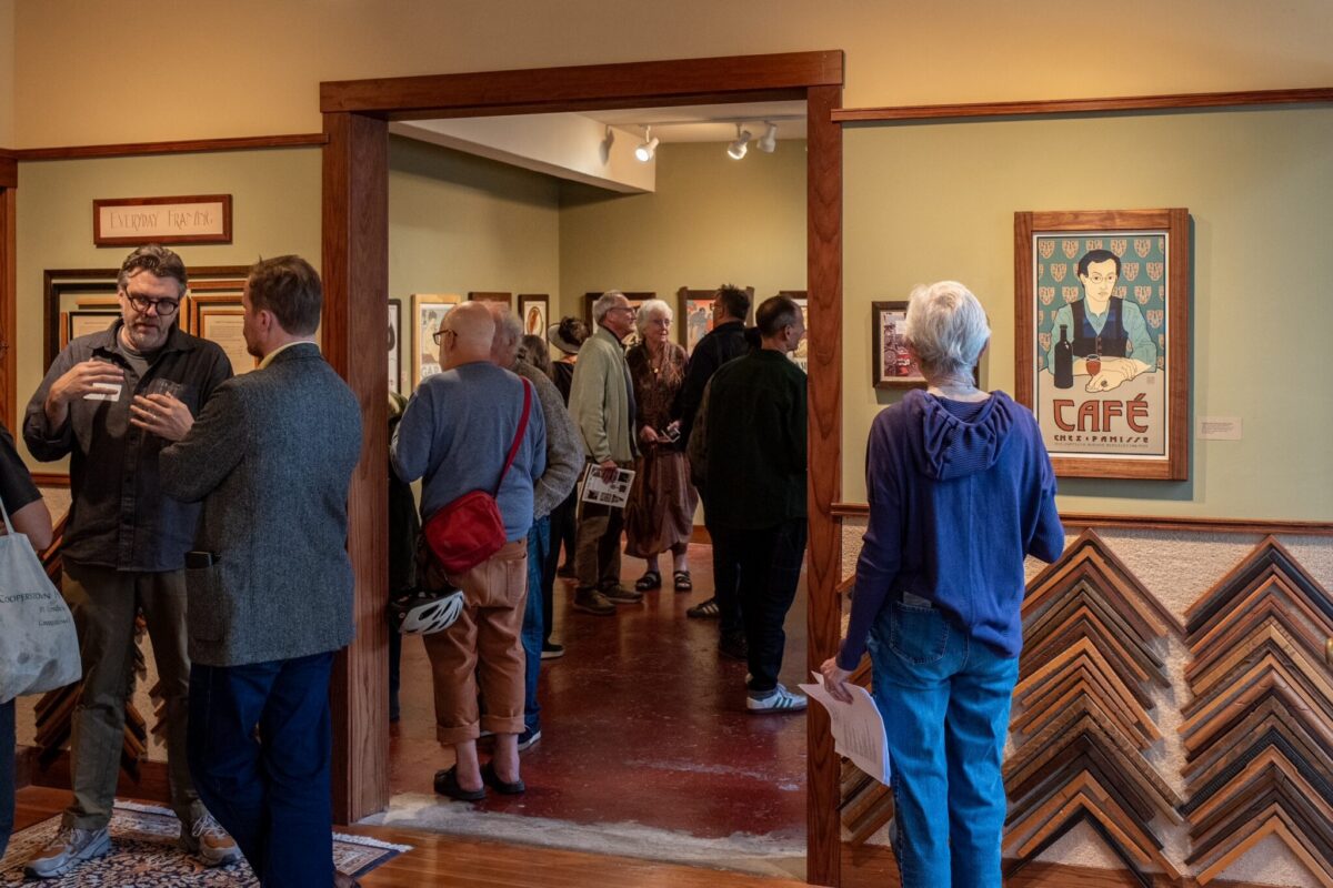 regularly (back when Mr. Peet was still around) for his pound of Italian roast. (I’ve recounted my own favorite recollection of the artist, my inspiring first meeting with him, here.)
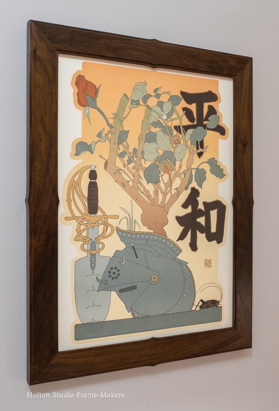
I was happy to have one couple decide to give the piece featured below a forever home. (More are available.) The 24″ x 17-3/4″ poster, is number 115 of 255 posters made over the course of Goines’s career. Generally called “Peace,” on his website, the artist titles it “Hei Wa,” and explains,
This poster was done in concert with 120 other American designers, each of whom also produced a poster, for exhibition on August 1st, 1985, at the Hiroshima Museum of Art. This exhibition coincides with the fortieth anniversary of the atomic bombing of that city. The Japanese characters are approximately translated as “No War.”
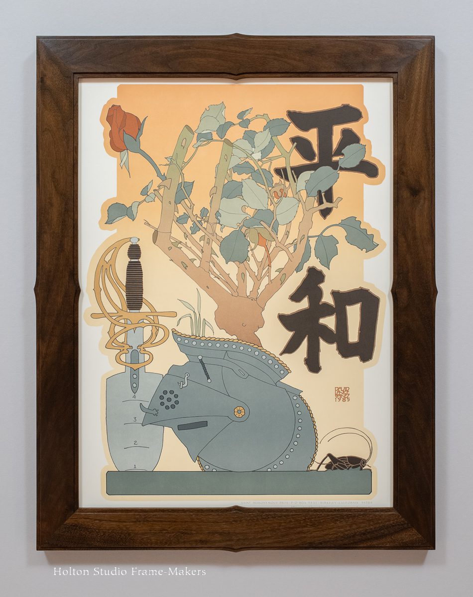
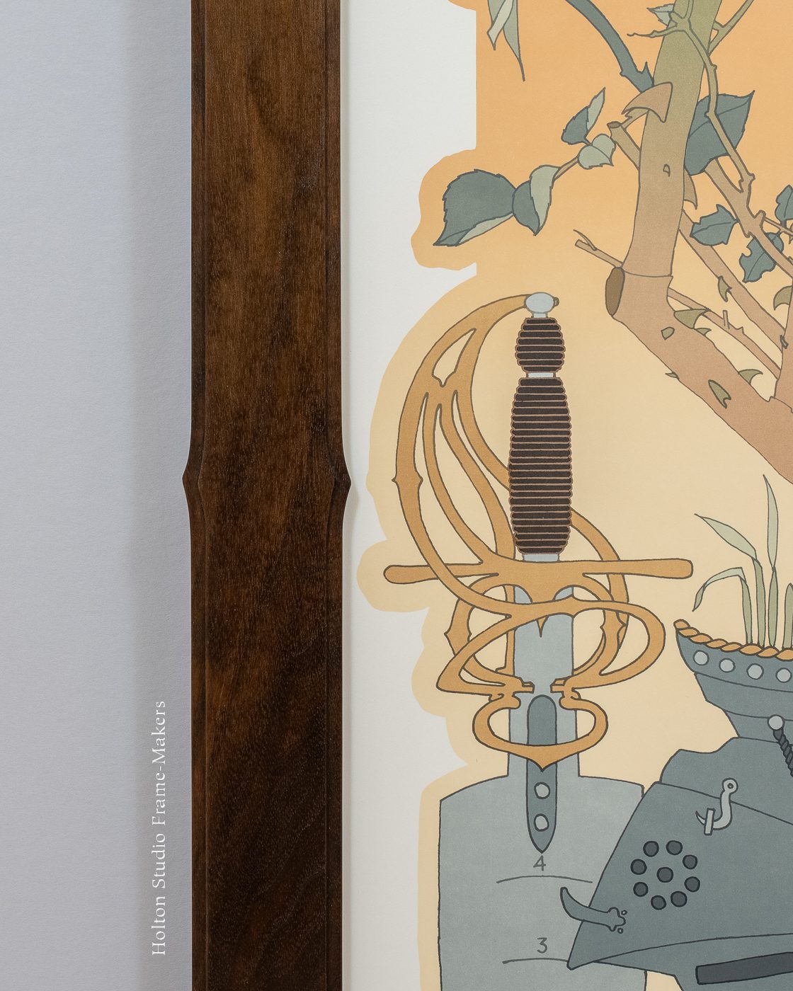
Like the Berkeley Horticultural Nursery poster featured in my last post, this one draws heavily on Japanese printmaking. And like that one, the frame is walnut finished with black wax.
One reason I love framing Japanese prints is that they frequently express a great deal of reverence for the decorative arts, which is a natural cue—and an enticing challenge—for the picture frame maker charged with providing the print a suitable setting. In this case, Goines has cleverly illustrated the swords-into-plowshares theme by adding to a gardening trowel a fancy sword hilt. The basic frame profile—here I made it 2-1/4″ wide—is a simple and failsafe treatment for Goines’s work because of the way the inner and outer fillets resonate with the heavy but subtle secondary lines (I call them “shadow lines”) that he often adds to his primary lines. For this one, I gave the frame just a little shaping to echo the design—in particular that lovely, sinuous hilt. The fillets provide emphasis to the detail. The way the point on the hilt and the point on the 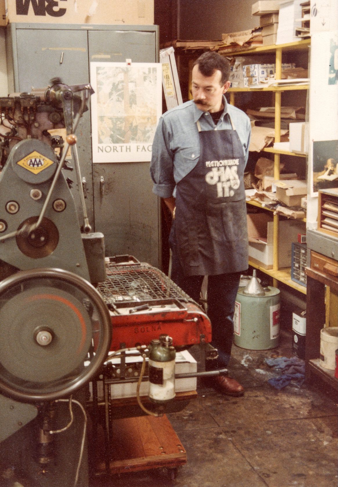 frame point to each other helps create harmony between the poster and its frame. Those center accents also echo the thorns on the rose bush.
As mentioned, this poster is sold, but more are available. (All works in the show were printed by the artist, and in limited edition; many are signed.)
“David Lance Goines: Posters and Prints” is on view through the end of the year. A sizable inventory of unframed posters is also on hand. The exhibit inaugurates our representation of the artist’s estate. We hope you’ll come!
—Tim Holton
At right: the artist in his studio,
St Heironymus Press, in 1980.