1993. Linoleum block print, 8″ x 6″. Framed in carved and painted walnut mitered frame with lap-joined walnut flat.
Chose walnut to harmonize with the background of the print as well as the branches. The lap-joined flat lies on top of the glass, hiding some margin as well as a gasket mat used simply for the archival purpose of separating the print from the glass.
This frame exemplifies how the accompaniment played by the frame can be vigorous as long as it works within its subordinate role. The process of block print making, which is carving, always prompts ideas for carving the frame. I just loved the little buds in the print and thought that form would make a suitable and simple running motif around the frame. I knew I could get away with such a strong pattern on such a small piece given that the buds play “second fiddle” to the spectacular flowers that are so dominant. A bit of color (just a touch of green on the carved buds, again, leaving the more dominant pinks in the print alone) was inspired by the lovely hues of the print.
People might question taking an all-out approach to framing something as seemingly inconsequential as a menu cover. But not only the beauty of this print but the consummate skill, sincerity of purpose and care the artist took with it inspired a bit of work on my part. I share Patty’s love of the pink magnolias found throughout Berkeley, their branches in bud almost as beautiful as in full flower. I framed this print in 1995 (I think), and it remains one of my favorites.
The work of artist, printmaker and designer Patricia Curtan draws on twin passions for gardening and cooking. She has a long association with Chez Panisse, involving cooking and writing as well as artwork for menus and cookbooks — most notably Alice Waters’s Chez Panisse Vegetables (1996, HarperCollins), Chez Panisse Fruit (2002, HarperCollins), The Art of Simple Food (Clarkson Potter, 2007) and The Art of Simple Food II (Clarkson Potter, 2013). She also has a title of her own, Menus for Chez Panisse: The Art and Letterpress of Patricia Curtan (Princeton Architectural Press, 2011), which gathers her work for Alice Waters, including the print featured here.
Each of Curtan’s linocut prints begins with a drawing which is then transferred to linoleum (a compound of linseed oil and cork powder) mounted to wood. The process requires a separate block for each color. The blocks are hand-carved to render a relief surface, then printed one block at a time on a 100-year-old press.
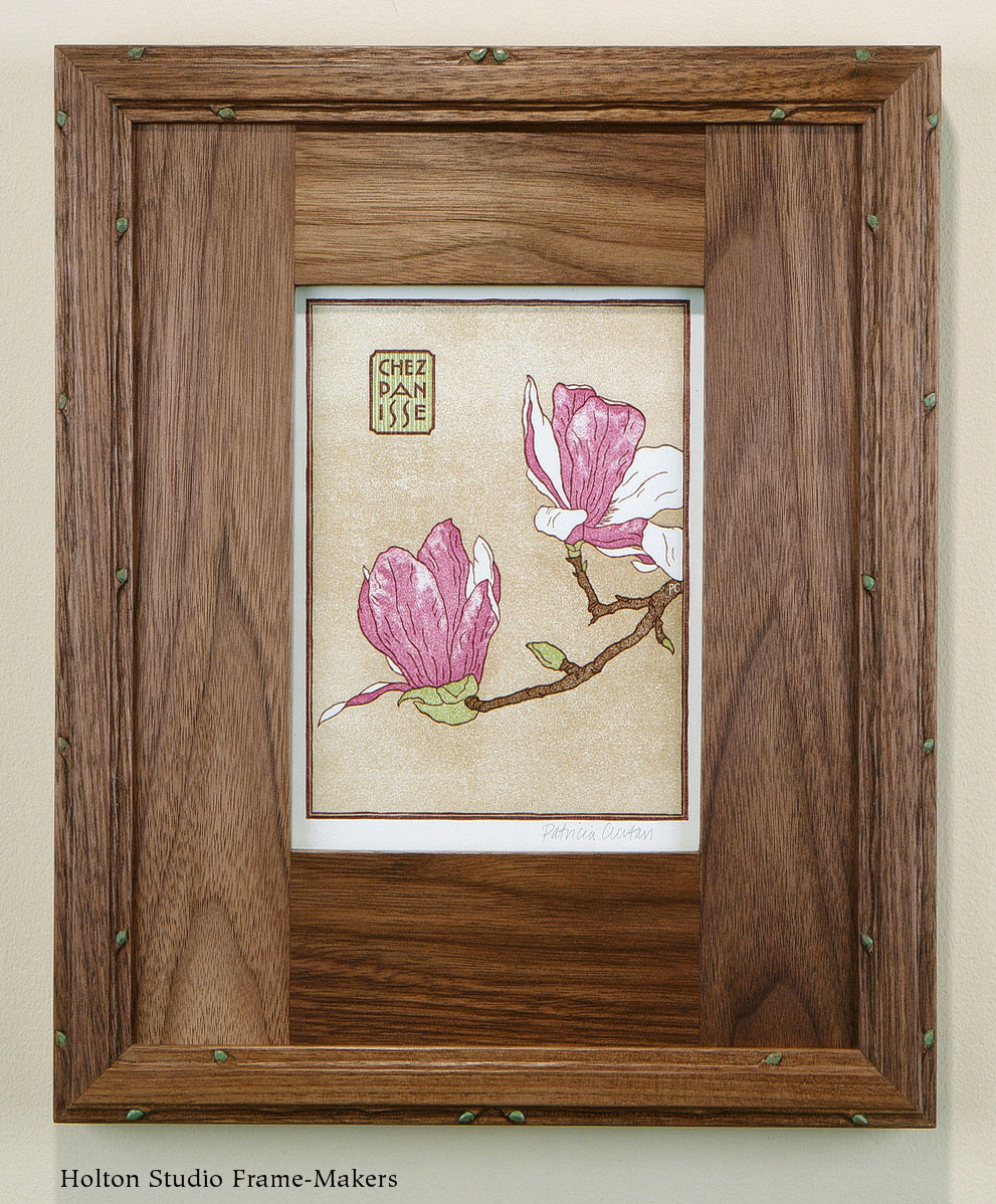
Patricia Curtan, "Magnolia Menu," 1993. Linoleum block print, 8" x 6". Framed in carved and painted walnut mitered frame with lap-joined walnut flat.
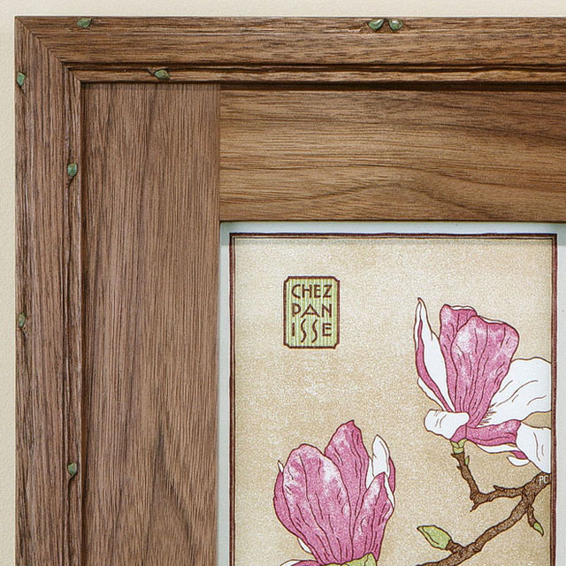
Corner detail