The twentieth century was not kind to picture frames. This Pablo Picasso etching of the artist’s model and muse (or one of them), Dora Maar, spent the better part of the last hundred years smashed into one of those acrylic box frames—the ultimate minimalist treatment. It didn’t even have a mat. After extraction and conservation work, the print came to me for something a little more worthy. At just 6″ x 4-1/2″, it needed not only something to do it justice artistically, but help to give it the necessary heft and emphasis to hold its own on the wall—while at the same time staying true to its fine delicacy.
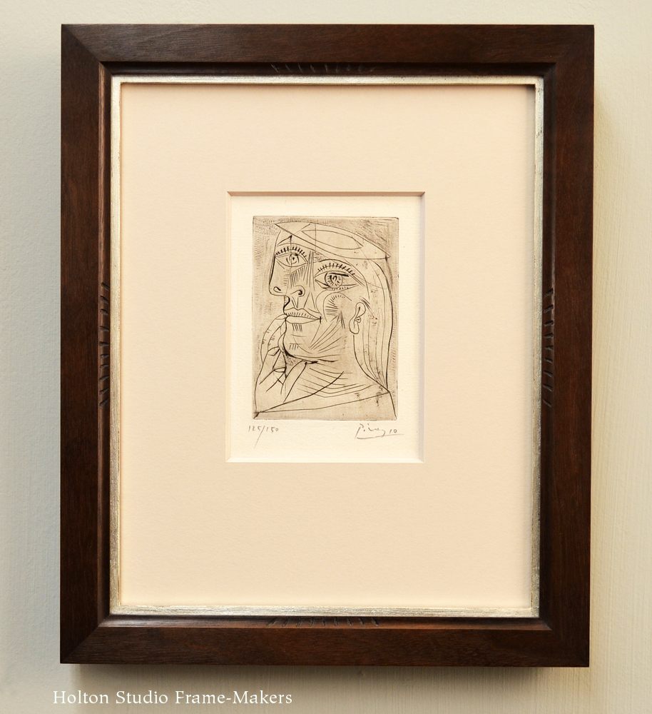
Pablo Picasso, “Dora,” n.d. Etching, 6″ x 4-1/2″. Custom carved mitered frame in walnut (Black wash)
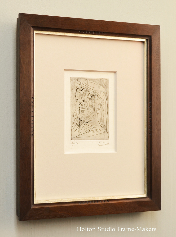
My solution was, first of all, to mat the picture plainly, simply using the background color of the print and an 8-ply mat (double the thickness of a standard 4-ply mat) to provide a sense of substance and the emphasis of a stronger shadow line that a mat adds; and wide enough to lend the print more presence without becoming pretentious (more on that in a second). Then we used a walnut frame, mainly flat because the print is deliberately a fairly abstract composition of lines on a flat surface; no illusionistic, formal rendering. The frame is plain but sympathetic with the lines of the print in three respects. Two have to do with the form: the coved sight edge and cut-in back (see photo below) echo the soft curved lines of the portrait. The other came to me as I searched the image for some way to give a nod to the artist’s use of engraved line, and settled on the eyelashes. In a recent blog post I pondered the notion of the frame as a kind of flower. Here it occurred to me that the frame is a kind of eye—an eye through which we see what an artist wants to show us. To suitably honor a picture by one of the twentieth century’s most celebrated artists, as well as to add emphasis, we chose to embellish the setting with a slender (1/8″ wide) white gold slip.
 When framing pictures by famous artists, we have to fight the temptation to be showy or pretentious. Great art is great art and deserves 100% effort by the frame toward simply seeing the picture. There is in such cases justification for extra emphasis by way of frame size, ornamental detail and so on. But such considerations must never be allowed to compromise our duty to help people see and enjoy the picture. The framing must remain subordinate to the picture and self-effacing. Every detail must be justified by the picture itself, and not allow in the distraction of extraneous history. When this is the case, those details enhance the picture and offer us a clear view; when details are not related to the picture they clutter and distract—motes in the eye that is the frame.
The same customer also brought in the Picasso print shown below. With very different lines—straight and angular, no curves—we opted for a more masculine frame, our No. 1100—1″. It too is in walnut with a black wash and includes a white gold slip. And it also has an 8-ply solid-core rag mat, but in a little different color from that used on the other piece, matching the slightly warmer background color of the print.
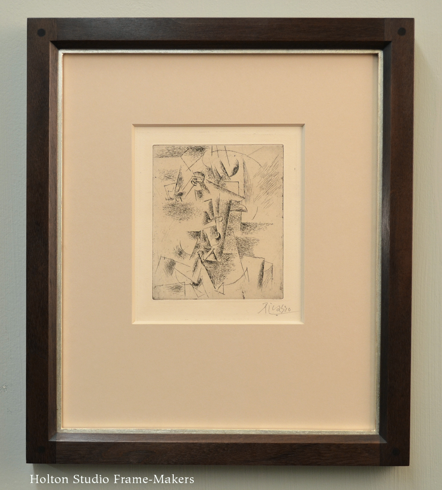
No. 1100—1″ with white gold slip on etching*