Last Saturday we hung our small exhibit, “Antique Japanese Prints and How to Frame Them.” I thought I’d post some thoughts on the second part of that. If you want to delve deeper in to this, please come to my presentation on Saturday, March 23 at 4:00, called “A Frame-Maker’s Approach to Framing Japanese Prints.”
The joy of framing Japanese prints is in the wonderful harmony that is possible between the print and its frame. This natural harmony stems from several factors, described here in reference to the examples in the exhibit of 19th century works by masters Kunisada and Kuniyoshi.
Beyond Style
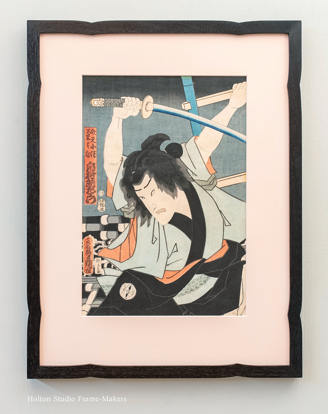
Utagawa Kunisada (1786-1865), “Ronin Wielding a Sword,” 1862.
It should go without saying that the frame should harmonize with the picture. Especially when framing historical work, though, many of us leap to the assumption that this means choosing a frame in a historically contemporaneous style. History is certainly an indispensable guide and a resource for harmonious frame design, but it must be used intelligently and with discretion. Just because a frame is historically “right” doesn’t mean it’s artistically harmonious. As I generally do, when framing this set of prints, I tried to ignore considerations of style, letting them float in the background of my thinking. Not being Japanese, had I aimed at my own idea of a Japanese frame, my designs would have inevitably felt inauthentic and generic. Instead, I was true to the prints themselves, looking closely at them and allowing them to suggest their own frames—frames that look right because they reflect the timeless qualities of the pictures, and give them an authentic place in the world today. By looking at the individual characteristics of the prints, I also ended up with each frame being unique to the picture and alive to its individual virtues.
Line
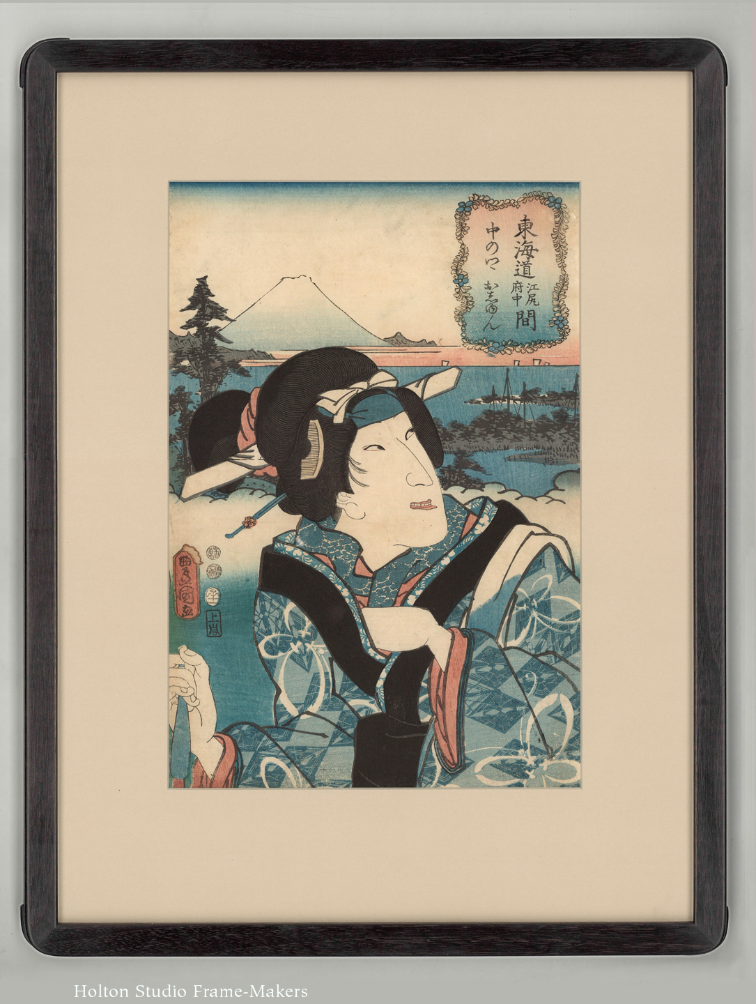
With respect to line, the natural harmony between frame and print is seen, perhaps above all, in the simple fact of the line provided by a thin frame, which suits most Japanese prints (but not all) especially well. Although all of the frames in this group have decorative detail, the plainest frame, such as our No. 1 or No. 2, in a black or dark finish will always be more than serviceable and will actively enhance a Japanese print.
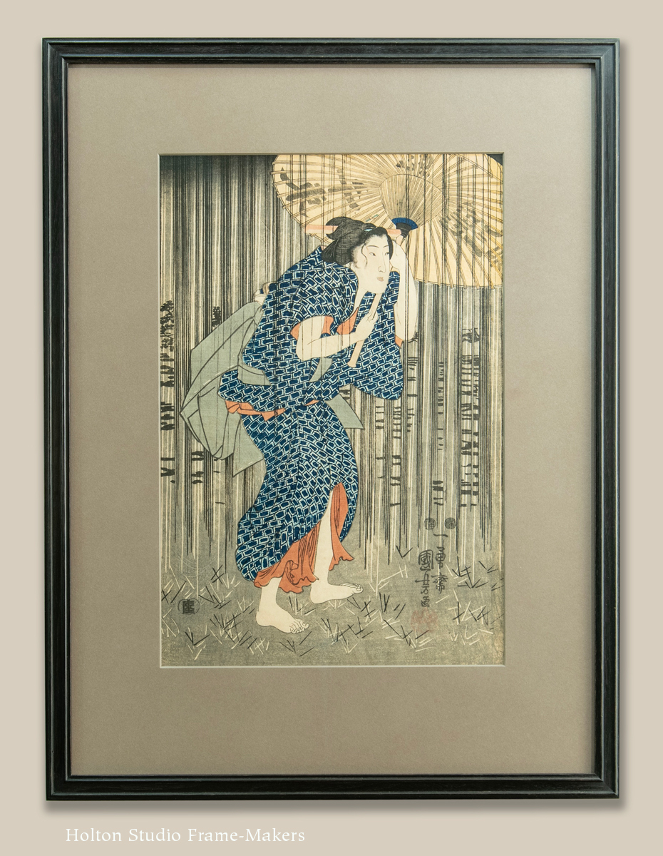
Utagawa Kuniyoshi (1798-1861), “Beauty with an Umbrella in the Rain.” Circa 1849-1851.
This is due in part to the inherent simplicity of an art form that’s limited in scale and both condensed and distilled in composition. At least as significantly, nothing is more salient in block prints than the use of dark lines to define and articulate the elements of the picture. A plain black frame directly underscores the printmaker’s wonderfully skilled use of line; by simply providing a strong line around the print it amplifies and honors one of the most fundamental and interesting aspects of the print.
In addition, there may be something to the fact that this popular art form was created to inexpensively decorate the common home; with the spare and simple home of the ordinary Japanese citizen in mind, the printmaker has envisioned the composition completed by the relatively plain trim and finish carpentry of such homes. The print is made, in other words, with the frame in mind, and therefore naturally welcomes it.
All of the frames in this collection start with providing that simple line, but then build on it with just one simple decorative detail. In the first example, at the top of the post, this essential line of the frame was itself used as a decorative detail. Other than the curved indents, which echo the sword as well as the black trim on the kimono, the frame is the No. 1—absolutely plain. In the example immediately above, the fine rhythm of lines depicting rain, and framing the figure, suggested further refinement of line in the pair of fine beads on the frame.
Form
After harmony of line, harmony of form comes naturally in designing frames for these prints.
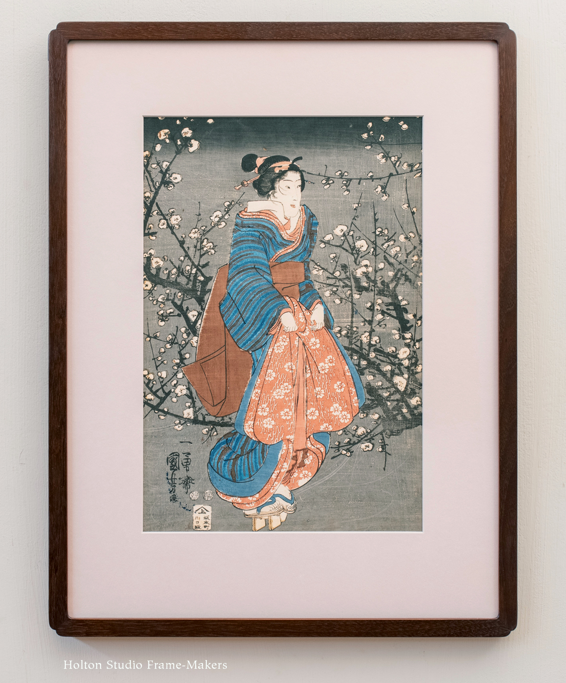
Utagawa Kuniyoshi (1798-1861), “Woman by an Old Plum Tree at Night.” Circa 1847-1850, woodblock print. $950.
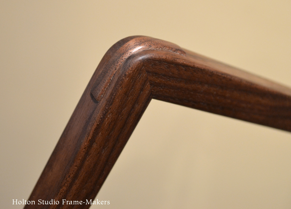
Form is always key to frame design, since the frame is three dimensional and so relates directly to the illusion of three-dimensional form which is inherently intriguing in a two-dimensional picture. This was the chief design idea in the frames for these next three prints (the one at right and two below). For the first two, the frame designs were suggested by flowers, which in both prints frame the figure. In the first case (at right), the frame’s decorative corners, which draw on a traditional Japanese frame corner design called a Kobe corner (see detail), also connect the flower pattern and the drape of the figure’s kimono—a connection surely not lost on the artist celebrating the woman’s beauty.
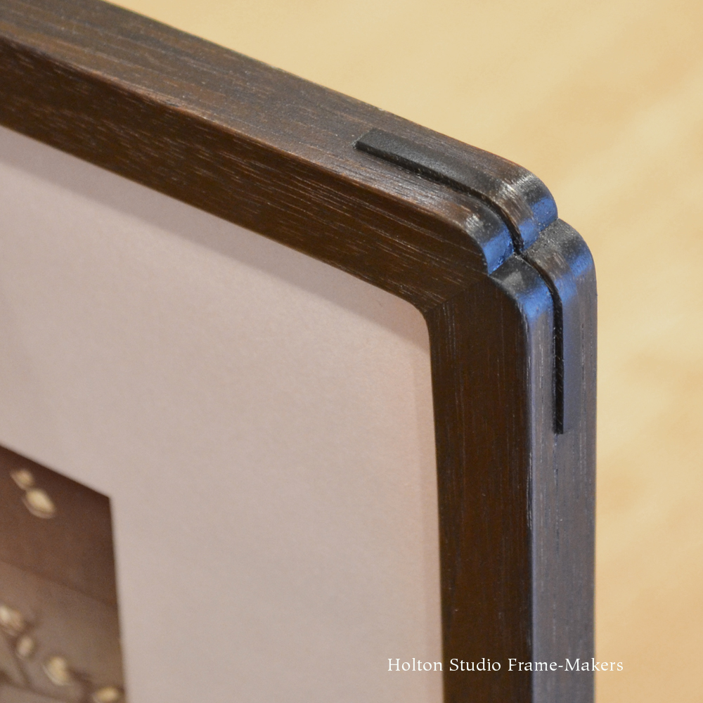
Our take on the traditional Kobe corner frame, with proud spline

No. 411 CV Crescent Cuts
In the second example, below, we used a simple cushion-shaped profile emphasizing the many rounded forms, and emphasized that with the decorative crescent cuts, which also pleasingly articulate the corners (detail at right).

Utagawa Kuniyoshi (1798-1861), “Beauty Walking at Night Near Flowering Tree.” circa 1847-1852. Frame No. 411 CV (crescent corner cuts) in walnut, stained black.
Hasui corner detail.
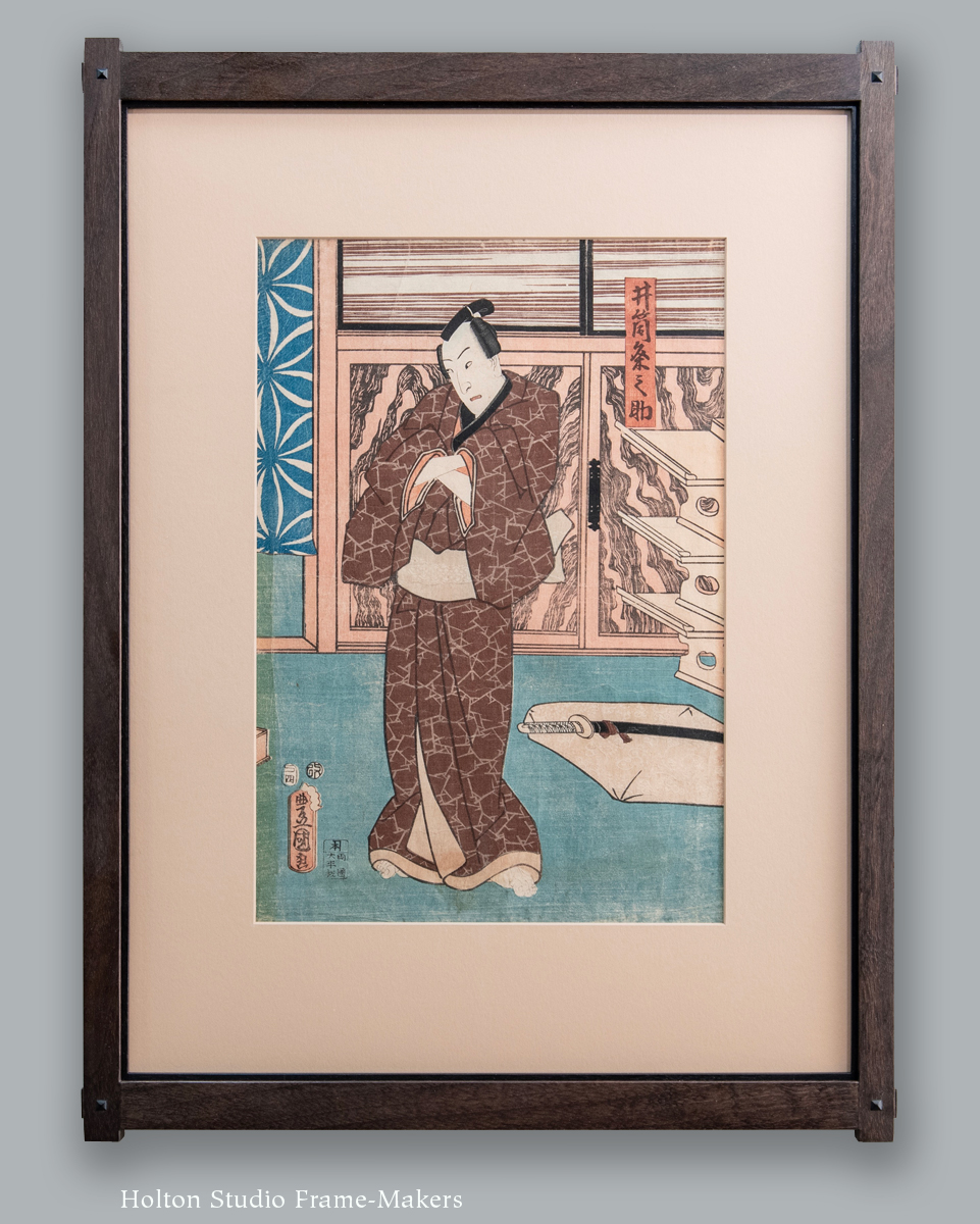
Proud splines, used on the Kobe corners on the third example, above, also articulate the rounded corners of this otherwise plain frame, below, the softened edges and corner detail acknowledging the Kabuki actor’s impressive hair. (This is a fairly recent frame design, which we call the Hasui, and it’s proved very popular. See corner detail view at right.) The frame on the print is in walnut stained black.
Utagawa Kunisada (1786-1865), “Half-portrait of Kabuki actor.” Dated 1852.
Nature and the Arts
So the love of line and the love of form common to most Japanese prints naturally lend themselves to the art of the frame-maker and allow for a natural harmony between the two art forms.
Utagawa Kunisada (1786-1865), “Man in Brown Kimono.” Dated 1857. Framed in Yoshida in walnut with black wash, with black walnut slip.
Along with these two loves I’d add two more loves expressed so frequently in traditional Japanese block prints, and certainly in all of these: the love of nature and the love of the decorative arts. I always say that nothing we make is more beautiful than what nature makes. For this reason, nothing about the frame is more important than the natural beauty of the wood. But as a decorative art itself, the frame always feels natural and welcome in the world depicted by the print, full as it almost always is with appreciation for the arts of architecture and its furnishings, textiles and the many other accoutrements of traditional Japanese life, including, as we see in these examples, things like weaponry and umbrellas.
Exemplary of both love of nature and love of the decorative arts, the print at left features (in addition to another lovely example of the art of the kimono, common to all the prints) impressive cabinetry showing off wildly figured wood. In response to this, our very popular mortise-and-tenon Yoshida frame was the obvious choice. A black slip in the frame gave further emphasis to the lines of the cabinets.
Our No. 15 CV Stops is a similarly versatile design of rectilinear forms that came to mind for the print below showing two figures in a marketplace, echoing as it does the rectilinear lines of the architecture in the background. (Background architecture in a picture is always a reliable reference and source for the design of the frame, which is itself background architecture.) This frame is in cherry with a deep red-brown stain.
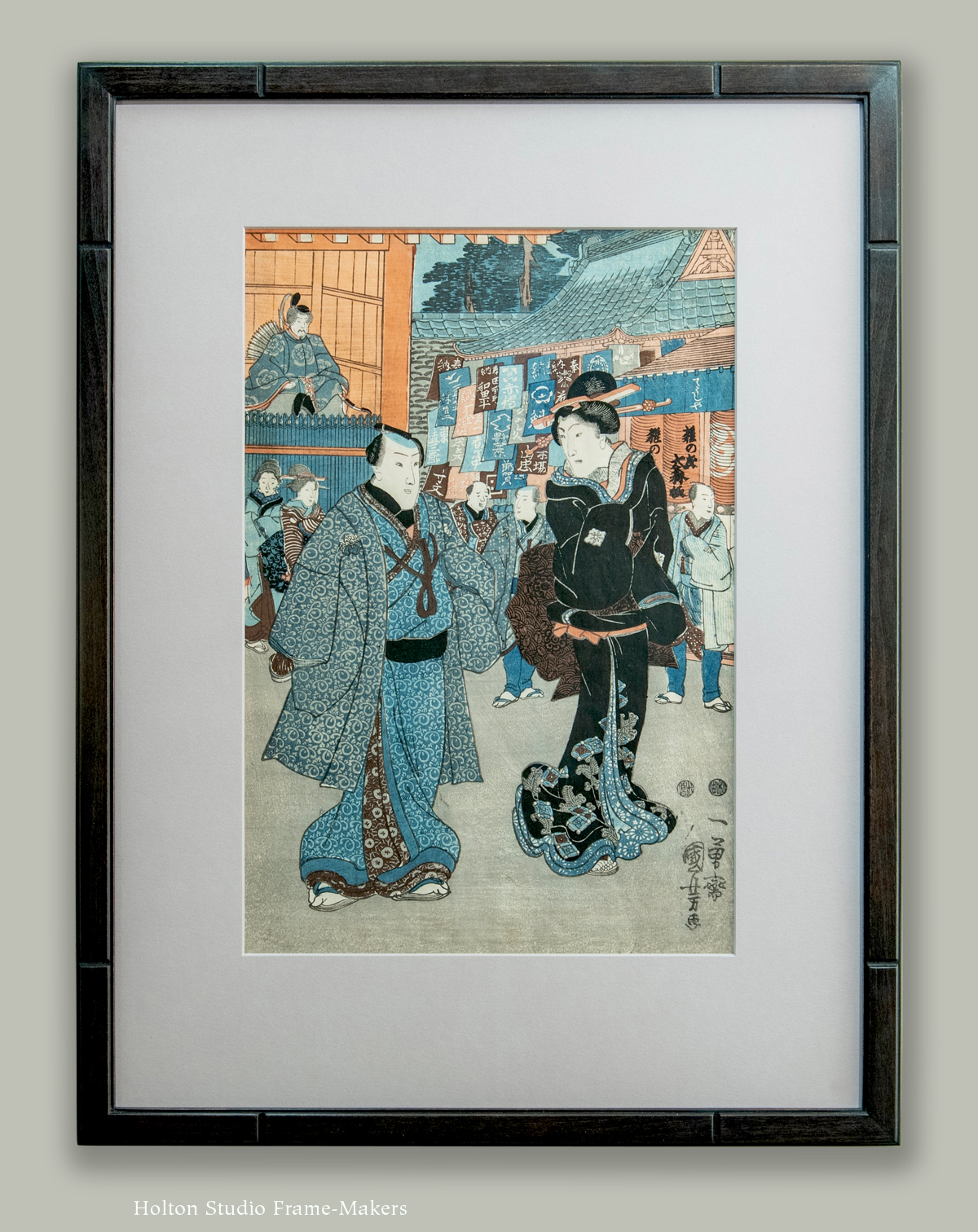
Utagawa Kuniyoshi (1798-1861), “Figures Walking on a Street.” Circa 1847-1852.
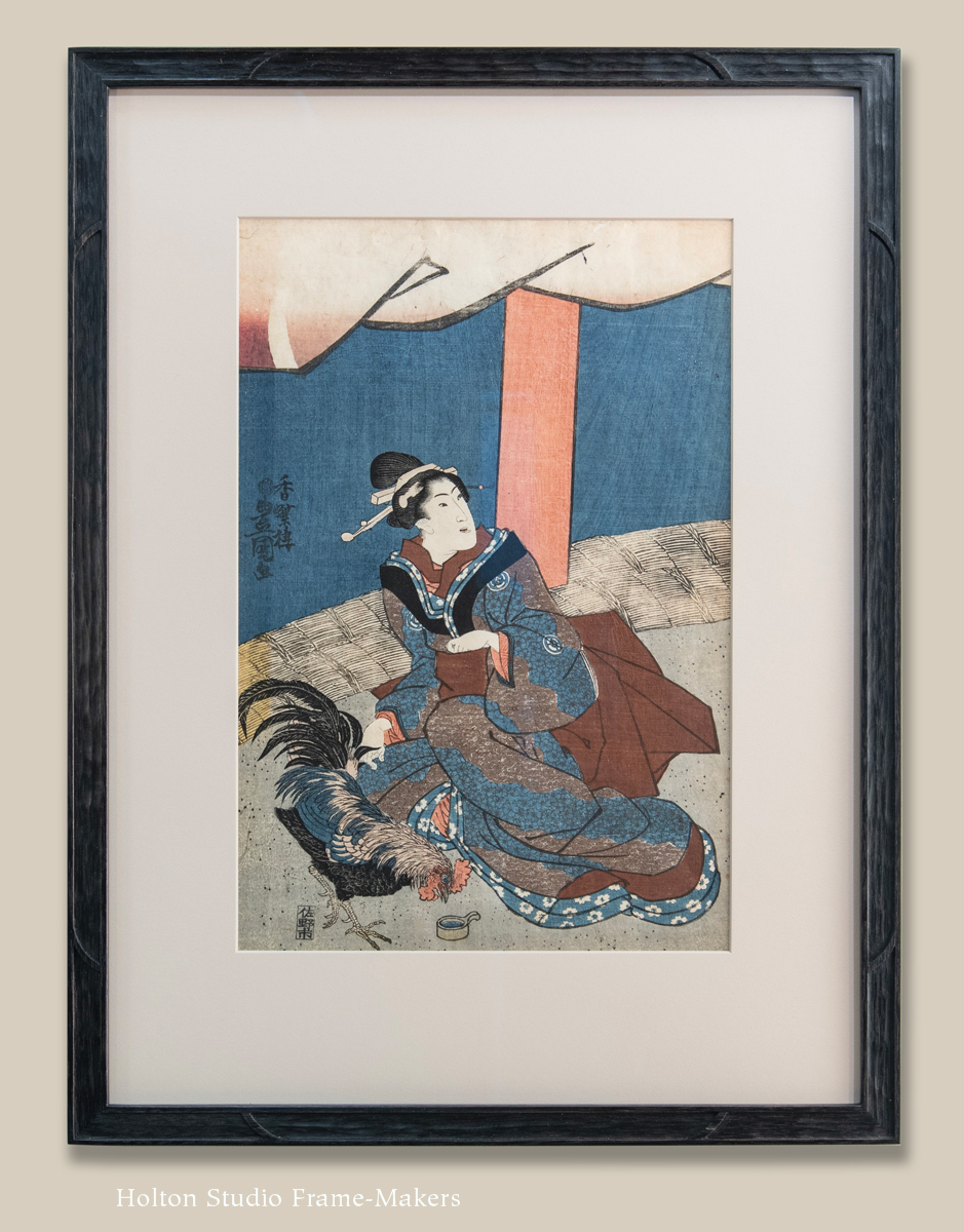
Utagawa Kunisada (1786-1865), “Woman Feeding Rooster.” Circa 1842-47, woodblock print, $950.
Harmony of Craft
Finally, I want to say a word about one exceptionally wonderful opportunity for harmony between Japanese prints and their frames, and that is in the use that can be made of the essential craft used in the making of the woodblock: carving. As this last example shows, the frame—which in this case is our No. 14 CV Curved Stops—can be made using the same method the printmaker uses to carve back areas of the wood to create the raised lines and areas that form the image. This point is admittedly subtle and probably lost on most people, but I do find that when I point it out to customers, they invariably experience an “ah-ha” moment. Deep down, we all appreciate, or are ready to appreciate, the sheer beauty in craft itself.
If you haven’t seen the actual blocks used in wood block prints such as these, as it happens, today our friend Yoshiko Yamamoto sent out a newsletter that includes not only a beautiful new print she’s done, but an image of the block for the print, which I’ve included below, and which, compared to the frame above, should illustrate the harmony of craft possible when framing woodblock prints.
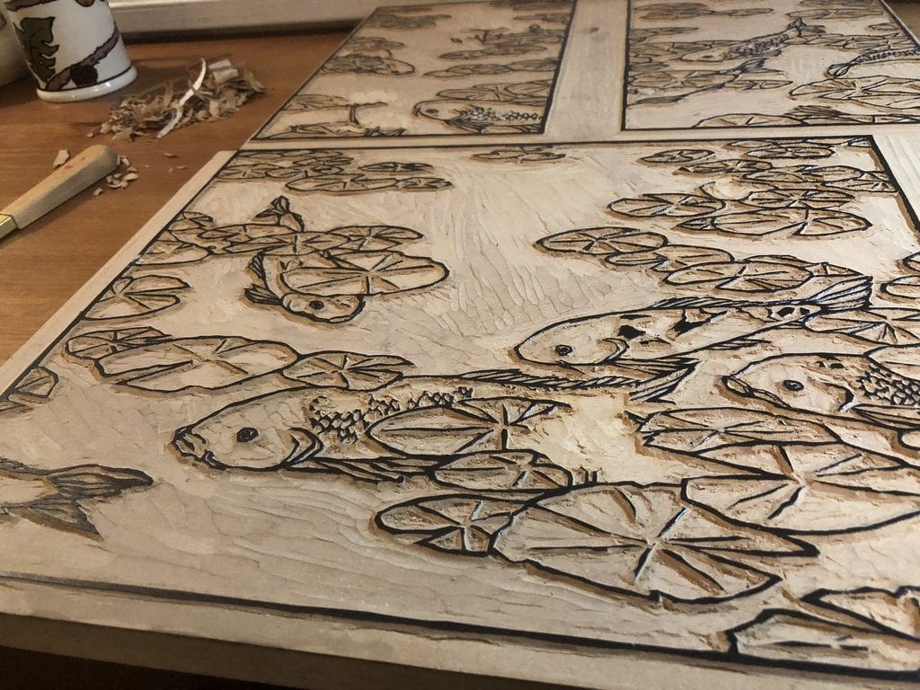
Yoshiko Yamamoto’s block for her recent print “Waterlilies—I”
I hope you’ll come by to see our exhibit “Antique Japanese Prints and How to Frame Them” and enjoy the prints in person. I’d love to talk about the framing, and perhaps what we can do to help you with your own prints. In any case, again, I will be giving a presentation on Saturday, March 23 at 4:00, “A Frame-Maker’s Approach to Framing Japanese Prints.” I hope you’ll come!
« Back to Blog